Disclaimer: I purchased this watch on the secondary market, and was not externally incentivized in any way to make this review. This review is in no way sponsored by Ming, or any entity. All opinions here are my own. Yes, I paid above retail.
Contents
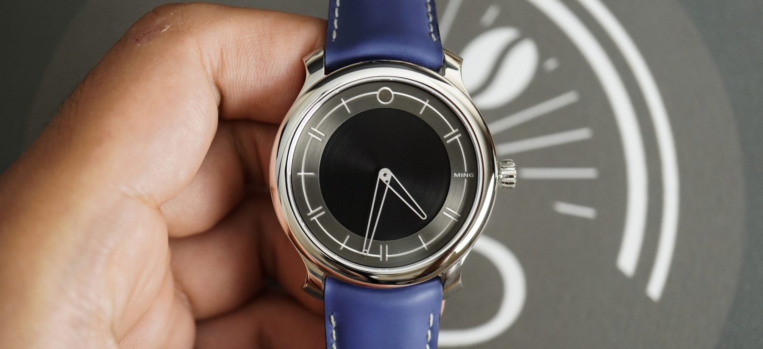
27.01
I was fortunate enough to buy a MING 17.01 sometime last year, and I enjoyed reviewing that watch. This is the 27.01, which is said to be the “spiritual successor” of their debut release. The 17.01 introduced the world to MING, and resulted in the creation of a pretty strong fan base, which has helped MING grow into what it is today. So to declare that this watch is the next step in the evolution of what is likely to be a pretty iconic watch sets expectations high.
The 27.01 was launched late last year at a retail price of CHF 3950, which is roughly $4350 before import duties. When this watch was first announced, I wasn’t completely sold on the design and price, and I was also pretty broke at the time, so I didn’t even bother getting battle ready for launch day. But since then, this watch grew on me, and I decided to keep an eye out for one if I could get it a price that wasn’t completely insane.

A little over a month ago, I finally found one for sale that was at, what I would consider, a reasonable premium over retail, and I couldn’t say no. Before we even get into the review, I will say that this is my favorite of the three MING watches that I’ve owned so far. And maybe by the end of this review, you’ll understand why I love it.
Let’s check it out!
Case
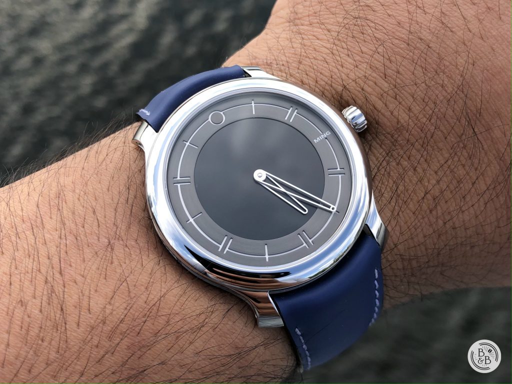
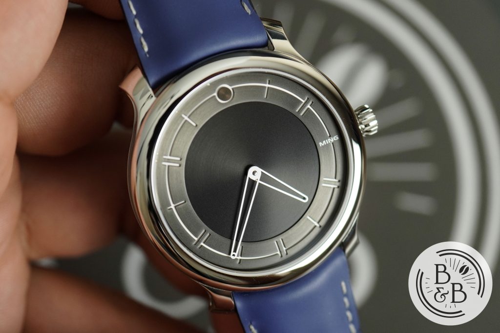
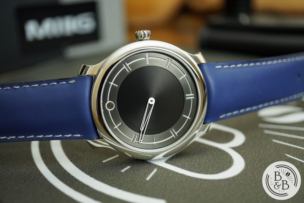
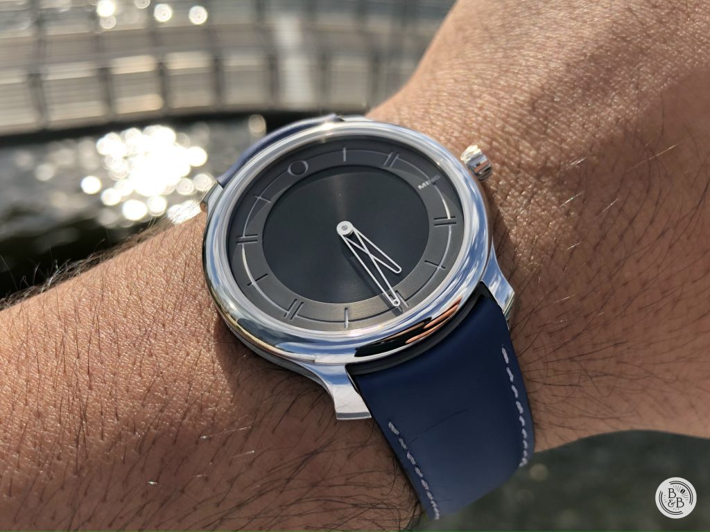
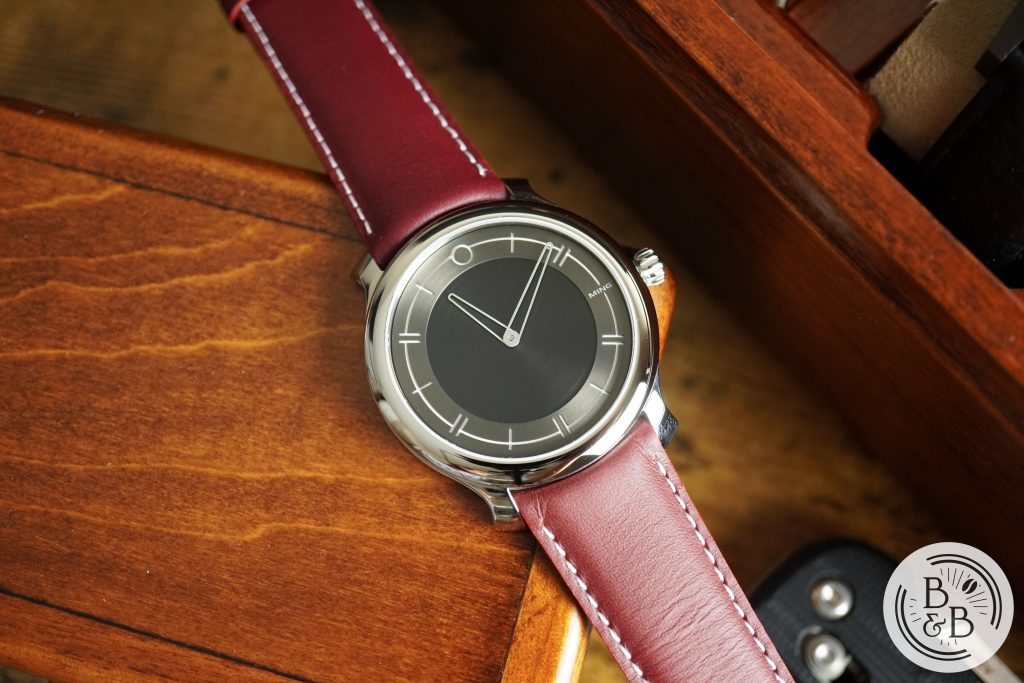
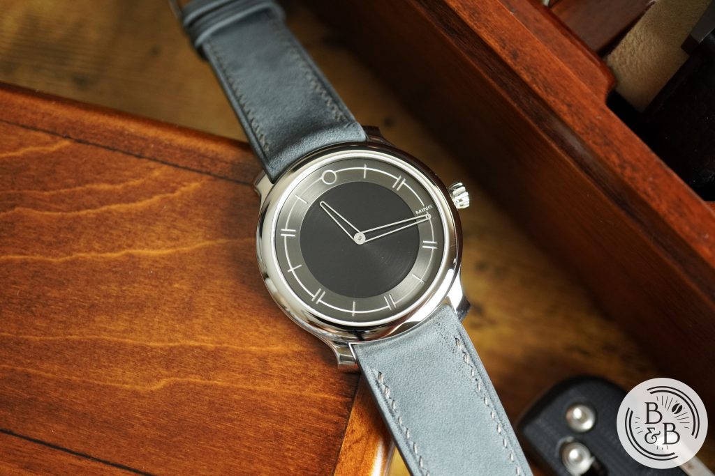
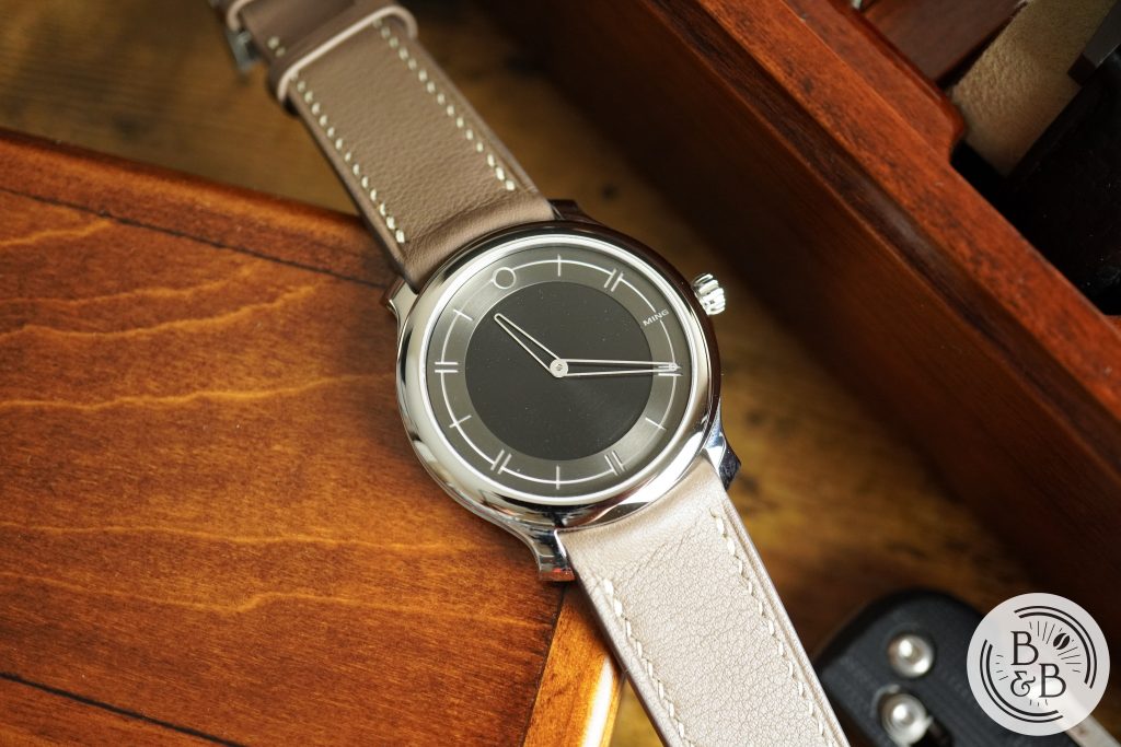
Since this watch is said to be an evolution of the 17 series, it makes sense that both cases look similar. The 27.01 measures 38 mm in diameter, 43 mm from lug-to-lug and an impressive 6.9 mm in height. The case is made of stainless steel and is mostly polished.
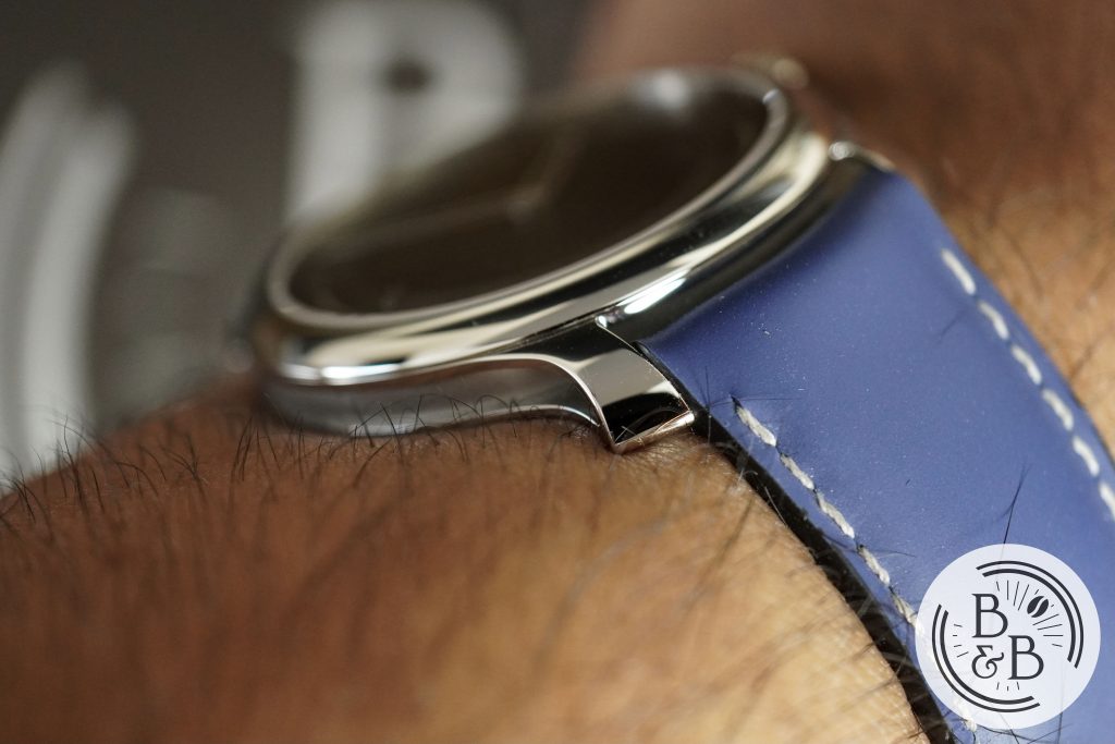
The most interesting feature of the case design are the hollowed out sides. I’ve always liked watches with hollowed flanks and I’m glad to see more brands doing it now. MING is not the first to do this, and neither is Holthinrichs, but it looks great and carving out material on an already sleek watch means it is very light.
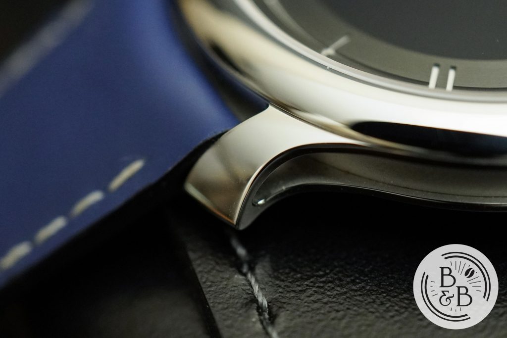
The lugs are slightly flared out in true MING fashion, and I enjoy it. The lugs are hollowed out like the sides and there’s a neatly executed support structure for the spring bars within. A very nice design that is well executed. The finishing of some of these edges is not perfect or crisp, but manufacturing a case like this is not easy, so I won’t hold it against them.
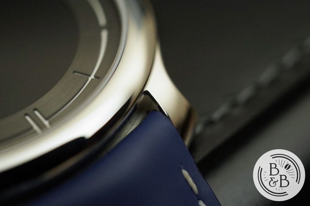
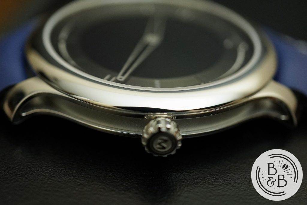
You then have a polished flat bezel section that is slightly rounded but sits flush with the flat sapphire crystal. The crystal appears to have a good amount of AR coating on the lower surface.
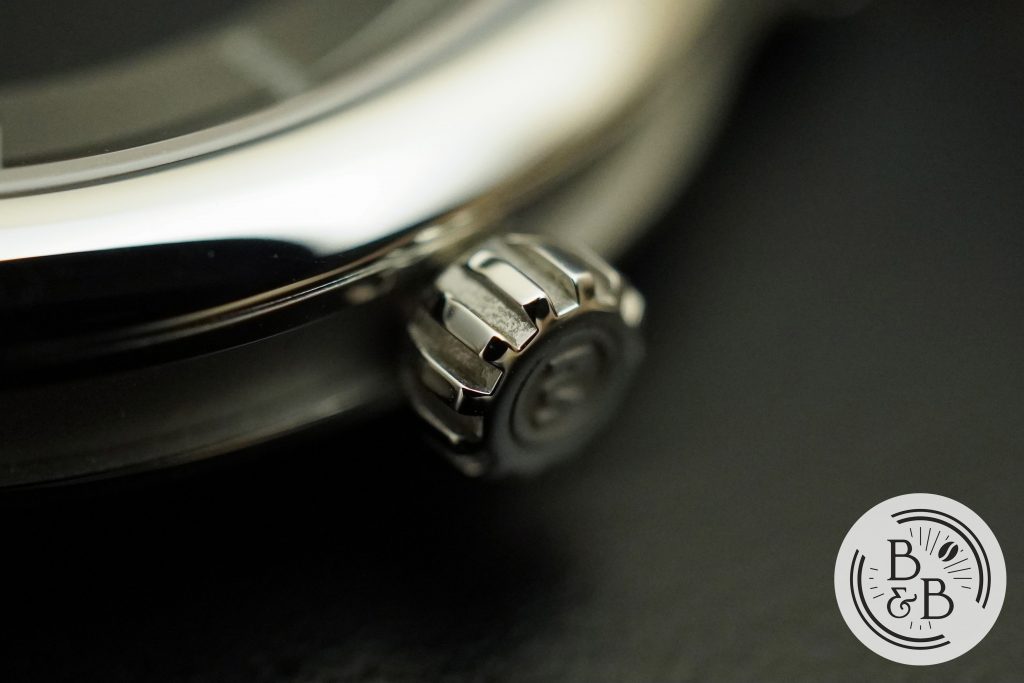
There is an 4.5 mm push-pull crown at the 3 o’clock position that follows the same gear-like design that they used on the 17.01 and 18.01. It is easy to grip and operate, and there isn’t any crown or stem wobble here. This movement is a pleasure to operate.
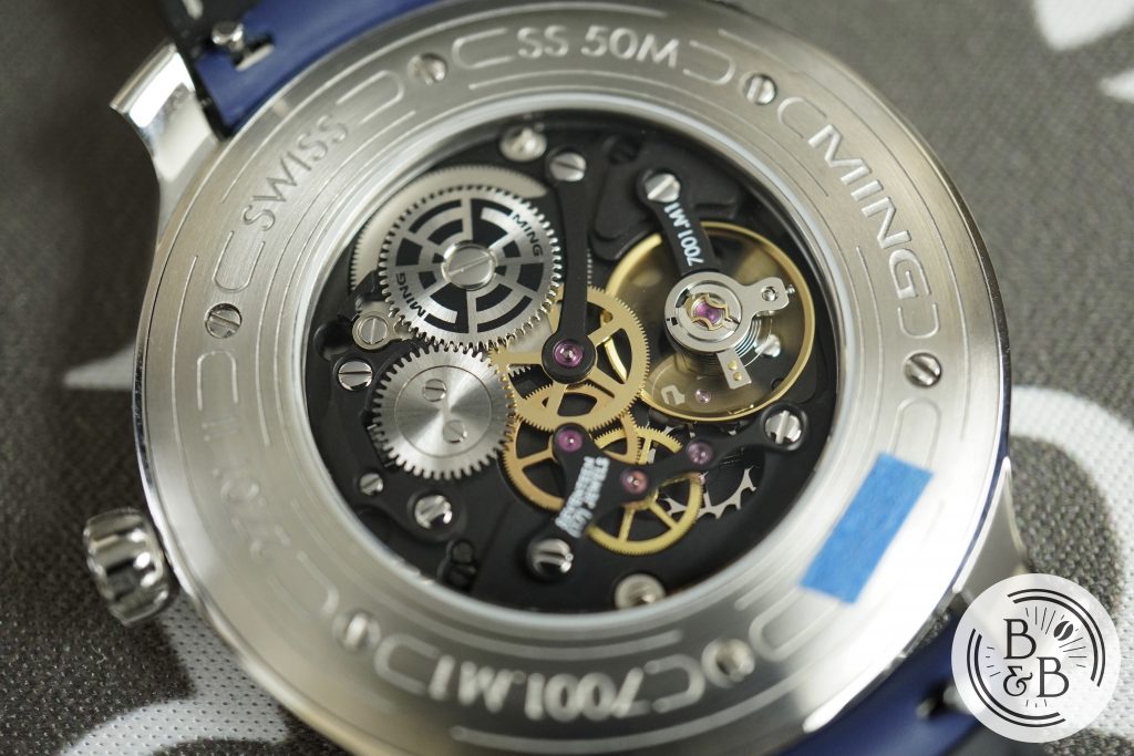
Flipping it over, you have an exhibition case-back that is attached to the case by means of screws. The flat case-back sits flush with the rest of the case and results in a very comfortable wrist experience. This watch is rated for up-to 50m of water resistance, but I will not be taking this one anywhere near water.
Dial
This dial design feels like a slight departure from the design style of the 17 series watches. The 17 series often used sapphire plates, textured surfaces, TRON-like lume, and some interesting dial layout ideas. And all of the above felt essential to the MING design language. But this watch is in many ways an anti-thesis to that style, as it strips away all the bells and whistles and only leaves behind the essentials. All you get is pure MING design, with very little of the fanciful engineering and manufacturing on the dial.
Initially, I think most people felt this design was a bit ordinary and plain, and I was one of them. This wasn’t really a love-at-first-sight dial design for me. But over the course of a few months, as I started to understand my own appreciation for watch design, this dial stood out to me among many very well designed and well made watches.
I realized why I enjoy MING‘s design style so much, and it goes back to the early 2000s when sci-fi circular tech brushes were all the rage on gaming forums and message boards. DeviantArt was exploding with these designs, and I enjoyed every minute of it. This design style also spilled over into another interest of mine – progressive metal, and bands like Periphery made it their design style for almost a decade! My own album artwork featured some of the similar design cues back in 2008. So yes, I’ve better understood my own addiction to this design style and while some have criticized MING following a design aesthetic that could fall out of fashion, I can’t agree with that, since I’ve been into this aesthetic for a while now!
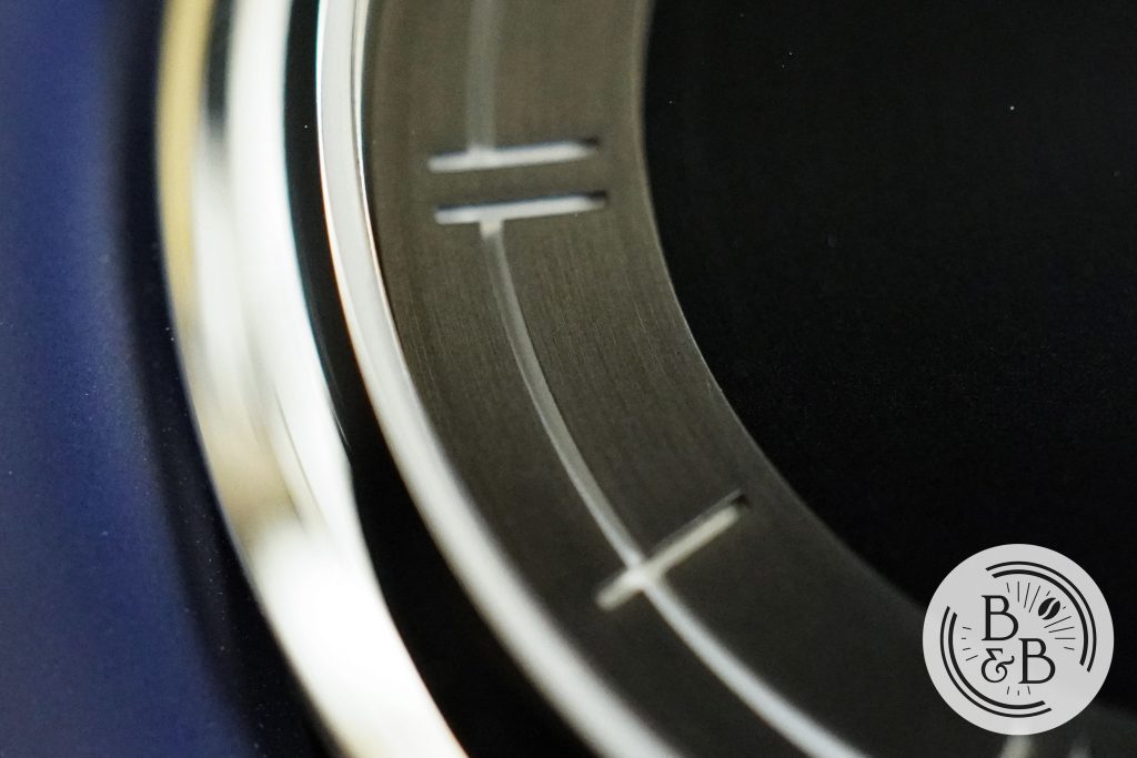
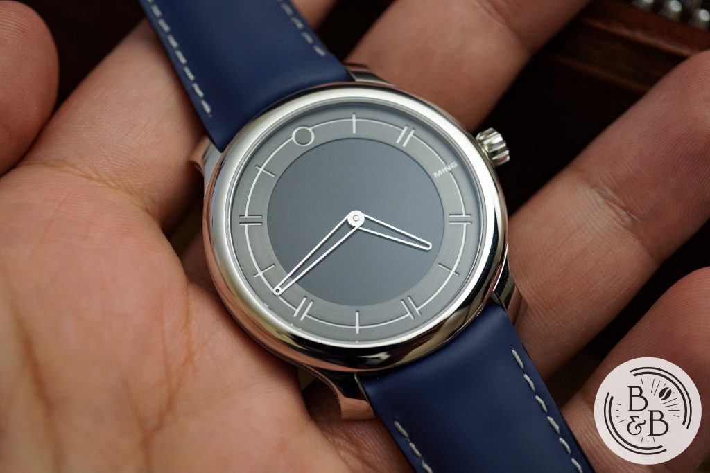
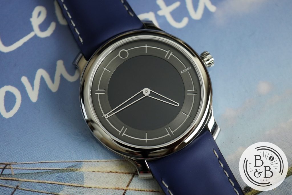
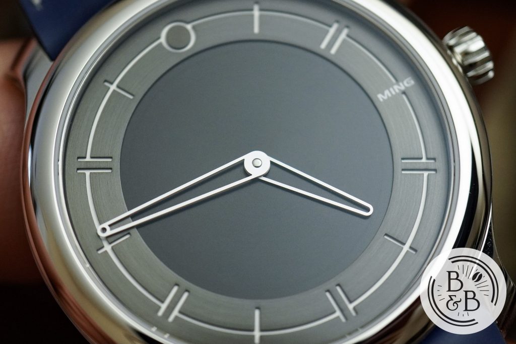
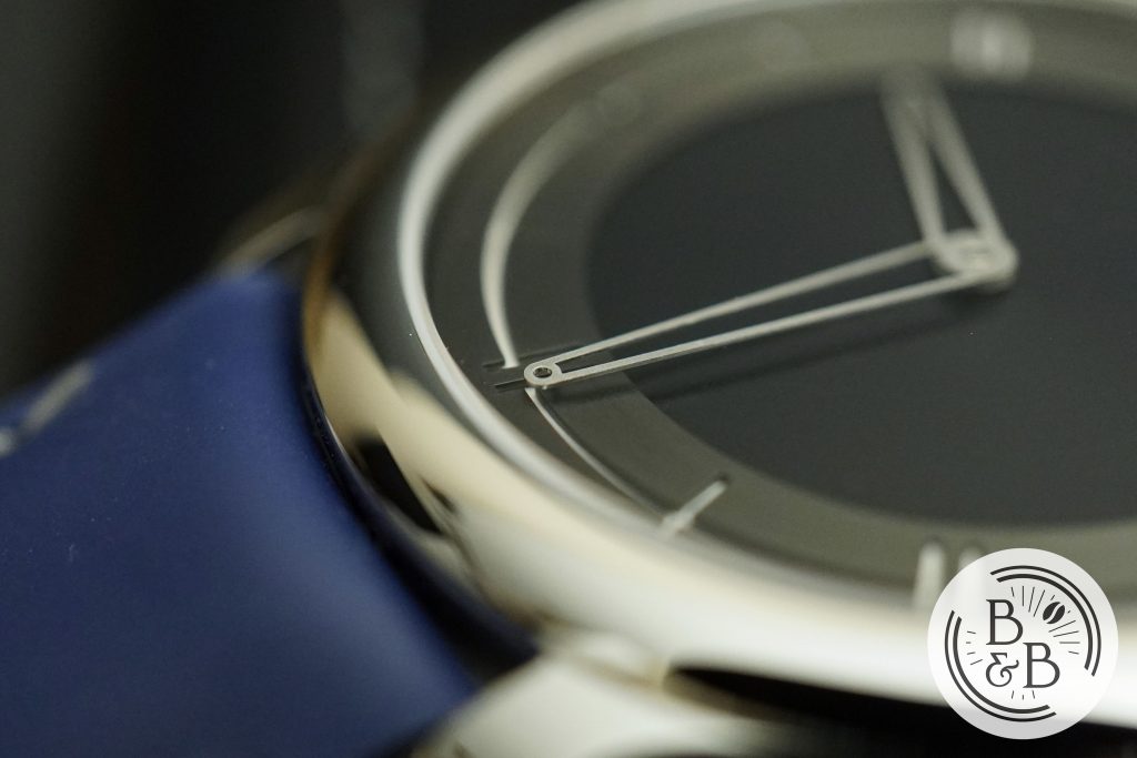
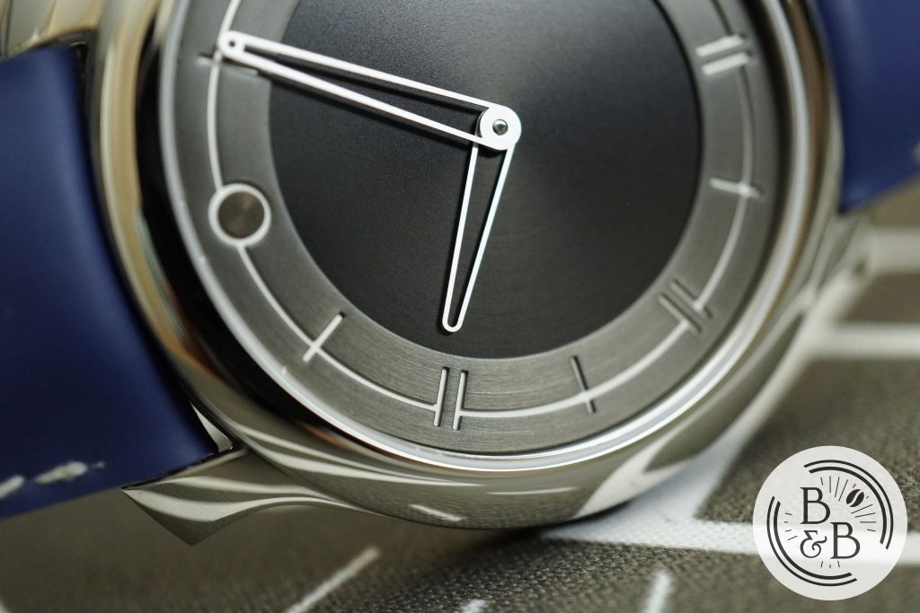
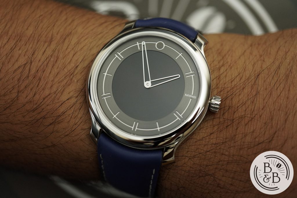
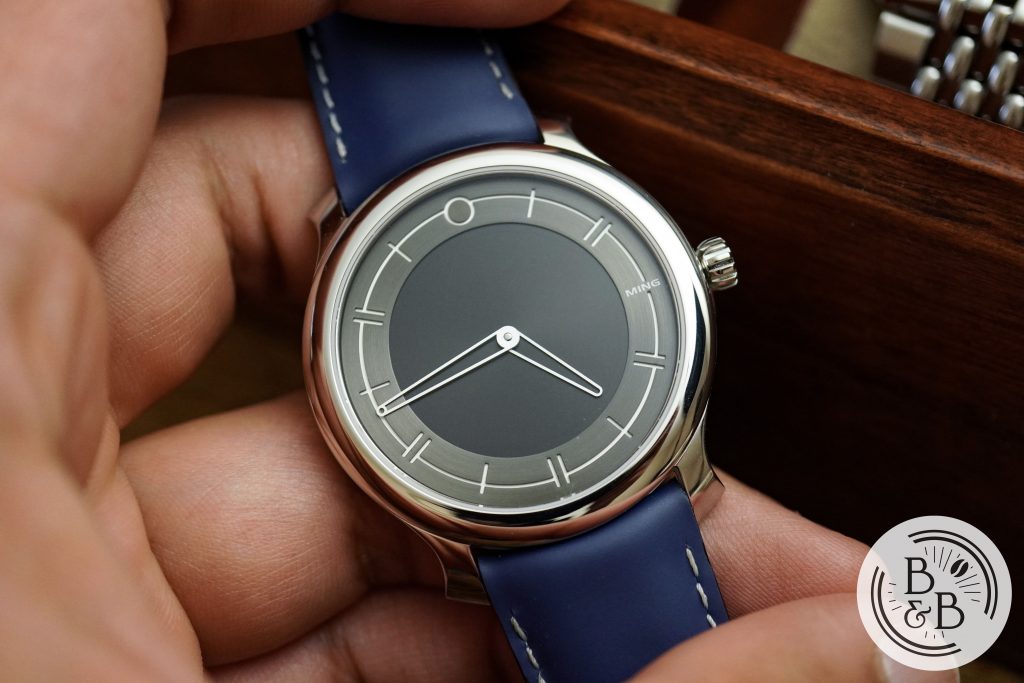
Coming back to the design itself – this dial is simple, clean and very legible. You have an outer circular brushed ring that has all the hour numerals cut into it. Beneath this is a white layer that serves as a way to highlight the cutout markings. The finishing here is excellent and there aren’t any shabby corners or smudges.
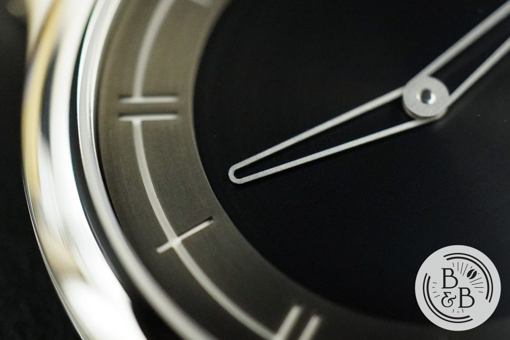
The circular ring appears to be radially brushed steel that is then coated with some kind of DLC or PVD finishing. The depth of the cutout markings adds a sense of depth to an otherwise very shallow watch – let’s not forget this entire watch, movement included, is only 7 mm tall.
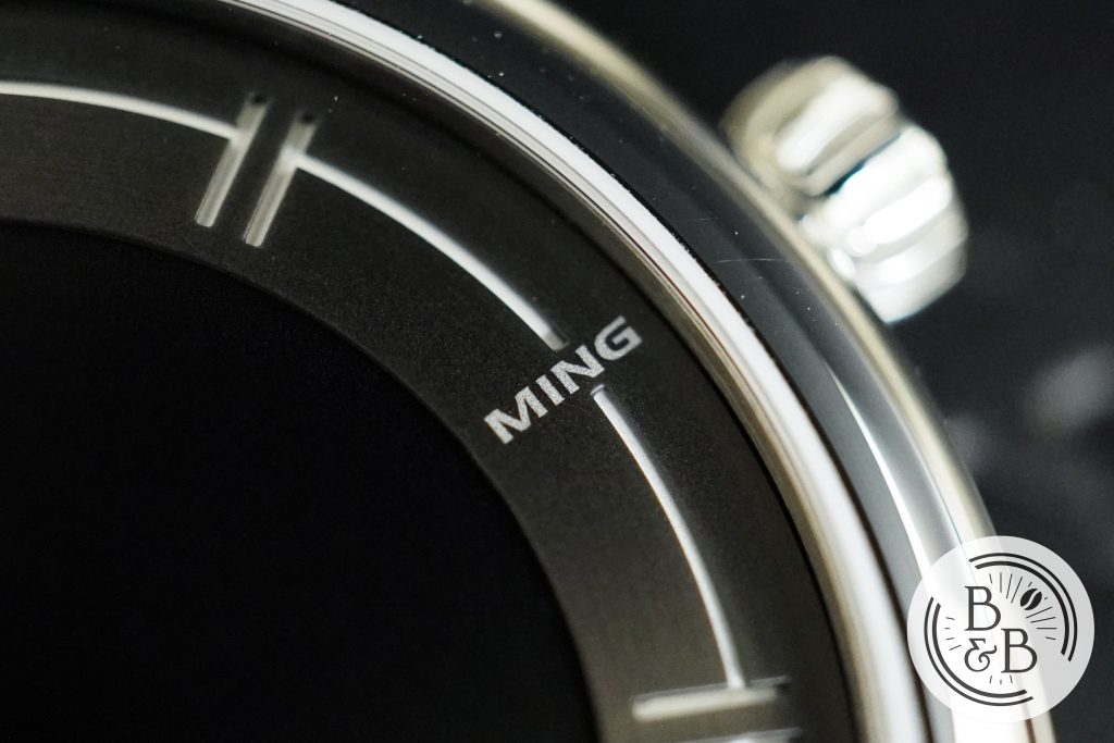
The markings alternate between single ticks and double ticks. They’re all connected, except at the 3 o’clock where they break at the subtle MING logo printed/etched onto the dial. This is the only asymmetric element, but is not glaring in any way as it balances out the 9 o’clock index while also lending itself to make the dial a bit interesting.
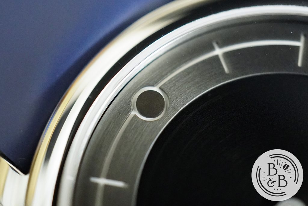
At the 12 o’clock you have the signature ‘0’ marking that has now effectively become a MING design cue, although some have drawn parallels between this and what Movado has been doing for years.
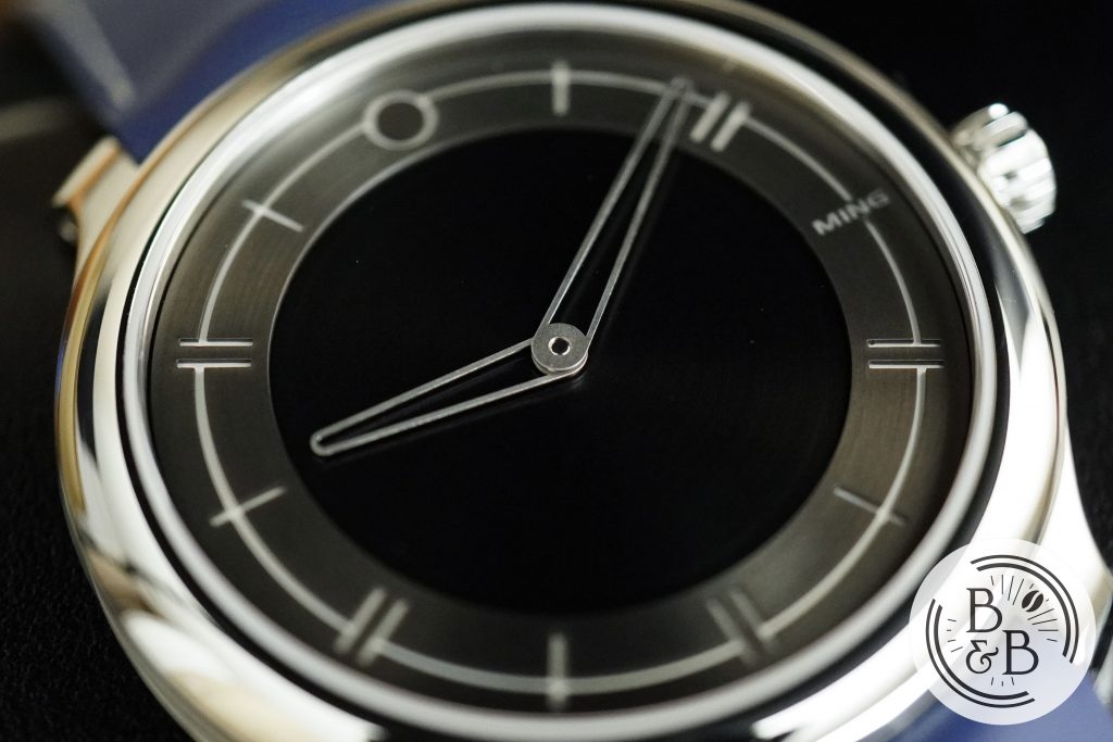
The center of the dial has a black base layer that is also radially brushed, and appears to be very similar to the Ming 18.01. There is a slight difference in height between the outer ring and the inner dark surface, and this adds a subtle shadow near the transitions. Great stuff!
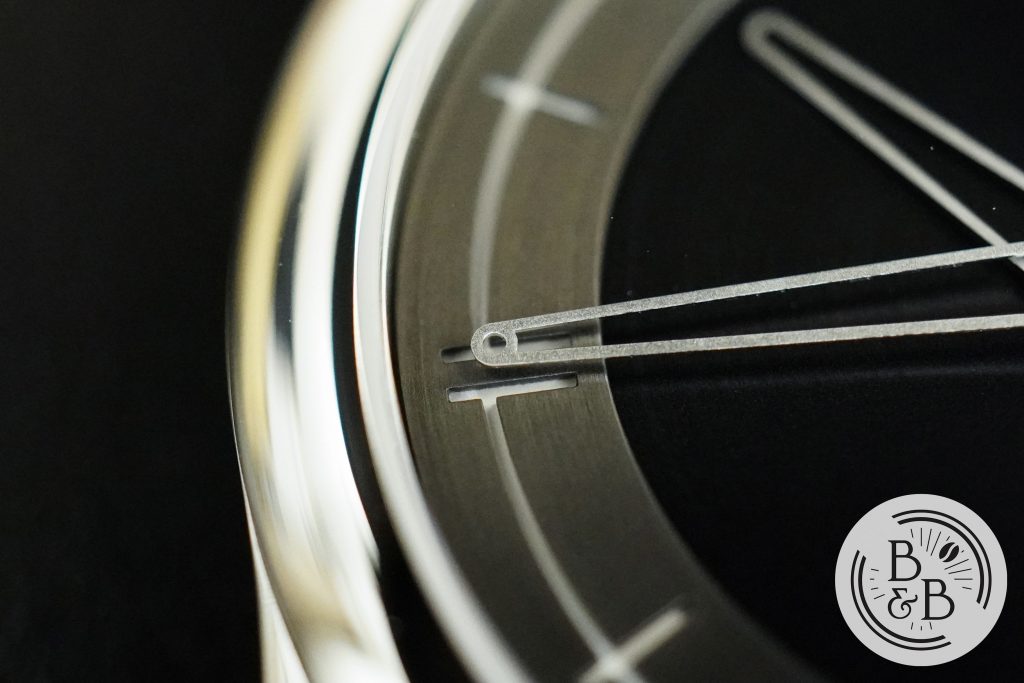
The hands are fairly straightforward, and follow MING‘s hand design style with curved tips and a wide base. The minute hand has a circular element at it’s tip that lines up perfectly with the edge of the outer ring.
The hands are media blasted and therefore have a rough overall texture and appearance. At a macro level, the edges of the hands are slightly rough as a consequence, but I think it works.
The pinion is capped, which is something I always enjoy seeing, and the finishing on the hands is pretty good.
Overall, I have no complaints about the dial design or finishing and while some may see a boring and simple dial, I see an example of a dial design that just gets it right.
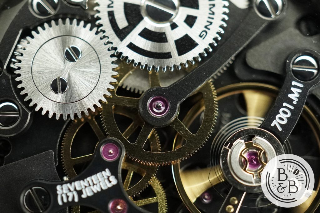
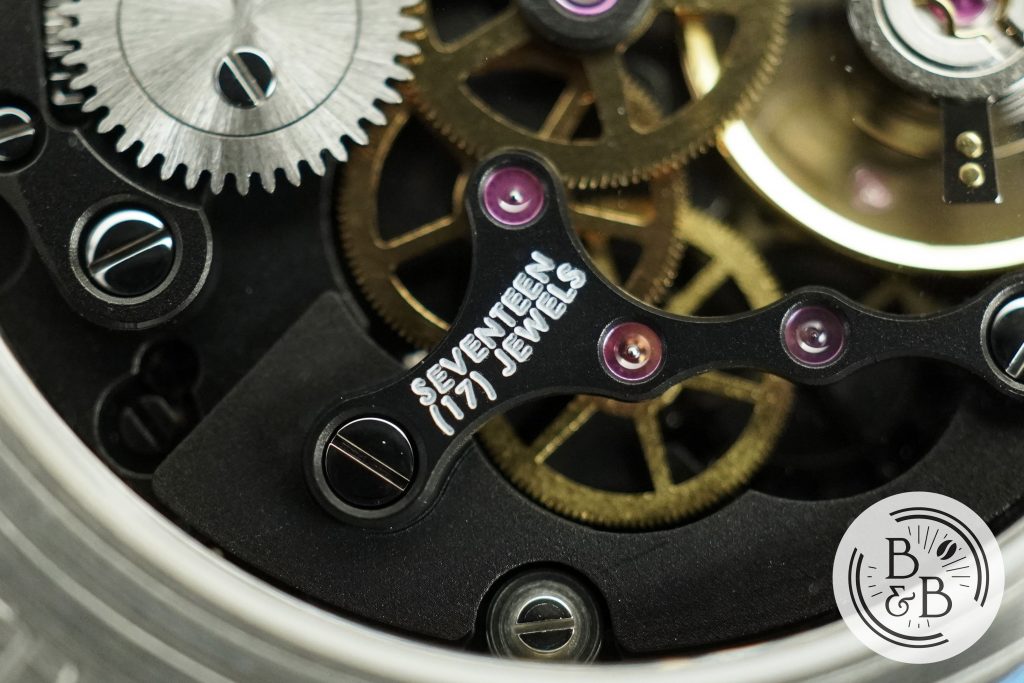
Movement

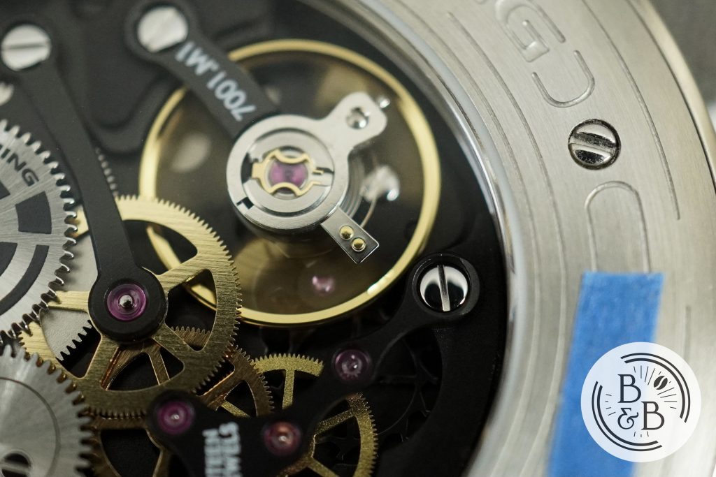
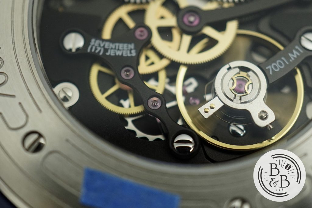
I’ve seen this watch get criticized for using “just an ETA 7001” movement, but let’s take a look at what’s really being delivered here. MING describes this movement as a heavily re-worked hand-wound ETA7001, executed by their partner Schwarz Etienne. For once, I think MING is being modest with their description here.
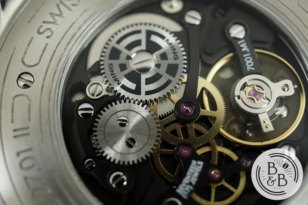
What this movement really is, is an incredibly well designed and very well finished movement that just so happens to fit the design layout of the ETA7001 so that some of the core components of that movement can be used, like the balance wheel and mainspring.
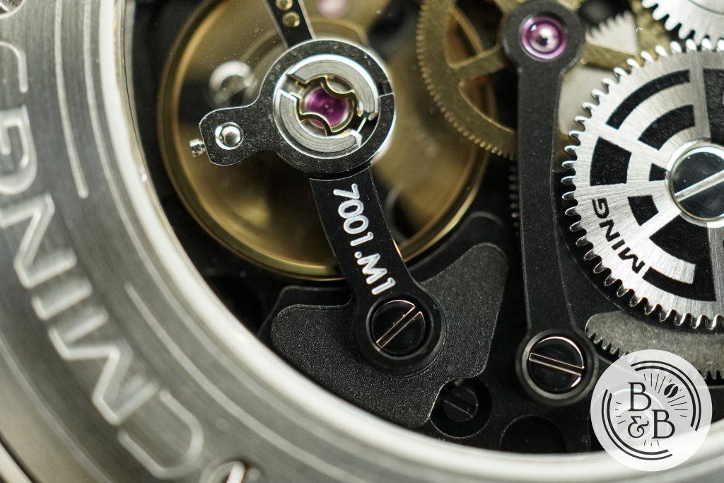
All the plates and bridges look new, and the space-age style design and the all black aesthetic looks incredible in person. The 7001 typically has a small seconds hand at the 6 o’clock position, but I believe that has been left out of the design, since this watch lacks a seconds hand.
This movement has been used in some form by a lot of popular brands, and while Blancpain and Nomos often describe their executions of these movements as modified/redesigned, they look pretty much identical to stock 7001s when you compare it to something like this.
I love the way this movement looks, and I think it plays a huge role in my attraction to this watch. The minimalist dial design is sci-fi-esque and futuristic, but then you flip it over and see the same design aesthetic carried out in an extravagant and elaborate manner. It tells a cohesive and interesting story, and is an example of thorough watch design. No corners appear to have been cut in making the design theme reach every corner of this piece, and that is really why I love it.
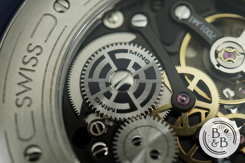
The overall finishing is excellent, and it is pretty clean movement too. I don’t have any real complaints with the quality control, and I think it is well done. There are a few particles and marks around, but only visible with a macro lens.
On my time-grapher, I observed roughly +5 spd in the dial up position and 0 spd in the crown-up position. I would’ve preferred if they used a chronometer grade movement in their dive watch since it was designed with a degree of functionality and practicality in mind, but the lack of rigorous bench-marking on this watch doesn’t bother me at all and I’m more than happy to live with these numbers.
So my overall opinion is that if you’re going to complain about the movement, you’re missing the plot, and this watch is likely not for you. Because this is no ordinary ETA7001. It isn’t going to do anything significantly different from a $1000 Stowa housing an ETA7001 but it sure as heck looks cool.
On The Wrist
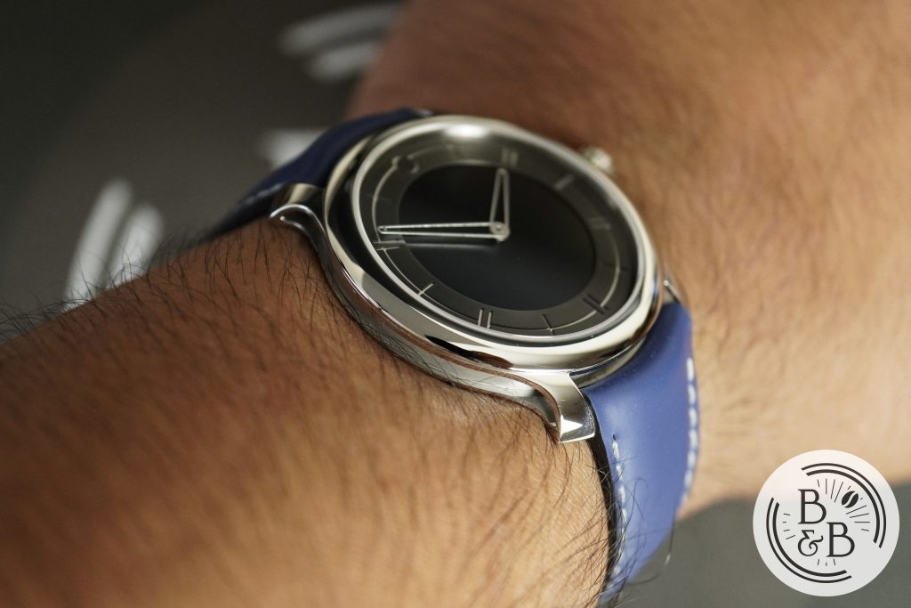
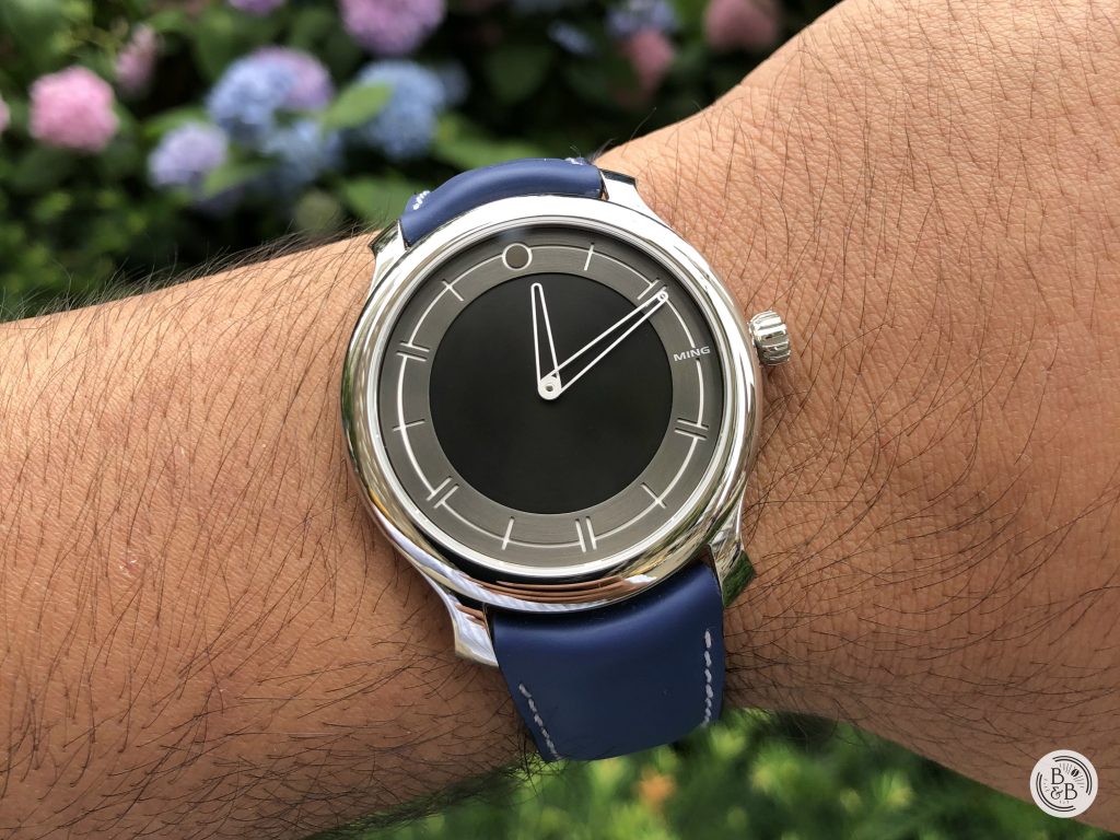
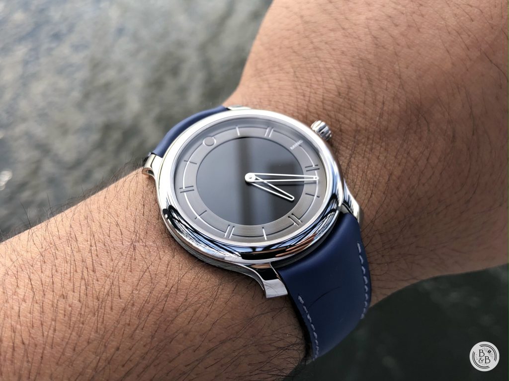
As you’d expect from a watch that is roughly 6.9 mm thick, it disappears on the wrist. The overall size will work for a variety of small and medium wrist sizes, given it’s modest 38 mm diameter and 43 mm lug-to-lug width.
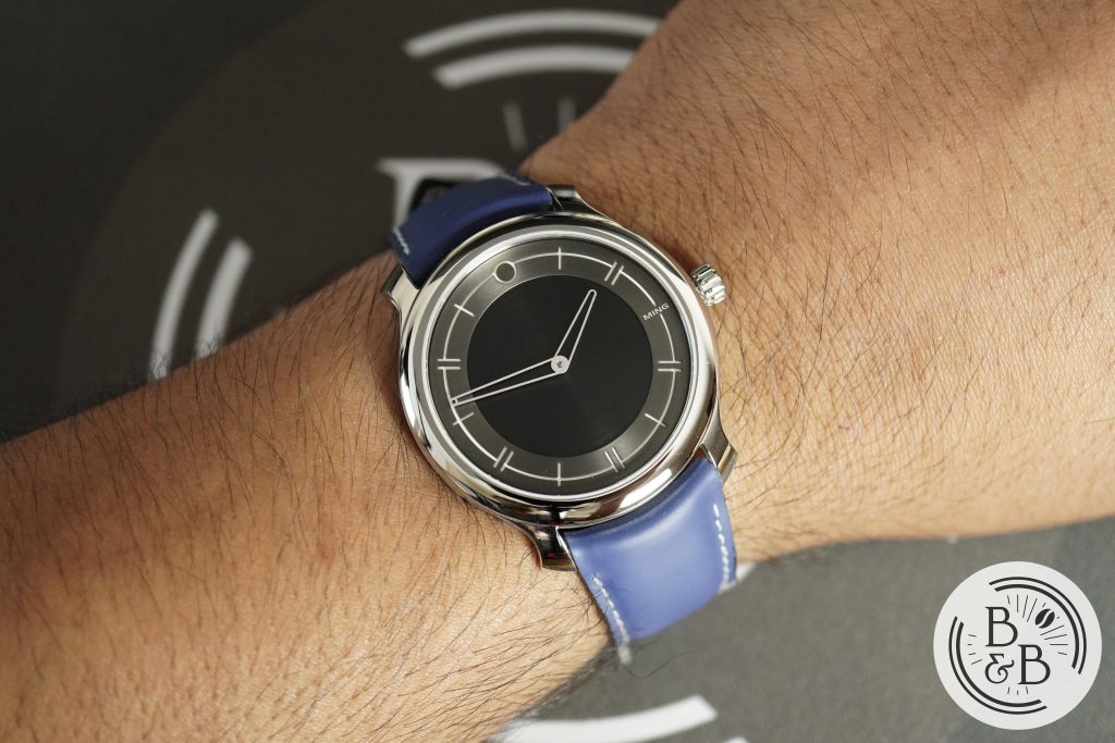
I think it wears great on my 6.5″ wrist, and I love the sleek dress watch aesthetic. I think that MING designs like this one lend themselves best to dressier watches, and this watch just comes together so much nicer on the wrist compared to the 18.01 H41 diver.
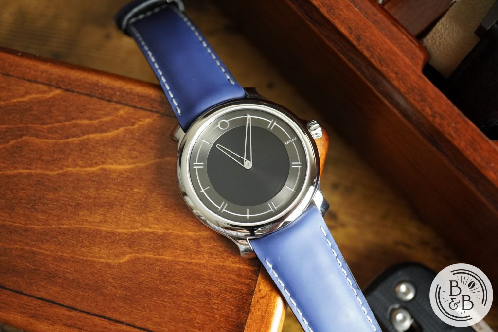
This watch ships with a burgundy leather strap, made by Jean Rousseau. It has a beautiful case-matched buckle with hollowed sides to continue their flying blade design theme. I wasn’t a huge fan of that color for this watch and I tend to prefer rubber in general, so I switched it to this blue rubber strap that I purchased with my 18.01 diver. This rubber strap is one of the best rubber straps I’ve ever owned, and I highly recommend one for your MING watches.
Overall, I love the wrist presence. It is comfortable, sleek and does not announce itself while it’s on your wrist. The design makes it very versatile, and I can see it being used in both formal and casual settings.
Concluding Thoughts
I recognize that this review has been primarily positive without much criticism. The truth is that I love this watch, and it is the MING I’ve enjoyed most among the three that I’ve owned. I’m not even a fan of dressy watches in general, but I can appreciate this one more than I did the MING 18.01 diver, even though divers are more of my thing.
I waited 6 weeks before writing this review, hoping that I would find some areas for solid criticism, but there really isn’t anything that stands out to me. We can definitely criticize their sales practices, scarcity and secondary prices, but I’m tired of beating that drum, and I think the 17.09 timed release shows that they want to be more accessible with certain models.
As for the secondary prices, you can blame the industry as a whole, and it is no secret that prices of watches this past year have made little to no sense. But I suspect a correction is coming, and I already see some highly inflated prices coming down across the board.
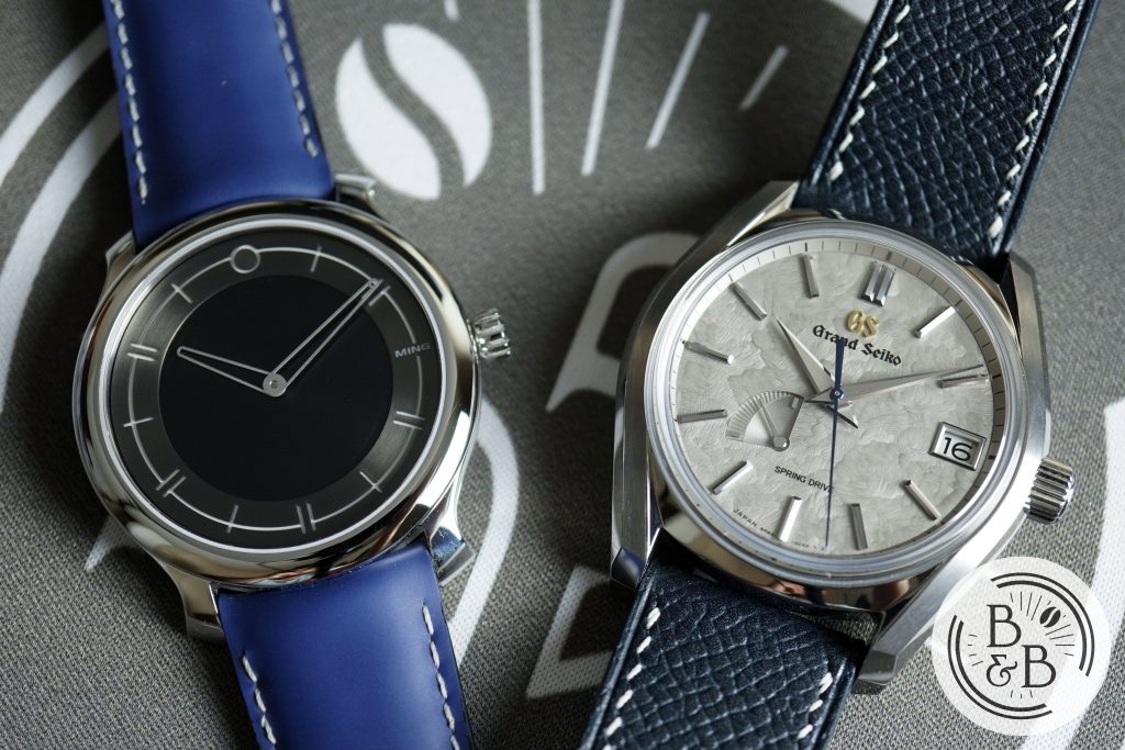
On that note – at retail, I think these watches are a fantastic purchase. But I don’t regret paying over retail for this, even though I am aware that there are plenty of other watches that you can get for the same amount of money that you might find to be “objectively superior” like something from Grand Seiko for example. But the MING design style is something I enjoy, and is one that I connect with given my appreciation for sci-fi design. I love what they did with the movement, and everything just comes together perfectly with this one.
Strap Change
Thanks for reading!