Disclaimer: This watch was sent to me on loan to review and I was not incentivized in any way to make this review. This is in no way sponsored by Dietrich or any other entity. All opinions here are my own.
Contents
Dietrich
I’ve been a long time follower of Dietrich and I’ve always admired and been fascinated by his strong and unique design language. Emmanuel Dietrich has created his own style of biomorphic and organic design elements and brought them together in the context of a watch, and the Organic Time and Dietrich Device series were a wonderful example of this expression. Those watches and designs are not for everybody, but mass appeal is a boring concept to me and pulls this hobby in a direction that contradicts the idea of watches as an extension of one’s unique personality.
Dietrich later took on the integrated bracelet stainless steel sports watch genre, and created the Time Companion, which was another bold, yet slightly more familiar design. With the Time Companion, Dietrich exercised restraint where organic and biomorphic elements were concerned, but still designed a product that was identifiably one of his, with a very cool hexagonal theme executed in his own signature style.
He has also attempted bolder and more artistic watchmaking projects such as the Perception, a highly unconventional approach to presenting the time, and one that continues his overarching design story. Dietrich has a design language that is unique, cohesive and a breath of fresh air in an industry that is dominated by mostly boring and uninspired designs.
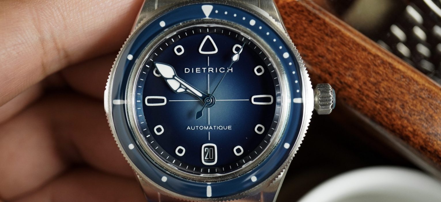
But you could argue that previous Dietrich watches were too unique, and stood too far apart for mass consumption. And I am likely to agree with you, and based on this latest release, I think he might be in agreement as well. This is the first of a series of watches that Dietrich plans to develop, that are his own interpretations of more conventional and iconic watch platforms. This is his take on the skin diver, and is called the Dietrich SD1. This watch was announced for pre-orders earlier this year, with a price of $1050.
In terms of price, this is perhaps the cheapest watch Dietrich has made, but you’ll have to ignore the dozens of unsold Organic Time inventory that made their way to bargain sites and could be found for as low as $600. But buy those at your own risk, as that was a result of Dietrich‘s move to a direct to consumer model. So while I pity the poor soul that paid full retail for an Organic Time watch, I suspect you’ll see more control and stability with Dietrich pricing moving forward.
Let’s check it out!
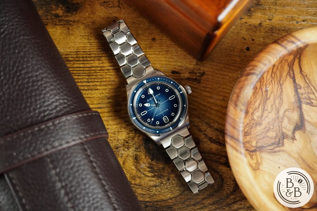
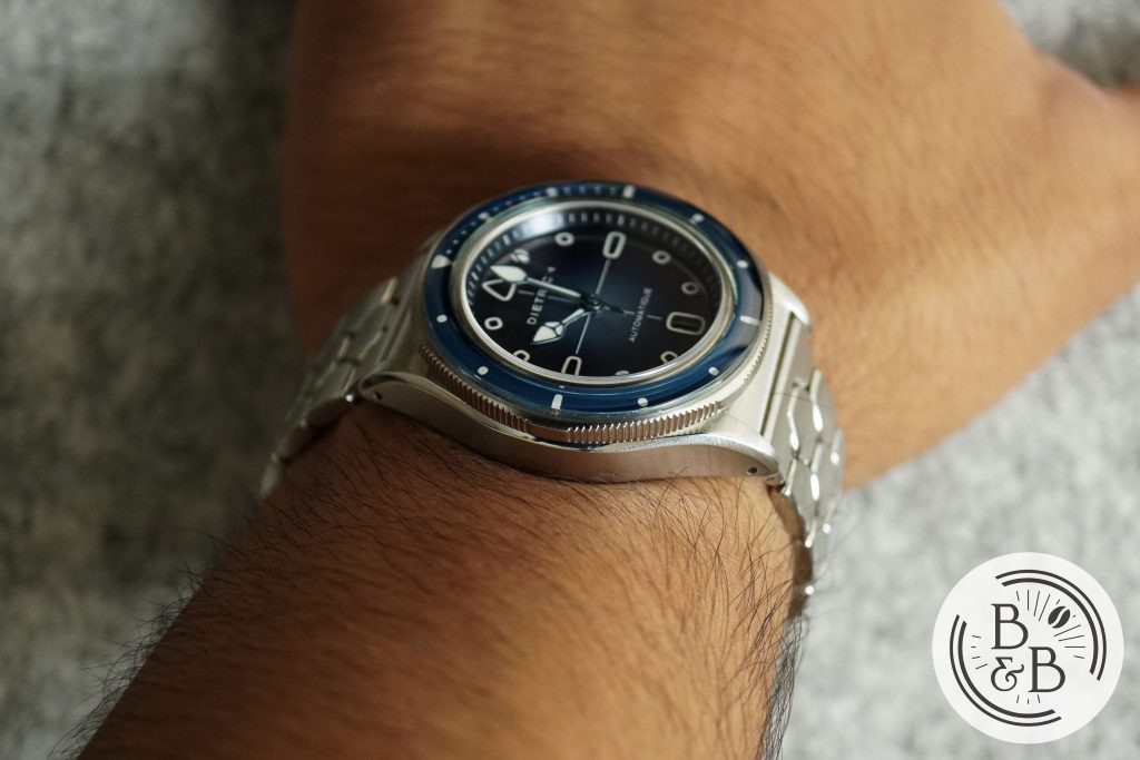
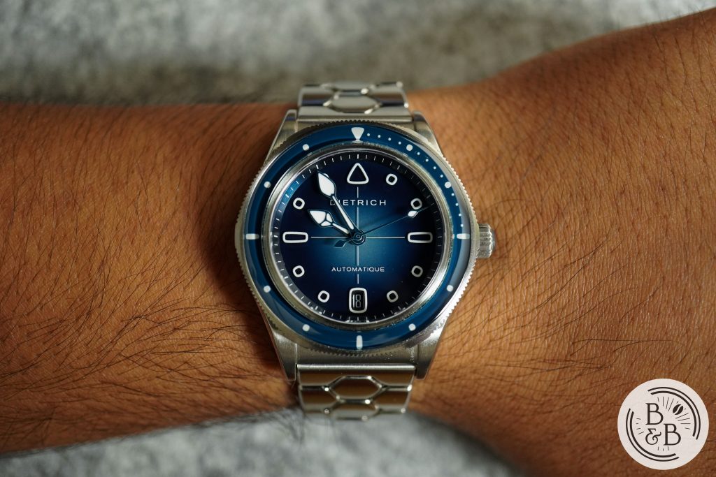
Case
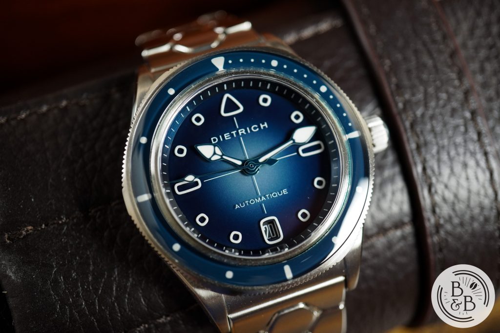
I measured the case to be 38.15 mm in diameter, 45.5 mm from lug to lug (43.35 mm between articulated end links) and 12.10 mm tall. The case is made entirely of stainless steel and is mostly brushed.
This watch is meant to look familiar and relatable, while also giving you a taste of the Dietrich design DNA. Personally, I would’ve loved to see an entirely Dietrich case design – his own interpretation of a dive watch, but instead you have a more conservative dive watch case design that resembles a few classics. I understand the decision, but I could’ve handled some more weird… just saying.
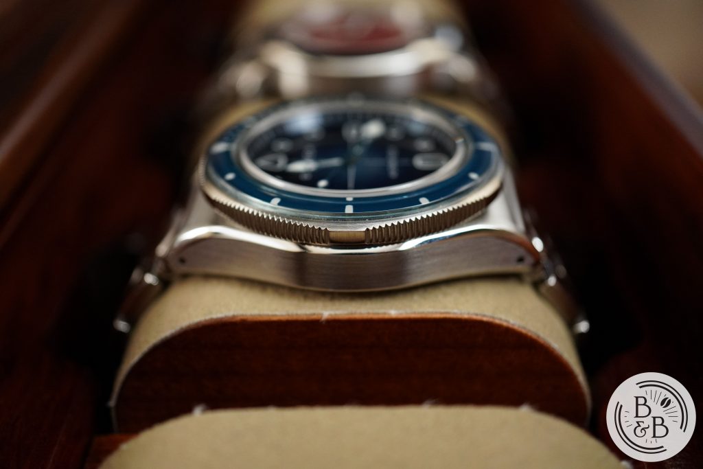
The case has a familiar slab like mid case construction that extends out into a pair of lugs that have a sharp but straight taper. The lug width is 20 mm and the lugs are drilled though.
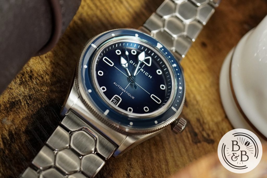
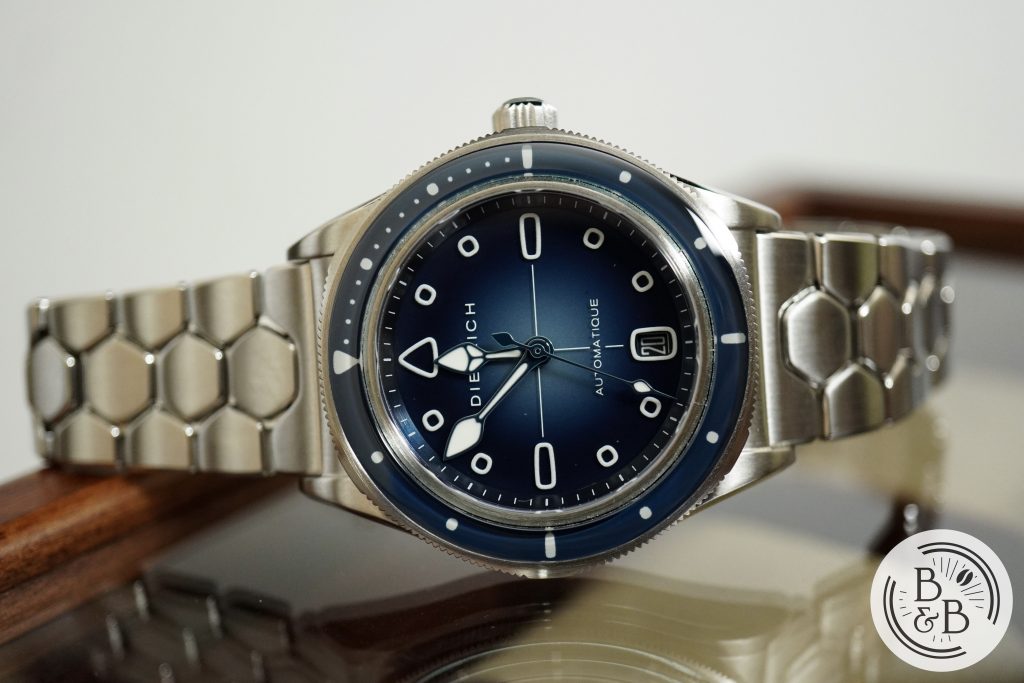
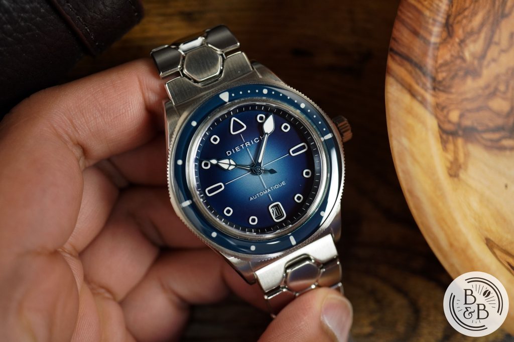
There is a 120 click uni directional dive bezel with a domed sapphire insert. All the bezel elements are lumed and the insert matches the rest of the dial. The bezel is not circular, and has some protruding edges as a throwback to his hexagonal design theme, and an extension of the bracelet design. This is however very subtle, and you have to look for it.
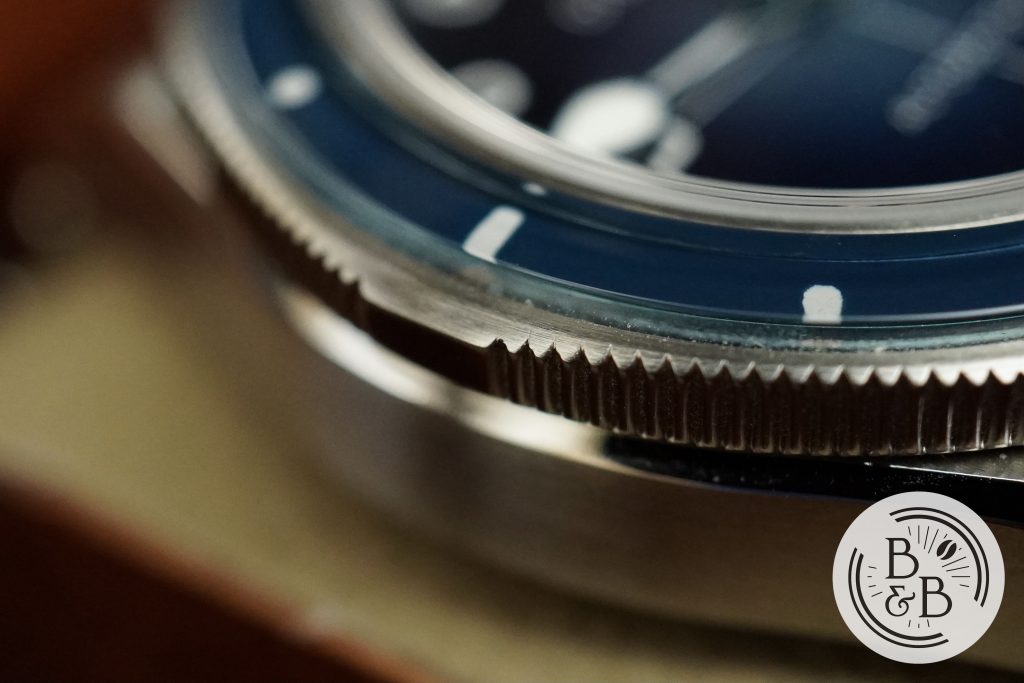
The bezel action is very Zelos-like with a stiff action and sharp clicks. There is negligible back play and everything seems to align well.
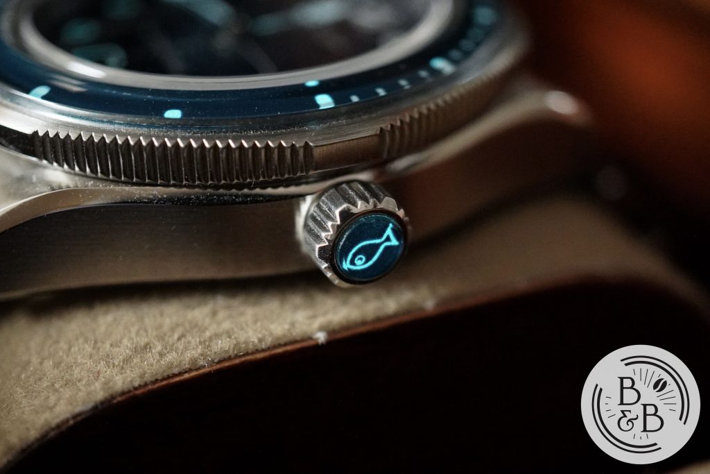
You have a 5.25 mm screw down crown at the 3 o’clock position that I think could’ve been slightly larger with deeper ridges. The crown also has a lumed sapphire insert with a fish on it. Unnecessary and expensive, but pretty cool.
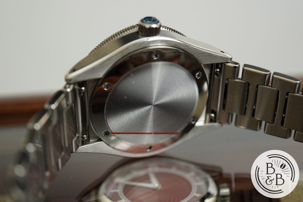
Flipping it over, you have a solid screw down case back with nothing on there. I’m growing tired of half baked case back designs – either go all the way with case-back art, or don’t bother at all. This watch is rated for up-to 150m of water resistance.
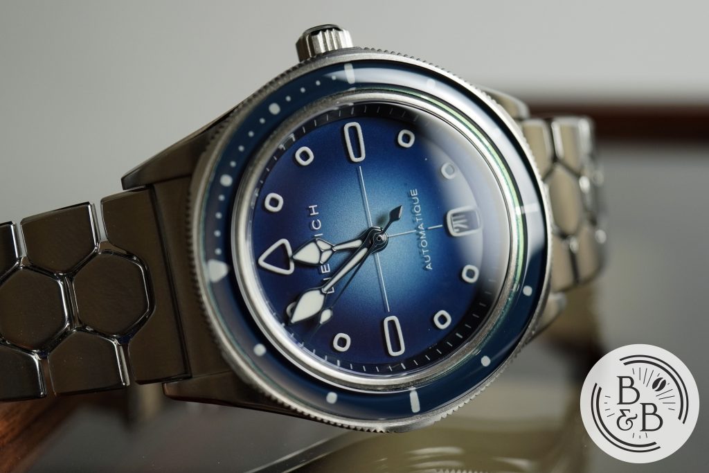
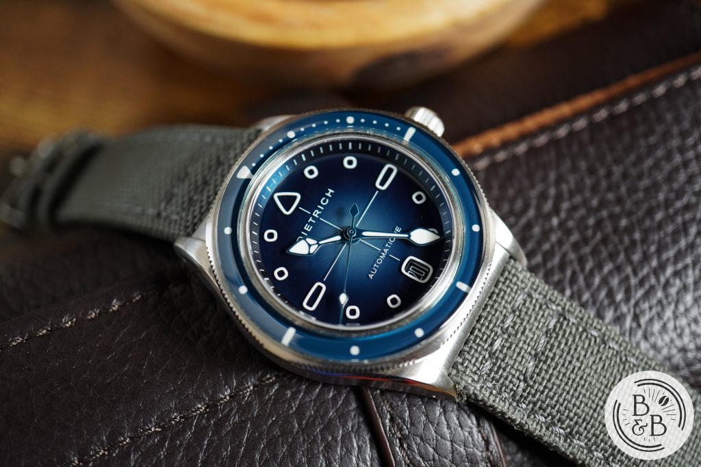
Dial
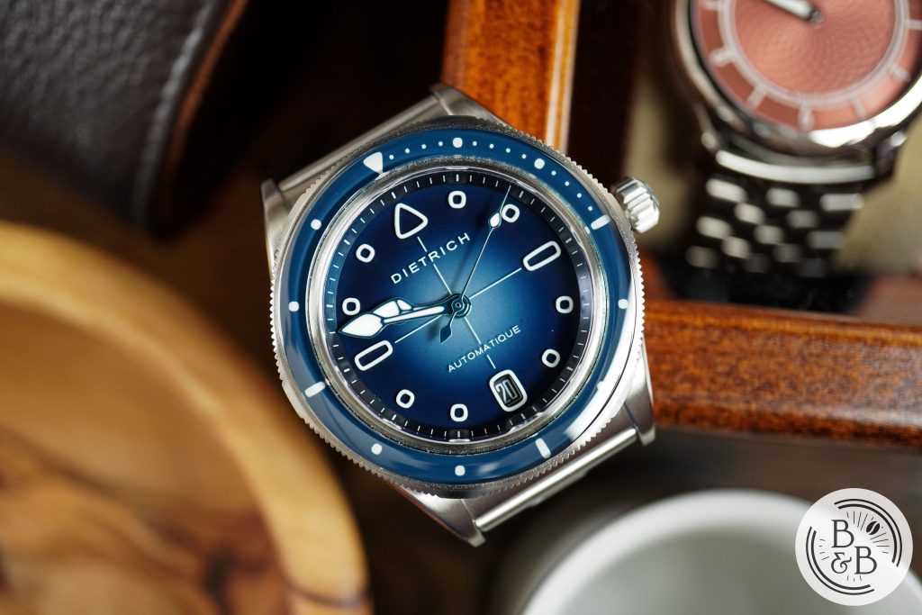
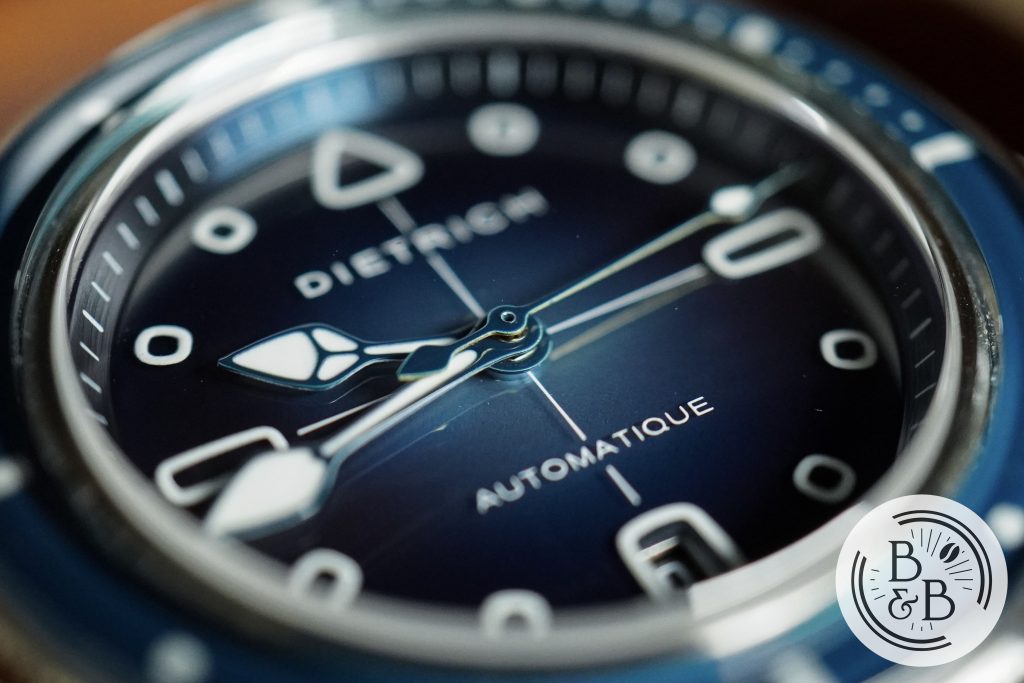
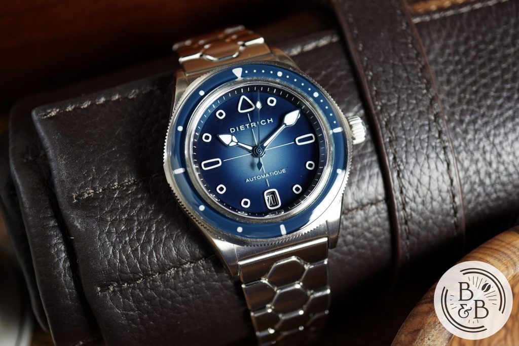
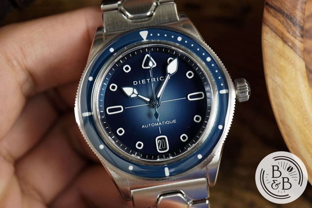
Sapphire dials have typically been used on more expensive watches, because they’re more difficult to work with, more expensive to manufacture and require slightly different tools to transform into watch dials. But I’m glad to see this material in watches that are not too expensive, and I love the sapphire dials on MING and Christopher Ward watches. This dial is equally interesting, and has a blue to black fumé gradient that looks fantastic. The finishing is good too, however I did notice a few blemishes and paint particles on the dial. Please note that this is a prototype.
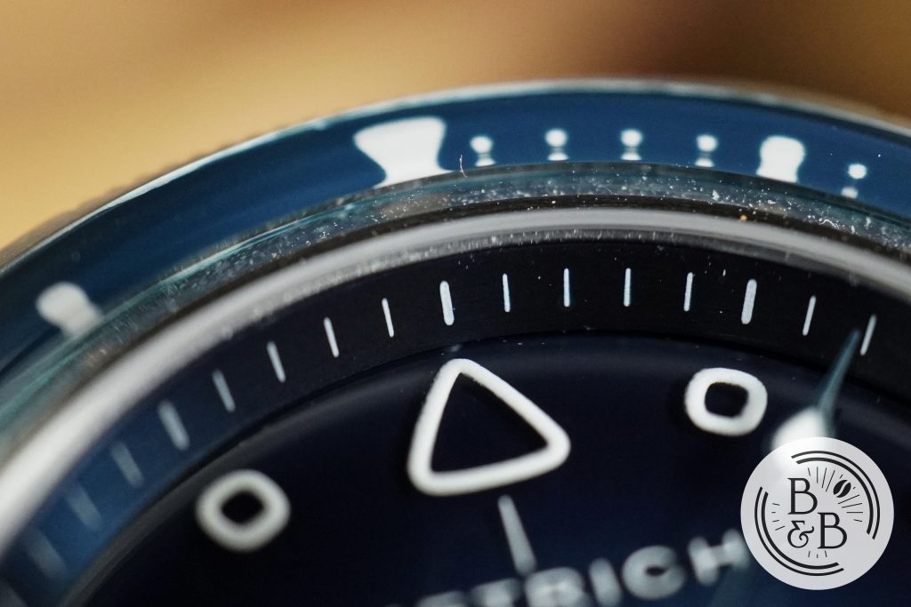
There is a sloped outer chapter ring that has a metallic blue texture with white markers printed on it. Each increment of five is highlighted with a slightly bolder tick, and the overall printing quality is good, but a few more stray particles around that I hope to not see on the production units.
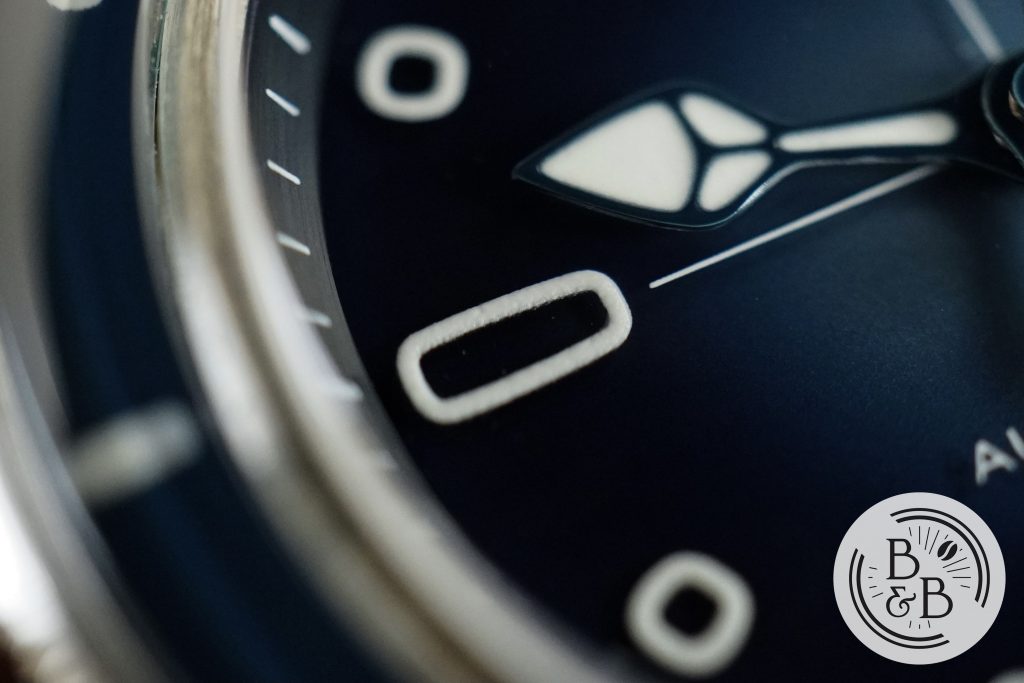
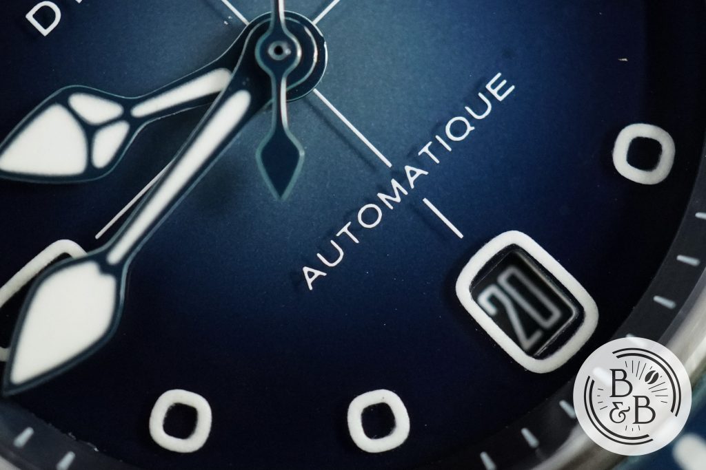
You then have a set of hour indices that are highly unusual, but also fitting with the Dietrich design theme. There aren’t any straight lines or circles here, and these indices are lumed and printed directly onto the sapphire dial. The fumé nearly fades to black beneath these markers, but if you look real close, you can see the shadow cast by these floating indices onto the layer below it. I love sapphire dials for this very reason, and I think it looks amazing.
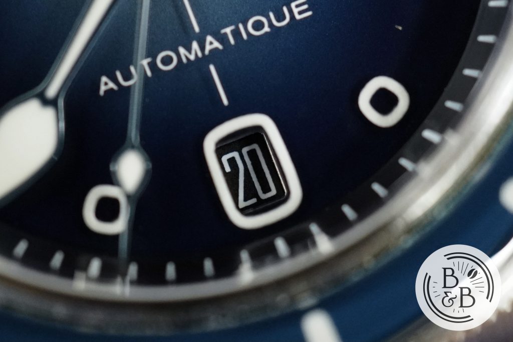
I’m a huge fan of 6 o’clock date windows and well integrated date windows, so this one earns a lot of brownie points in my book. However, I’d be lying if I said I didn’t struggle to read the date clearly, just because of how deep the date wheel is. And this also reveals the thickness of this dial construction, which is significantly thicker than more traditional alternatives, and even comparable sapphire dials from Christopher Ward.
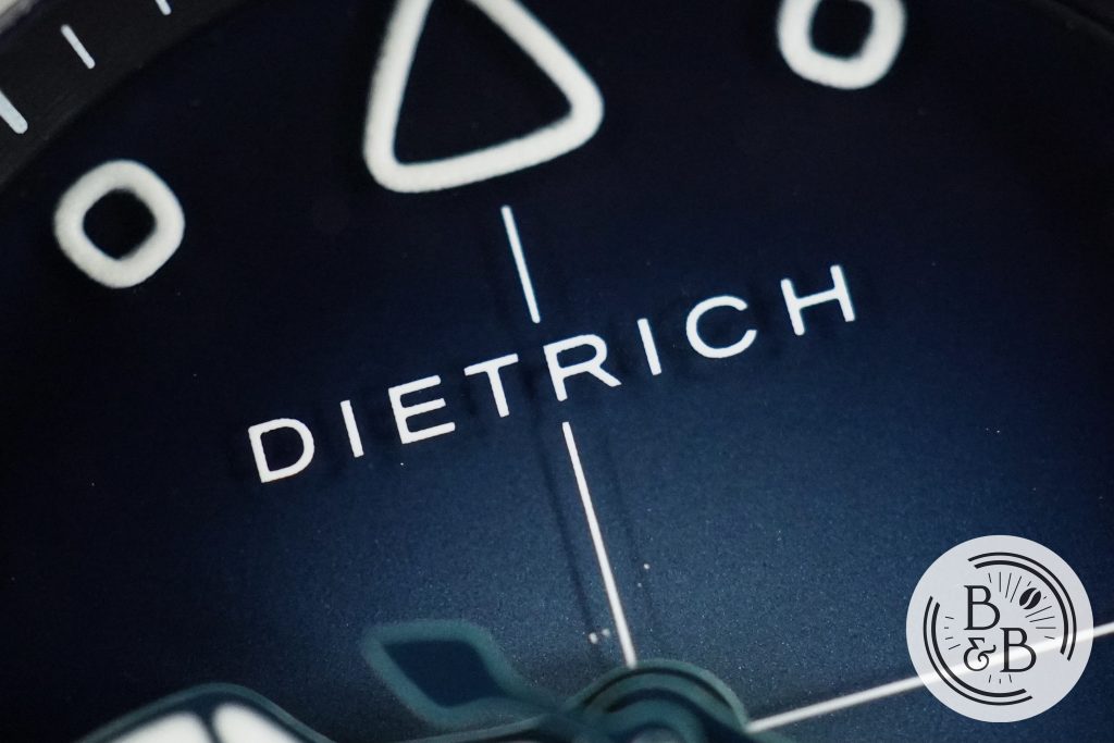
You then have the brand’s name printed below the 12 o’clock marker and ‘automatique‘ above the 6 o’clock marker. The printing quality is good, and you can fully appreciate the shadow cast by these elements here, since the fumé is light enough. But you’ll also see a few scattered paint particles here that slightly ruin this beautiful aquatic back drop.
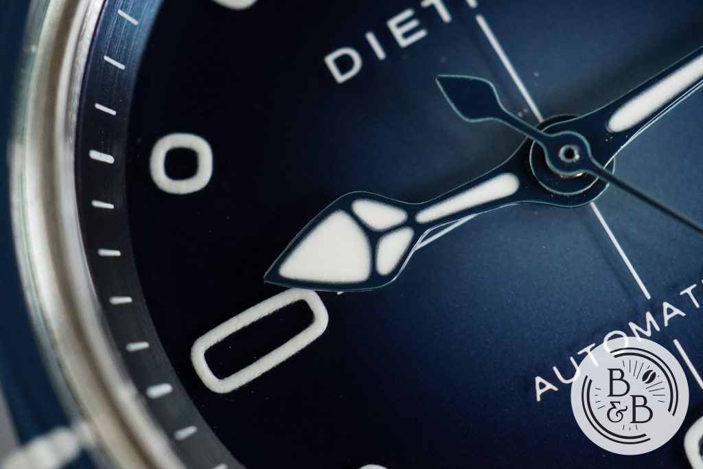
The handset is probably the only design element that was directly carried over from some of their previous watches. The hands are well proportioned, well lumed and well finished. I can’t tell what material they’re made of, but they look good and suit the overall design.
I love this dial design, and I think it looks quite unique and in line with the rest of their watches. Apart from the few scattered paint particles, the finishing looks very good too.
Lume
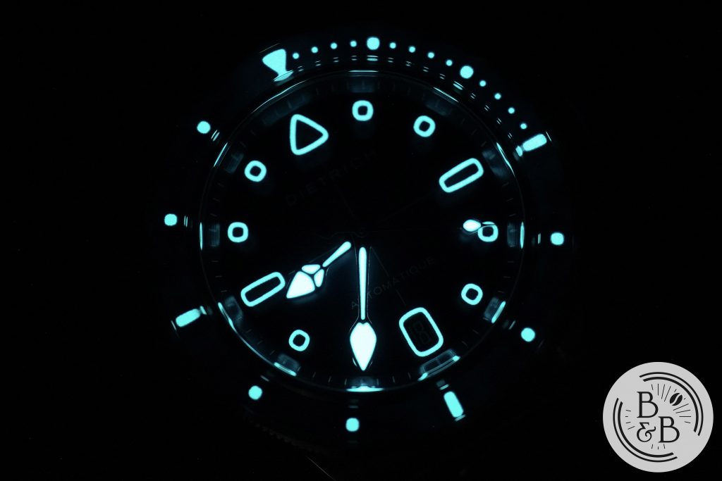
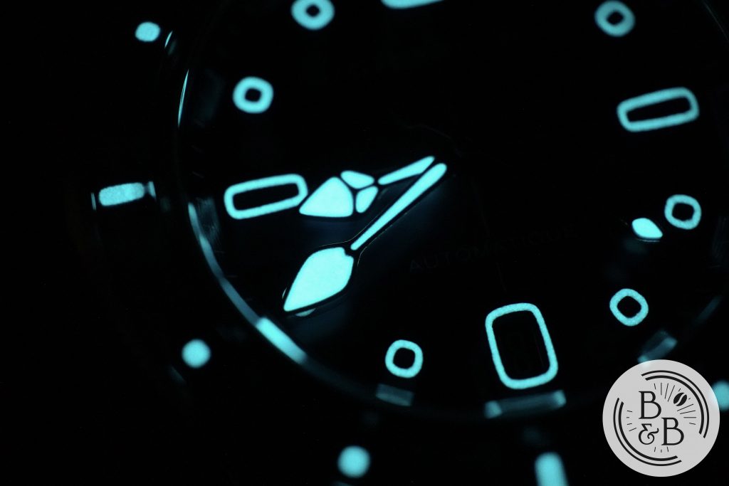
I think everybody watching so far knows exactly what’s coming, and yes the lume design on this watch looks fantastic. Dietrich‘s futuristic organic design lends itself great to lume.
All the dial elements are lumed, date window border included. They didn’t go lazy on any of these aspects, and managed to entirely lume the bezel insert too. So great job team Dietrich!
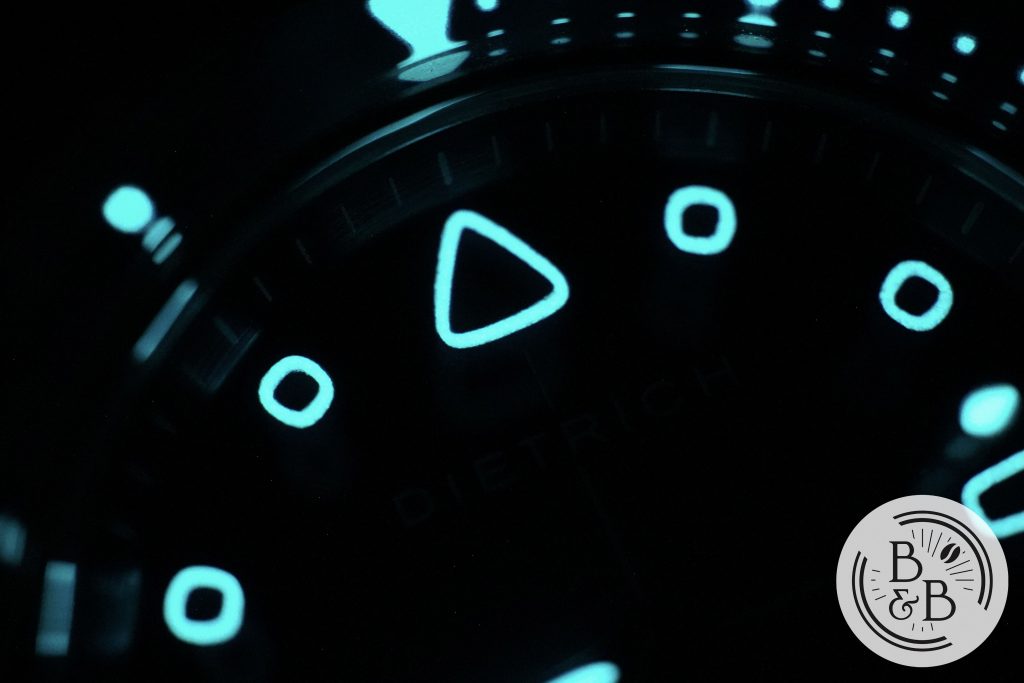
Given that all the dial elements are finely printed on the sapphire plates, the performance isn’t going to be as bright and glaring as a Seiko or Zelos diver, so don’t expect blindingly bright lume.
The hands appear to be well lumed though, and hold their charge a bit longer than the rest of the dial.
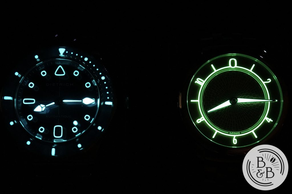
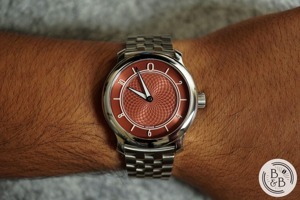
Within my collection, I think the best watch to compare it with is my MING 17.06 Copper, since they both use similar techniques on the dial. To me, the MING appears to outlast the Dietrich, but not by much.
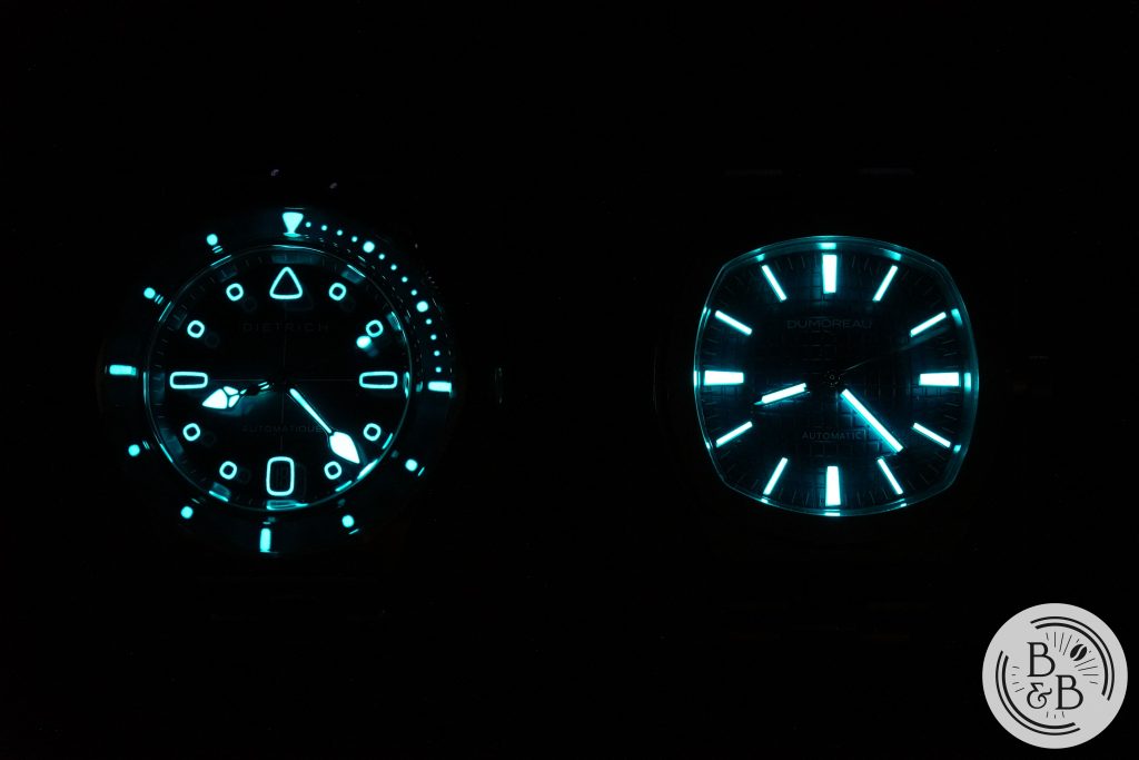
I also compared it with the Dumoreau DM01 since I had it in for review at the time, and here you start to see the slightly lower performing lume of the Dietrich SD1. But because of the beautiful design, I think the SD1 can be forgiven, even though this watch has a functional under pinning.
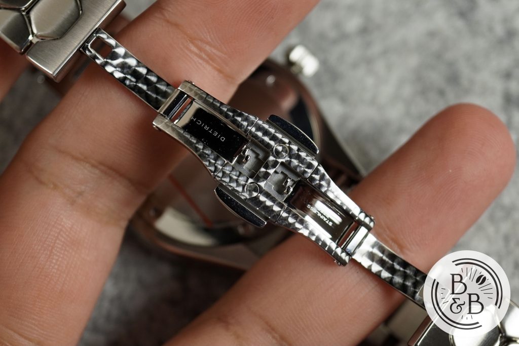
Bracelet
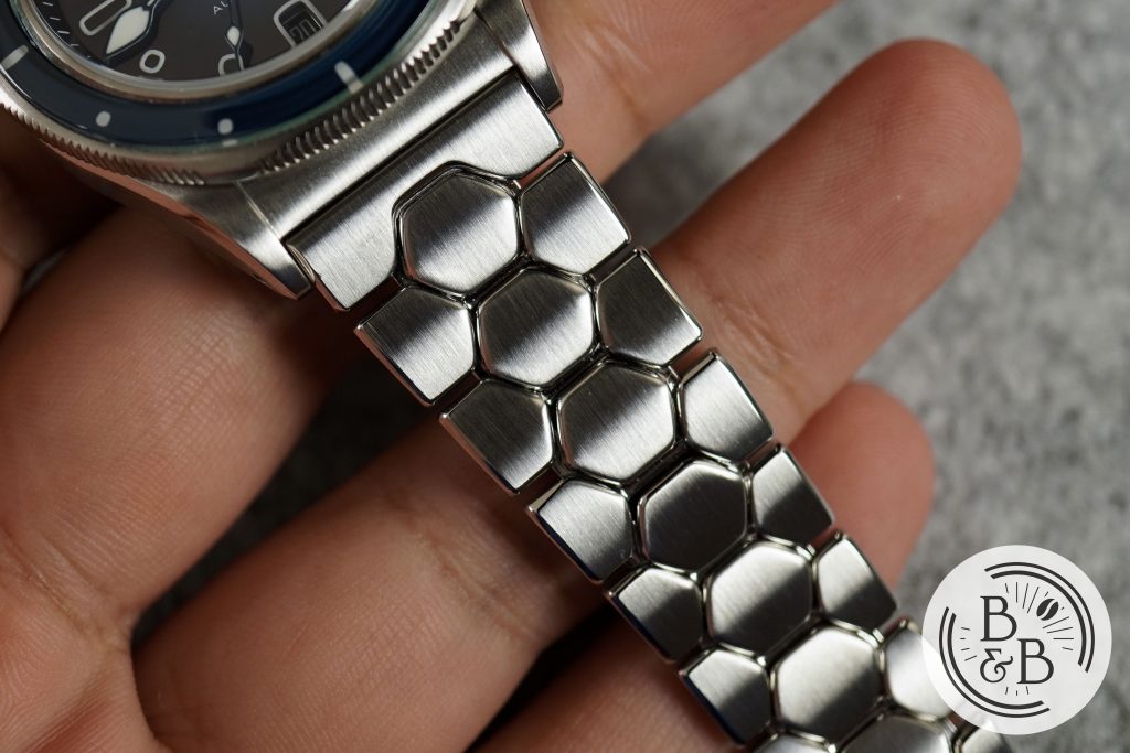
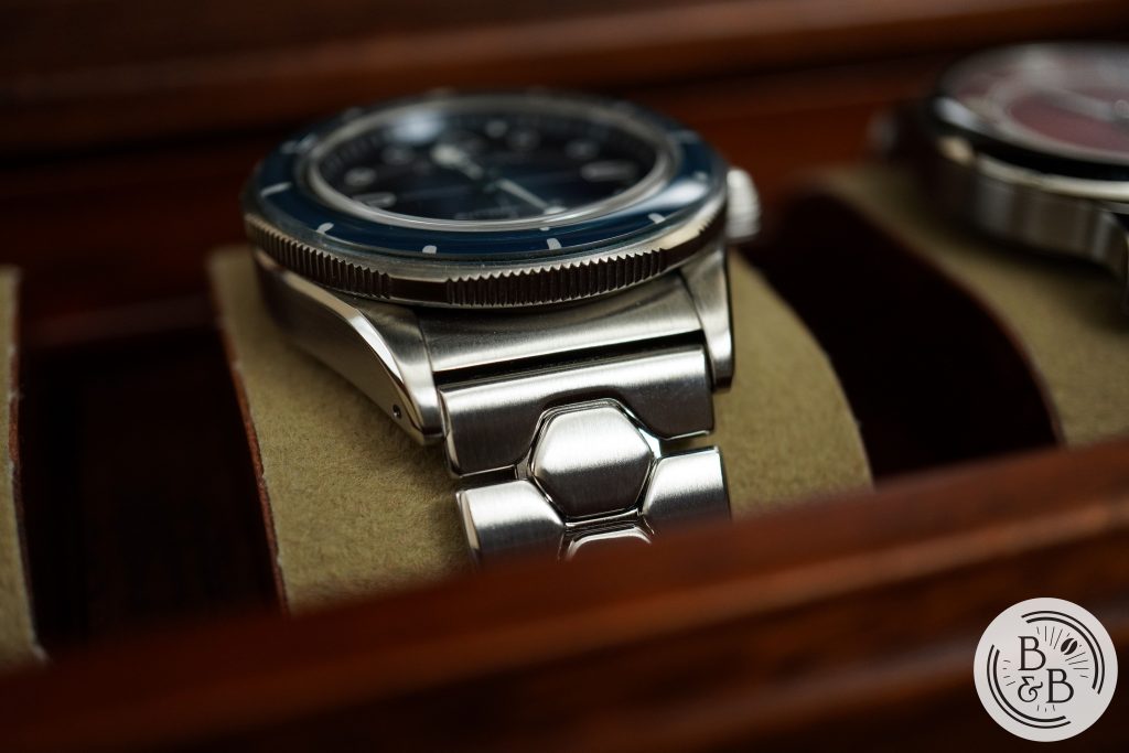
If I’m not mistaken, Dietrich introduced this bracelet style with the Time Companion series, and there we saw it in the form of an integrated bracelet design. I didn’t get a chance to actually see one in person, but I heard from a few owners that while the bracelet looked amazing, it lacked the kind of articulation required to support smaller wrists.
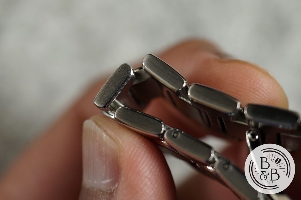
I’m happy to report that this bracelet seems to have fixed that issue, and there is a lot more articulation now and it should support a variety of wrist sizes and shapes.
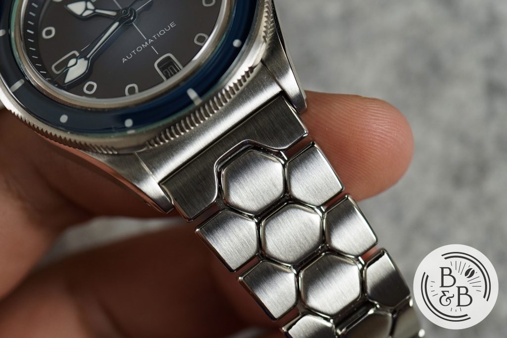
The bracelet has straight end links, which means you can also use it on other watches that might support this unique design style. And the straight and compact lug design also makes third party straps look fantastic and well integrated.
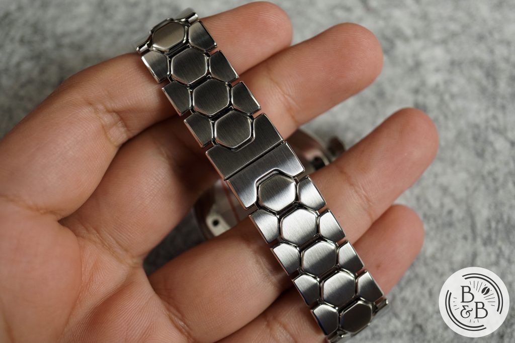
The links are light, and reasonably well finished with a brushed surfaces and polished inner accents. The bracelet ends with a butterfly style clasp, but Dietrich also provides two other sizes for half and three-fourth links. I wish the bracelet had a bit more heft to it, and was slightly thicker, because the slim and light bracelet tends to accentuate the head of the watch more than is necessary.
In terms of balance, I think this watch could’ve benefited from a slightly more functional and larger clasp. Like I said in my review of the MING 18.01 diver, I think dive watch designs should have more functional bracelets, and one that is more easily adjusted for size. But I think function followed form here, and my same criticism of the MING applies here too, except with a bit more wiggle room for Dietrich since they are a ways apart in pricing.
Movement
This watch uses a Sellita SW200-1 movement. There isn’t much to say about this movement except that it is an appropriate choice in this price category, and that it is easily serviced and keeps good time.
On my time-grapher, I observed +6 spd in the dial up position, and +8 spd in the crown up position. All good numbers, so nothing to worry about.
On The Wrist
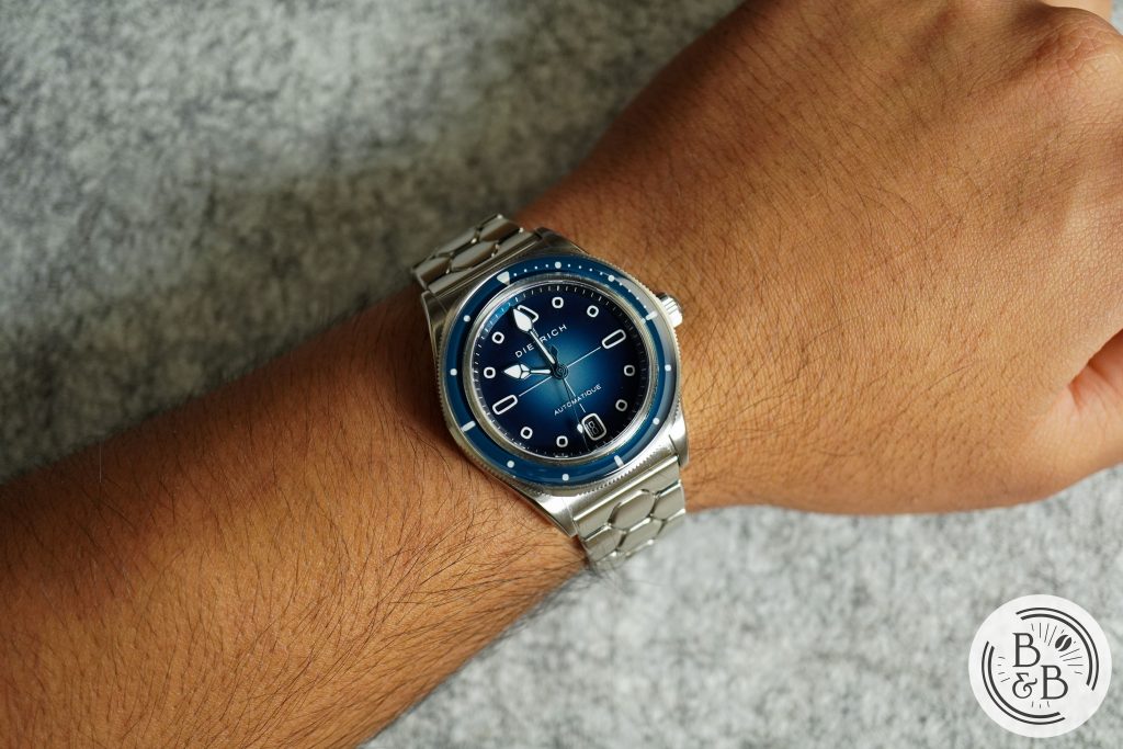
This watch wears great on my 6.5″ wrist. My biggest issue with most of Dietrich‘s collection so far has been size. I absolutely loved what he did with the Organic Time collection, but those watches were far too large for my modest wrist. He reigned in the dimensions with the Time Companion collection, but the rigid bracelet was still not small wrist friendly enough.
If you were expecting a substantial wrist presence, you will be caught off guard by the 38.15 mm diameter and 45.5 mm lug-to-lug width. They wear smaller than you’d expect, but the 12.10 mm height on a slab like design draws a bit of attention to it.
I find these dimensions to be comfortable, and enjoyable for a dive watch, but I’m not sure I’d recommend it to anyone who enjoys a larger watch. It tends to wear very similar to my MING 17.06, which in comparison appears larger than it wears, and the SD1 does feel a bit top heavy at times.
Concluding Thoughts
To wrap this up – if you like this design, go buy this watch. The blue ones are already sold out, and there aren’t too many of the black dials left. I’ve been told that a second batch will only show up in late 2022, if at all. In this market, you don’t get too many opportunities to buy watches that are as unique as this, for a price like this, and in a package like this. This watch is relatable, but is also a new experience. And I think that’s what they were going for. In a world where everybody seems to want the exact same watches, and where the pursuit of individuality and self expression has been compromised by the temptations of profit and the desire to telegraph wealth and status, the Dietrich SD1 is a breath of fresh air.
And if you don’t like this design, that is entirely understandable too. This watch is still pushing the boundary, and may be too “out there” for those with more classical tastes. And luckily for you, there are some excellent watches in this price range already.
I’ve also been informed that there have been delays with the delivery estimates for these watches, and orders are likely to go out in December instead of October as previously stated. I’ll just say that while these delays can be frustrating, it is almost always a good idea to give brands some breathing room to deliver. Because a rushed assembly and delivery does not work in favor of anybody, and these watches are worth the wait.
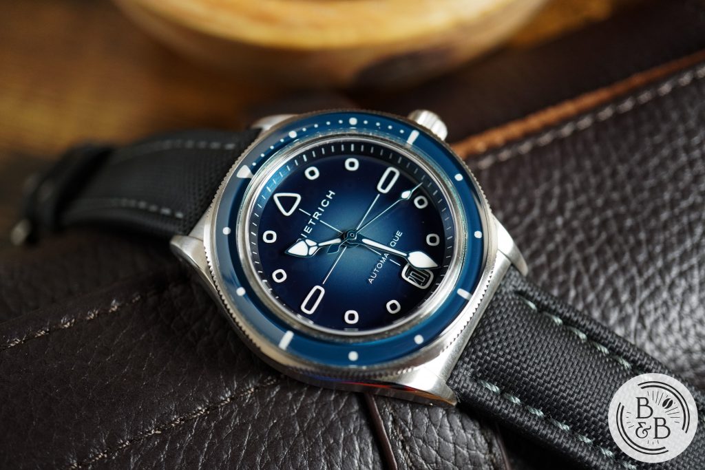
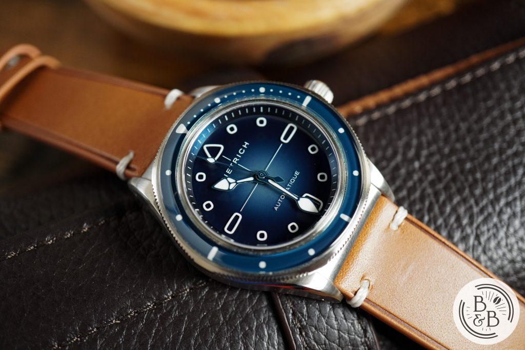
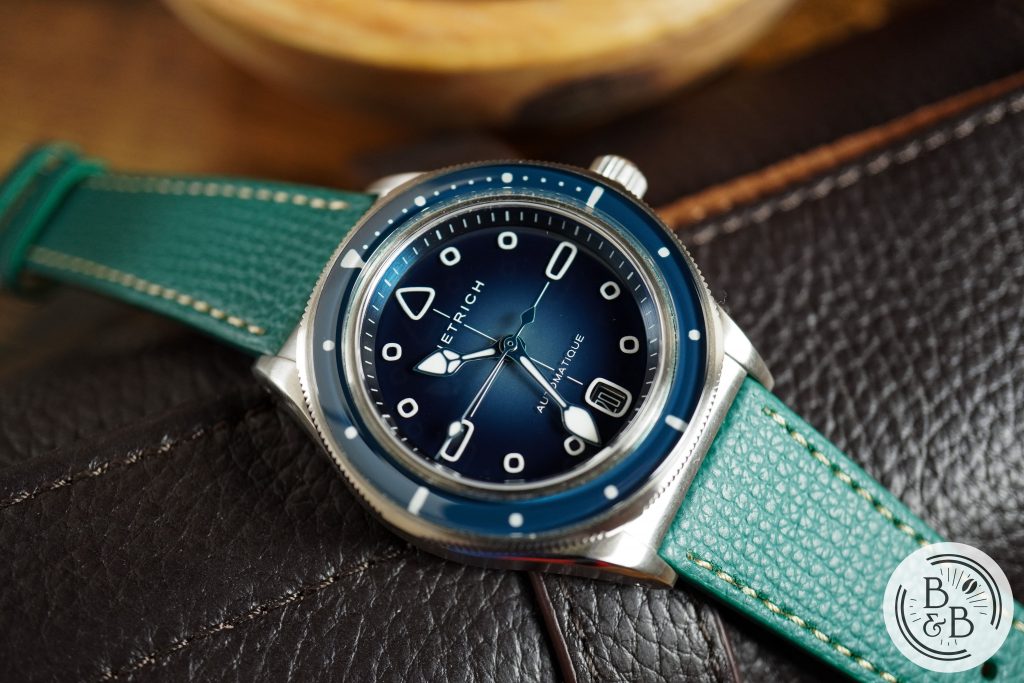
Strap Change
Thanks for reading!