Disclaimer: This watch was sent to me to review, but I was not incentivized in any way to make this review. This is in no way sponsored by Mitch Mason or any other entity. All opinions here are my own. Since this watch is a prototype and was worn/used by other reviewers, please make note that the experience might differ from that of a brand production piece.
Mitch Mason
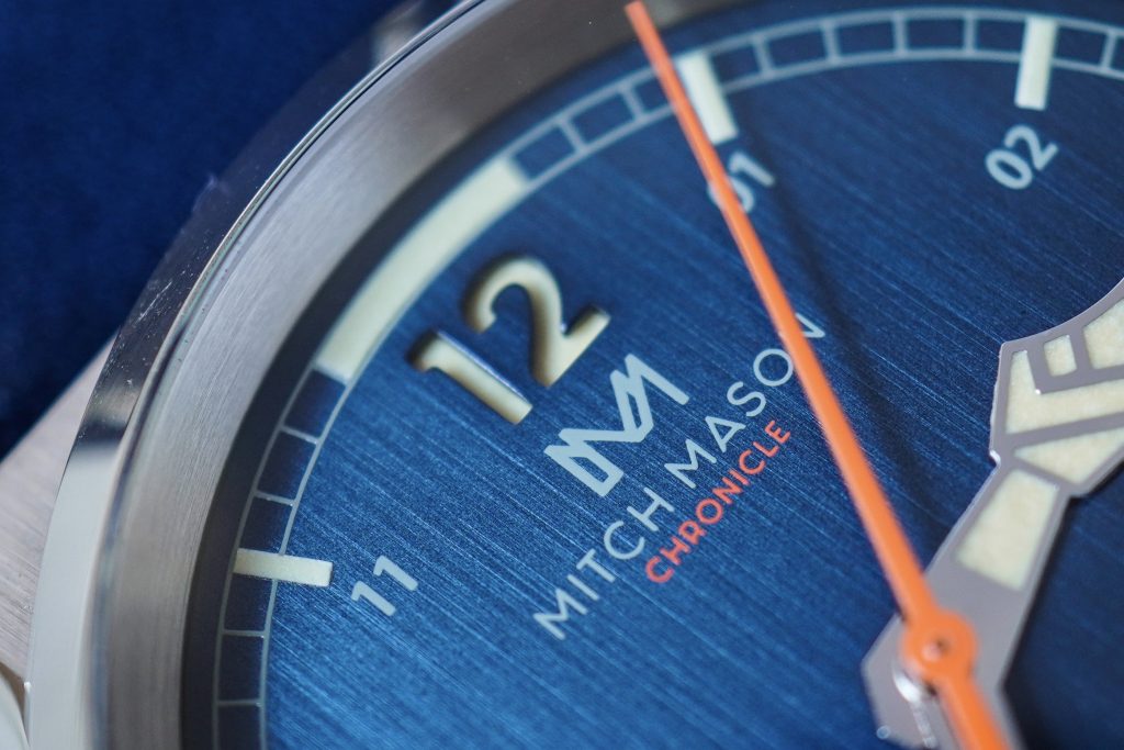
Mitch Mason is a new micro-brand based in Singapore and was founded by Benedict Ong. I will be looking at the Chronicle, which is their first offering, and is an interesting execution of a WWII military field watch. To be completely honest, the name ‘Mitch Mason‘ for a brand name doesn’t sit well with me because I can’t think of any good reason to have the name ‘Mitch‘ on a watch dial. So, to the next brand that thinks ‘Chad Timepieces‘ or ‘Brad Watch Co.‘ sounds like a good brand name, please reconsider. However, according to Benedict, this brand name was carefully chosen, with ‘Mitch’ meaning “Someone who plays truant” and ‘Mason’ meaning “One who builds“. In a gist, the name was selected to inspire the idea of going against the norm to build great things. If this watch was any less beautifully designed, I might’ve considered dwelling over the name for longer, but the rest of this watch makes this extremely easy to look past.
Case

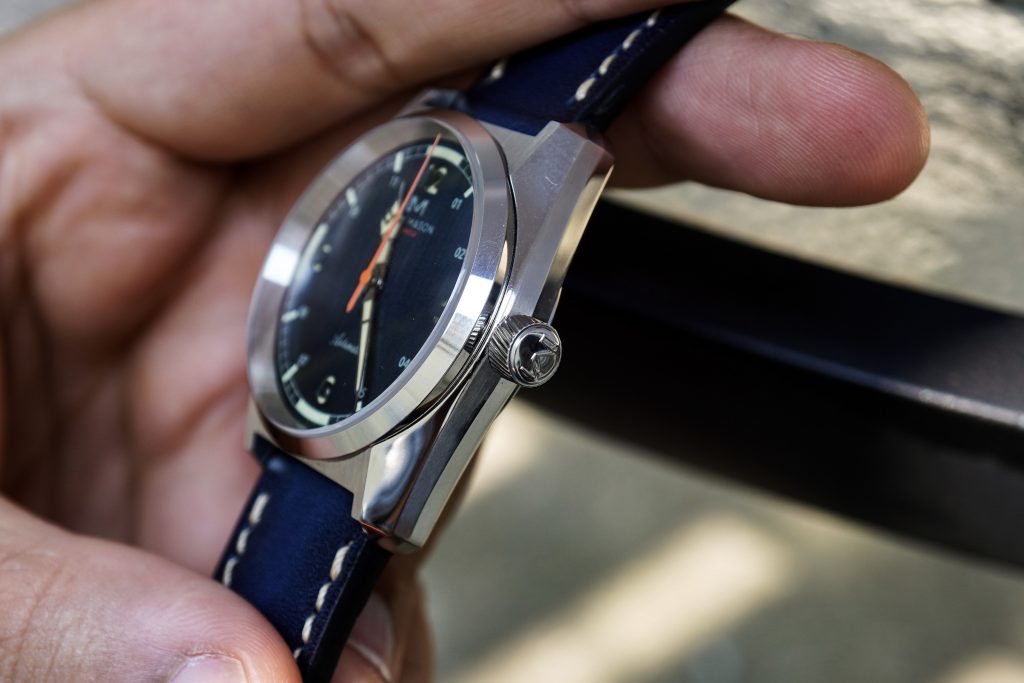
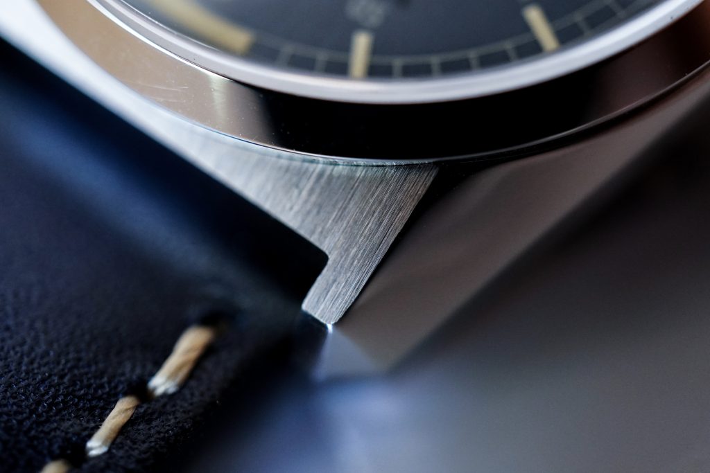
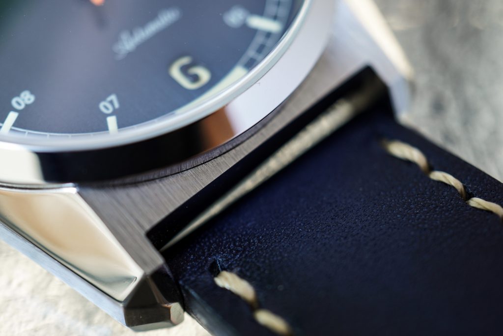
The case is interesting with multiple polished surfaces that start at the lugs and work their way around the case. The case extends outward with vertically brushed surfaces, in a similar manner to vintage Grand Seiko watches. I really like the flat case and strap joint, together with the compact lugs. The case is 36.5mm in diameter and 43.5mm from lug-to-lug. I’m glad they used a 20mm lug width as it makes the overall case silhouette more rectangular. The watch is roughly 13.5mm, but if you ignore the domed crystal and the slightly curved case back, it is closer to 11mm. It doesn’t feel like a tall watch at all, even though you might initially be worried about the overall 13.5mm height.
Benedict informed me that the polishing on this prototype was done by hand for R&D and resulted in some uneven surfaces, and that the final would be significantly better. I’ve spent many hours looking at the case and even this “imperfect” polishing is acceptable at the $380 Kickstarter price. If they can top this with their final production pieces, I think you will be getting an excellently designed and finished case.
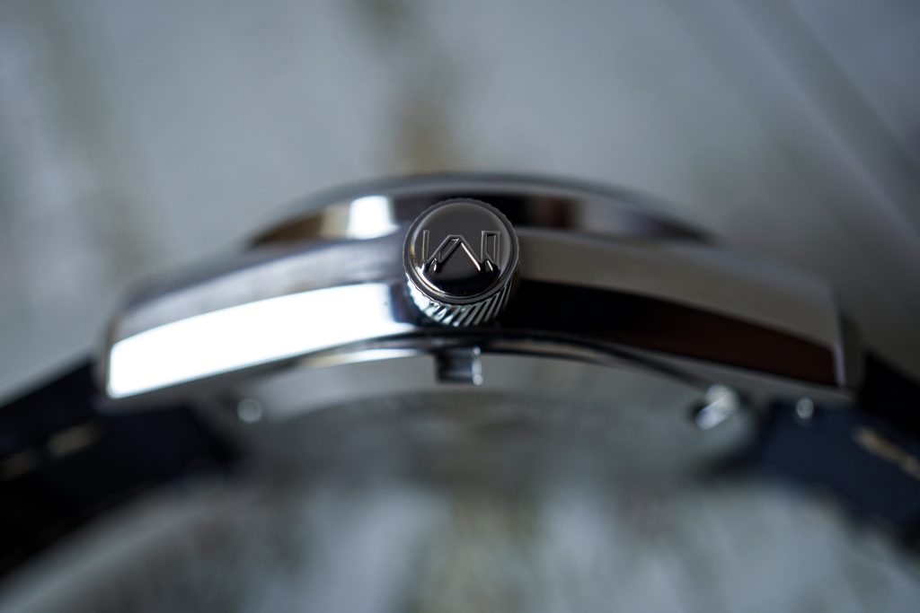
The signed crown is one of the few things I’m not too happy about. The crown is 6mm in diameter and has knurling that doesn’t offer much in terms of grip. But once again, this crown is being redesigned for the final production watches and is said to have fewer but deeper ridges that will make it easier to operate. However, I would’ve also liked to see an “oversized” crown on this watch – maybe something between 7-7.5mm. I think it would compliment the design well, and also make it much more ergonomic.
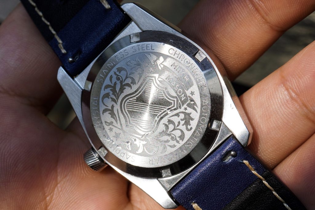
Both the crown and the case-back screw down into the case, and allow the watch to be rated for up-to 200m of water resistance. The case-back is solid with an engraving of a Coat of Arms with the brand’s name on it. I’m a firm believer in having solid case-backs with interesting engravings, over an exhibition case-back that shows off a boring unfinished movement, so this case-back definitely earns points in my book.
Dial
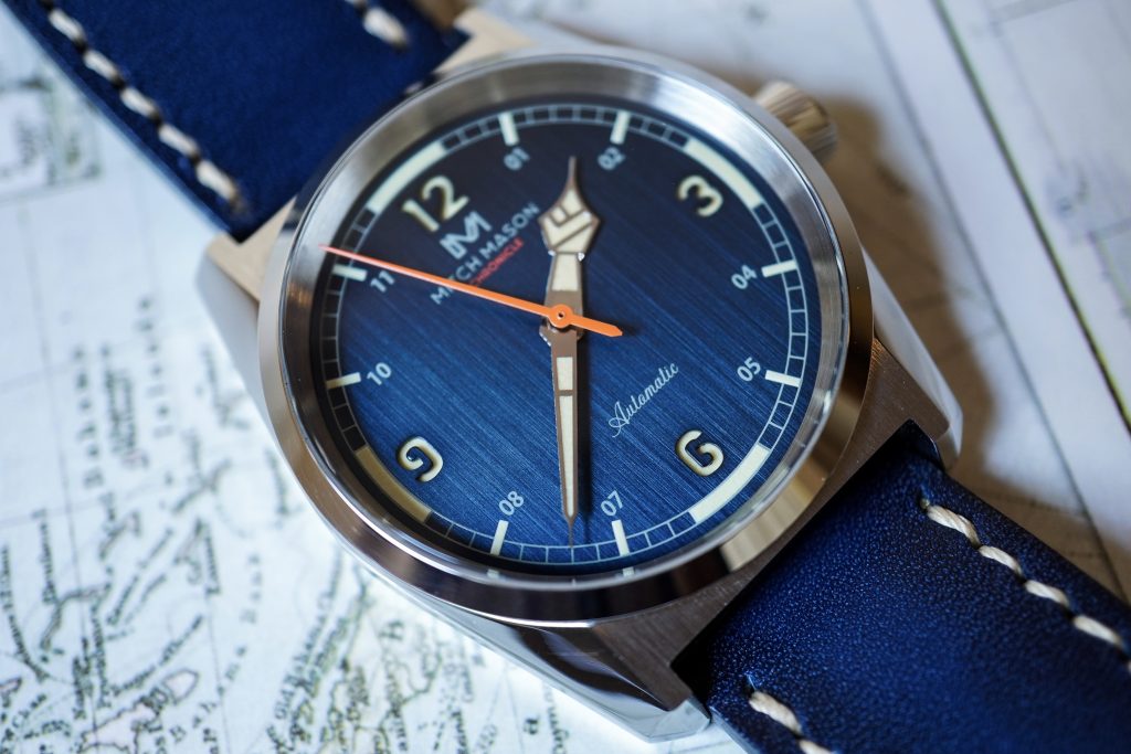
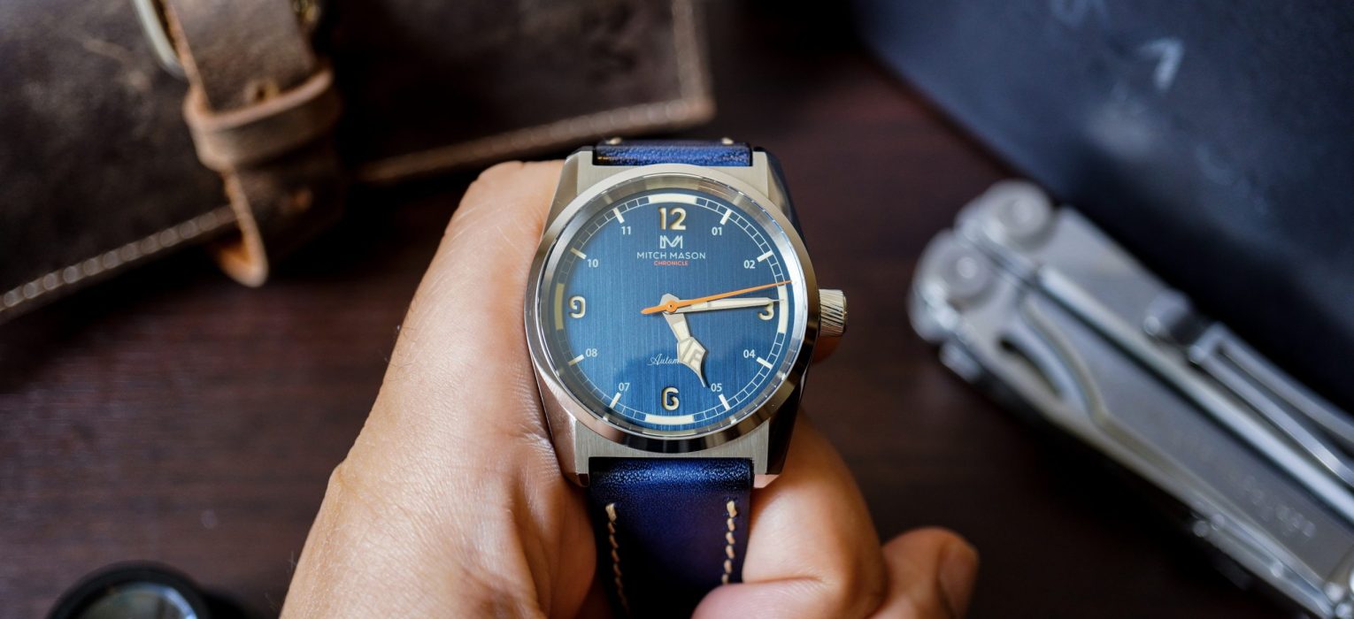
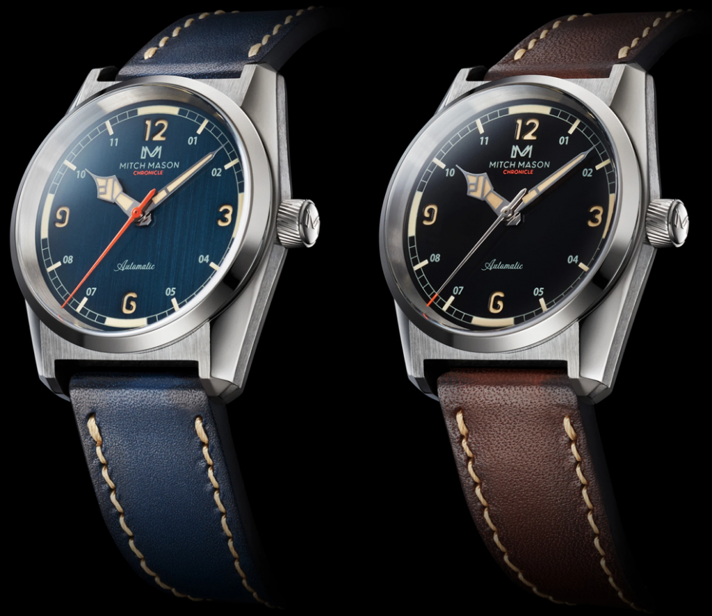
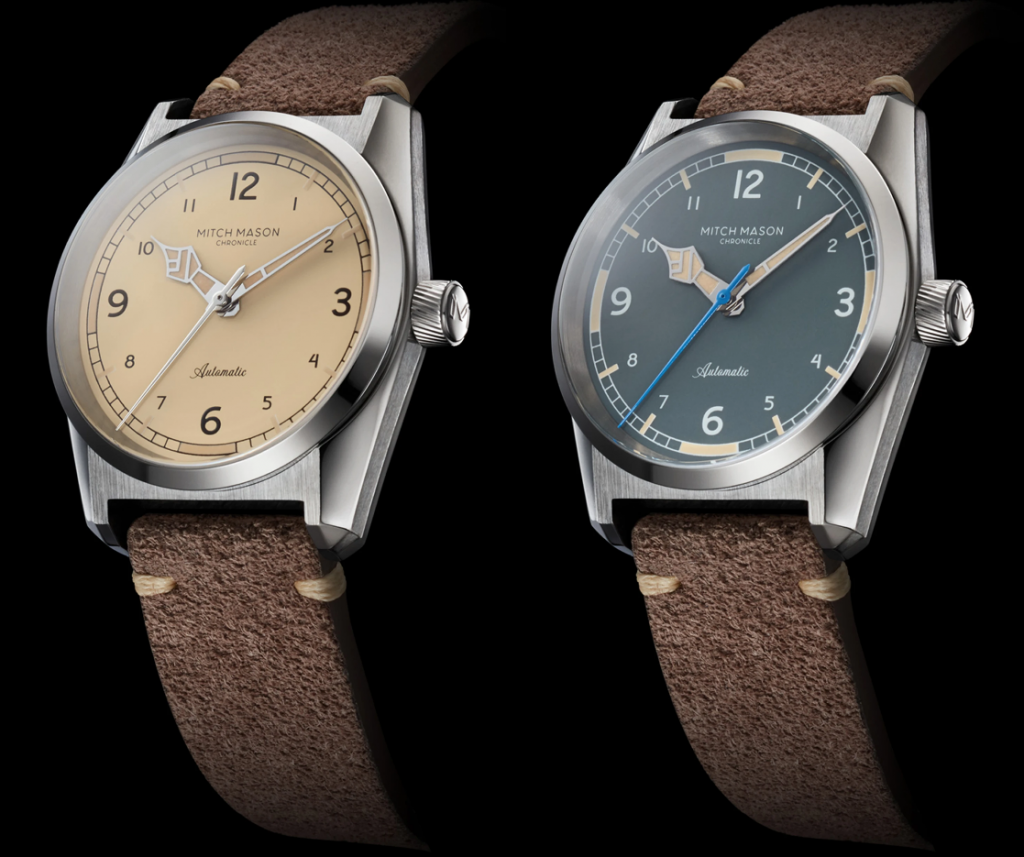
The watch that I have here is the Steel Blue variant and in my opinion the best of the lot. The Steel Blue and Jet Black appear to be more modern in design, with sandwiched dials and the brand’s logo at 12 o’clock. The Desert Sand and Field Gray are have more of a vintage aesthetic. I think the Desert Sand looks fantastic and would definitely be my second choice.
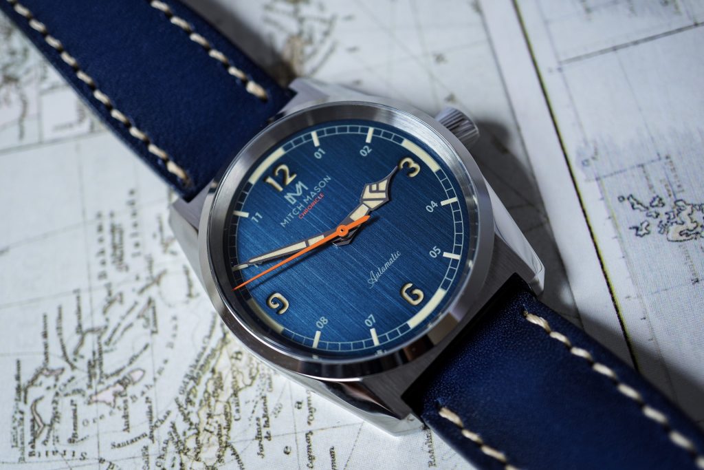
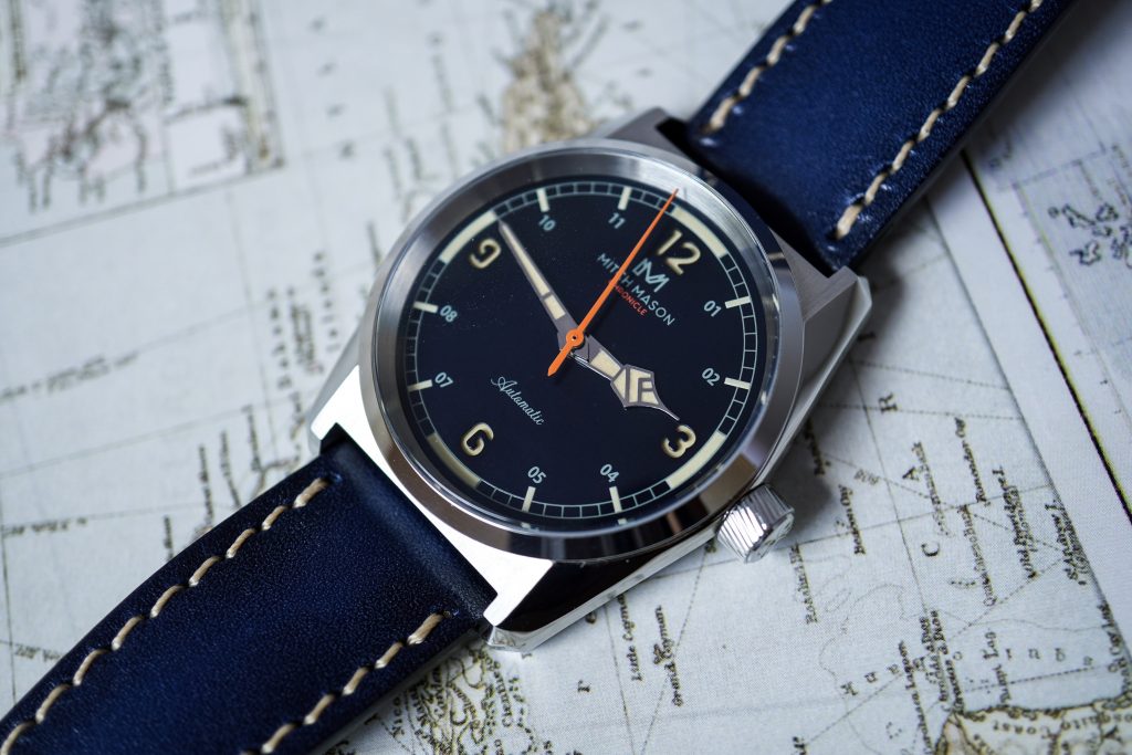
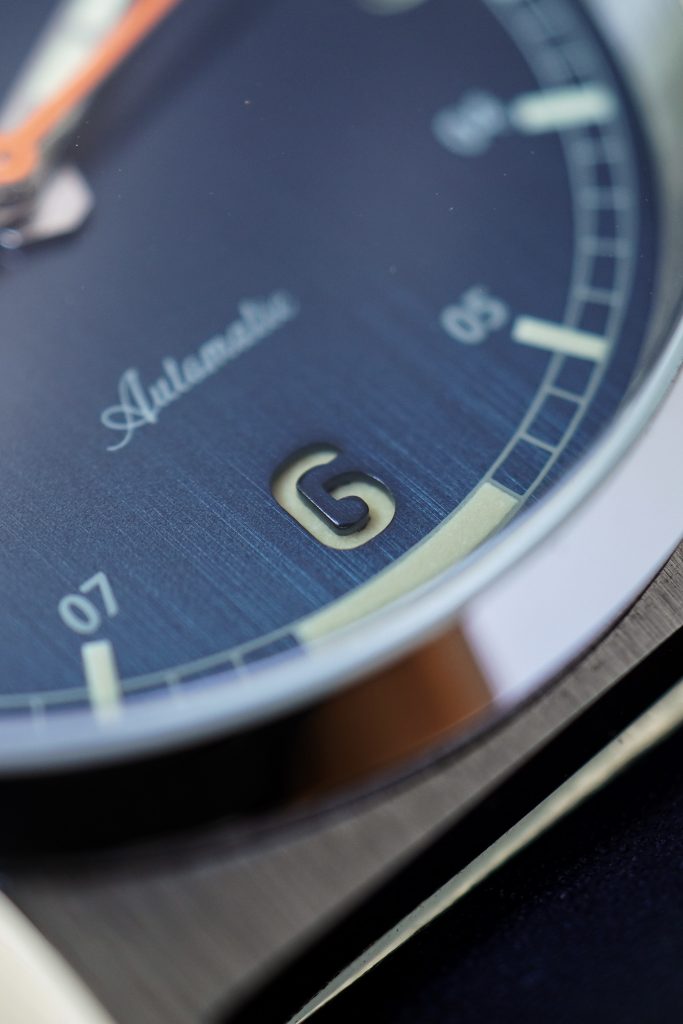
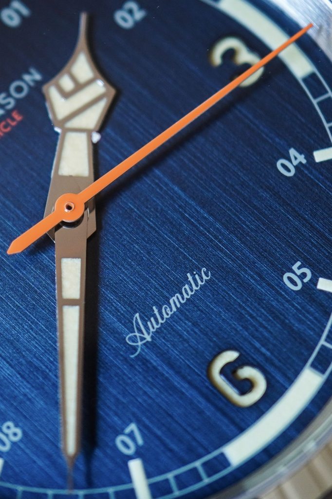
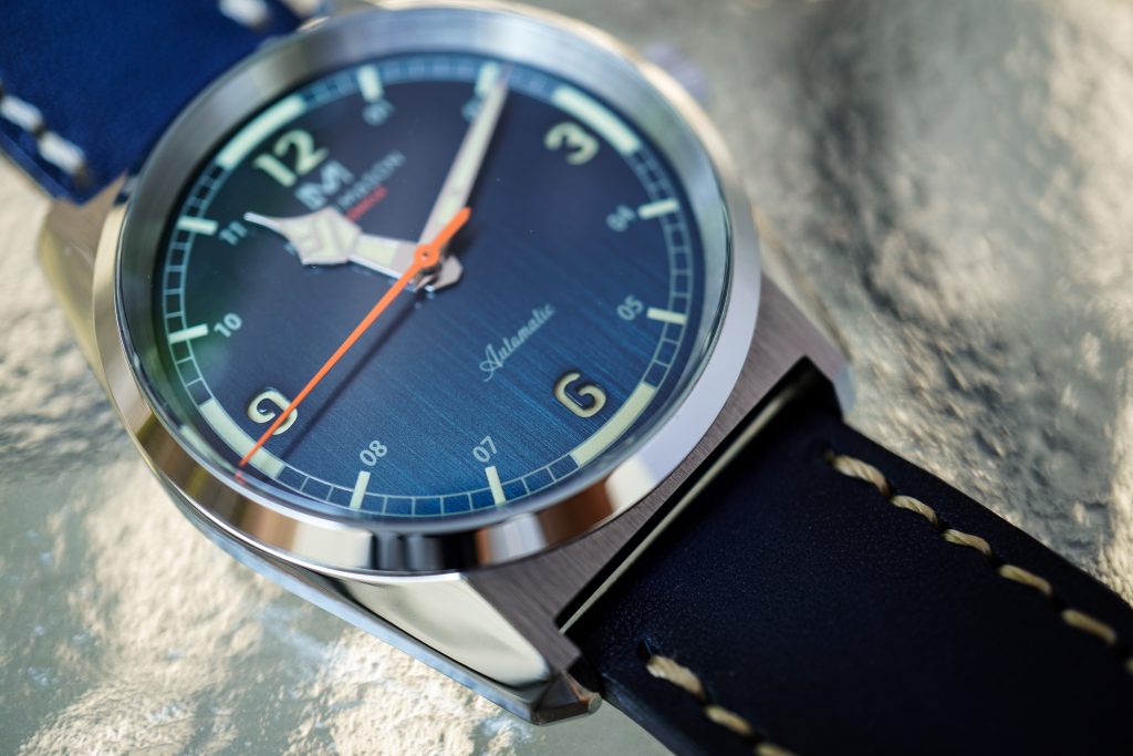
The dial is textured with a vertical brush pattern that is wonderfully matched by the vertically brushed case surfaces. The blue dial on this watch reminds me of my Blue Gilt Baltic Aquascaphe – it drastically changes appearance based on the type of lighting. If you look at all my photographs of the Chronicle here, you’ll notice the dial take on multiple identities – from bright blue under natural light to almost black when under a shadow. I personally love this and think it adds tons of character to the watch and also helps it stay versatile. I also love the vertical pattern and almost ‘natural’ (flame maple-esque) look to the grain on the dial.
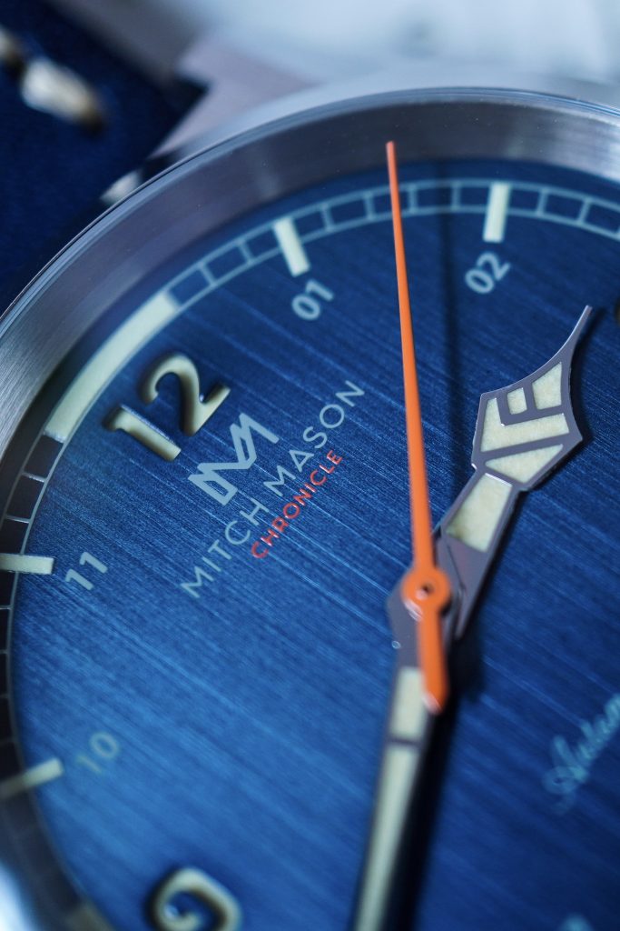
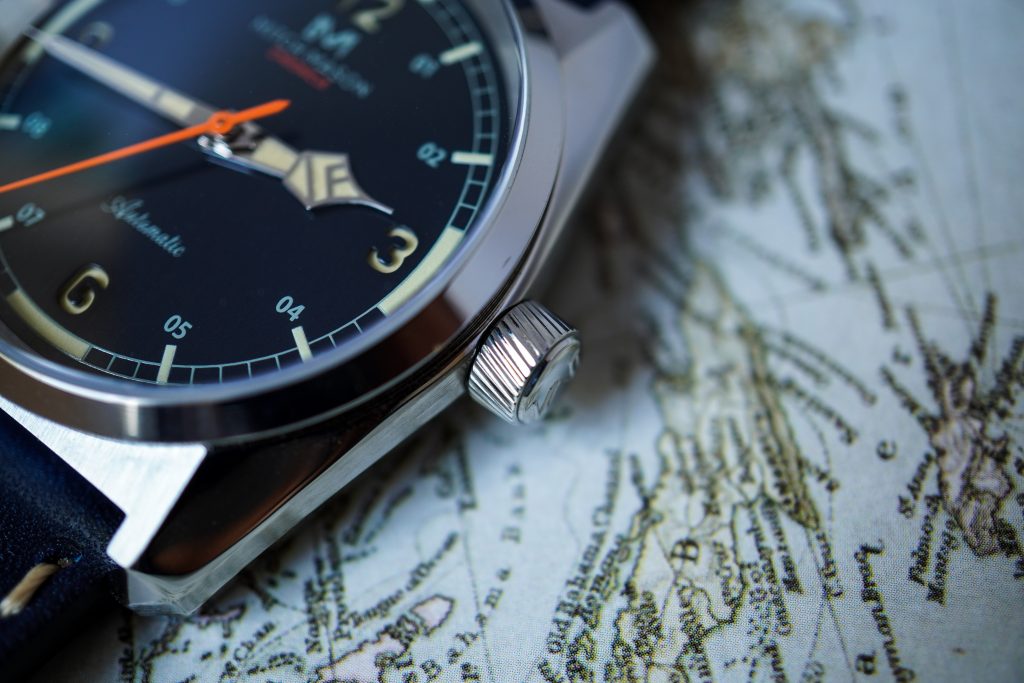
Similar to the Baltic Aquascaphe, the Steel Blue and Jet Black variants of the Chronicle have sandwiched dials. The hour numerals for 3,6,9 and 12 are recessed and filled with lume. The finishing on this is good, but I noticed a few surface irregularities on the interior surfaces of the ‘3‘ and ‘6‘ numerals. Benedict mentioned that this will be cleaner on the final production pieces. The rest of the dial is very well finished and well beyond what you would typically expect from a watch that costs $380.
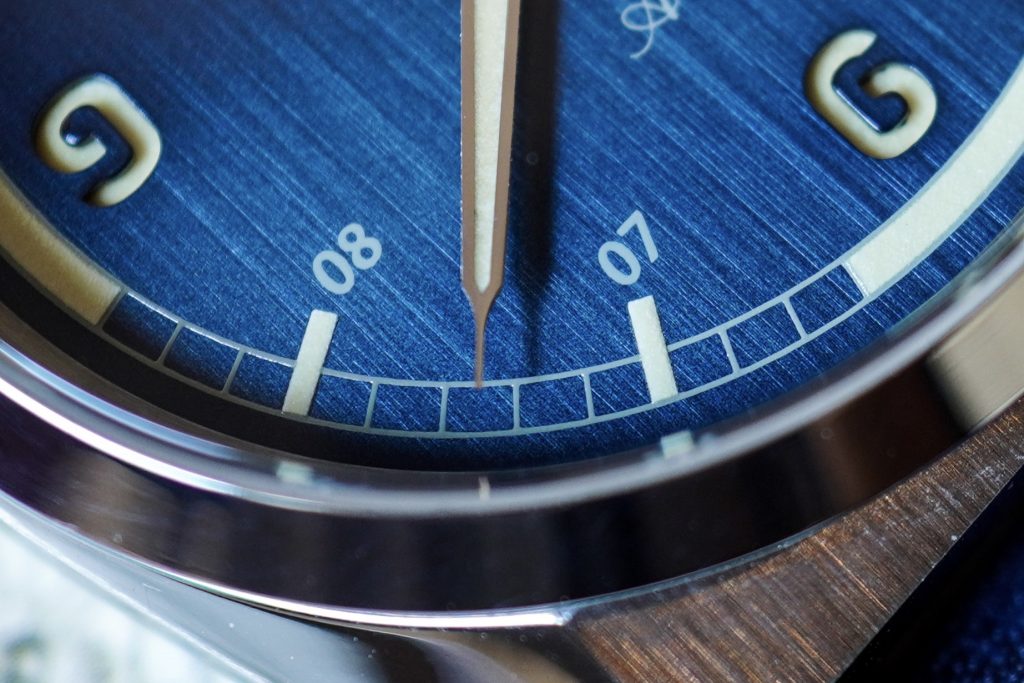
The rest of the hour indices are printed onto the dial in a different font and are written in two-digit form, i.e 01 instead of 1. I love this as it maintains the overall symmetry of the dial. There is an outer minute/seconds track that is also printed onto the dial in a railroad track pattern. The hour markers are highlighted by painted lume indices, with wide indices for the four primary axes. The finishing on this is excellent and even after much scrutiny I couldn’t find any irregularities or dust.
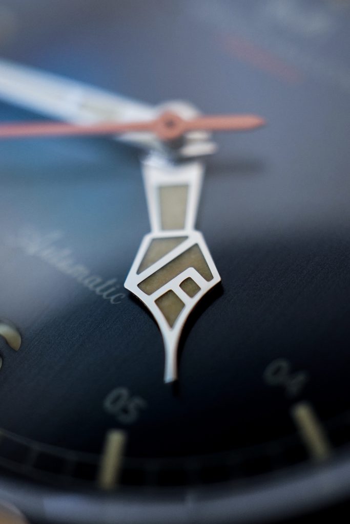
Mitch Mason have chosen to design their own hand set for this watch, with the hour hand being the most interesting of the three. Another YouTube reviewer mentioned that the hour hand looks like a fountain pen nib and I can’t un-see that now. I’ve also noticed that folks either love or hate this hour hand, but I think it’s different and suits the watch well. It has definitely grown on me since I first saw it online.
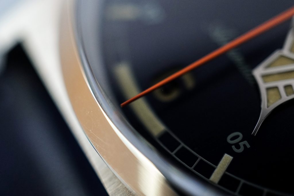
The minute and seconds hands are quite simple and allow the hour hand to take center stage. The seconds hand is painted orange and extends outward till the edge of the dial. I’ve been told that the production version will have a shorter seconds hand that will not extend beyond the seconds / minute track. I agree with their decision and think that it will look better once shorter. If I was forced to nit-pick, I’d say that the shade of orange used is a bit bright and a darker orange might’ve suited it better. But overall the hands are finished well without any irregularities or dust on the surfaces. The paint on the seconds hand is uniform as well and I couldn’t find anything to complain about. This is quite impressive if you consider the fact that this watch is set to cost $380.
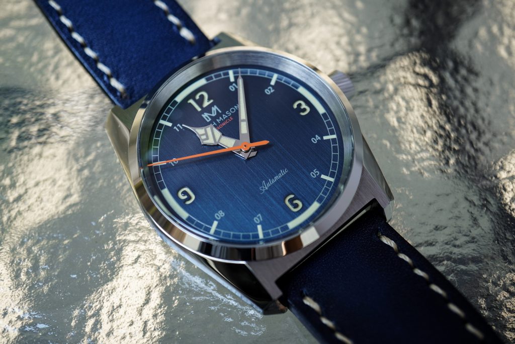
Overall, the dial and case alone make this an easy watch to justify buying. The attention to detail and quality control is fantastic. And if the production pieces are better than this prototype (as promised), I believe this will be a very successful Kickstarter campaign.
Lume
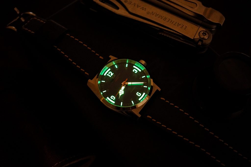
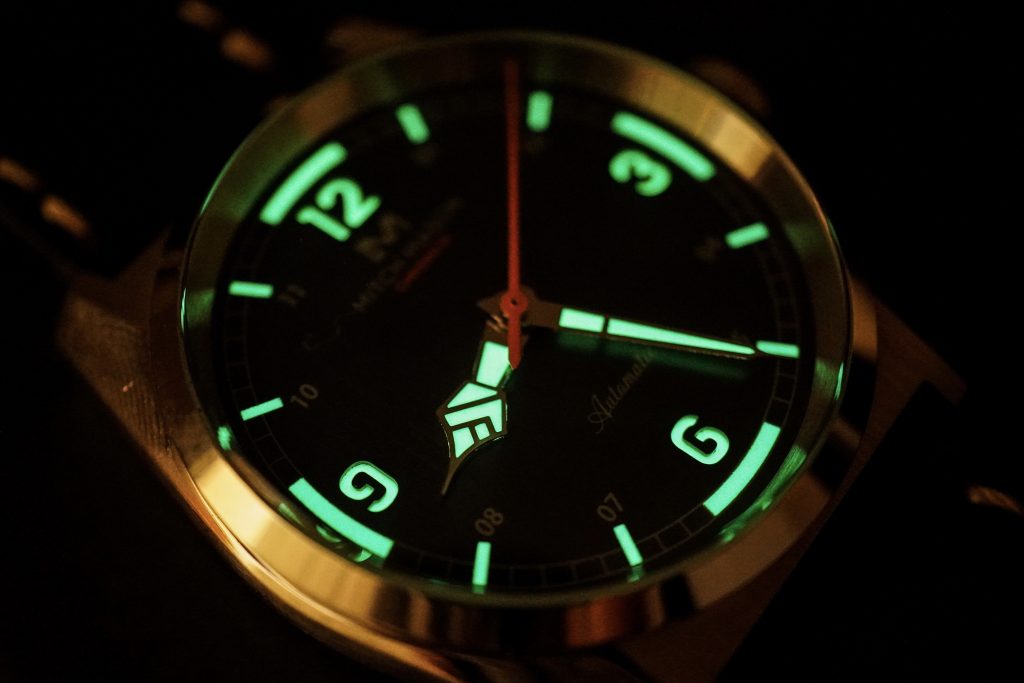
As mentioned above, the hour indices, hour and minute hands and recessed numerals are all lumed with SuperLuminova. The lumed components are bright and more than acceptable. If this is to be an everyday beater watch, good lume is a hard requirement and this watch doesn’t disappoint.
Movement
This prototype has a Sellita SW200 movement, but the production watches will house a Miyota 9039 instead. The dimensions of the watch will not be changed but since this watch doesn’t have the final movement of choice, I didn’t bother logging it’s accuracy. I like the 9039 and I think it’s more than appropriate for the $380 (Kickstarter) and even the $500 (Retail) price-tags.
On The Wrist
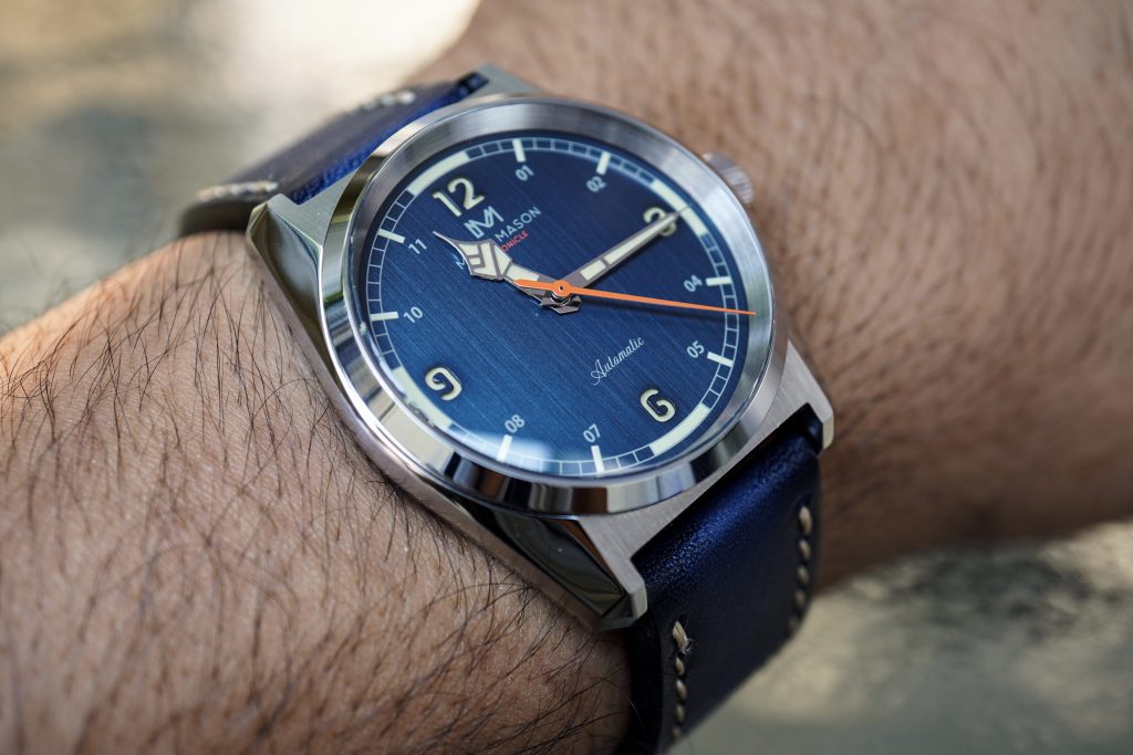
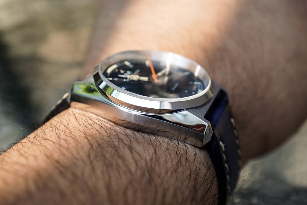
On my 6.25″ wrist, the 43.5mm lug-to-lug width translates to a very comfortable wrist experience. The 13.5mm height of the watch goes unnoticed because of the 1.5mm crystal and roughly 1mm of case-back cover. It sits low on the wrist is perfectly capable of being an everyday watch.
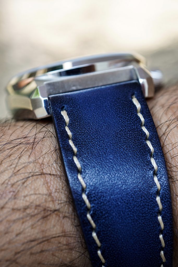
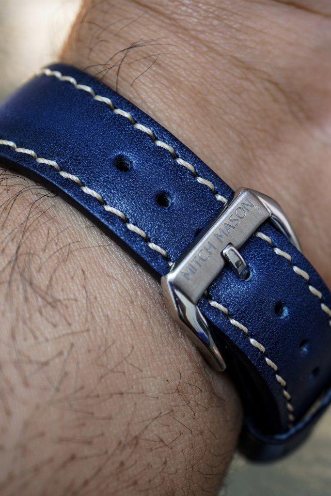
Each watch ships with a matched leather strap. The quality and comfort of this strap has really impressed me. This feels like something you would typically pay upwards of $75 for. The overall design and finish is excellent, and it has a simple signed buckle. I hope he decides to sell them separately because I’ll definitely be picking up a few for some of my other watches.
Concluding Thoughts
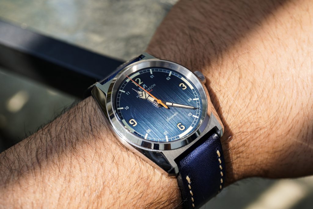
If you are in the market for an interesting everyday beater watch that has an overall unique aesthetic, you can’t really go wrong with this watch for the price. If the design appeals to you, I highly recommend grabbing one at the $380 Kickstarter price. I think it delivers an incredible amount of value and I would personally go with the Steel Blue option. I love the dynamic dial and it’s many different personalities.
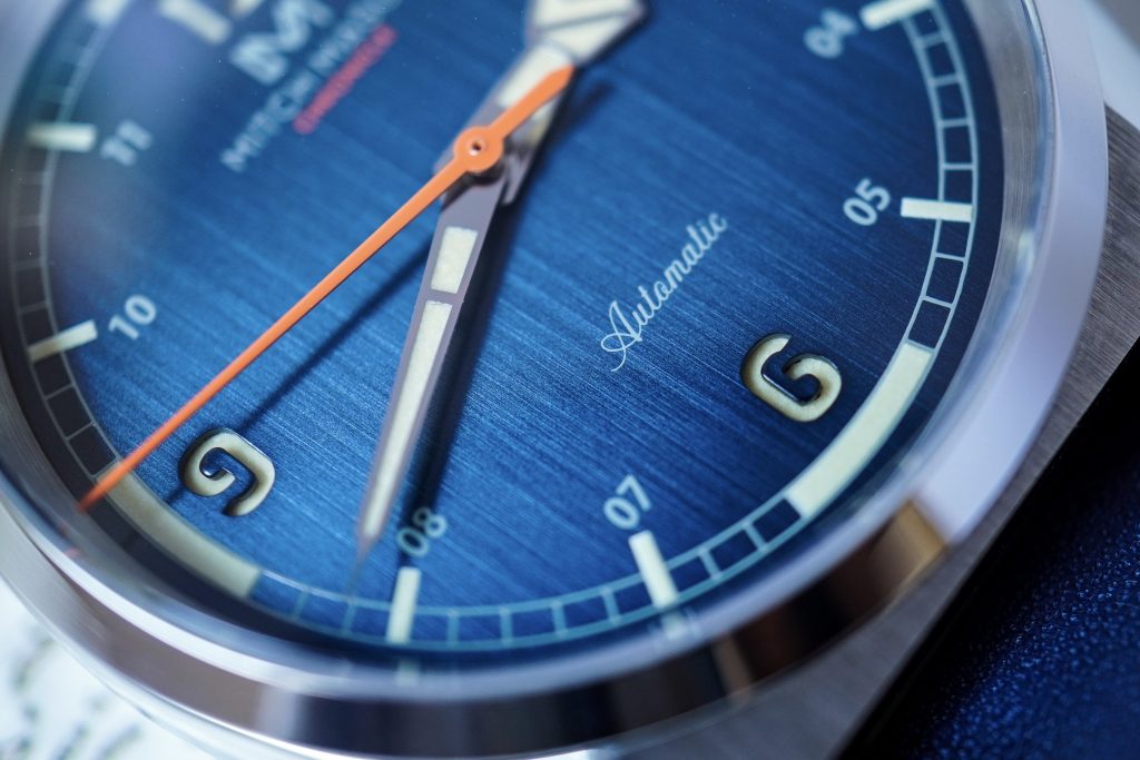
This watch is manufactured and assembled in Hong Kong and China. As I mentioned above, the dial on this prototype is exceptionally clean (except for the 2 small irregularities in the recessed numerals) with no smudges, dust or blemishes. If the prototype is any indication of their final production run, I think it’s safe to say that their QC is in good hands.
From my limited interactions with Benedict, he seems like a genuine watch enthusiast who is extremely passionate about this project. I’m confident that this project will be completely funded, but only time and experience will tell if Mitch Mason is able to match their impressive designs with the same level of customer service. I wish Benedict Ong the best of luck for a successful campaign and I hope you enjoyed this review.
Go sign up for the Mitch Mason newsletter if you are interested – https://mitchmason.com/

