Disclaimer: This review is in no way incentivized by Tissot or any other entity. I purchased this watch brand new for the purpose of this review. All opinions here are my own. The Tissot Seastar Quartz that I make references to was purchased on eBay without a box or papers, and I have not verified it’s legitimacy or authenticity. But it passed the “it looks real, because I found others like it online” test.
Contents
Intro
There is something about 1970s watch design that makes it incredibly appealing to me. A lot of watches from that era used straight lines, dramatic angles, and an abundant use of flat surfaces. Gerald Genta‘s designs for Patek Philippe, Audemars Piguet, IWC and others, seemed to have spearheaded this design movement, and his design styles have only become more popular over time. If you look around today, you’ll find plenty of copies disguised as homages, and plenty of homages disguised as original designs. And most affordable watches in this price category often fall into these design traps, just because the design language is so distinctive.
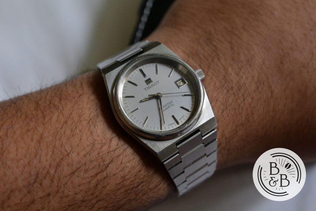
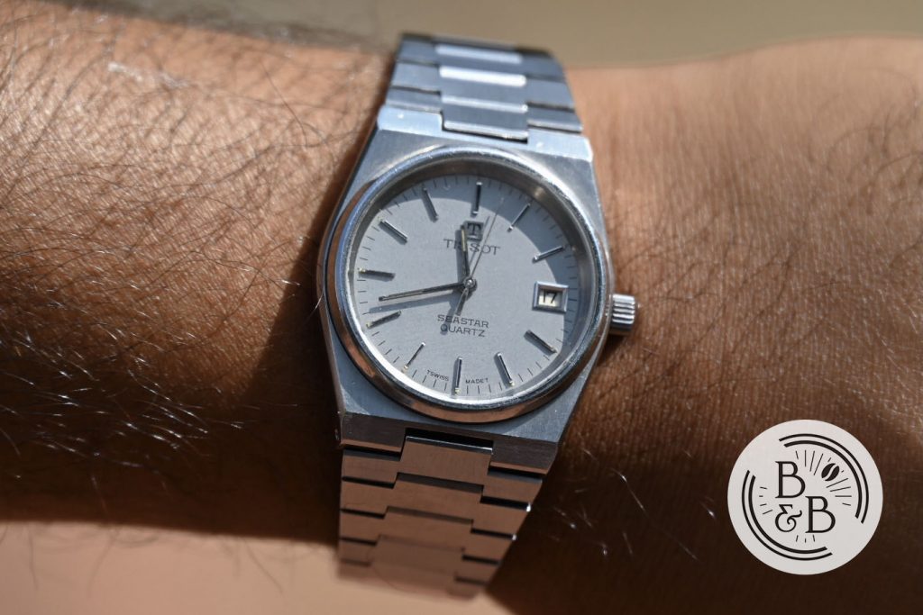
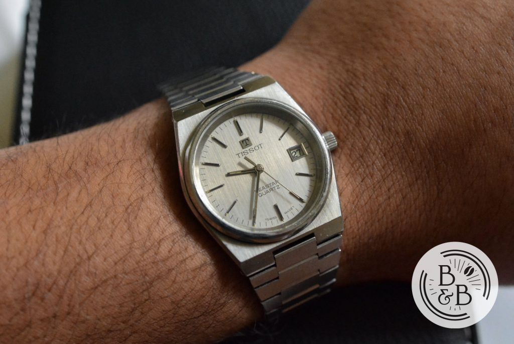
But the idea of heavily borrowing from that rule book is not limited to modern watches. Even in the 70s, there were those influenced by that design style, and the Tissot Seastar is one such example. I didn’t know about this watch until a few years ago, when I was browsing eBay auctions late at night, as most watch enthusiasts do. I came across this Seastar Quartz and thought it looked great. I did some digging, and convinced myself this watch was legit, and decided to buy it. What arrived was a great looking watch, and an affordable way for me to own and enjoy the 70s design language, from a brand that has it’s own interesting story and heritage. I haven’t had this watch authenticated, but it looks legit and the movement inside behaves exactly like the Caliber 2031 is supposed to.
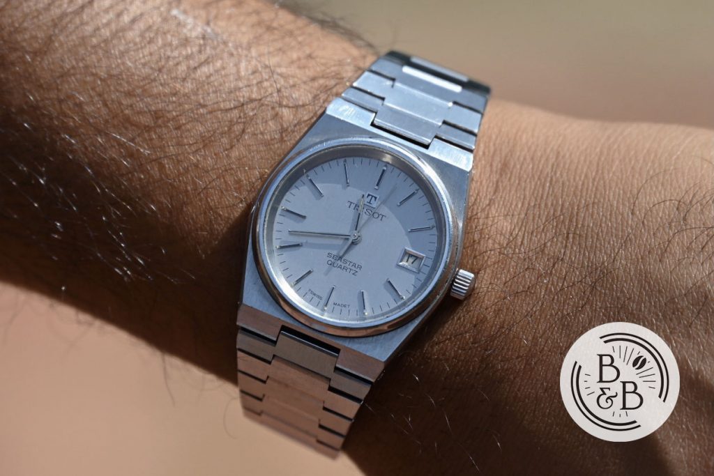
Vintage watch hunting on eBay is always a gamble though, and thankfully you don’t need to look at sketchy listings to get your 1970s watch design fix. Tissot recently released these watches as an addition to the PRX lineup, which appear to be heavily inspired by the Tissot Seastar. And I figured since I’ve owned the Seastar, maybe I’ll have some interesting or intelligent insight to offer. Unfortunately, I don’t have the Seastar in my possession right now, but I’ll include some photographs wherever relevant.
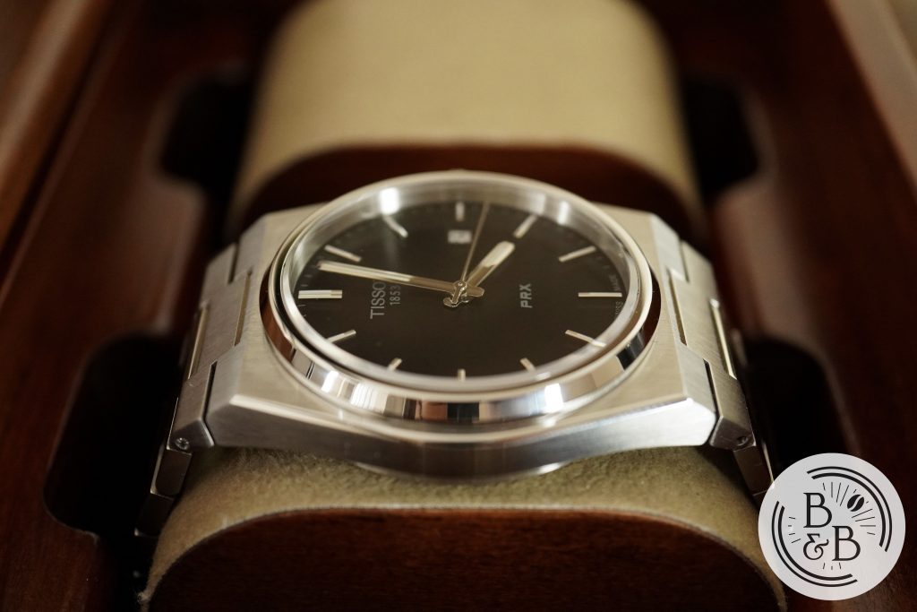
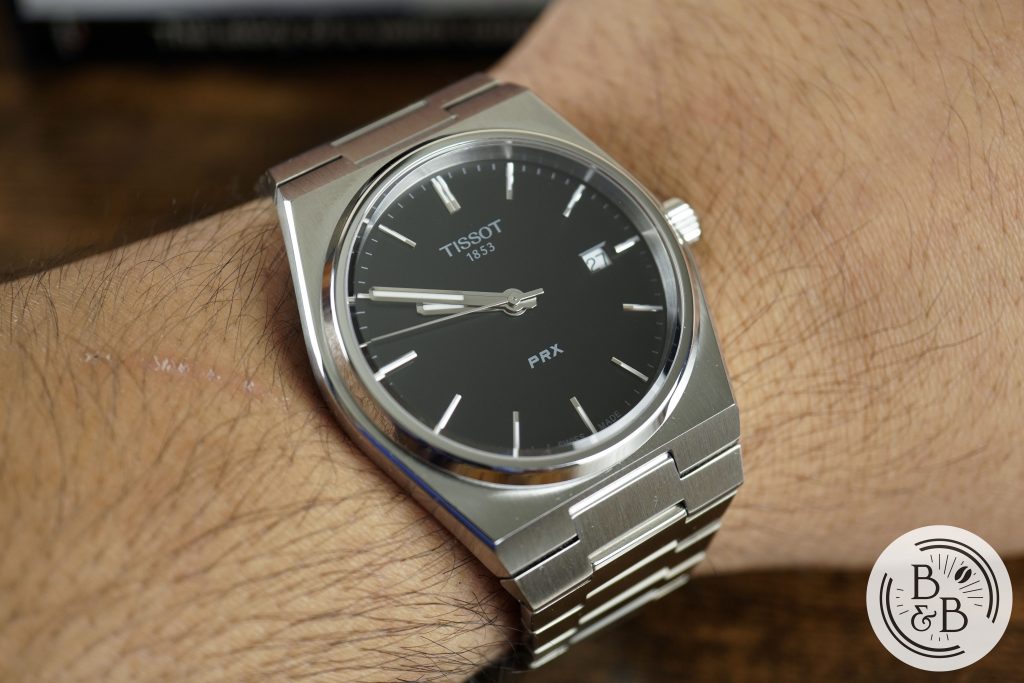
The PRX is offered in three dial colors, and has a retail price of $375. Tissot is usually a brand you can get a discount on, but given the heavy demand for this watch right now, you might have to wait a while to get a discount, as they are moving quick even at full retail.
Let’s check it out!
Case
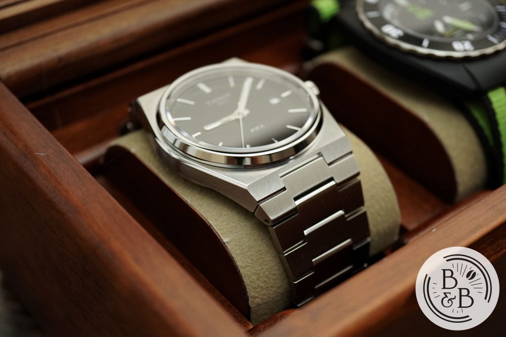
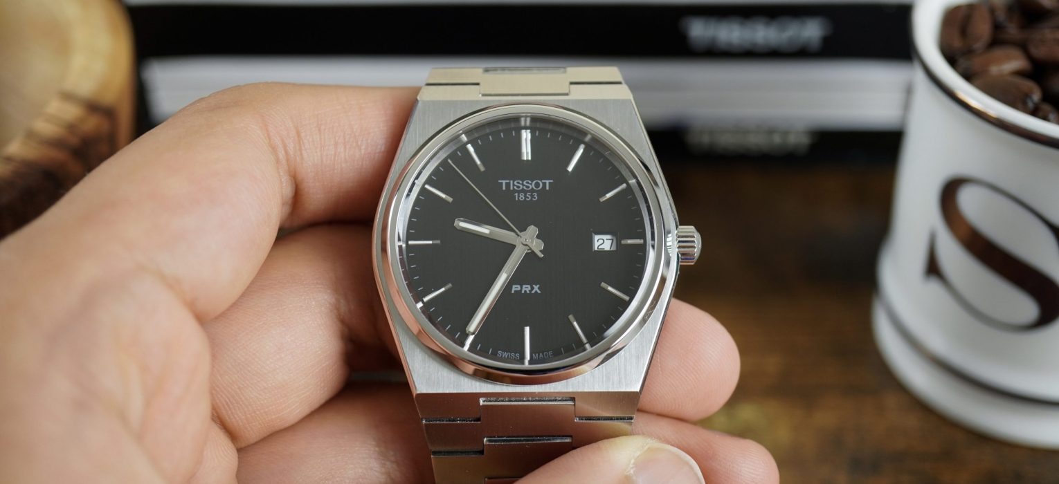
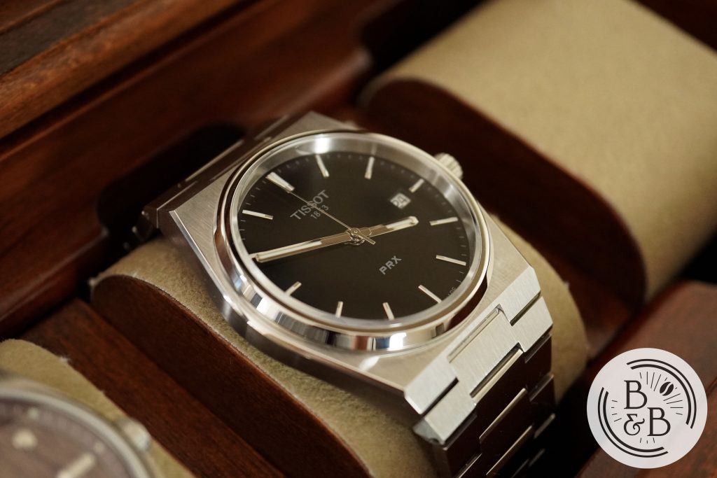
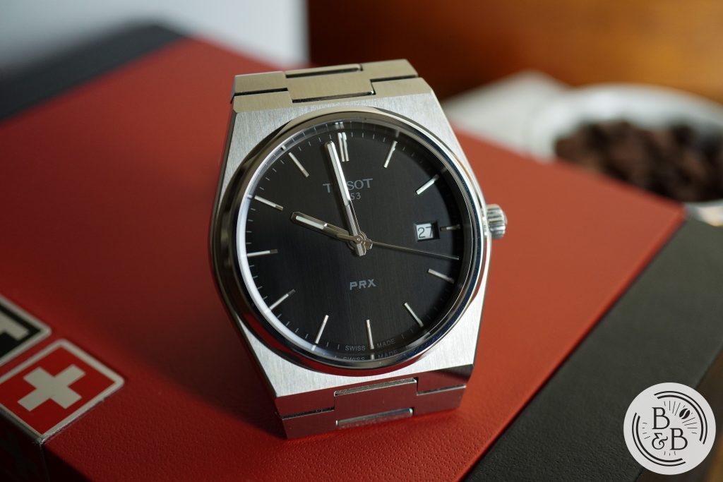
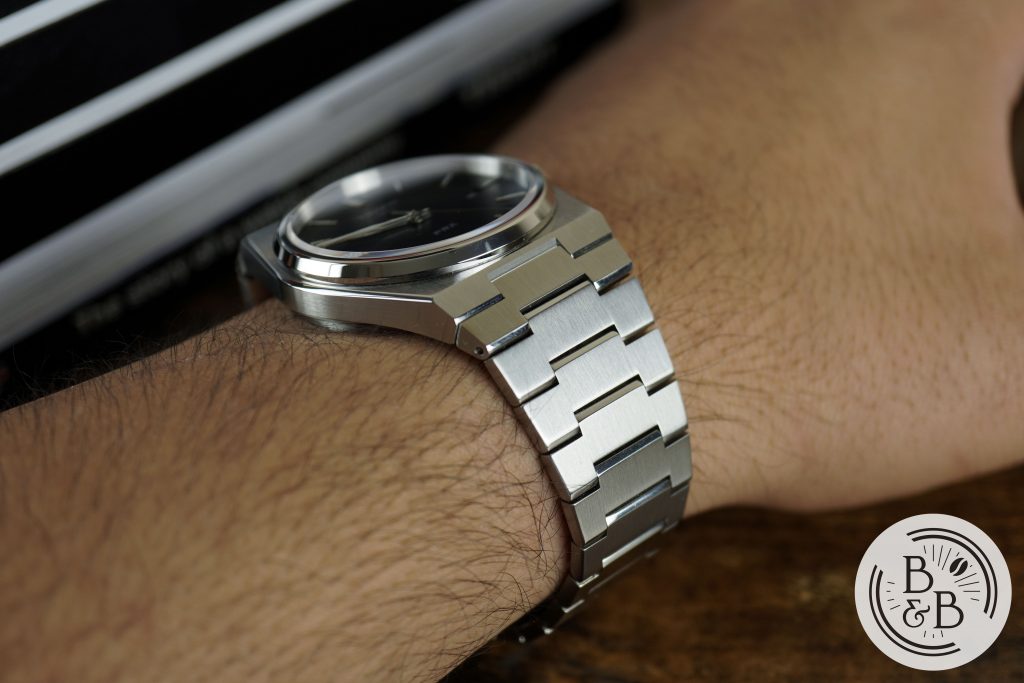
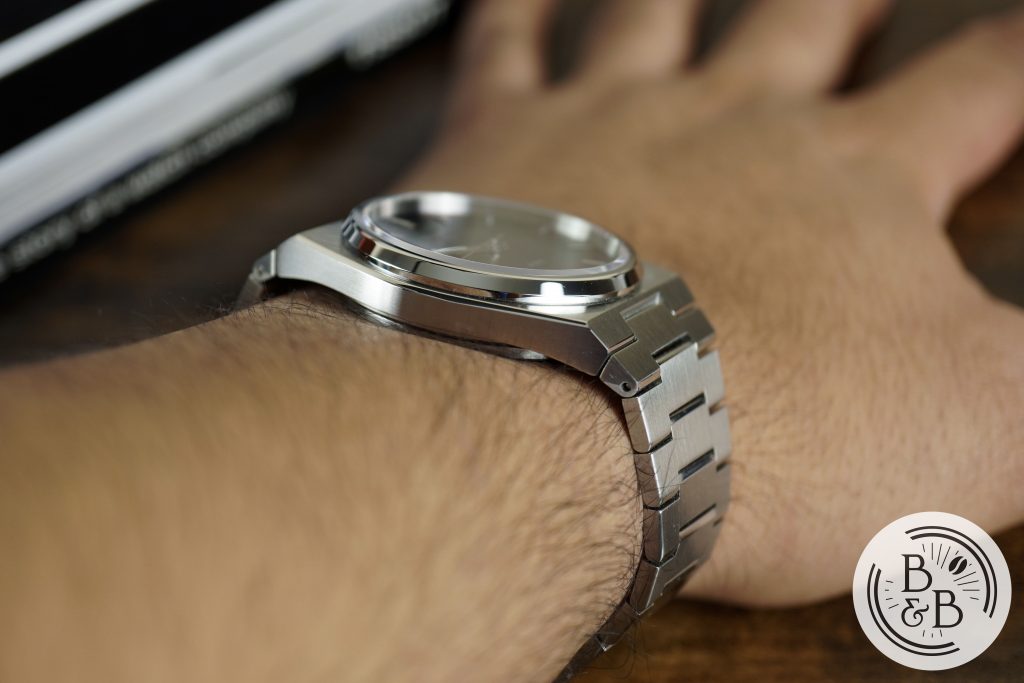
I measured the case to be 39.25 mm in diameter, 44.25 mm from lug-to-lug (but 51 mm if you include the fixed end links that angle downwards a bit), and 10.5 mm in height. The case is made of stainless steel and combines mostly brushed surfaces with a few polished accents.
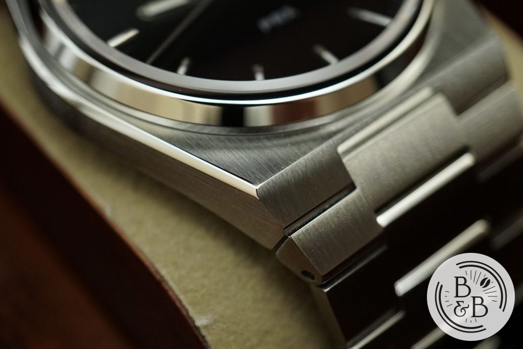
What I like most about this case (and the old Seastar) is the use of polished edges and slightly rounded corners, which makes it feel like a refined and well built watch, and also very comfortable to handle. The quality of brushing is mediocre, but reasonable for a $375 watch.
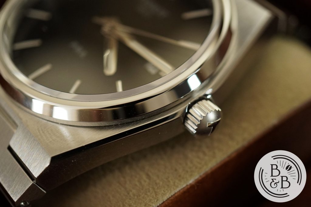
There is a polished fixed bezel section that seats a flat sapphire crystal. I’m not sure what kind of AR coating scheme was used here, but I haven’t had any trouble with reflections.
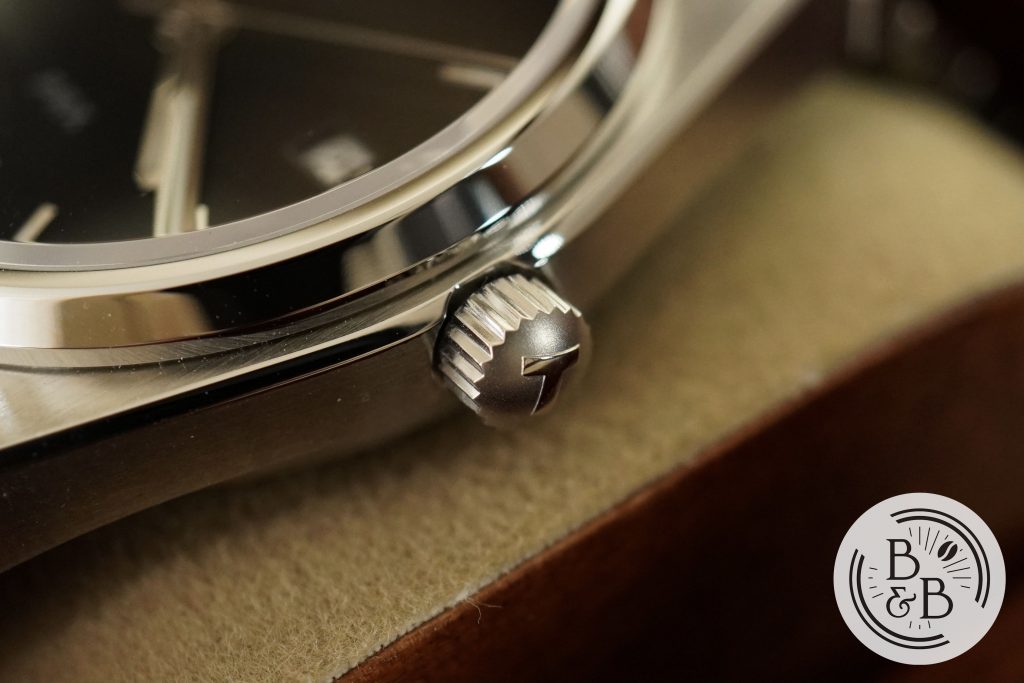
You then have a 4.5 mm push-pull crown at the 3 o’clock position that has an excellent grip, bead blasted finish and a signed top. It is slightly recessed into the case, and is easy to operate, without any crown or stem wobble.
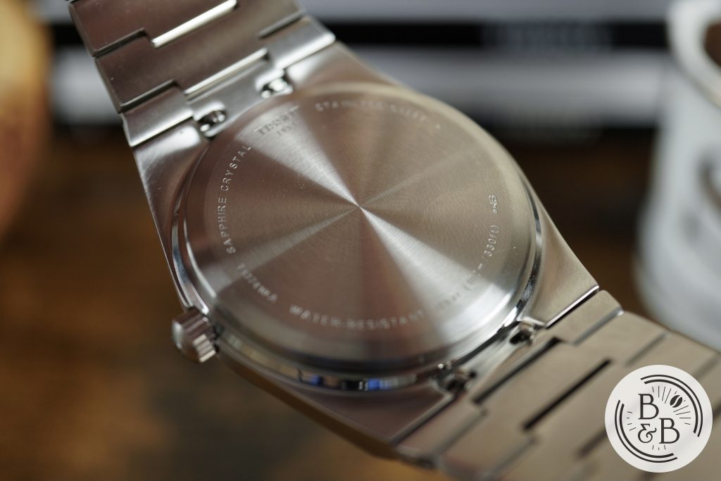
Flipping it over, you have a solid screw-down case-back, and the watch is rated for up-to 100m of water resistance.
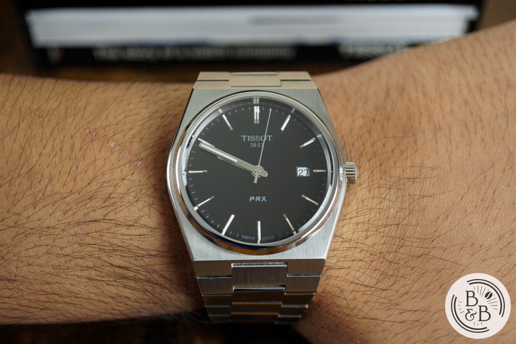
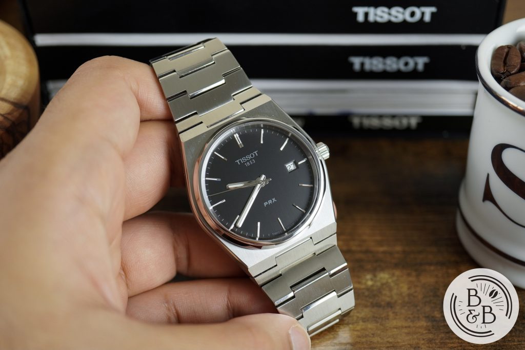
Dial
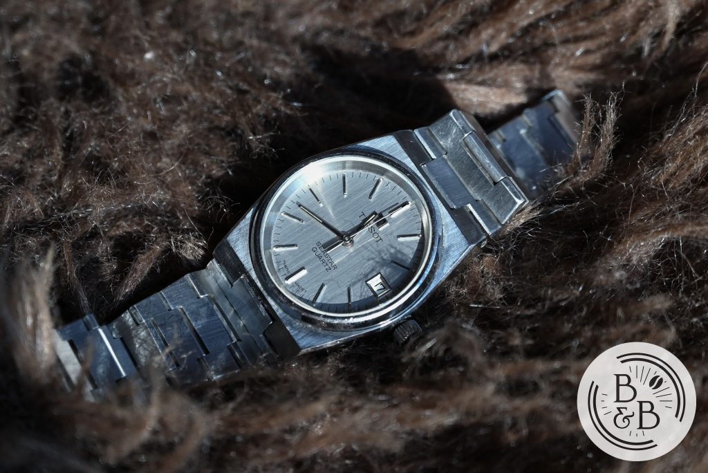
The PRX is offered in blue, black and a brushed silver dial option. I think the brushed silver is closest to the Seastar that I own, but has rose gold colored hardware. I decided to buy the black dial PRX to review, but I think the blue looks great as well.
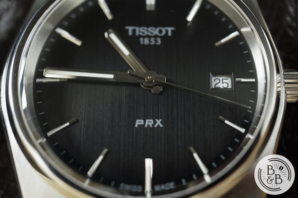
All three dials have vertically brushed metallic surfaces, like on the Seastar, however it is a bit harder to capture the brushing on the black dial, and even Tissot‘s own photographs don’t do a good job showing this off.
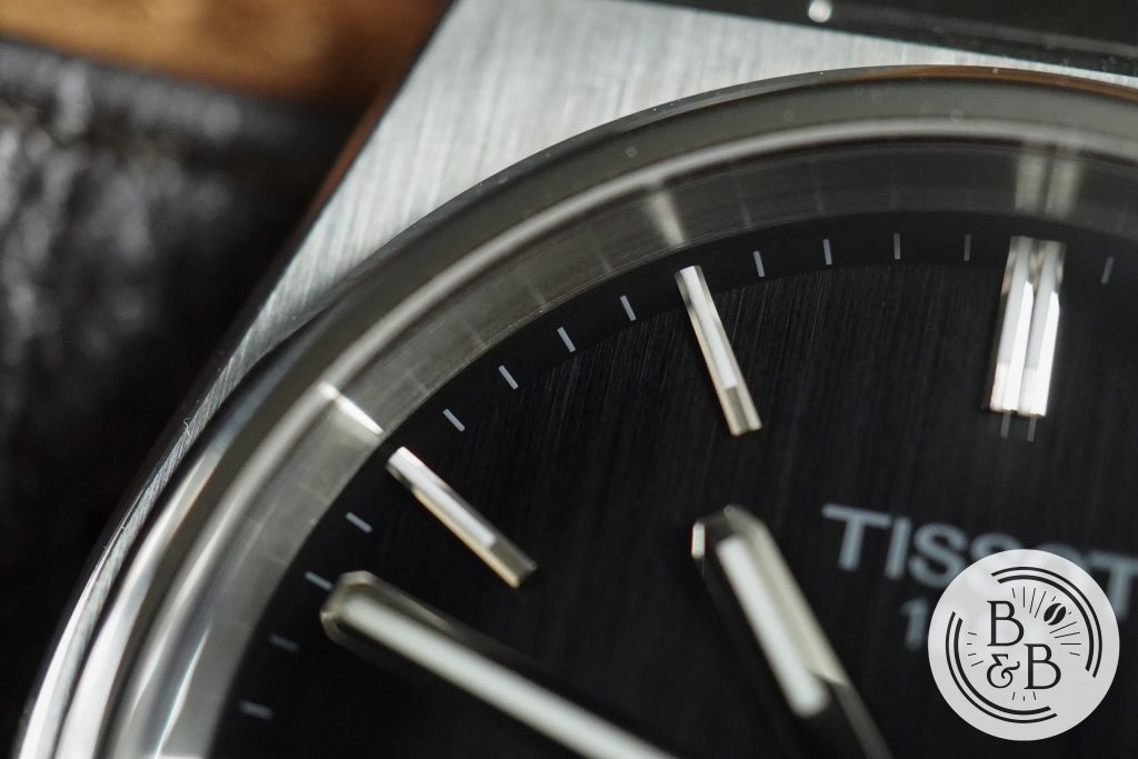
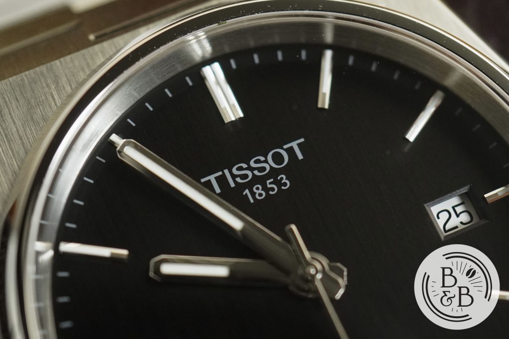
There is a slightly sloped black chapter ring that has printed white ticks. This is easy to read given the contrast, and the difference in textures between the chapter ring and dial is very subtle. I like it.
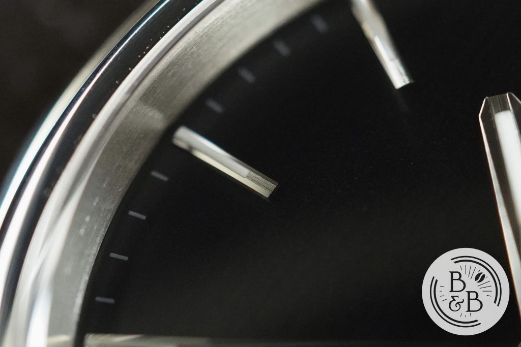
Similar to the Seastar, you have applied indices that are long and narrow, and appear to combine brushed top surfaces with polished edges and also filled with lume. The finishing here is quite impressive.
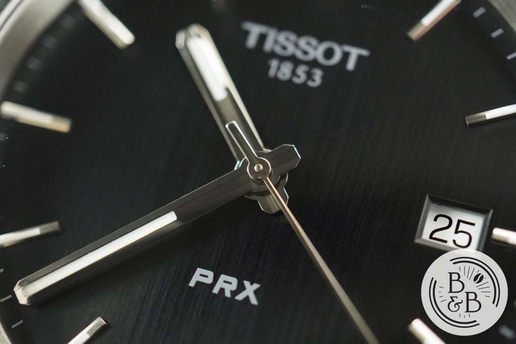
The brand’s logo and watch name are printed below the 12 o’clock and above the 6 o’clock hour markers respectively, whereas on the original Seastar, there was also an applied logo.
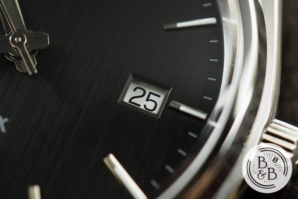
You then have a date window at the 3 o’clock position that is very neatly cut into the dial surface, with sloped slides, and a white date wheel. While this looks neater and a bit more elegant, I prefer the bold framed window on the Seastar.
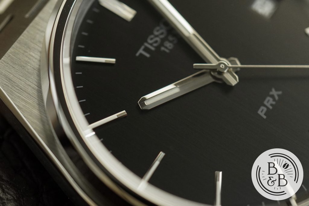
The PRX gets an entirely new handset that does follow the design style of the indices to an extent, with a brushed center section and polished sides. The proportions are great, and the handset is very easy to read.
Overall, I like what they did with the dial here. They retained most of the original design elements, but made a few changes to suit the larger dial size and modern preferences. A bulky framed date window and slim but weakly lumed handset may not have been as popular.
Lume
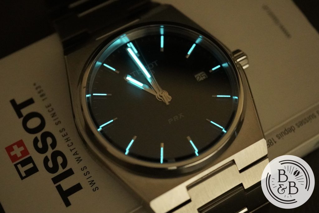
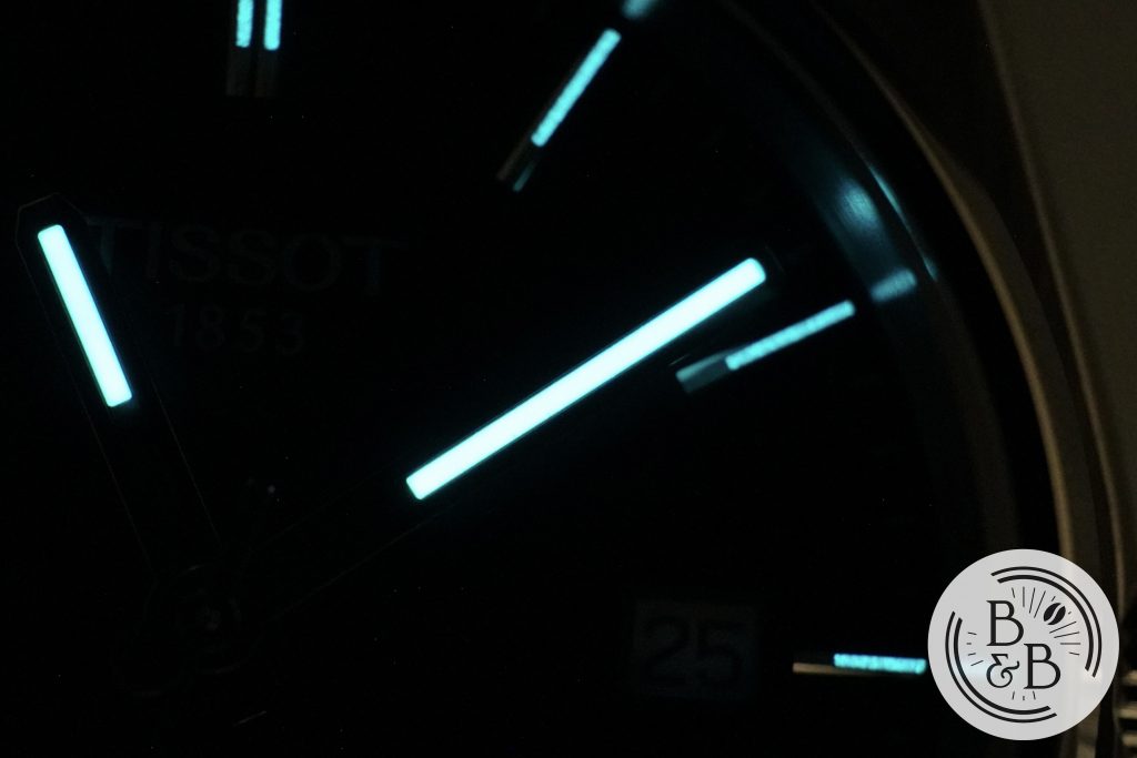
The lumed elements on the indices and hands are quite slim, so don’t expect very bright or long lasting lume.
You aren’t going to be able to read the time when you wake up at 3:00 am in a panic after your recurring nightmare of trading your entire watch collection for one Filippo Loreti watch.
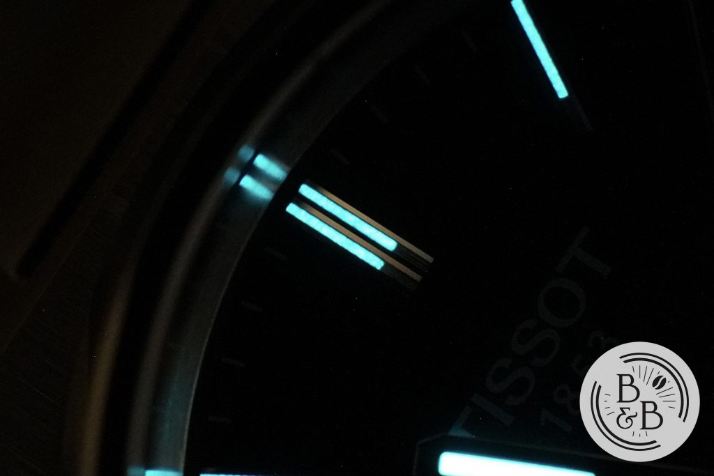
But the lumed hands and modestly lumed indices should be sufficient for quick light to dark transitions, and maybe an hour or two in the dark. I think the lume design is an upgrade from the small Tritium lumed pips and hands on the old Seastar.
Movement
There’s not much to discuss about the movement, as this watch uses a pretty standard ETA quartz movement – the F06.115. It is an entry level quartz movement, as expected, with a battery that needs to be replaced every 4-5 years.
I believe that Tissot will be releasing an Automatic version of this watch for around $600 in July this year, with only a small increase in case thickness and a dial that is definitely trying to be an Audemars Piguet Royal Oak, and is slightly disappointing.
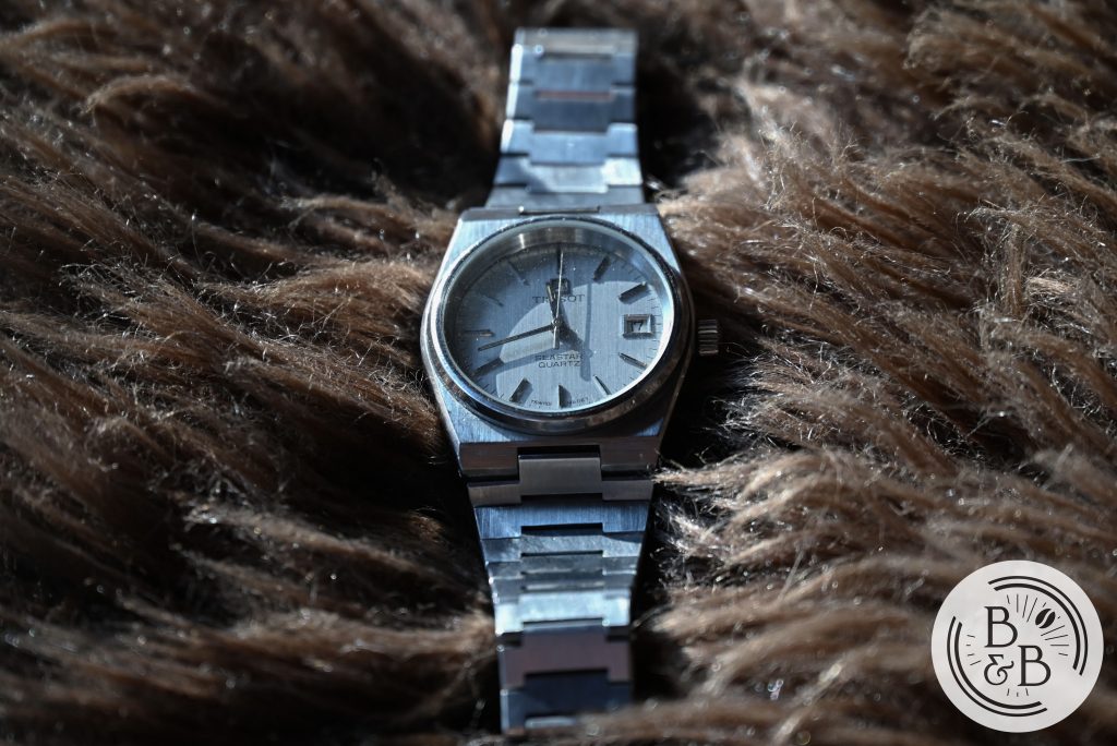
On the other hand, the Seastar actually uses a pretty interesting movement – I believe it is the Caliber 2031, where you adjust the time by pressing down the crown and holding it down for different amounts of time to adjust the seconds hand, minute hand and hour hands respectively.
Bracelet
The quality and finishing of the bracelet is great for the price. A lot of brands have tried to ride the Gerald Genta hype train, and have usually done a good job with case finishing, but almost always failed at the integrated bracelet. The links are usually too rough or sharp, the finishing isn’t great, or the articulation is just extremely poor.
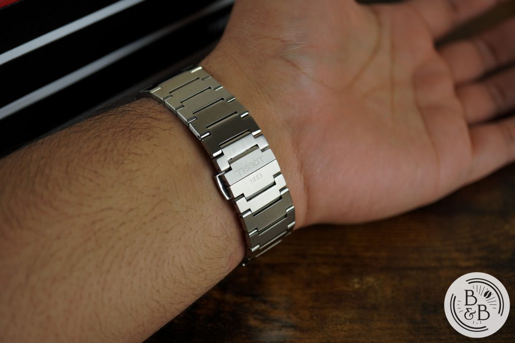
This watch does a better job than most, with soft edges and corners on all the links, a reasonable amount of articulation and no hair pulling that I experienced. It tapers from about 24.5 mm after the end links to 17.5 mm at the clasp.
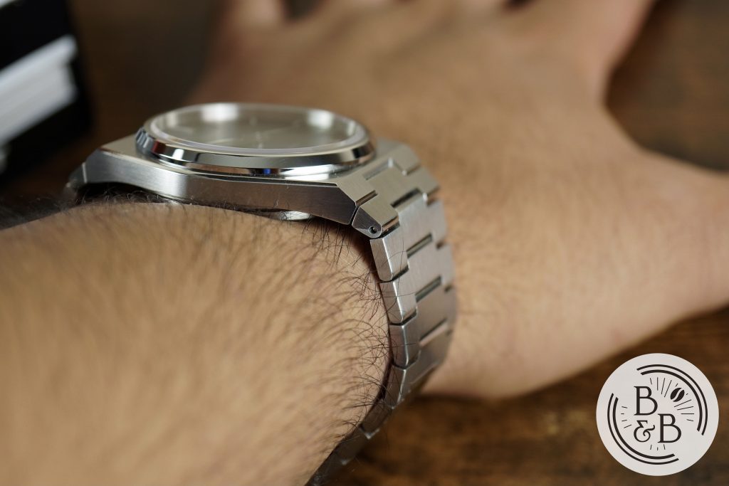
The end links don’t articulate, and hence increase the effective lug-to-lug width. The end links on the old Seastar didn’t articulate much either, but it was less obvious given the smaller overall footprint of the watch.
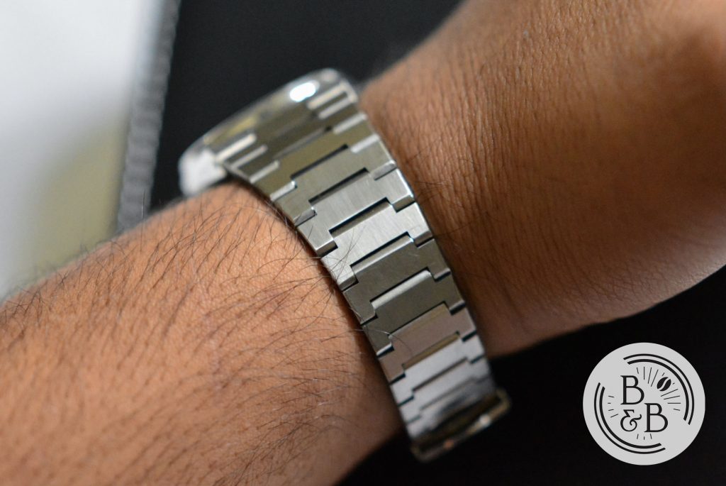
The finishing on all the links is good, and the design has been mostly preserved.
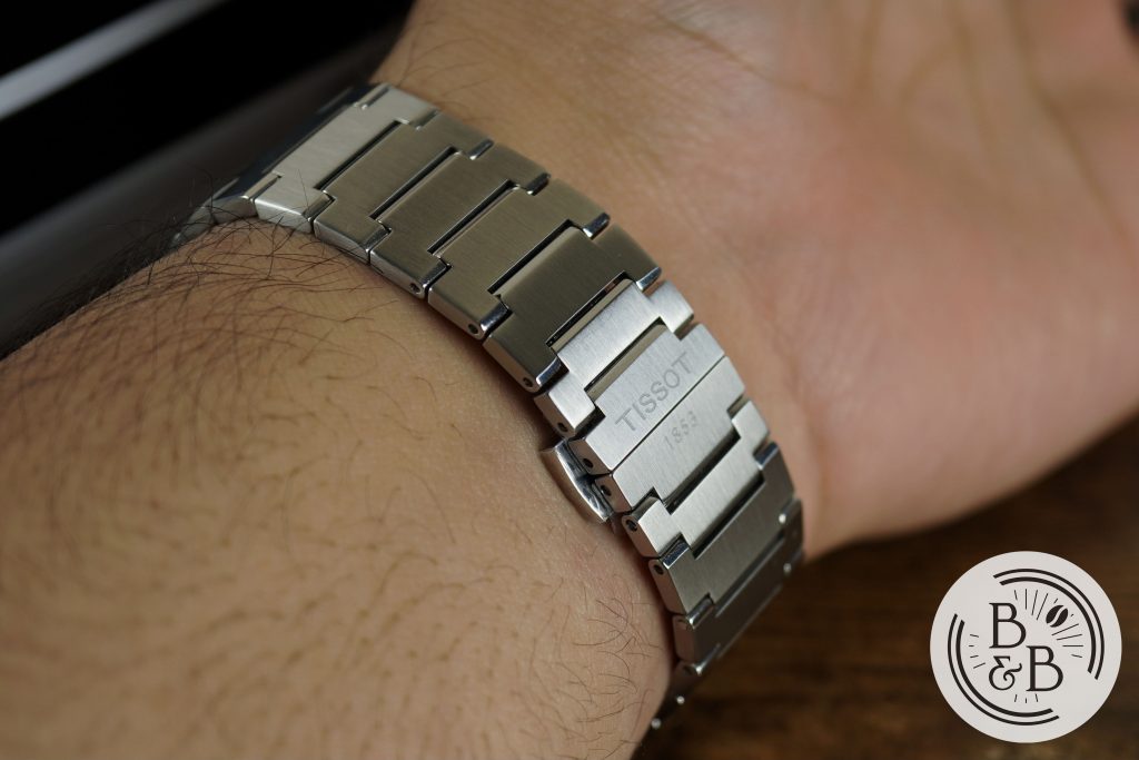
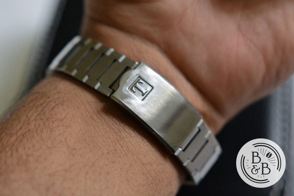
The PRX has a butterfly style clasp with two half links included. I was able to dial in a decent fit, but I prefer the press fit clasp on the Seastar, which has 7 micro-adjustment slots spanning the entire length of the clasp.
On The Wrist
The 39.25 mm case diameter and 44.25 mm lug to lug width wear a bit larger than you would expect because of the fixed end links increasing the effective lug to lug width to about 51 mm.
This watch wears a lot larger than the original Seastar, but isn’t too large for my 6.25″ wrists. I’d say that my wrist size is the lowest recommended size to wear this watch without too much overhang.
The 10.5 mm overall case height helps this watch sit low on the wrist, and the bracelet allows it to drape fairly well around the wrist.
I wouldn’t say this is the most comfortable watch to wear, but it’s not bad either. I’ve heard some folks say this is difficult to wear because it is too large, and while that is mostly a personal preference, I think some of those comments are slightly exaggerated.
But if you’re comparing it against it’s predecessor, then yes absolutely, this is a much larger watch and is going to have a very different presence on your wrist.
Concluding Thoughts
I’ll wrap this up quick – I like this watch, and I think for the price that you’re paying, you’re getting good build quality, excellent dial finishing and a watch that has all the 1970s design DNA that we all love. I know a lot of watch enthusiasts will want to sit this one out, and wait for the automatic movement, and that’s completely fair. But personally, the only reason I’d buy this watch is because of what it looks like, and I couldn’t really care about the movement inside. And given that the Seastar was quartz, maybe you can argue that the quartz is closer to the original. Although the Caliber 2031 is a lot more interesting than the ETA quartz inside this one. If the ‘leaked‘ photograph of the Automatic is accurate, then I think that watch steps into Royal Oak homage territory for me, and I much prefer this dial.
At $375, and maybe closer to $300 when the discounts kick in, this watch is a lot nicer than some of the other Genta-esque watches I’ve reviewed on this page.
Thanks for reading!