Disclaimer: this video/review was not sponsored by Jiro Katayama, Otsuka Lotec or any other entity.
Video
Otsuka Lotec Release Timeline
(As of April 2026)
| Year / period | Model | Notes |
|---|---|---|
| 2008–2012 | No.1, No.2, No.3, No.4 | Private (prototype) pieces made by Katayama before public sales began. |
| 2012 | No.5 | First public Otsuka Lotec model; regulator with date. |
| 2015 | No.6 | Double retrograde display. |
| 2020 | No.7 | Jump hour style watch with two apertures. |
| 2021 | No.7.5 | An evolution of No.7, with three apertures. |
| 2023 | No.7.5 (new specification) | Updated module and revised case/material/crystal package; official page labels it “new specification (2023 – now).” |
| 2023–2024 | No.6 (new specification) | Official page labels current No.6 “new specification (2023 – now),” while Katayama said the current version launched in 2024. |
| February 2025 | No.5 KAI | Officially shown as a new model at the Harajuku exhibition in February 2025; current production model. |
| September 2025 | No.9 | Official completion announced on September 22, 2025. |
| March 2026 | No.8 | Official completion announced on March 10, 2026. |
Jiro Katayama: A Different Kind of Watchmaker
Some independent watchmakers are known primarily for movement ideas. Others are known for finishing, or for a particular kind of artisanal spectacle. Jiro Katayama’s work feels different because his watches come across first as complete industrial objects. That likely has a lot to do with how he arrived here: Katayama came out of car and product design, bought a small lathe around 2008, began by making watch cases to practice machining, and only then became absorbed by watchmaking itself. He made No.1 through No.4 between 2008 and 2012, and started selling the original No.5 to the public in 2012. That origin story matters, because Otsuka Lotec still feels like the work of someone who thinks about the entire object at once, not just the mechanism inside it, and that’s one of the most important attributes that I look for when adding watches to my own collection.
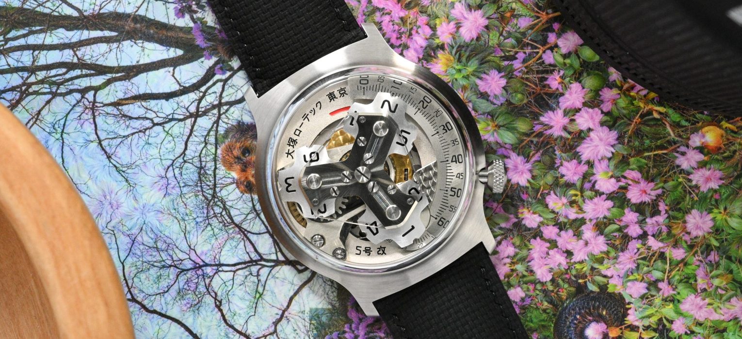
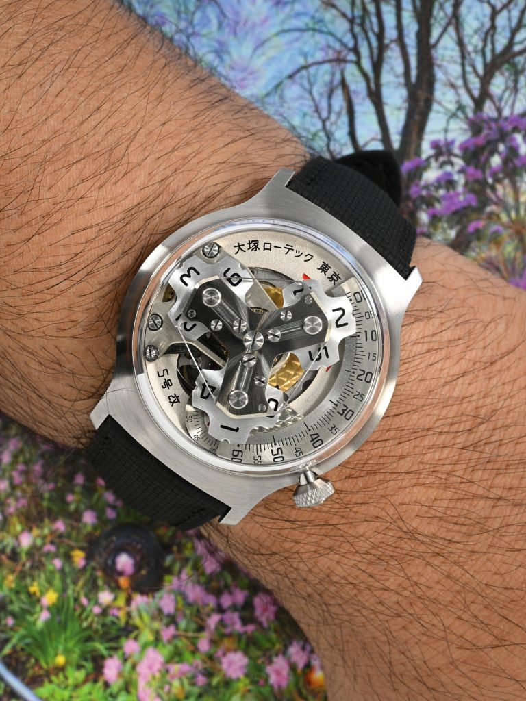
That is also why the No. 5 Kai is the right place to begin this two part series on Otsuka Lotec. Even though it is a recent watch, it carries the name of the first publicly sold Otsuka Lotec. Katayama himself has said it was called “No. 5 Kai” because it inherited the case design and the ball-bearing concept of the original No. 5, the first watch he sold. The official model page goes further and says the Kai inherits the design elements of the No. 5 released in 2012, with the case refined from that earlier watch. In that sense, it is a modern interpretation of the brand’s first public statement.
Mechanical/Analog Interfaces for the Wrist
Katayama’s broader inspiration also helps explain why Otsuka Lotec feels so distinct. On the brand site and in interviews, he points to old film cameras, industrial instruments, gauges, and the analogue feel of older machine-made objects as key references. That sounds obvious once you know it, because Otsuka Lotec watches rarely resemble conventional “luxury watch” compositions. They feel more like mechanical-analog interfaces scaled for the wrist. The appeal is very much a departure from traditional Swiss romanticism, and instead embodies the clarity and conviction of singular minded industrial design.
The Kai’s display format is a good example – satellite or wandering hours are not new, and they are certainly not unique to Otsuka Lotec. The underlying idea goes back centuries in clockmaking, and in modern wristwatches collectors most commonly associate it with watches like the Audemars Piguet Star Wheel and, more recently, Urwerk’s highly futuristic interpretations. At this point, the concept has also been democratized across lower price tiers, so the mere presence of satellite hours is no longer enough to make a watch interesting. The Kai works because Katayama stages it inside a case and crystal architecture that feels perfectly suited for it, and makes the mechanism feel very much integrated into the entire experience, from materials to texture.
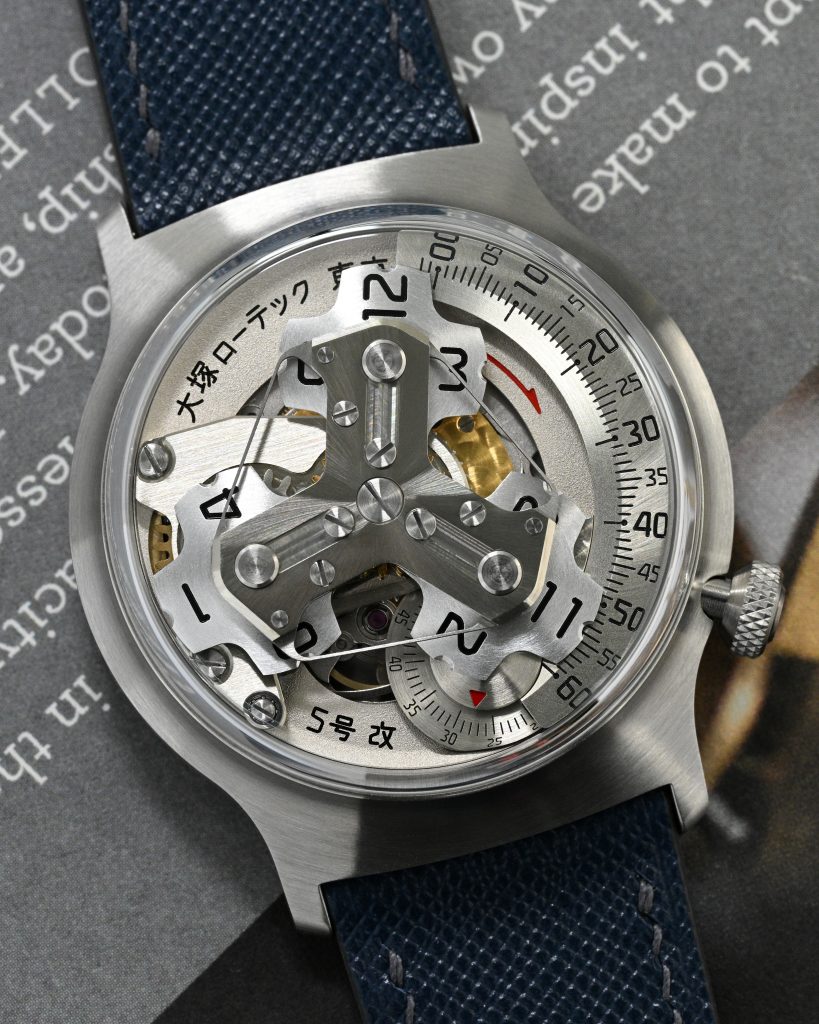
Under the Crystal
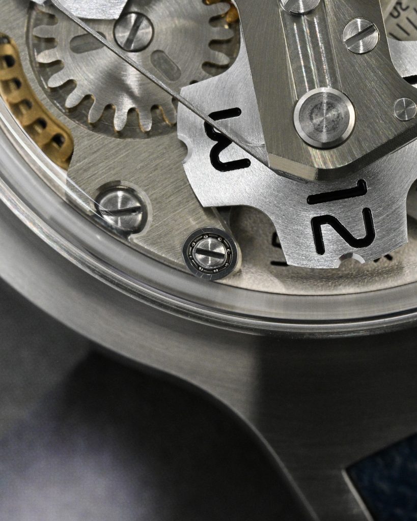
The case is where his background shows most clearly. On paper, the official dimensions are 40.5mm in diameter, 12.2mm including the crystal, with 22mm lugs, a 316L steel case, and a box sapphire crystal with anti-reflective and anti-fingerprint coating. My measurements came in essentially the same, at roughly 40.25mm across, 46.75mm lug to lug, and about 12mm overall, with a crystal width of just under 36mm. But those numbers don’t easily translate how this watch looks and feels, because this is one of those watches where the crystal does a huge amount of the visual work. Otsuka says the crystal itself is 4.6mm tall over a 7.6mm mid-case, and that the case edge was lowered as much as possible so the minute plate, hour disks, and other elements inside could cast distinct shadows. That sounds dry in spec-sheet language, but on the wrist it is exactly what you notice: the watch reads almost like a mechanical snow globe, with the display suspended inside a transparent dome.
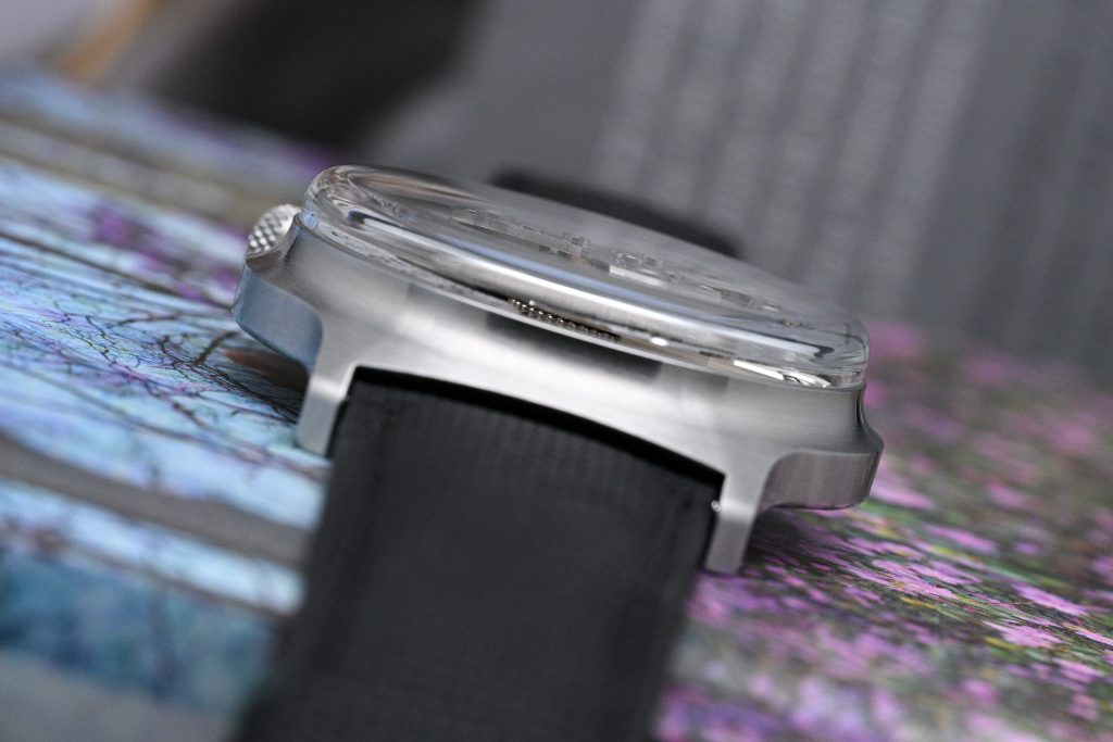
The case is industrial in its finish, mostly straight-grained rather than decorative, yet the overall shape is fluid and refined. The form rises naturally from the flat base through the sculpted mid-case and into the boxed crystal. The anti-reflective treatment is also crucial here, because this watch needs visual access more than it needs sparkle. There are too many moving parts, too many layered surfaces, and too much spatial drama under that crystal for reflections to be treated as an afterthought. The crown is easy to access, well proportioned at 5.5mm in diameter, and the watch has an expected low water resistance of 30m.
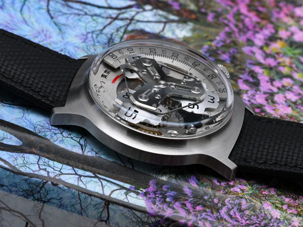
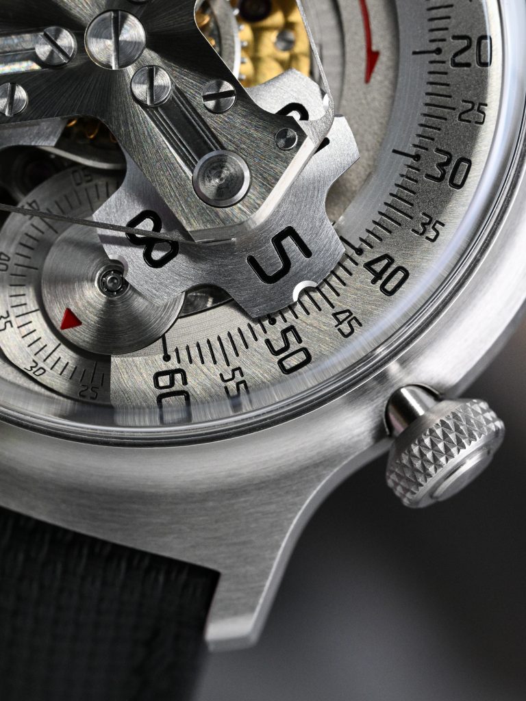
The dial-side architecture is what makes the Kai memorable. There is little here that tries to impress in the traditional handmade-watch sense. You are not getting elaborate hand-polished bevels, angles of any kind, or showpiece finishing for its own sake. What you do get is, to my eye, more convincing than a great many mediocre artisanal watches: carefully staged contrasts in color, texture, shadow, and surface treatment, all working toward one unified visual effect. The Japanese script printed around the mechanism, the contrasting finishes of the visible components, and the constant movement of the display elements create one of the most distinctive dial-side experiences I have seen. This is exactly where Katayama’s “complete product” thinking pays off.
Why All the Fuss About a Ball Bearing?
The bearings are not a trivial detail here either. The official Kai page states that the original No. 5 used two ball bearings and that the Kai continues that idea with two MinebeaMitsumi bearings, one specially created for this model’s hour-disk switching system. MinebeaMitsumi says that bearing measures 2.5mm in outer diameter, 1.0mm inner diameter, and 0.8mm thick, and that it enabled the Kai to become the first watch to use a satellite-hour mechanism that switches the hour disk by directly engaging a pin with a bearing. The second bearing, at the center of the seconds disc, is the company’s 1.5mm bearing, which both Otsuka and MinebeaMitsumi describe as still the world’s smallest commercially available steel ball bearing in this class.
In use, the watch has some quirks worth mentioning. The official description says the hour disk switches twice per hour, almost like a jumping hour, by directly contacting the ball-bearing roller at roughly 8 o’clock. On the wrist, that means the transition begins before the top of the hour, around the last third of the minute cycle, and the primary time display can appear to pause briefly while the transitioning disk climbs over and hands off to the next hour. In practice this is more of a behavioral quirk than a functional problem, because the display catches up and overall timekeeping remains intact, but it is a good reminder that this is a very specific piece of mechanical theatre built from scratch.
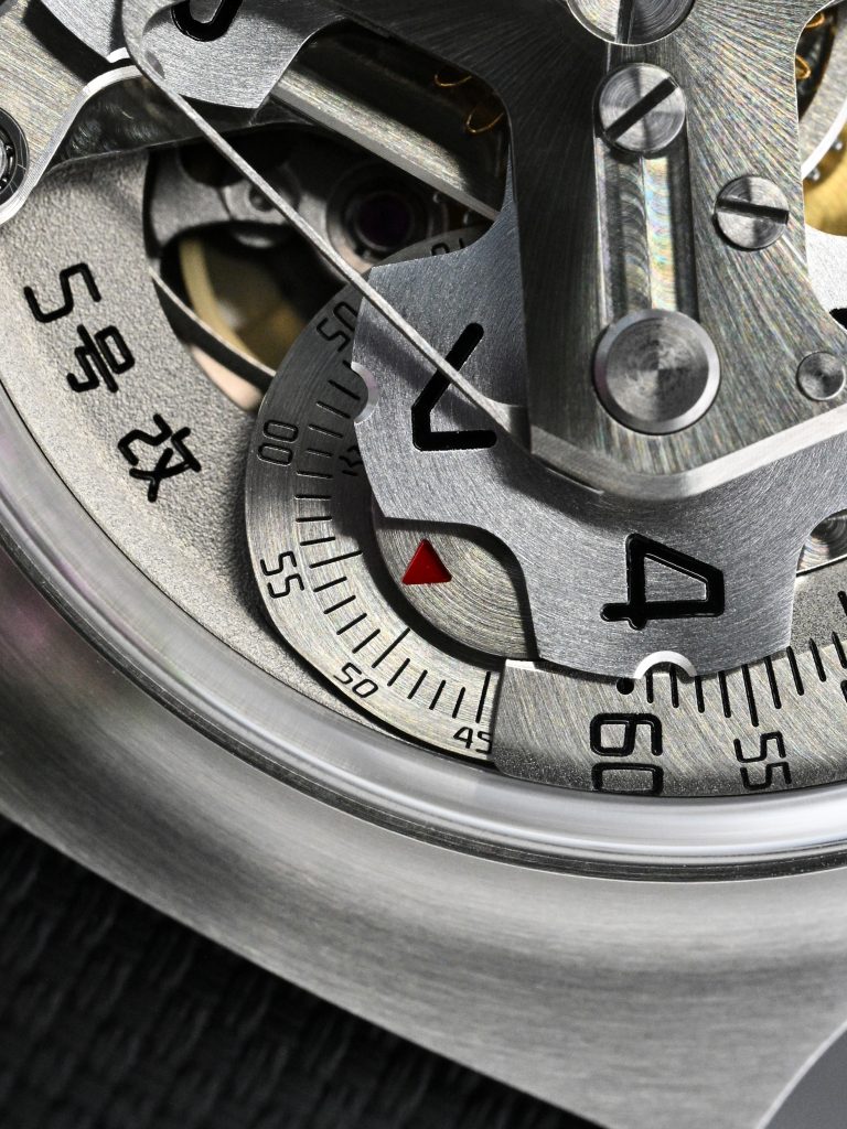
I also noticed that the seconds disc can show visible jitter. The most plausible explanation is that a visibly exposed weighted seconds disc makes tiny fluctuations in torque delivery, backlash, or friction within the added display works much easier to see than they would be on a thin conventional seconds hand. In other words, the display architecture probably amplifies behavior that would be visually negligible in a more ordinary watch.
On The Wrist
Wear-ability is also well considered, even if its overall silhouette might suggest otherwise. At 57g for the head, with a compact sub-47mm lug-to-lug, the Kai avoids the clumsiness that could have easily come with a display like this. It wears across a wide range of wrists better than the design might suggest.
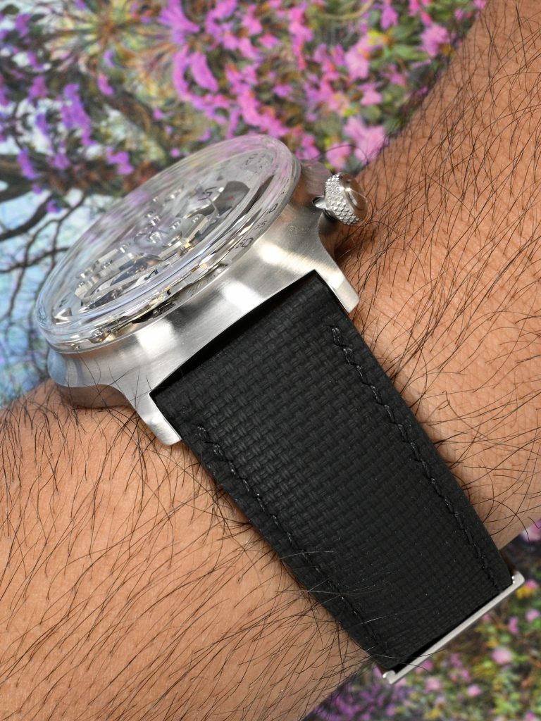
My only real aesthetic hesitation is the strap. It is well made, but feels a bit unwieldy and visually heavy on wrist given its thickness and design. That is subjective though, but it is one of the few areas where I can see some owners preferring to experiment with alternative 22mm straps.
Going from No. 5 to No. 6
What makes the Kai so compelling is not that it introduces an unfamiliar complication, but that it presents a familiar one with an uncommon level of cohesion. This is a watch where the case, crystal, display, materials, and tiny mechanical details all feel conceived together, and that is still far rarer in independent watchmaking than it should be. It also neatly reinforces what makes Jiro Katayama interesting in the first place: he does not approach watchmaking as a movement designer searching for a container, but as a designer and machinist building a complete object from the ground up. Even its quirks feel less like flaws than reminders that you are looking at a very specific mechanical idea.
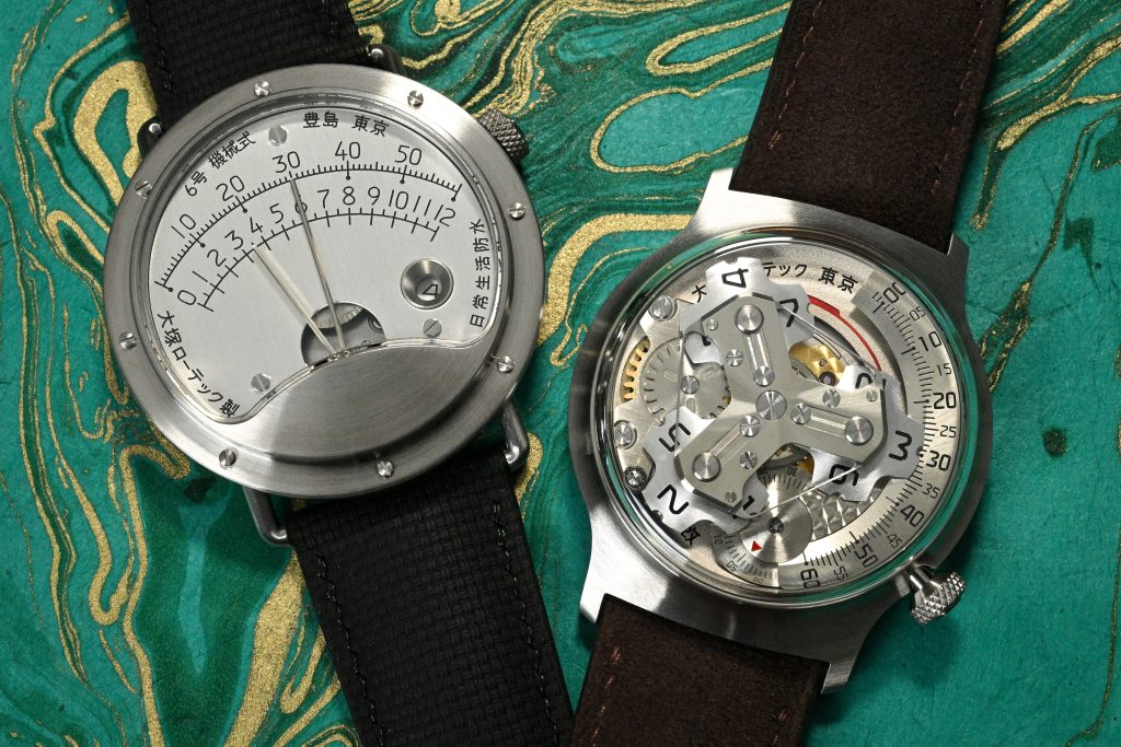
The Kai connects directly back to the first public Otsuka Lotec, and in doing so helps explain the foundation of the brand: an industrial design mindset, truly bespoke construction, and a refusal to rely on generic watchmaking solutions. In the next part of this series, I’ll turn to the No. 6 and how those early principles of design and engineering matured into what is, to me, both my favorite watch from the brand and perhaps its most recognizable piece.