Disclaimer: This watch was sent to me to review and I was not paid to write this. This is in no way sponsored by OSO, or any other entity. All opinions here are my own. OSO has stated that they will be gifting me a watch from this collection if the project is successful, but they have no control over the content of this review.
Since this watch is a prototype and was worn/used by other reviewers, please make note that the experience might differ from that of a brand new watch.
Contents
OSO
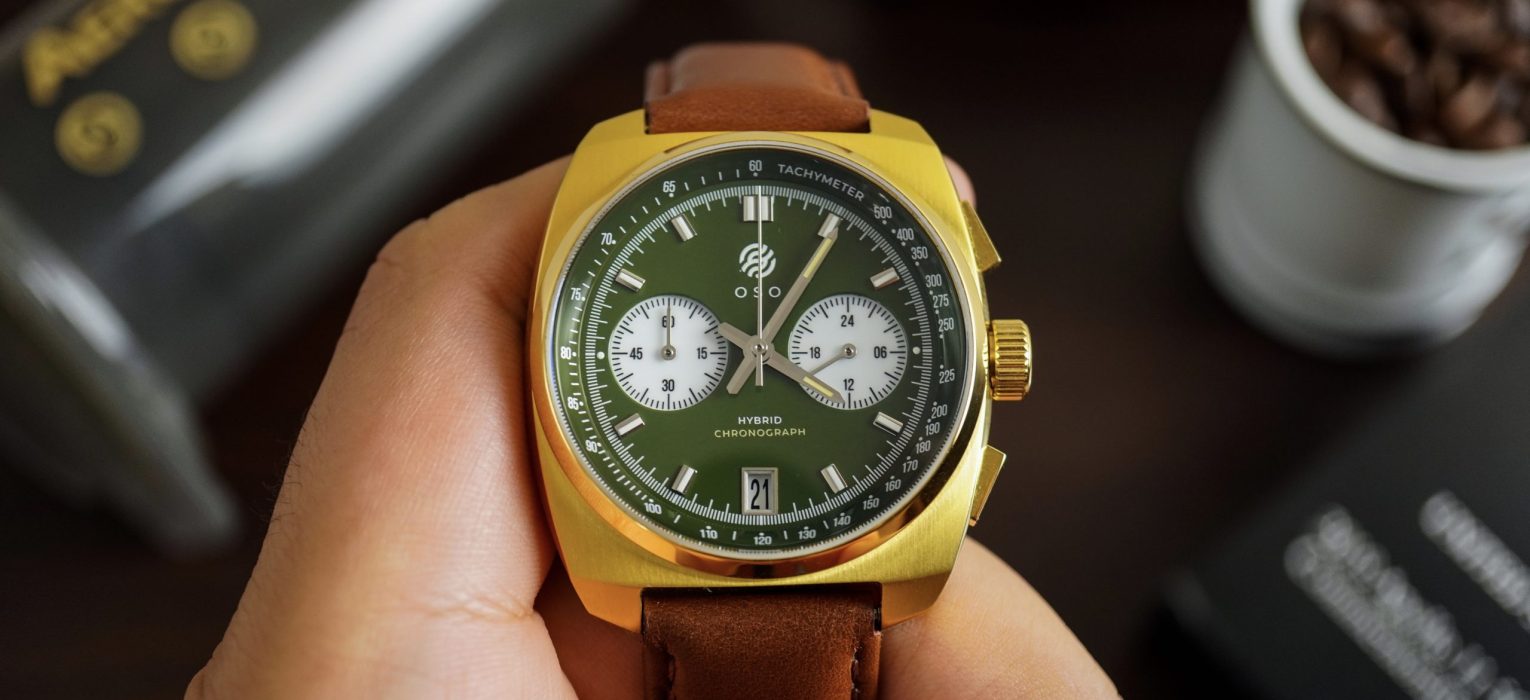
OSO is a new microbrand based in Singapore, and they’re dipping their toes into this highly competitive market with a meca-quartz equipped chronograph watch that appears to be inspired by the early decades of the Space Age. This is the Orbit Collection, and is a line-up of vintage inspired chronographs that do actually look the part for an aerospace inspired chronograph. I’m not sure what OSO stands for, but I’ll take a guess and say that it was heavily inspired by the Orbiting Solar Observatory (OSO) program of the 60s.
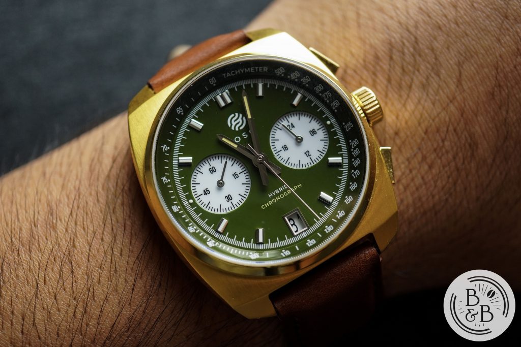
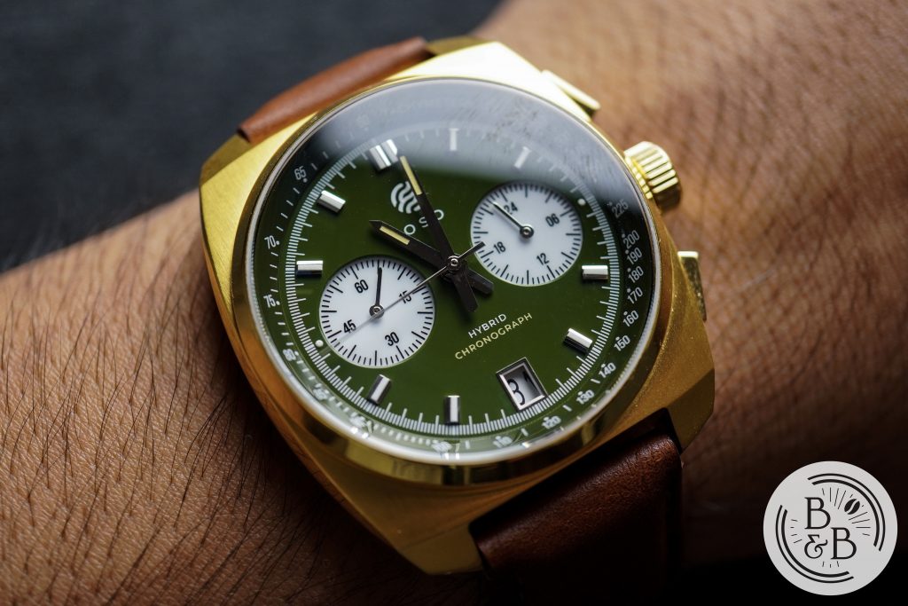
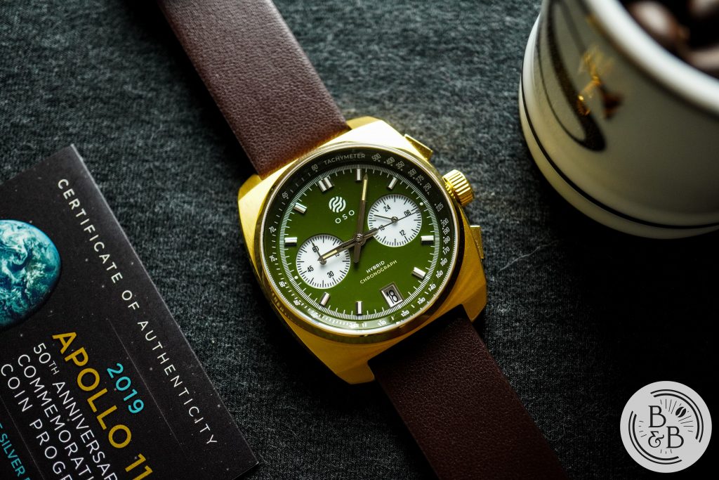
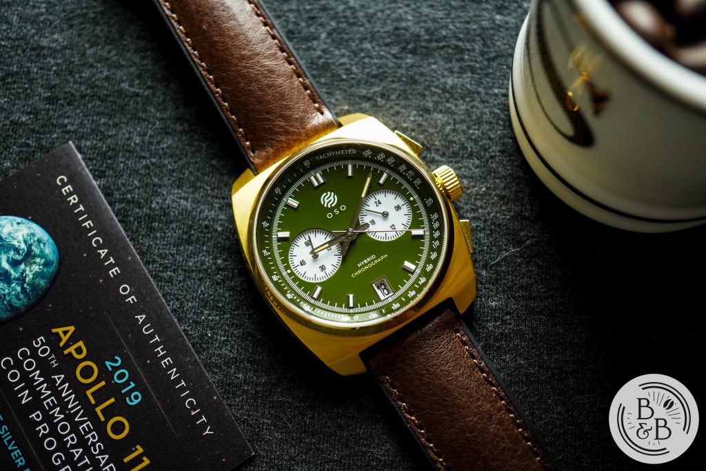
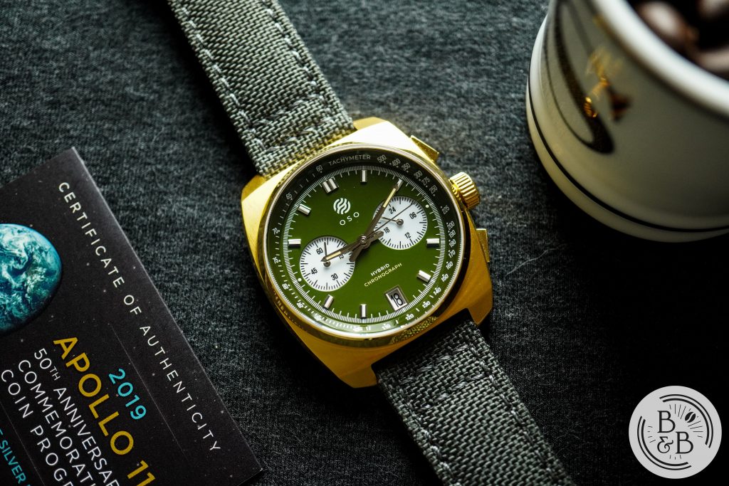
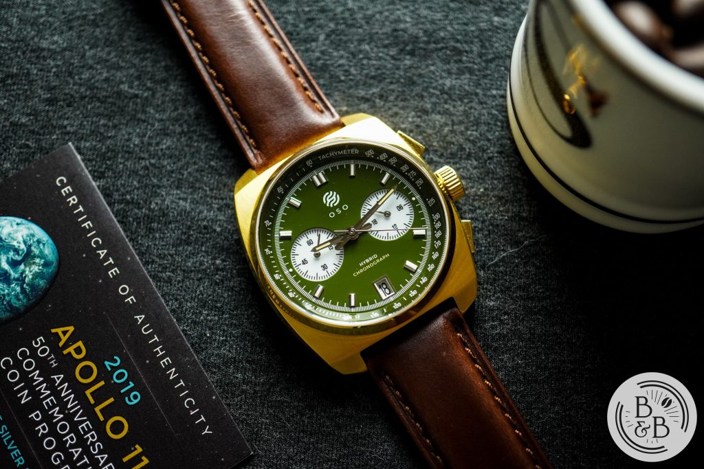
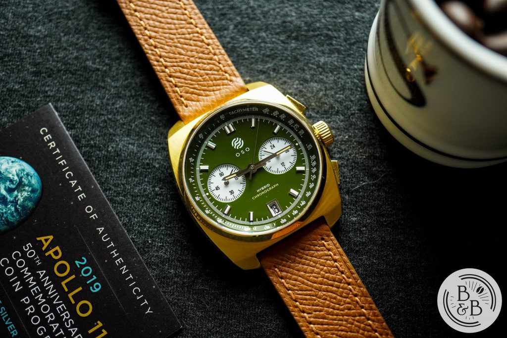
The Orbit Collection is offered in three different case and dial configurations, and I requested to review The Mirage, which has a gold case, green dial and white sub-dials. These watches are scheduled to be launched via Kickstarter on November 10th and prices will begin at $220 USD, and an eventual retail price of $300.
Let’s check it out!
Case
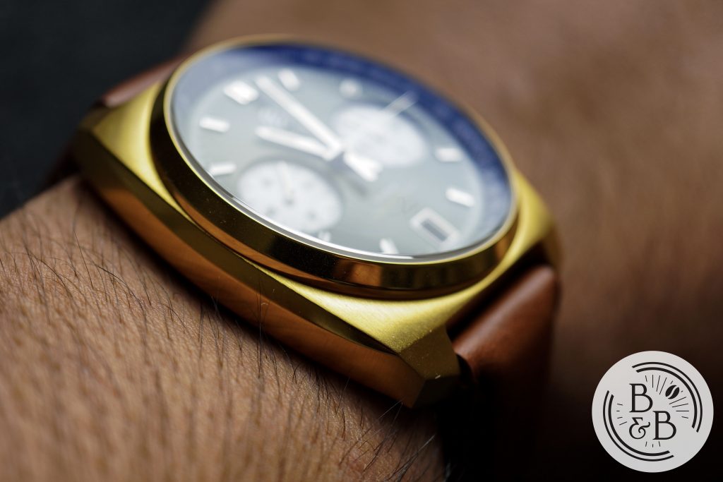
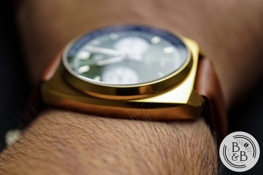
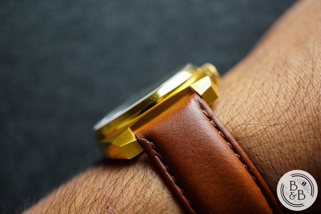
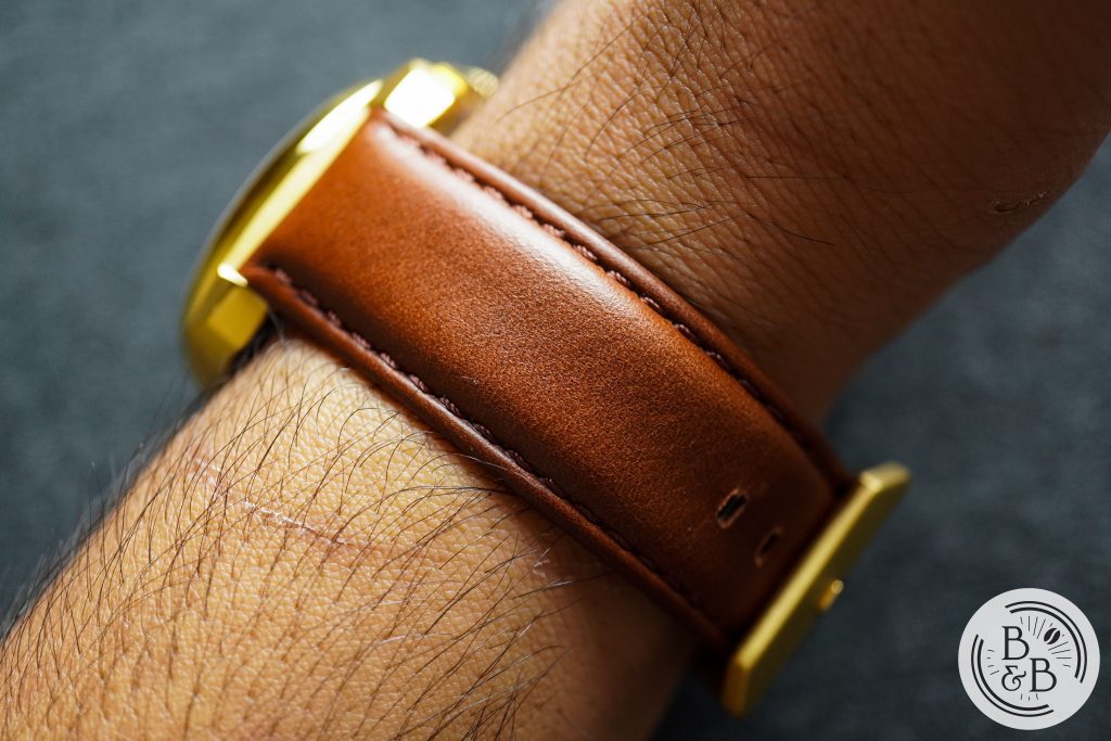
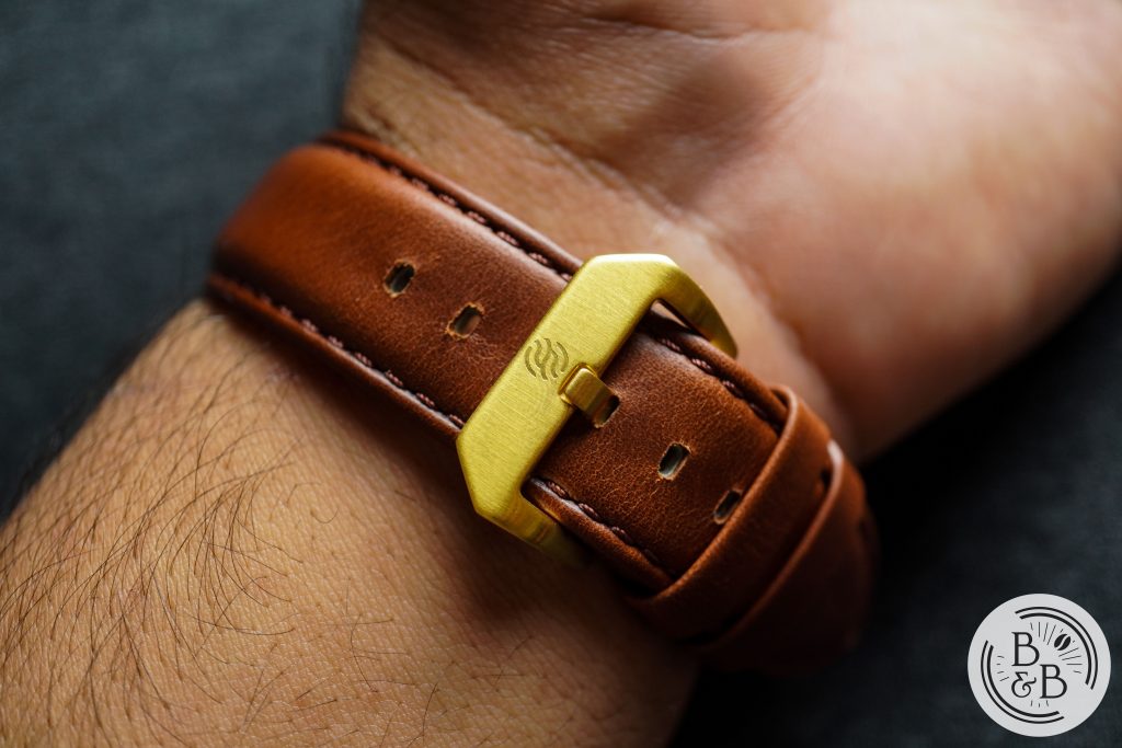
The case measures 40mm in diameter, 46.5mm from lug-to-lug and roughly 12mm tall. This particular model, The Mirage, has a gold colored case that is made of stainless steel and is mostly brushed, with a few polished accents. The case is somewhere between a tonneau (barrel) and a rectangle, and has all angular surfaces to echo that vintage design aesthetic. Along either side of the case, there is a polished bevel, or chamfer, that plays with light very nicely.
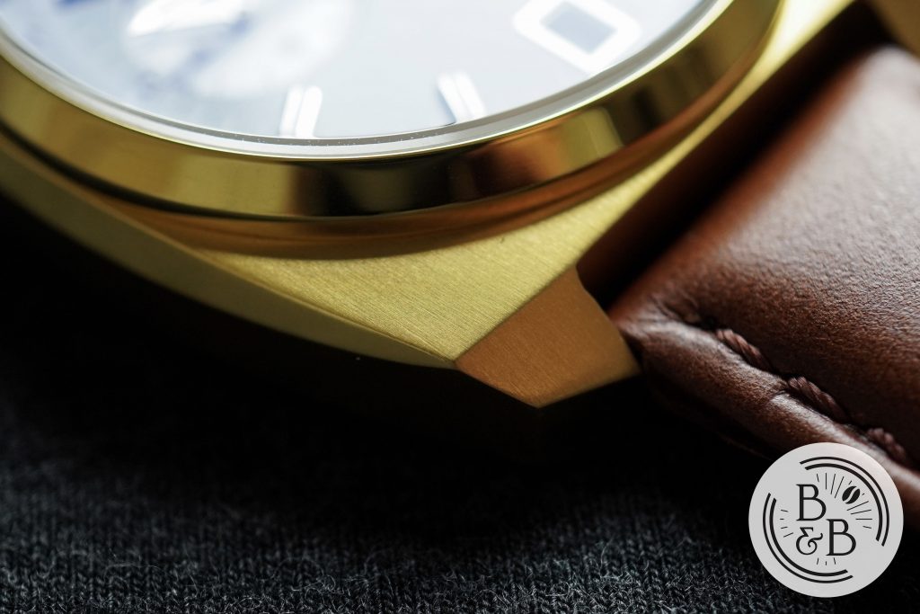
The lugs are angular and short, and slightly curve down towards the wrist. The lugs are not drilled through.
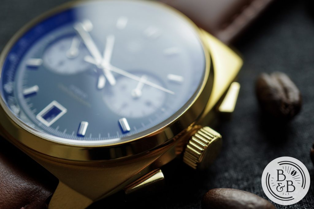
There is a fixed bezel section that is polished, and houses a slightly domed sapphire crystal with AR coating on both sides.
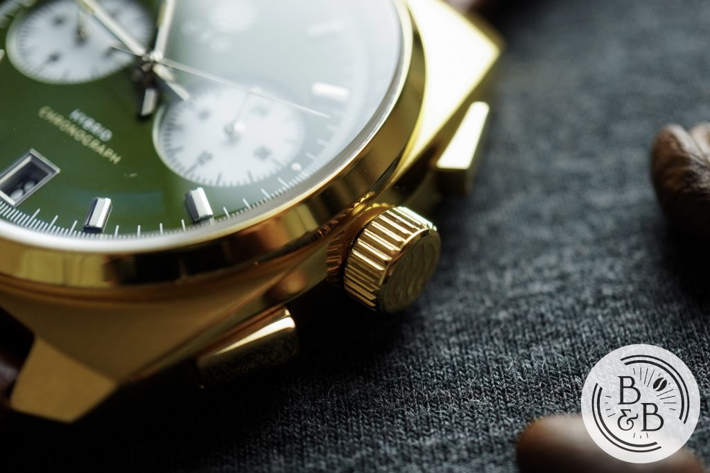
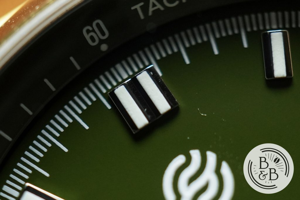
The two chronograph pusher buttons are also polished, and the action is very solid. The crown does not screw-down, but is signed with the brand’s logo, and is very easy to grip and operate. I didn’t notice any crown or stem wobble.
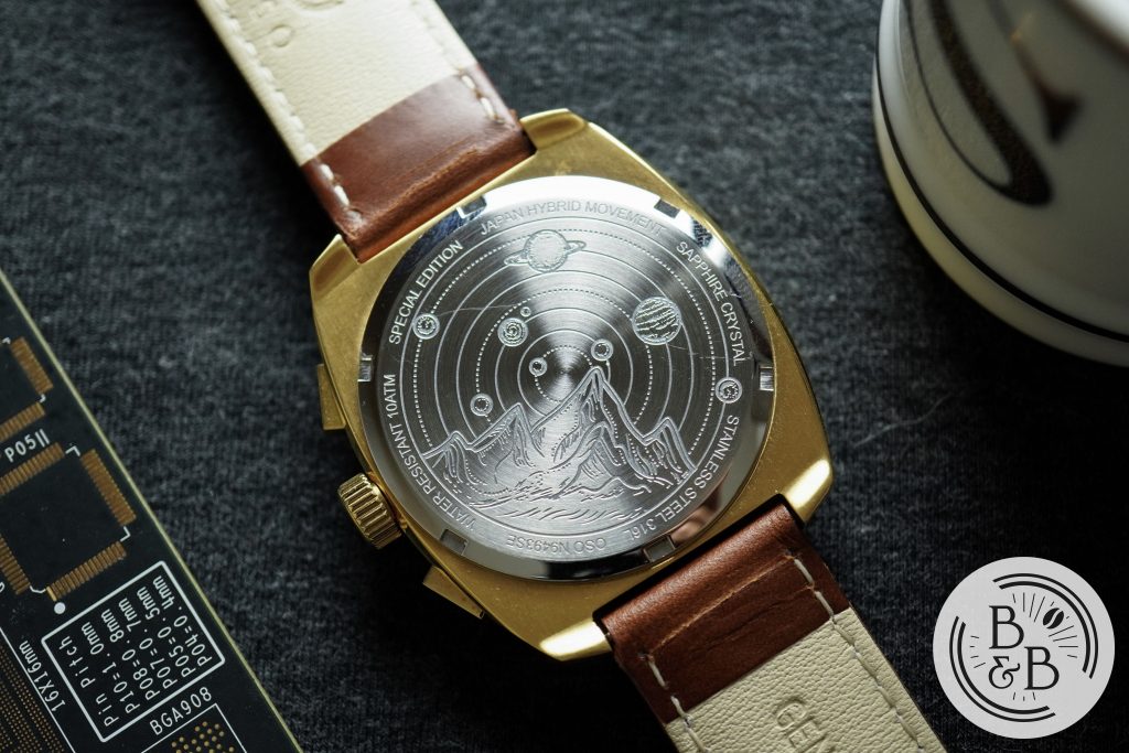
Flipping it over, you have a solid screw down case-back with a beautiful engraving inspired by the cosmos. This watch is rate for up-to 100m of water resistance, which is impressive considering the lack of a screw-down crown or screw-down pushers.
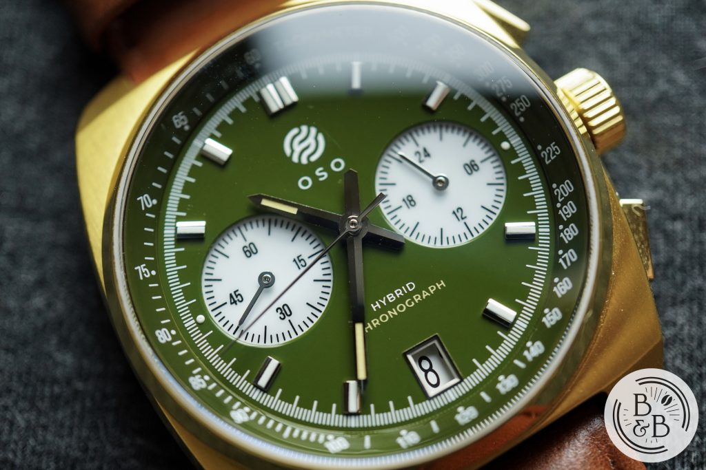
Dial
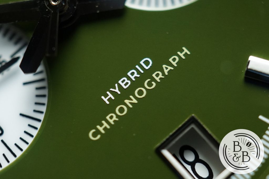
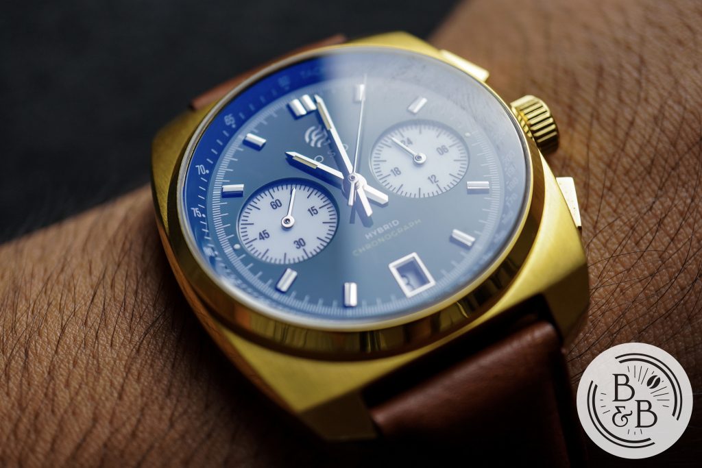
The OSO website lists the dial finishing as a smooth matte, but to me the base of the dial has a similar appearance to ceramic. states that the base of the dial is made of enamel, and I think it looks great! I opted for the green dial, but they offer two other options too.
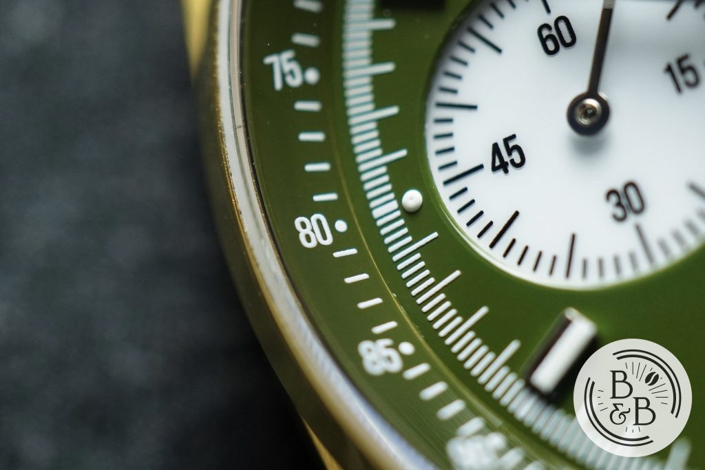
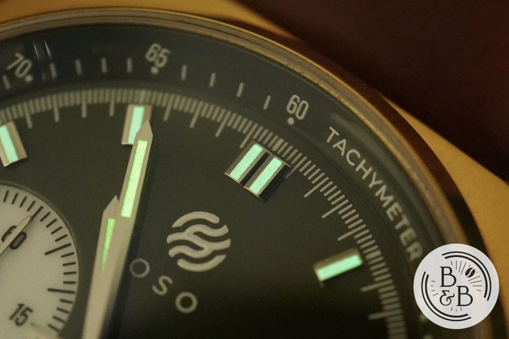
The outer most element is the tachymeter scale, which is printed in white on the green background. The quality of printing here is good and this entire section is easily legible.
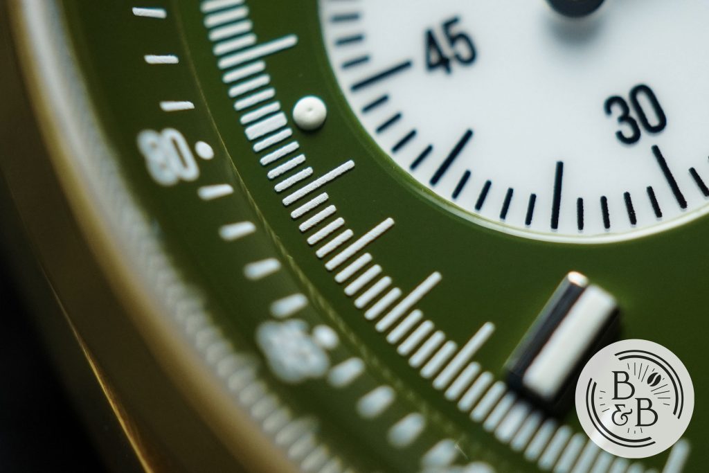
The next element is the minute/seconds marker ring, with a large tick for every second, and four small ticks for the milli-seconds. Again, the quality of the print is good for what this watch costs, but a bit grainy compared to higher end watches.
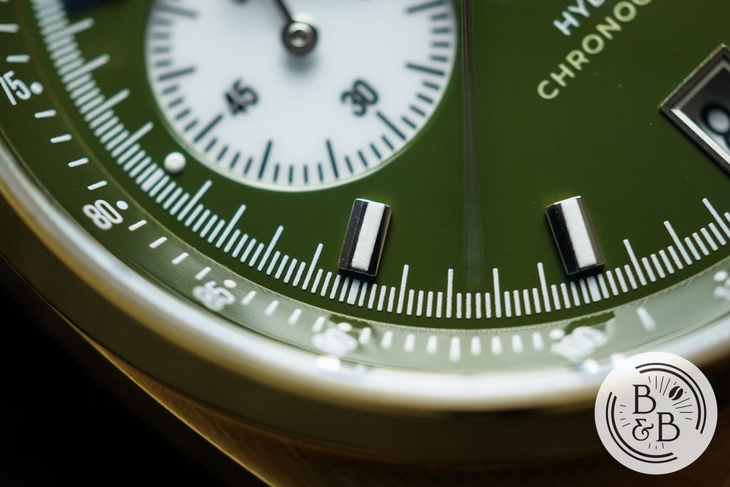
You then have applied stainless steel indices that are filled with C3 Super LumiNova. At the 3 o’clock and 9 o’clock, these indices are replaced by circular lumed pips because of the two sub-dials. I think this is a very smart design choice, and most brands would’ve skipped an index here altogether. Good job on this!
The finishing on the indices is alright for the price, but I wouldn’t say it is great. The lume isn’t cleanly filled on all the indices, and I noticed some dust/dirt on them too. But again, for the price I suppose you have to set your expectations accordingly.
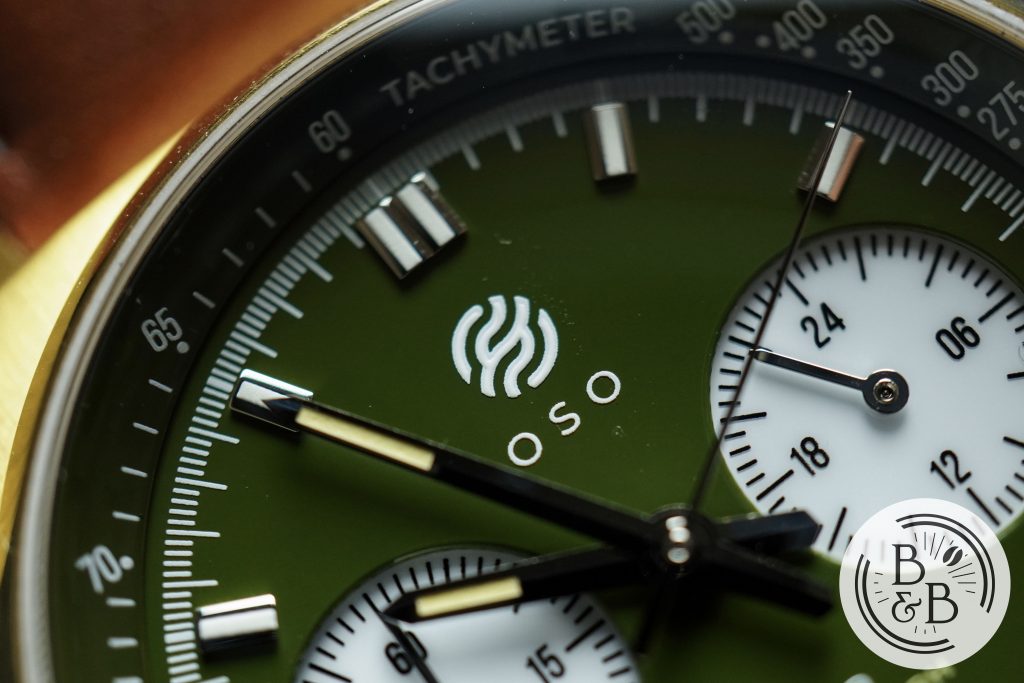
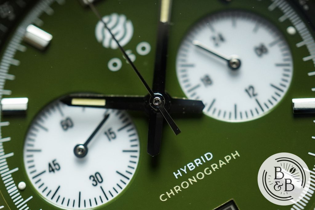
The brand’s name and logo is printed under the 12 o’clock index, and once again the printing is a bit grainy, but I also noticed a lot of dust/dirt in this area. I know not to expect perfection at $220, but this is unfortunate at any price point, and I hope that the quality control is improved on the final production units.
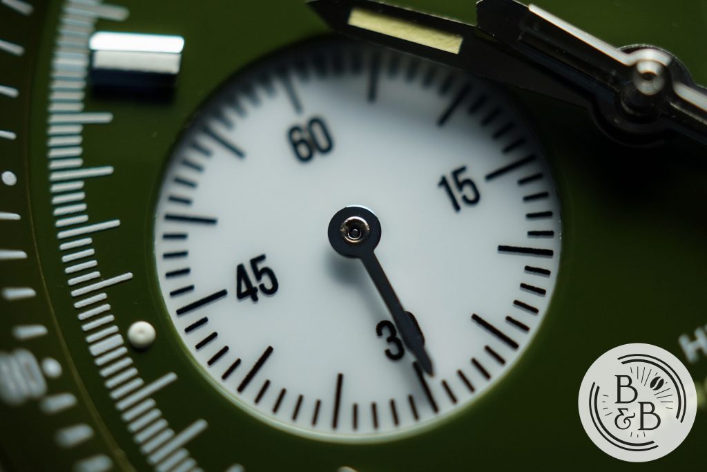
There are two sub-dials, at the 6 o’clock and 9 o’clock positions that are recessed into the dial. The printing on these is significantly better, and I love the contrast of the white sub-dials against the dark green dial.
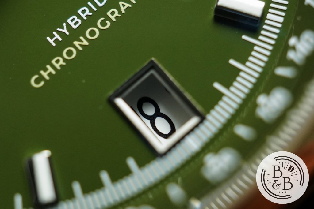
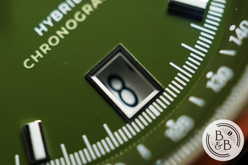
There is a date window at the 6 o’clock position that I think is a perfect choice for this layout. The entire dial maintains overall symmetry and the dial definitely contributes to that. The date wheel has a white background with black text and matches the sub-dials perfectly. The framed window is reasonably well finished too.
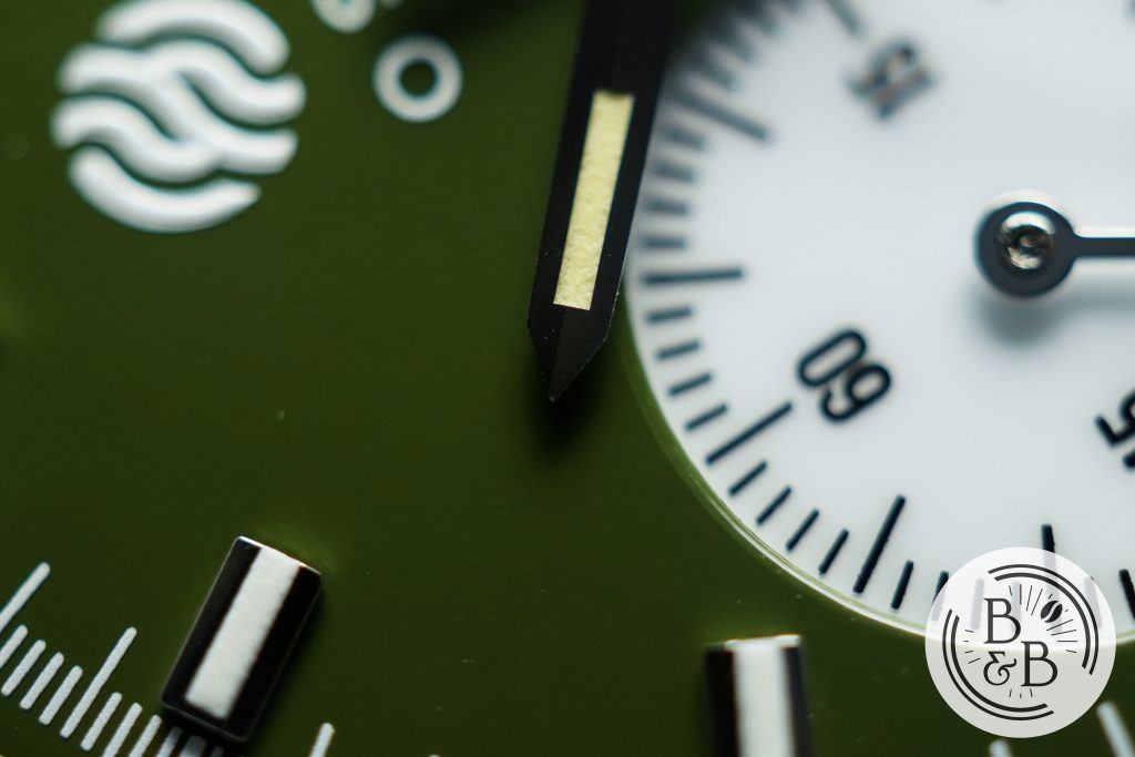
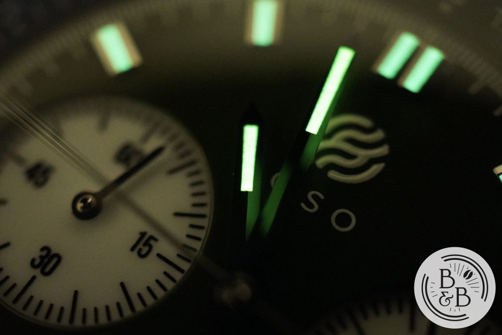
The hand set design is appropriately selected for a chronograph dial, and doesn’t draw much attention to itself. The hands are finished reasonably well, and well lumed too.
There’s a bit of dust and dirt on the hands, but this is somewhat expected from watches of this price. And none of this can be easily seen without a loupe or macro lens. Note: some of the dust in the above image is on the crystal and not inside the watch.
Overall, I like the dial design and I think the entire dial comes together very nicely. The colors are great and the symmetric layout works perfectly. My only concern is the finishing. At the very least, any dust/dirt that can be seen with the naked eye must be addressed. For the $220 price tag, the micro-particles can be tolerated.
Lume
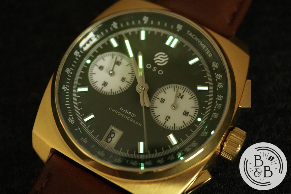
With most sports chronographs, I keep my expectations low where lume is concerned. I don’t expect elaborate lume design, and I don’t expect Seiko levels of brightness either.
I was pleasantly surprised to find that all the indices were generously filled with C3 Super LumiNova.
The hour and minute hands are also lumed, and all the lumed elements are fairly bright and hold their charge reasonably well. Don’t expect this to stay bright through the night, but it is still adequate.
Movement
This watch uses a Seiko VK64, a hybrid meca-quartz chronograph movement with a sweeping seconds hand. You should know that where affordable chronograph watches are concerned, I’m biased in favour of these movements over mechanical movements like the Seagull ST19. So for the $220 price-tag ($300 retail), this is more than appropriate.
The button action is excellent, and the movement works as it should. I didn’t bother tracking performance on this one.
On The Wrist
The 40mm diameter, 46.5mm lug-to-lug width and 12mm height make for a comfortable wrist experience.
It wears well on my 6.25″ wrist, but given the rectangular shape, it wears a bit larger than you would expect for a 46.5mm lug-to-lug width watch.
The case-back protrudes out of the case by roughly 1mm, and the weight of the watch is well distributed. No problems with comfort!
Concluding Thoughts
Overall, I think this watch is interesting. The case and dial design works well together, and at the $220 price-tag, this is a fun watch to wear. The dial is in need of better quality control, because many of the dust/dirt particles are visible to the naked eye. At this price, I don’t expect perfection, but after reviewing the Vandaag Schallmauer it is clear to me that excellent finishing is not exclusive to expensive watches.
The build quality and design is present, and the watch does have an interesting and unique personality. I like the meca-quartz movement and it helps match the case’s solid and robust build. I also like the overall wrist experience. So if the design appeals to you, you’re probably going to enjoy this piece.
Strap Change
Thanks for reading!