Disclaimer: I purchased this watch new and was not externally incentivized in any way to make this review. This review is in no way sponsored by Kurono Tokyo or any other entity. All opinions here are my own.
Contents
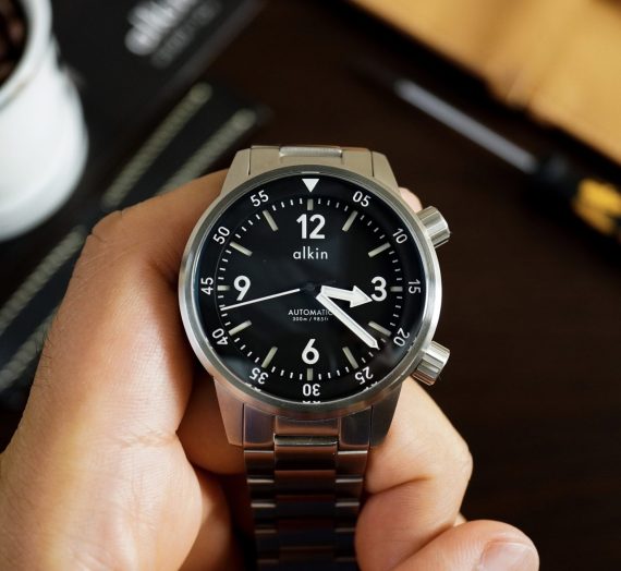
Toki
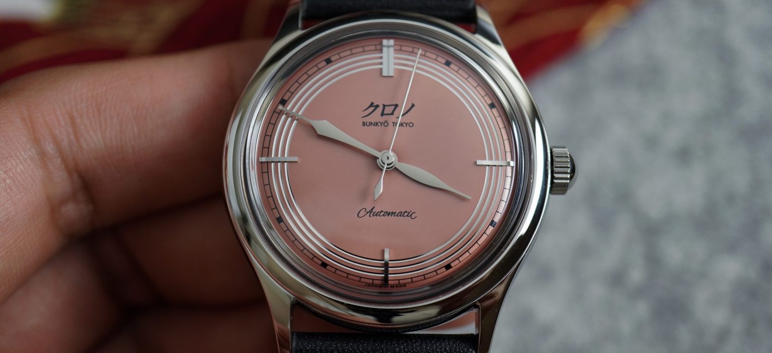
This is the third watch that I’m reviewing from Kurono Tokyo. Technically the previous two watches were from their Chrono Tokyo JDM label, but they’re essentially the same watches, and these two brands have merged since my first review. This is their anniversary model, called the Toki, named after the bird that inspired this beautiful and unique coral / pink dial. This watch was a timed release, and attracted lots of customers. These watches are still being delivered, and originally had a retail price of around $1800 USD.
This review will be a quick one, since the case and movement are identical to the Chrono Tokyo Bullseye that I previously reviewed, and I’d rather not go into those in detail again. So we’ll mostly focus on the dial, the experience, and some of my thoughts on the brand’s direction and future.
Let’s check it out!
Case
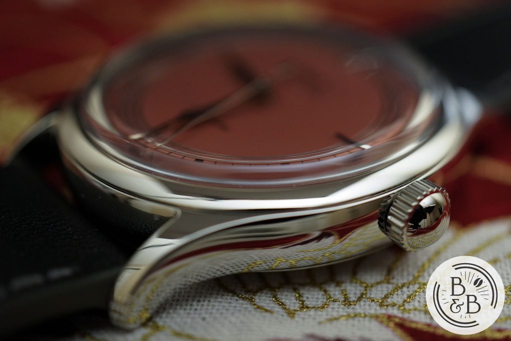
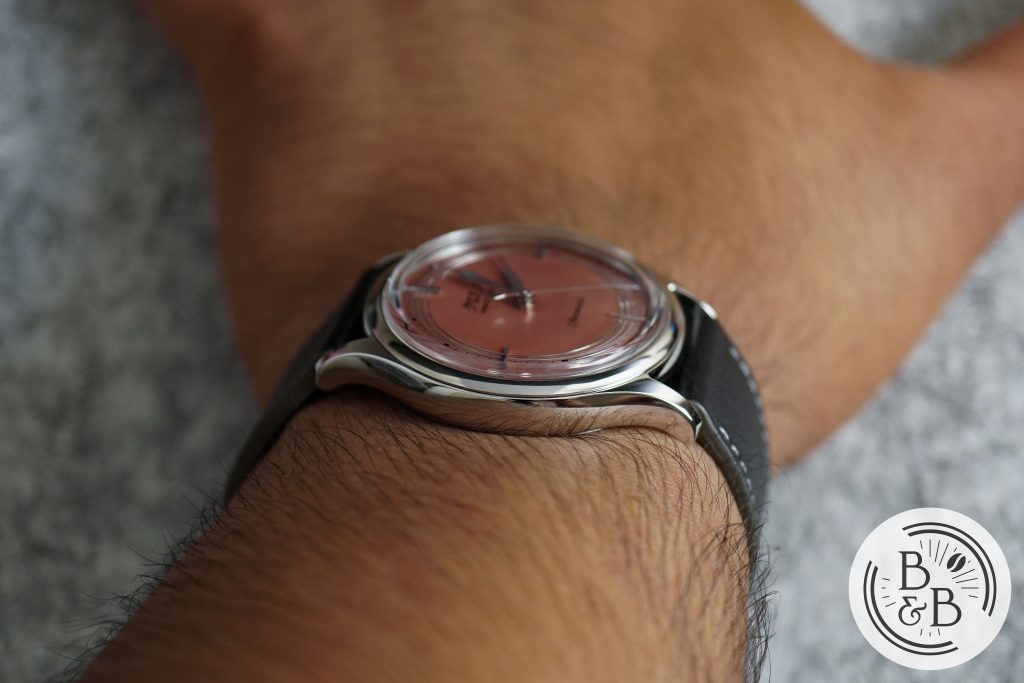
Similar to the Chrono Tokyo Bullseye, I measured this case to be 36.8 mm in diameter, measured from 4 o’clock to 10 o’clock, 42.85 mm from lug-to-lug and 10.5 mm in height. The case is identical in design and finishing, so I won’t go into this, but this watch reminded me of how amazing the case is, and what an excellent job was done with the finishing. A great design and a perfect execution, but as I’ll talk about later, I think it is time for Kurono Tokyo to retire this case and move onto something different and better.
Dial
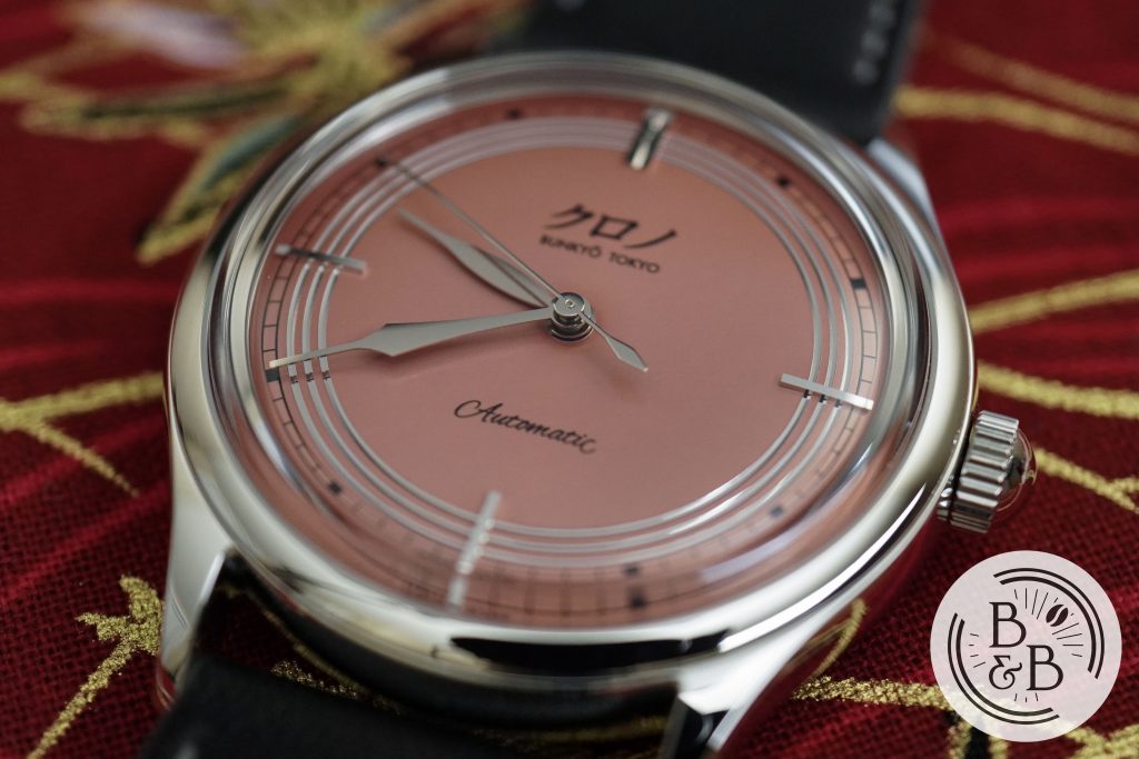
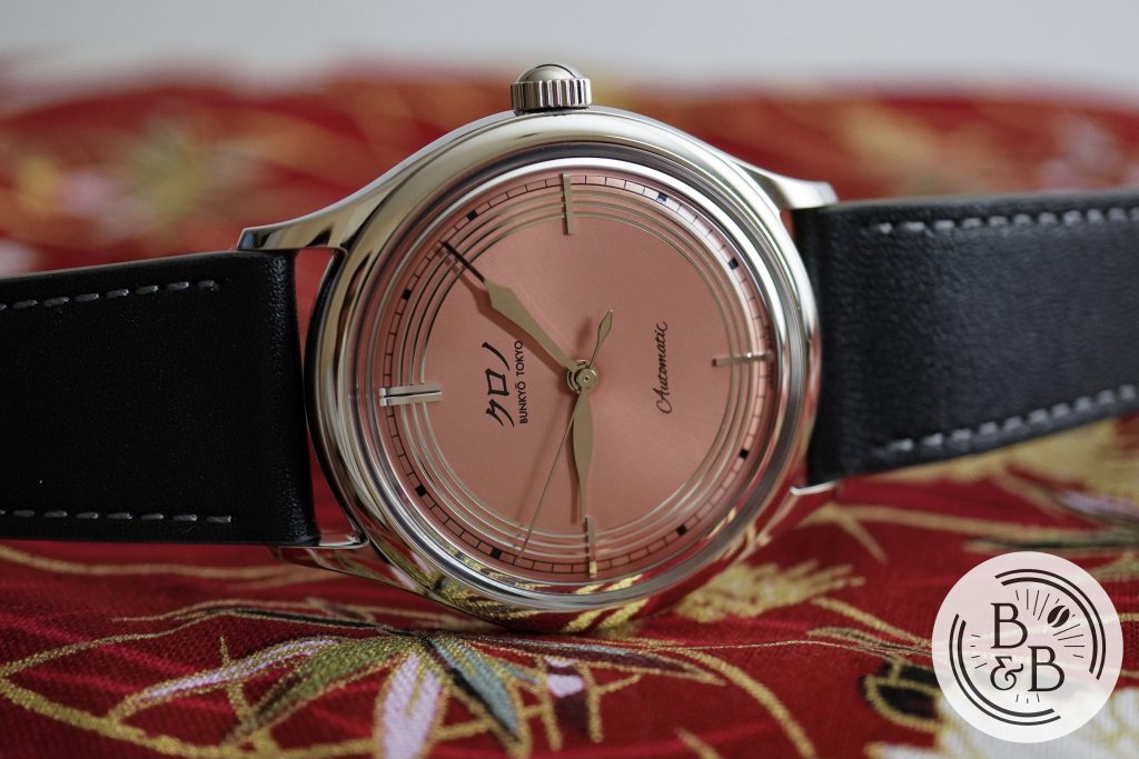
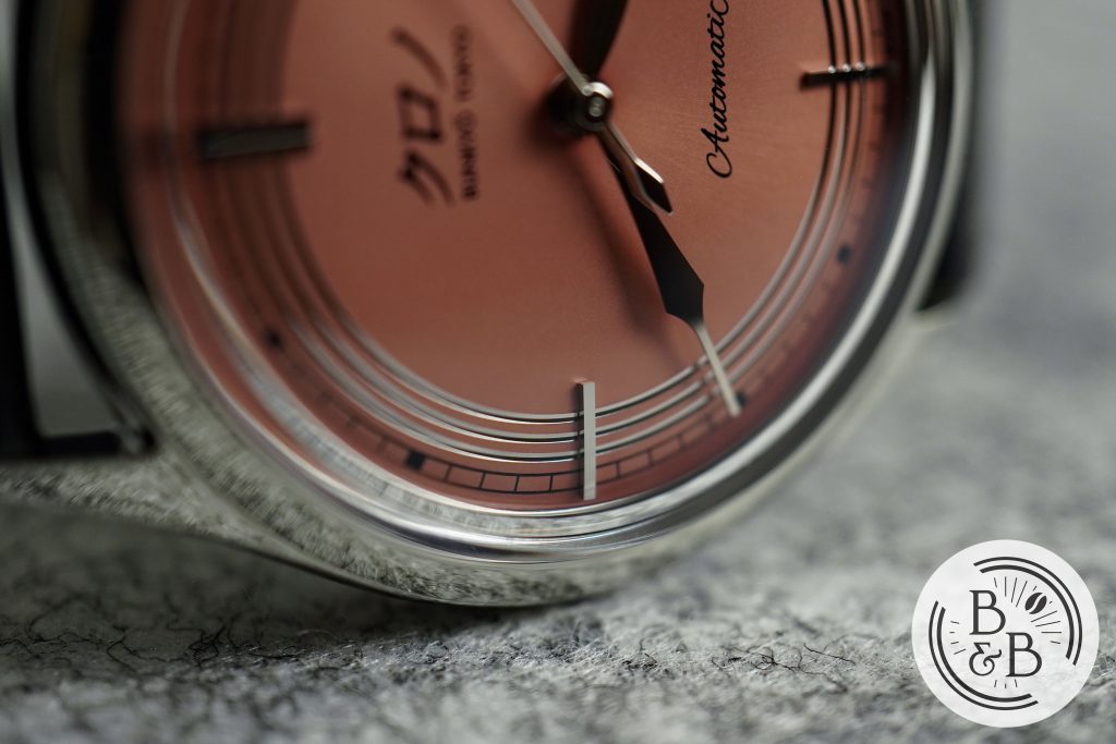
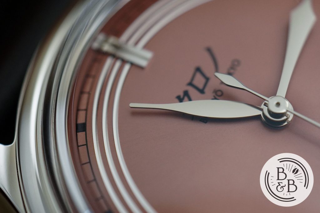
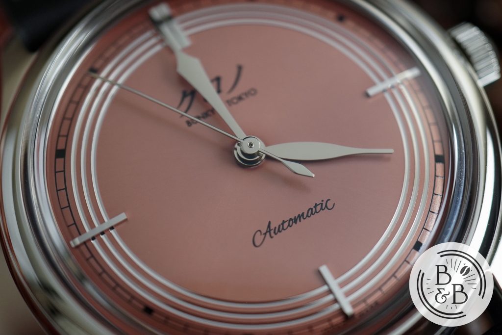
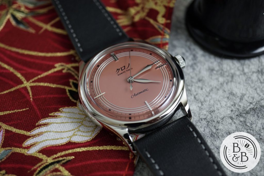
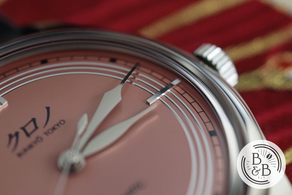
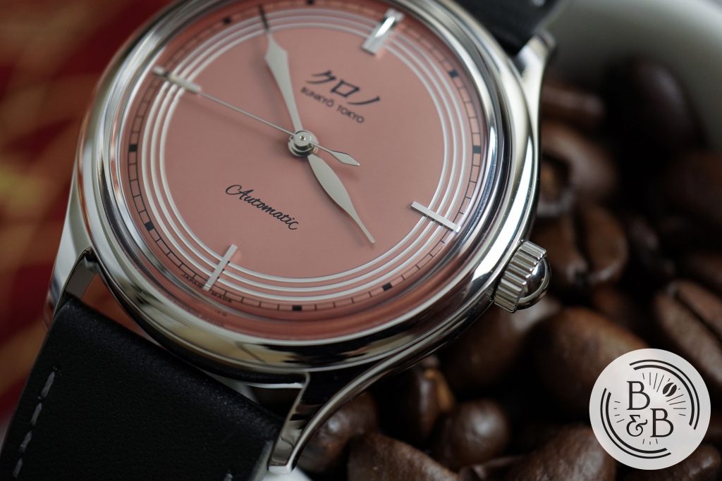
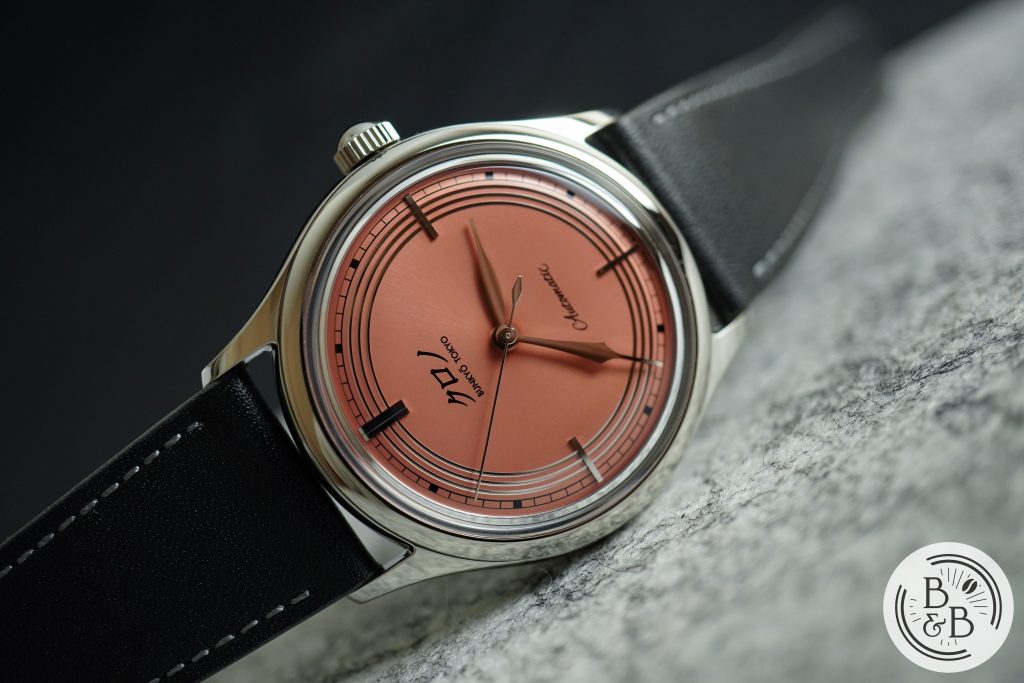
The dial on this watch is magnificent. I’ve always found Kurono Tokyo dials to be appealing, and it was the quality control on the last two watches that held them back. But this watch completely blew me away, starting with this very unique color, and all the way to the finishing and quality control of each dial element.
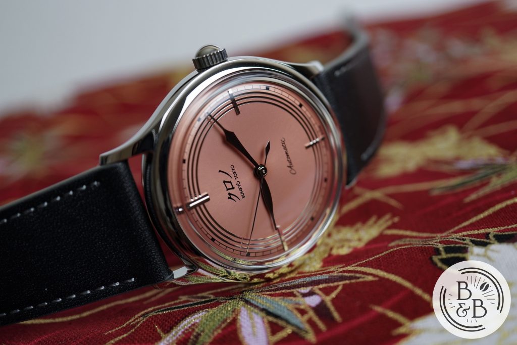
The base of the dial has a subtle sunburst texture that is only visible under direct natural light. The color of the dial is a combination of coral red and pastel pink, and the result is just stunning.
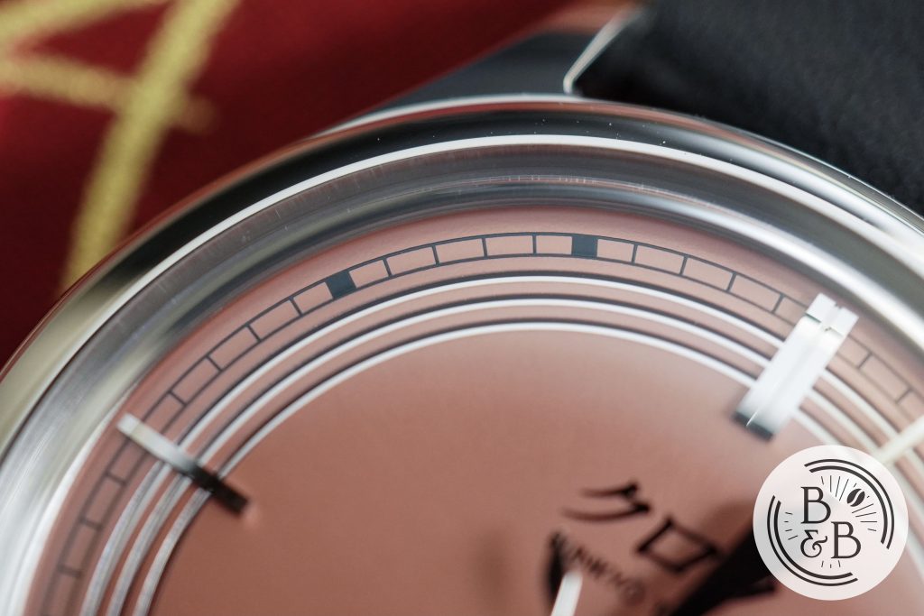
You have a printed black outer minute track that has a traditional railroad style design, with block markers for each increment of five. The printing quality is excellent, and it is easy to read.
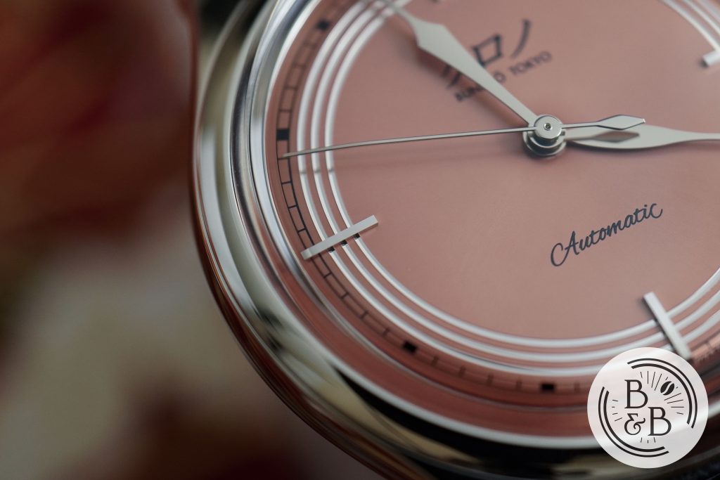
There are beautifully polished stainless steel indices at the four cardinal axes, with double batons at the 12 o’clock. These indices are mirror polished and reflect light from the rest of the dial. The proportions are great, and the height of these indices adds plenty of depth to the dial.
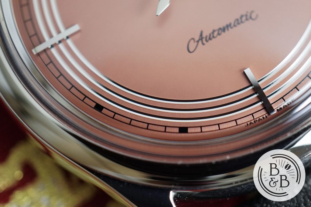
The indices are visually connected to each other via three concentric ridges that appear to be polished. This combination of indices and concentric rings is clearly inspired by the Art Deco design philosophy that Hajime Asaoka loves to draw from. The finishing and quality control on all these elements is exquisite.
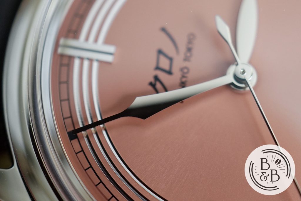
The hand set is beautiful in design, perfect in proportion and pleasing to the eyes. Both the hour and minute hands are rounded, and this adds character to the watch, and makes the hands look “fluid” under most lighting.
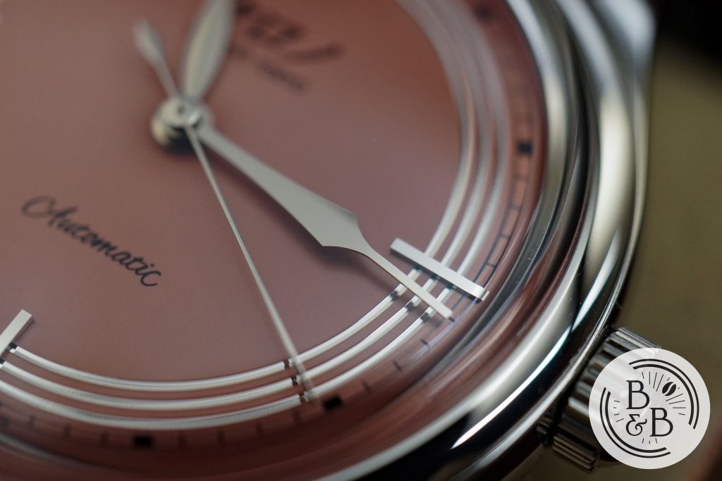
I think the proportions are excellent, with both the minute and seconds hands reaching the outer track, and the hour hand hovering over the cardinal indices.
The finishing is excellent, and the quality control on this dial is light years ahead of what I saw on the last two Chrono Tokyo watches. Overall, I’m completely sold on this color, this design, and their finishing capabilities. And with a dial this well designed and executed, I will already declare that I think this watch is worth the retail price.
Movement
The movement is the same Miyota 90S5 that they’ve been using in all their three-hand watches. I’ve talked about it in detail in my previous Chrono Tokyo review, but the gist of my thoughts are – it is perceived to be a cheap movement in an expensive watch, but they don’t have any better alternatives, given the fact that they want to keep the entire watch Japanese.
This watch is also primarily about design, so a great movement may not be a priority for them. The aspect of the movement that bothers me most is the wobble it causes given the sleek and lightweight case. If Miyota were to make an equivalent hand-wind movement, I think that would be perfect here.
On my time-grapher I observed roughly +9 spd in the dial up position and +10 spd in the crown up position.
On The Wrist
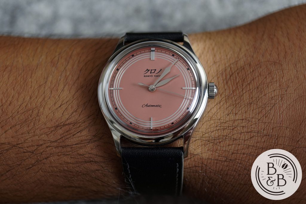
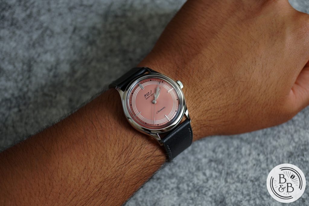
As you’d expect from a roughly 37 mm diameter watch, this watch wears well on my 6.5″ wrist. Even on my modestly sized wrist, this watch does feel small, but like a formal and elegant dress watch. The nearly 43 mm lug-to-lug width is appropriately chosen for the case and the height is just a bit over 10 mm.
If you have medium or large sized wrists, be warned that this watch does wear exactly how you’d expect a 37 mm dress watch to wear, and arguably a little smaller given the dial design.
Given my primarily casual lifestyle, I can’t see myself wearing this as an everyday watch, but instead as a dress watch for formal occasions only. Which is one reason why I believe Kurono Tokyo should add more diversity to their case designs, if they want to grow their customer base.
Concluding Thoughts
My closing thoughts here are more broadly about the brand and less to do with this particular watch. This watch is great, and it is nearly perfect where design and finishing is concerned. The presentation and branding is also spot on, making the ownership experience absolutely luxurious, which is exactly what you’d want from a watch like this. This is the best Kurono watch of the three I’ve reviewed.
But while this watch may check all the right boxes, I think it is time Kurono Tokyo moved on from this platform. At this point, we’ve seen the same dish cooked ten different ways, and I personally see it as dilution of this product line. There are only so many different colors you can play with before passionate enthusiasts get bored.
Personally, I wouldn’t buy more than one of this case style, however beautiful the dials. Because while there are some differences across the Bullseye, Toki and Grand Akane, they don’t actually stand out to me as three different watches. It’s just three new dials, and that’s getting stale, and I think the community is catching on too, based on the number of Kurono watches that refuse to move on Chrono24.
So, my hope is that Kurono Tokyo preserves these beautiful watches by doing them the respect of moving on from them, and onto other case designs. 37mm is a tough size for many, so perhaps a larger case would be a welcomed addition to the family? How about exploring some more interesting complications and movements? A moon-phase could perhaps fit in organically with their dress watch aesthetic. If Kurono Tokyo has any interest in being taken a bit more seriously than “just a design based brand”, perhaps a simple movement designed by Hajime Asaoka and outsourced to a third party manufacturer? I think Kurono Tokyo have what it takes to do creative and innovative things in this space, and I just hope they use that opportunity to further evolve their catalog.
Thanks for reading!