
Disclaimer: This watch was sent to me on loan to review and I was not incentivized in any way to make this review. This is in no way sponsored by Eza or any other entity. All opinions here are my own.
Contents
Eza
Eza is a micro-brand with German roots, a Dutch founder and a strong Swiss connection. The legacy brand Eza goes back to the early 1900s, and was located in the German watchmaking and jewelry town of Pforzheim, which still makes watches to this day. After falling off the map for 37 years, this brand has been recently revived by young watchmaker, Adriaan Trampe, who has a formal education in watchmaking and entrepreneurship. The brand currently operates out of Switzerland, but their watches are assembled in Pforzheim.
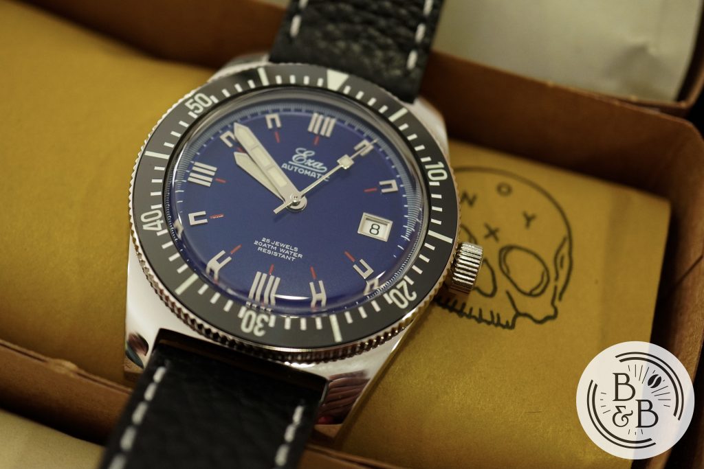
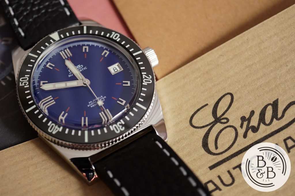
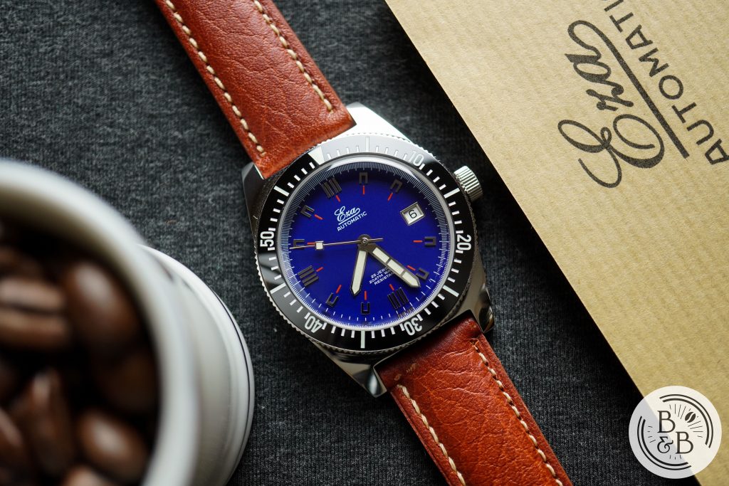
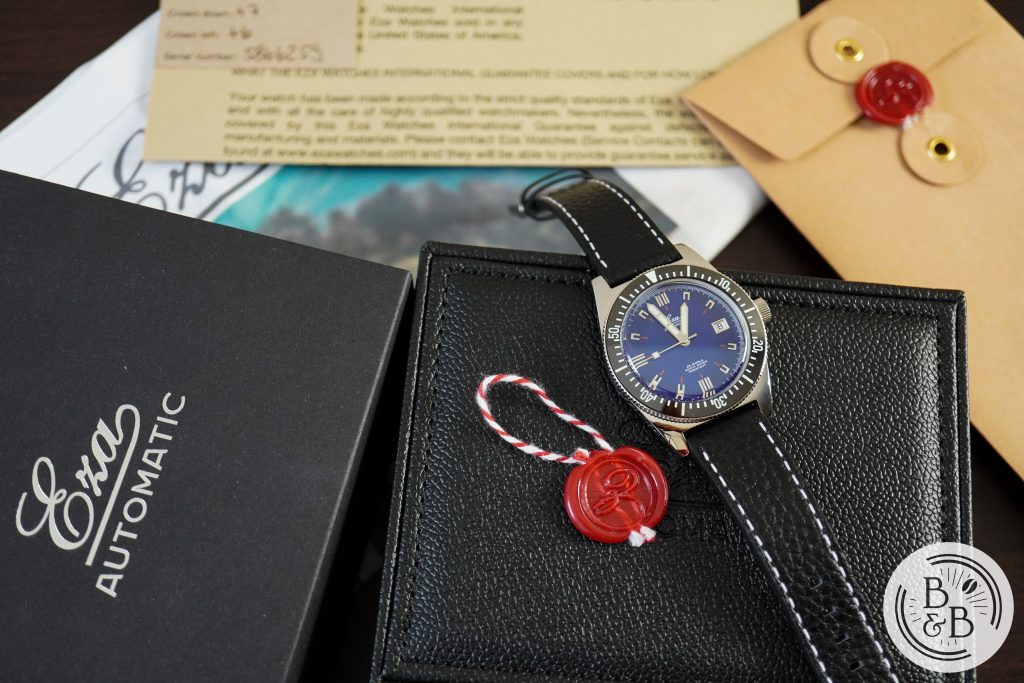
The watch we’ll be looking at today is the Eza 1972, a re-issue of an original Eza design from the 70s, but slightly re-imagined for the present day audience. I wasn’t very familiar with this brand, or this design, and I had only heard of their Sealander watch prior to this. But the moment I took this watch out of it’s well presented packaging, I was shocked at how convincing this watch is. Putting the dimensions aside, it looks like a New Old Stock (NOS) piece from the 70s, and I think that is amazing and also very difficult to achieve.
I managed to find a few photographs of the original dive watch from the 70s, and I recommend taking a look at this blog post, and this Instagram post. While Eza does offer an even more accurate reissue, called the 1972 Limited Edition (100 units) in a 36mm case, with a plexiglass crystal and 30m of water resistance, I’m a bit more partial to the regular 1972 because of it’s more modern dimensions and functionality.
Let’s check it out!
UPDATE: Pricing for Eza watches has increased as of May 11th 2021, and the Eza 1972 is now $995 USD.
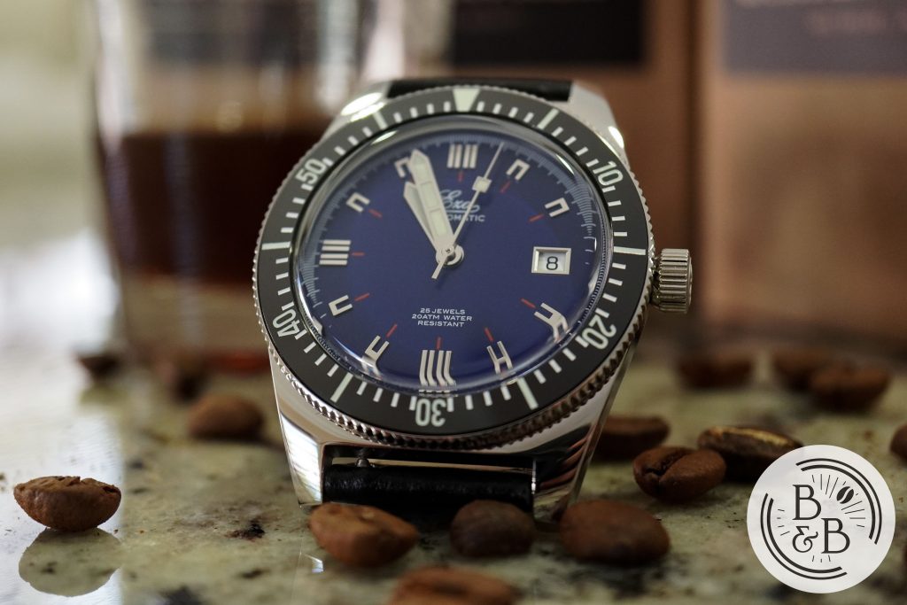
Case
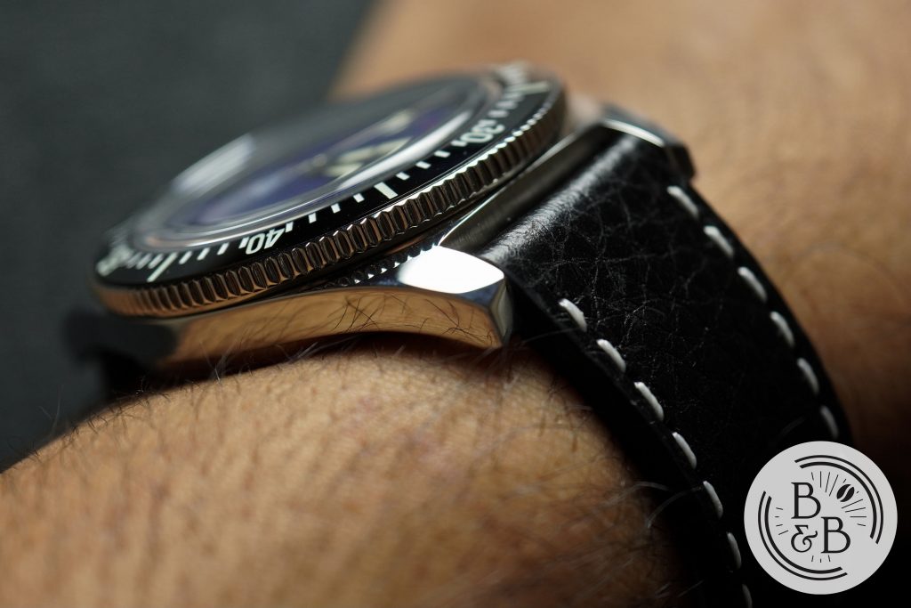
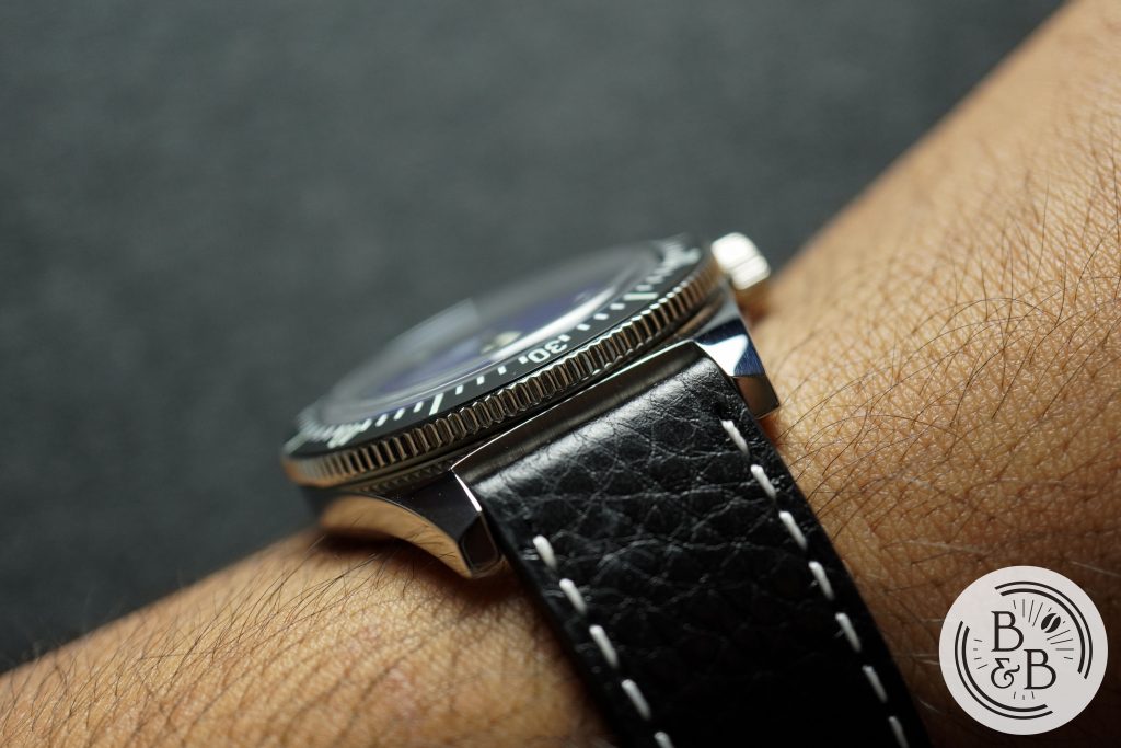
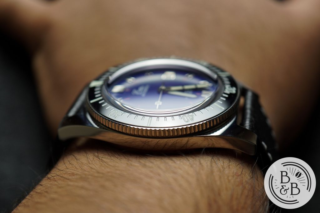
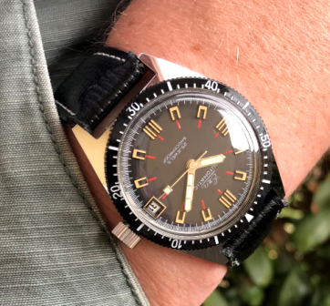
The case measures just under 40mm in diameter, 50mm from lug-to-lug and 12mm tall (closer to 10.5mm if you ignore the protruding crystal). The case is entirely polished, like the original, and the polishing is very well done. As you’d expect, with great polishing comes great fingerprint magnetism, so if this bothers you, keep a microfiber cloth close-by.
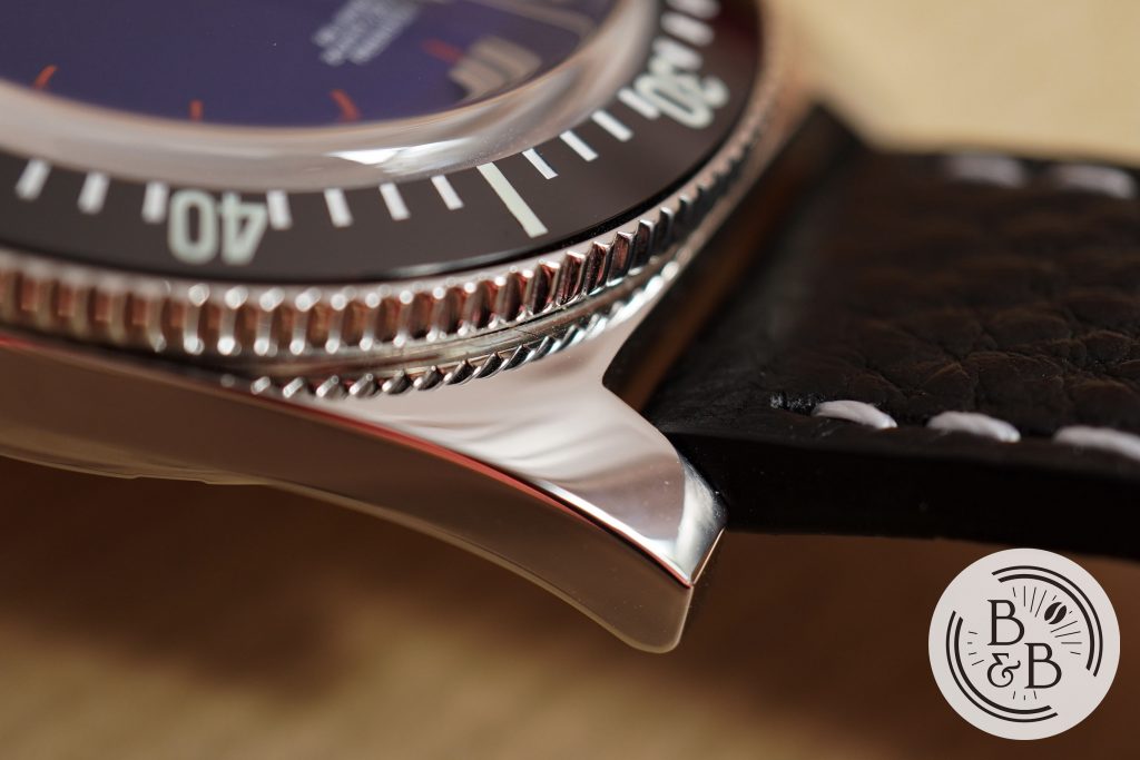
The lug width is 20mm, and the case gently tapers into two lugs that dramatically curve down towards the wrist. This helps the 50mm lug-to-lug width work for smaller wrists such as mine.
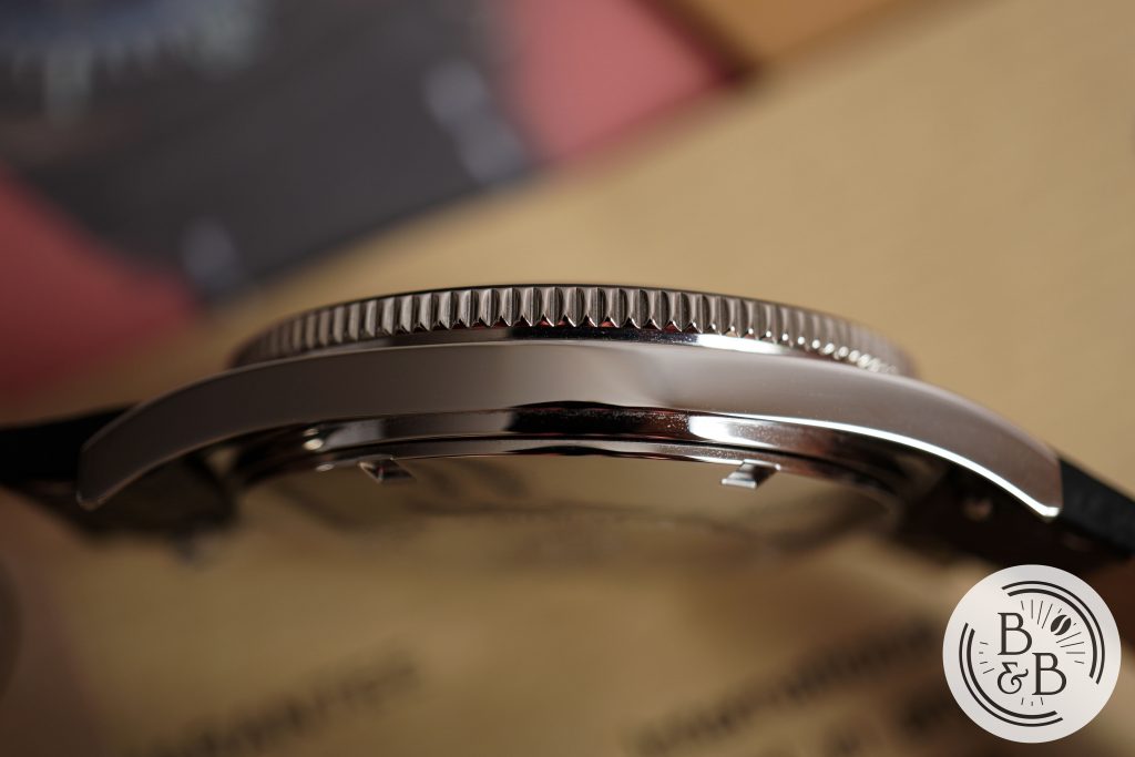
I really like this slim and curved mid-case section. It makes the overall 12mm height feel significantly shorter.
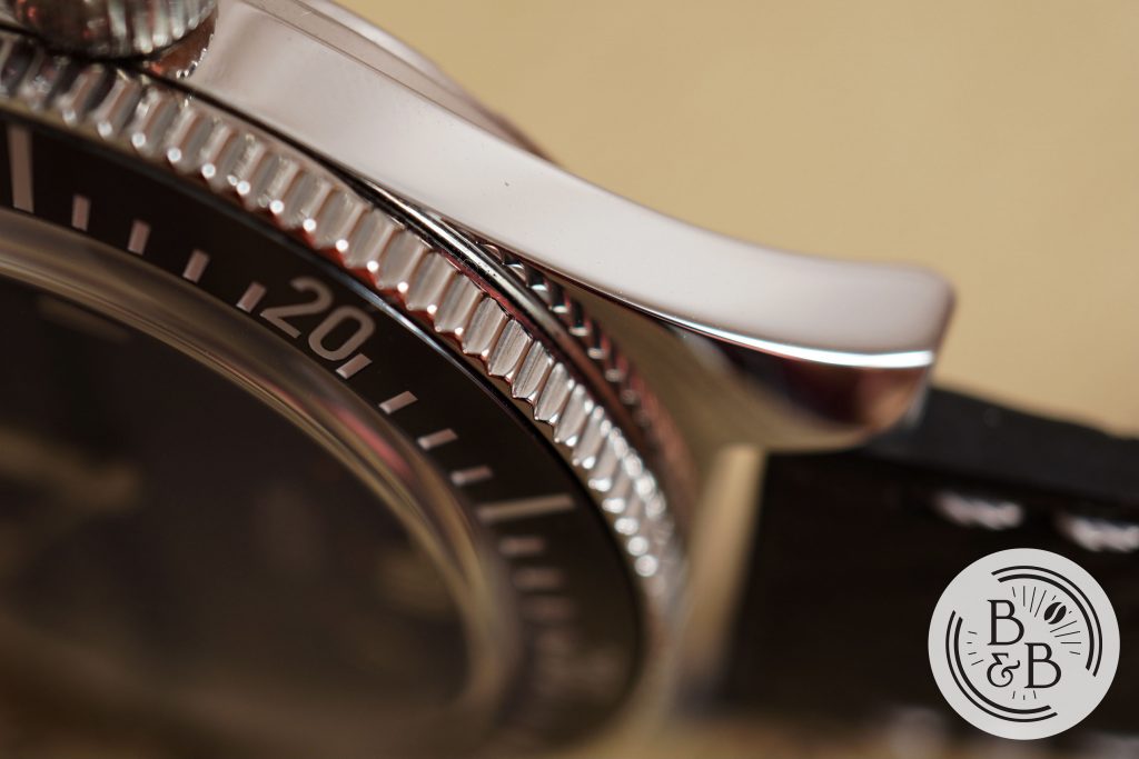
There is a 120-click unidirectional bezel with a glossy ceramic insert. The bezel grip is good, and the action is solid. There isn’t any back play here. The bezel does have lumed elements.
The bezel seats a boxed sapphire crystal that does an excellent job of giving you a vintage plexiglass experience, without actually using plexiglass. There is a good amount of distortion at the edges, but the seconds track is still easily legible. I’m aware of all the other benefits of plexiglass in delivering a good vintage watch experience, but I prefer this.
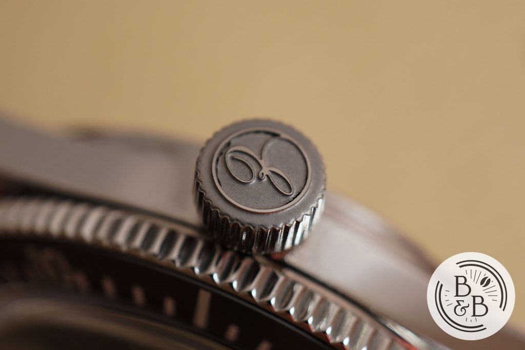
You have a screw-down crown at the 3 o’clock position that is very easy to grip and operate. The crown screws directly into the case, and there isn’t any crown or stem wobble. The signed crown top appears to be media blasted instead of polished.
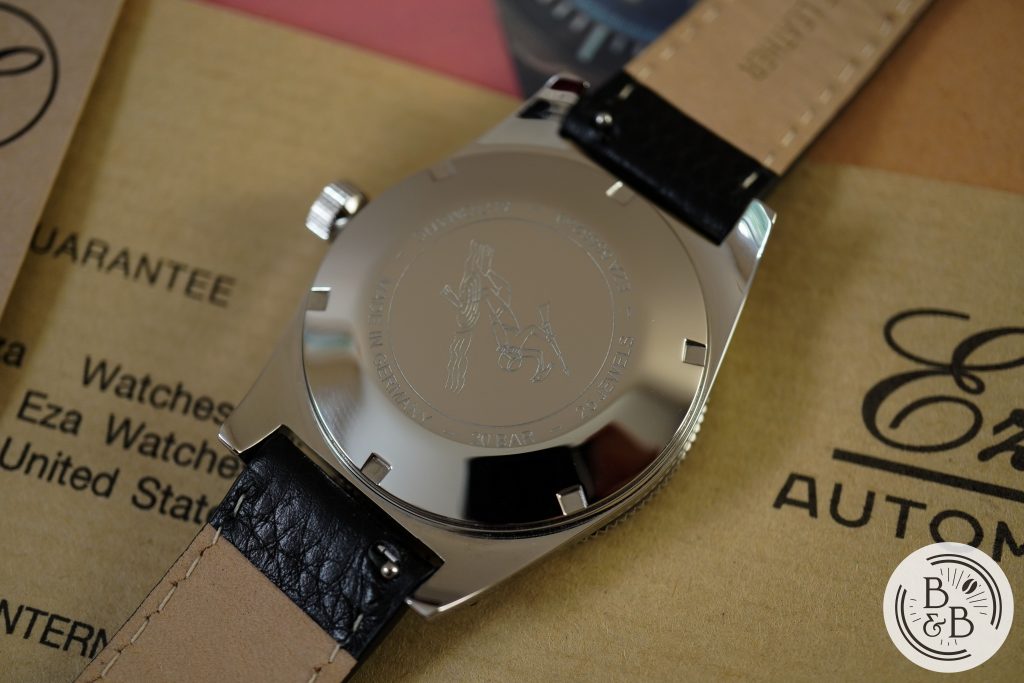
Flipping it over, you have a solid screw-down case-back that is extremely simple; but also convincing. There is a light engraving of a diver, and some specs at the edges.
If you put aside the dimensions, this is a very convincing vintage skin diver case. The sapphire crystal is a welcomed modification, and the 200m of water resistance (instead of 30m on the original) is very much appreciated too.
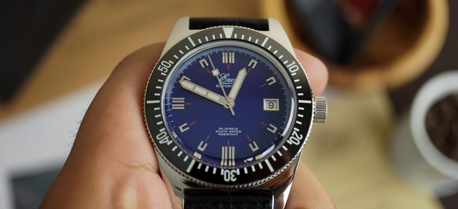
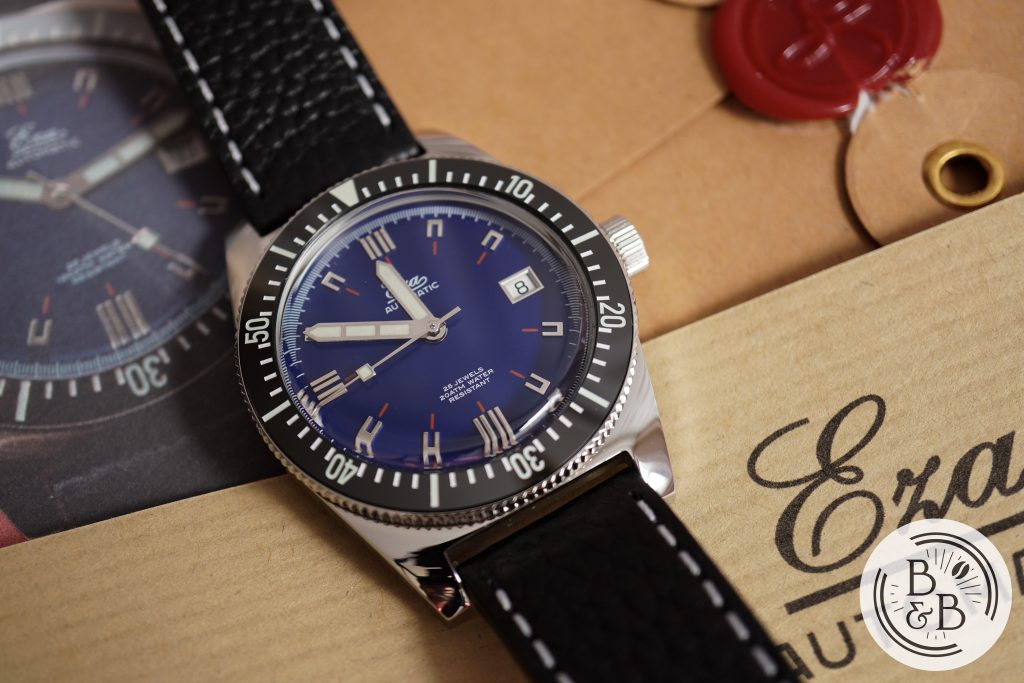
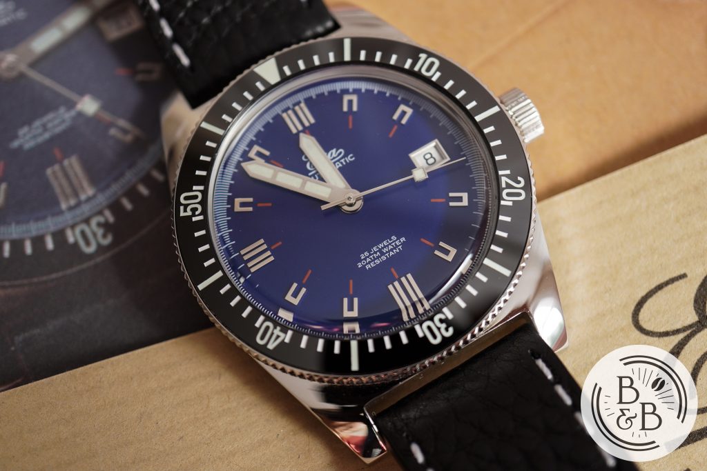
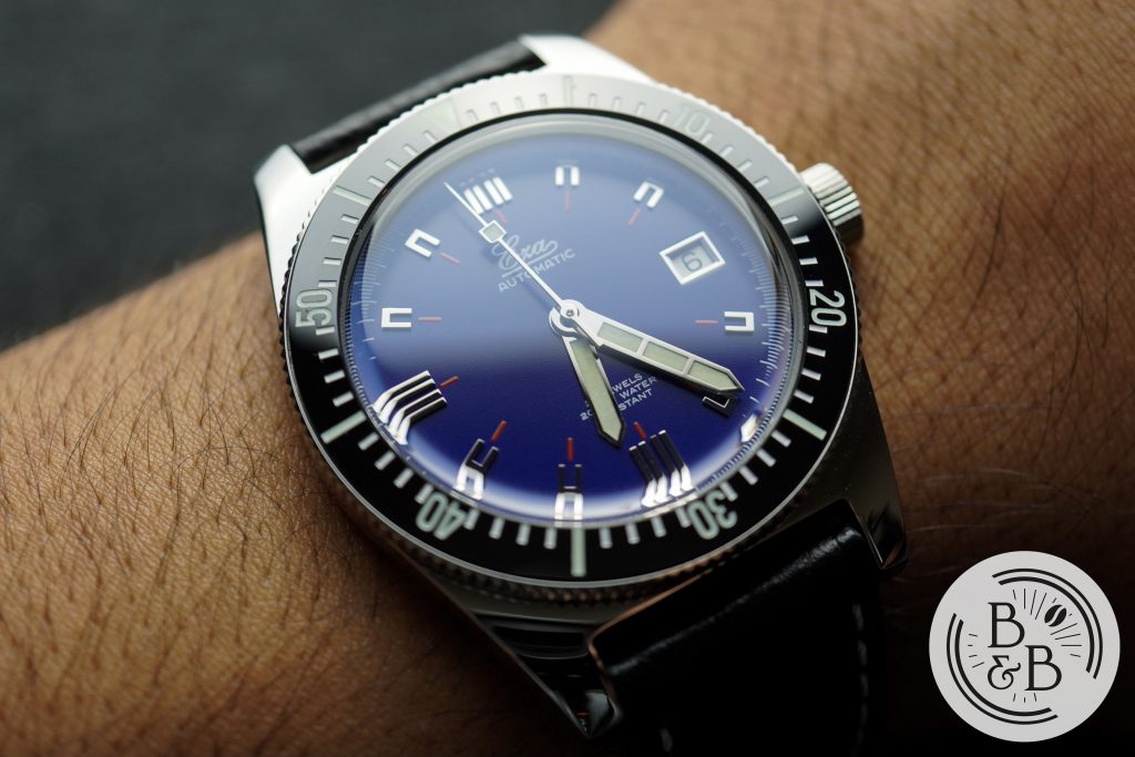
Dial
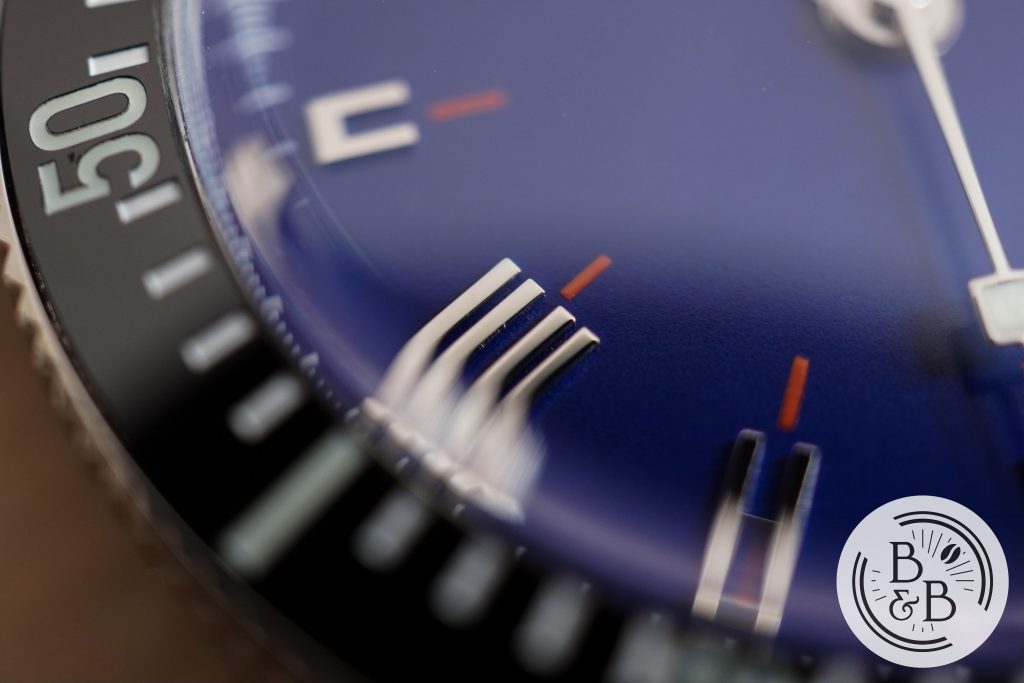
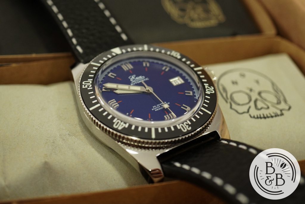
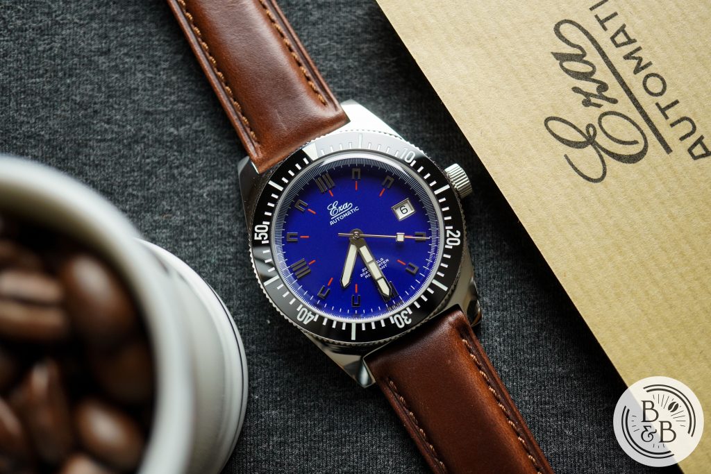
I requested to review the blue dial 1972, but they also make this in a black dial option. I’m not entirely sure if a blue dial was offered in the 70s, but either way, this shade of blue is a perfect choice. And the matte base is well finished.
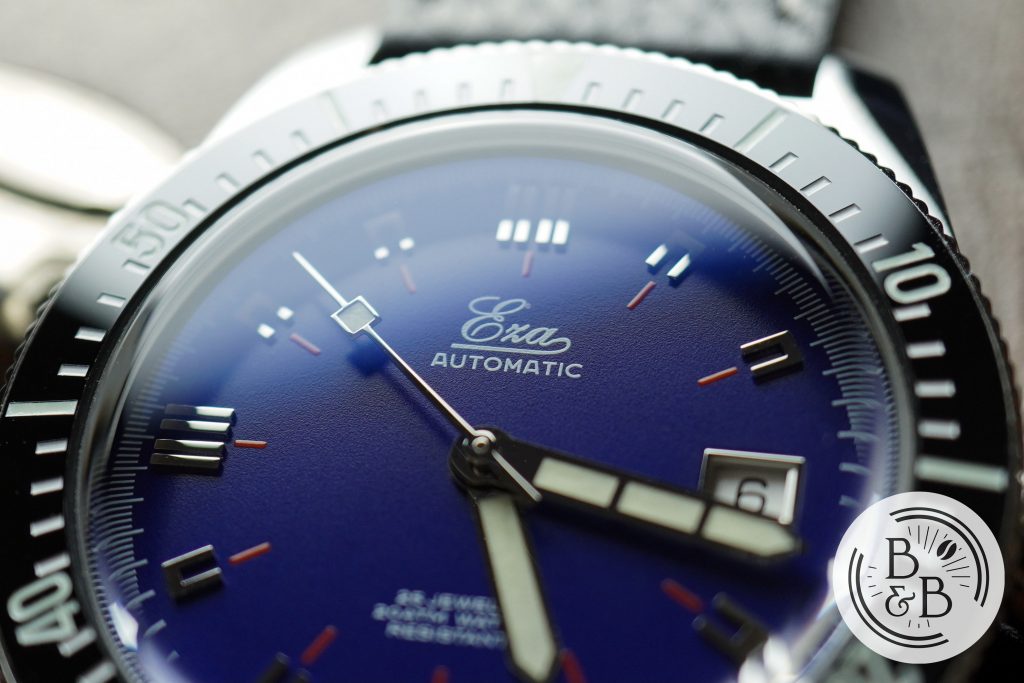
There is a printed outer minute and seconds track, using a combination of short and medium sized white ticks. The quality of printing is excellent, and I didn’t notice any blurring or smudges.
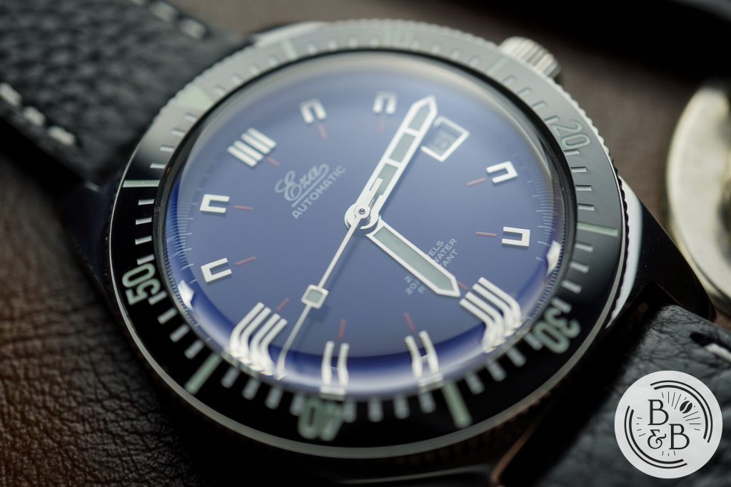
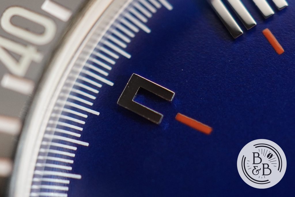
You then have a sequence of very unique applied indices, which gives this dial all of it’s interesting personality. I believe the watch from the 70s had these indices applied on a small plate, which was then applied onto the dial. These indices are applied directly onto the dial, and I very much prefer this.
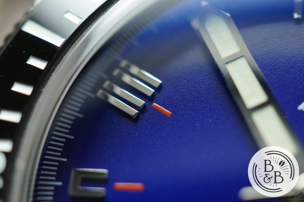
The indices at 12, 6 and 9 o’clock have four stick indices that are in two sets of two. The finishing is very good on these.
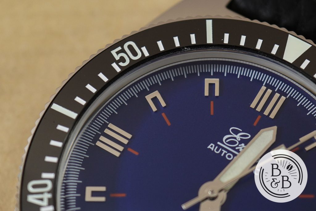
The rest of the indices have a squared off ‘U’ shape. All the indices have accompanying printed red ticks next to them. These hints of red across the dial gives it a lot of character, and works well against the blue dial. The finishing on the indices is very good for the money. I did notice a few micro-particles on a small fraction of them. But I believe this to be acceptable for what this watch costs.
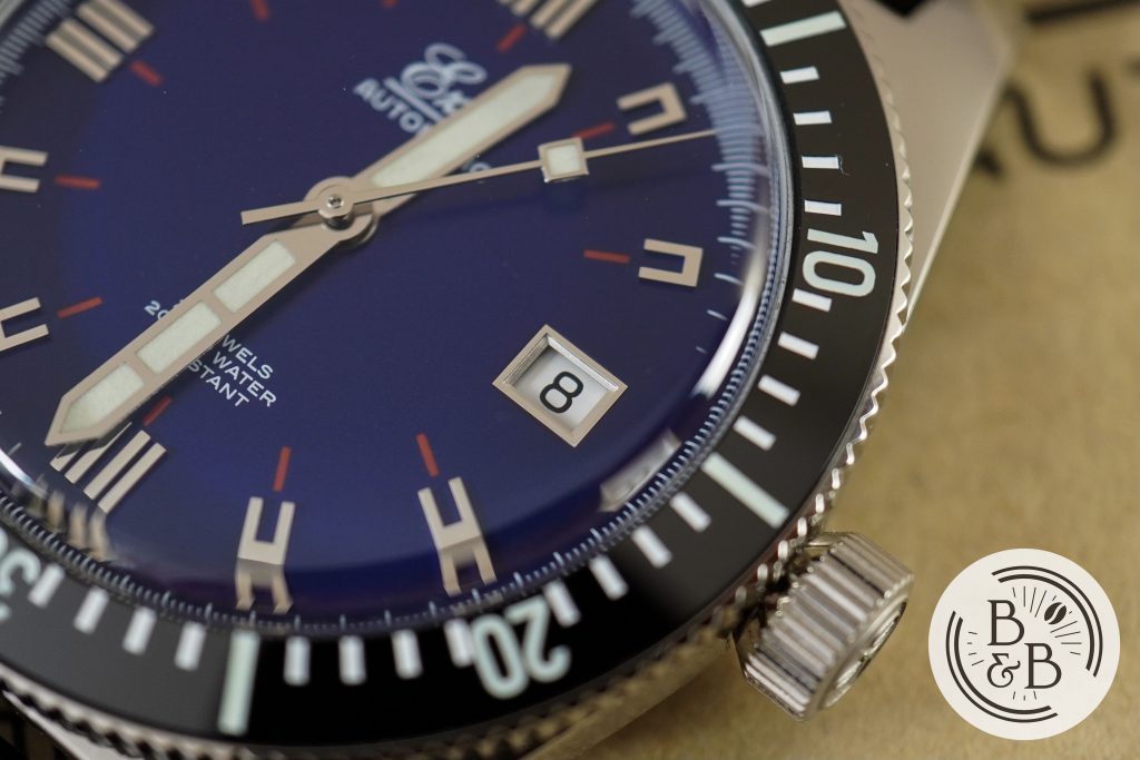
You then have a framed date window at the 3 o’clock position, with a white date wheel and black text. This is true to the original, so I’m willing to let this slide. If this wasn’t a re-issue, I would prefer the date window to be at the 6 o’clock position, or have a more subtle date wheel color that is matched to the rest of the dial. Unlike the original and the limited edition re-issue, the date window doesn’t have an accompanying red tick. I believe this is because of the movement’s date wheel placement and size relative to the dial size. But the design remains well balanced and I don’t mind this.
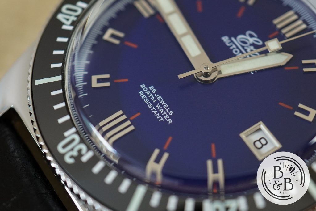
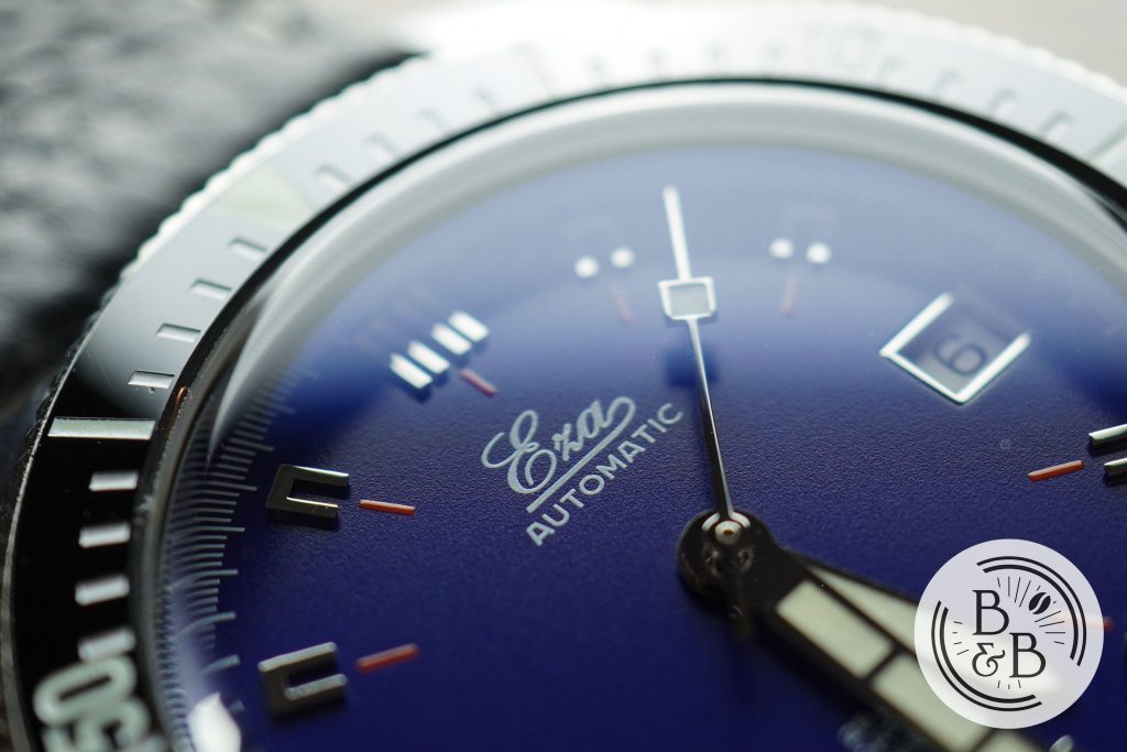
The brand’s logo is under the 12 o’clock, and a few tech-specs above the 6 o’clock. I really like the choice of font that they used here, and it is definitely era appropriate.
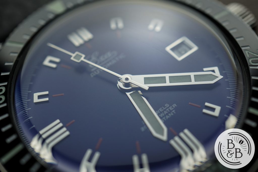
The hand-set follows the original design closely, but is appropriately re-scaled for this case, as well as modern preferences. The hands are very generously filled with lume, and are polished. The finishing is great, and the proportions are excellent.
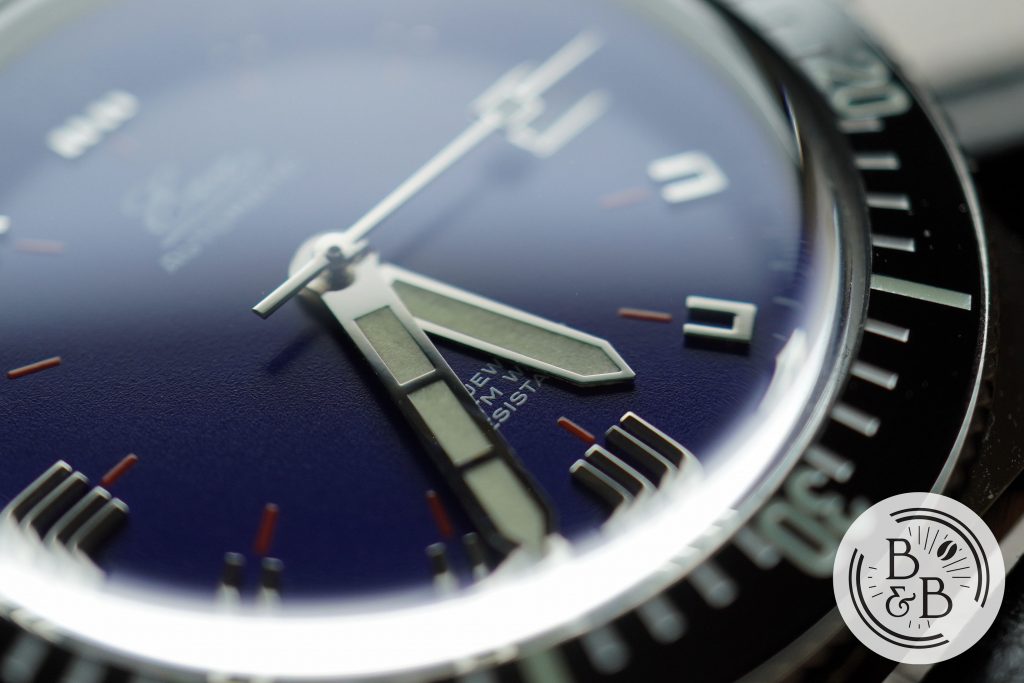
Unlike the original, the hour hand reaches over the red ticks, and the minute hand over the indices. But this is a much more legible design, and I gladly welcome these changes. What really impressed me is how close the hour hand is to the base of the dial. It looks like it is resting on the surface of the dial, and I think that’s awesome.
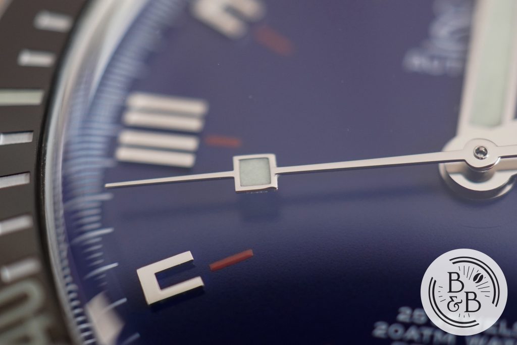
The seconds hand was originally stunted, and only reached the red ticks. But here the seconds hand makes it’s way all the way to the seconds track. I would’ve liked if the seconds hand was just 1mm longer, but I’ll take it.
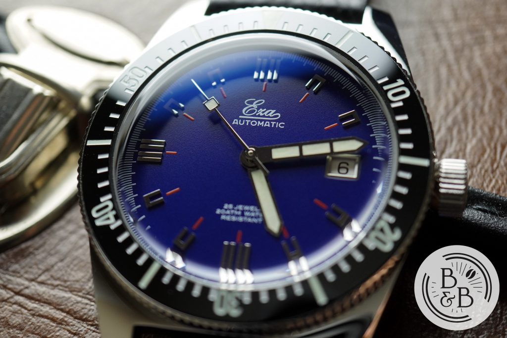
Overall, I’m sold on the dial. All the changes made to the original, I see as improvements. I love how unique this dial is, the unconventional hour indices and unexpected red markers.
Lume
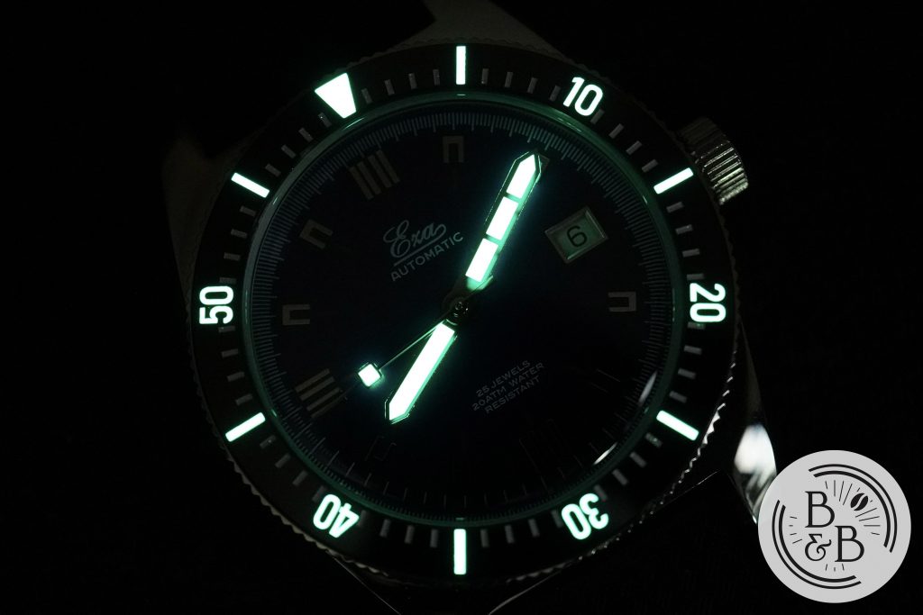
While the unique applied indices lack lume, the well lumed bezel provides enough of a visible reference in the dark. The hands are also very generously lumed.
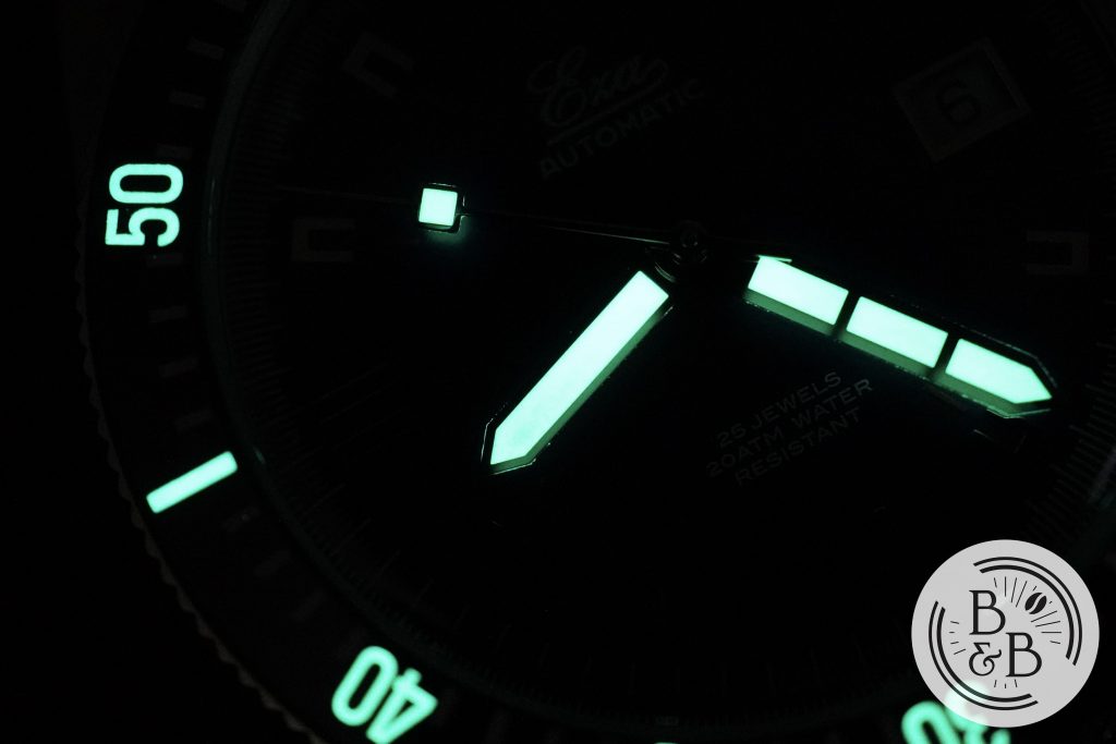
All the lumed elements are using C3 Super LumiNova, and appears to be better than standard grade, maybe grade X1?.
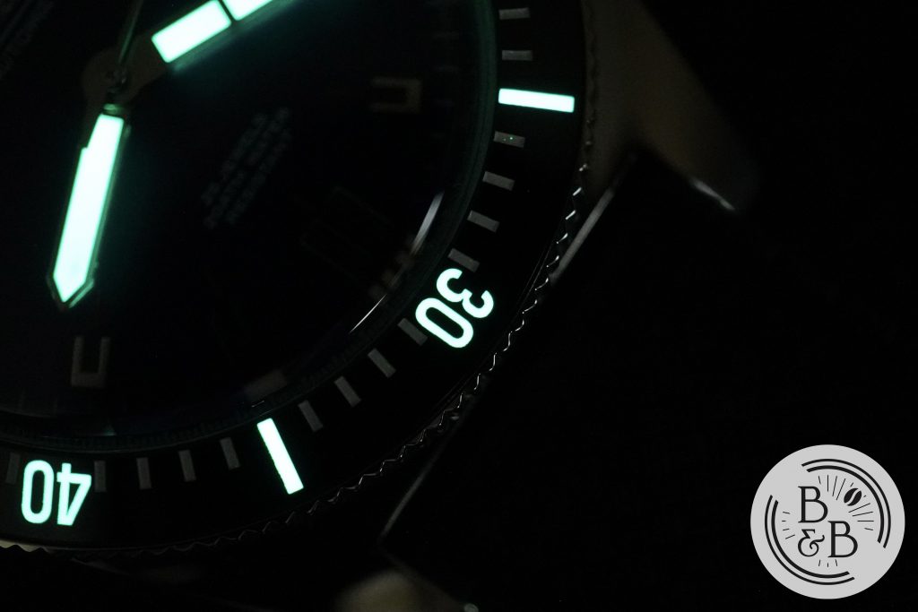
Only the increments of 10 are lumed on the bezel insert, but I think this is more than sufficient, as many watches refuse to lume more than the 12 o’clock index. The lume on the bezel is actually quite generously applied and holds it’s charge well.
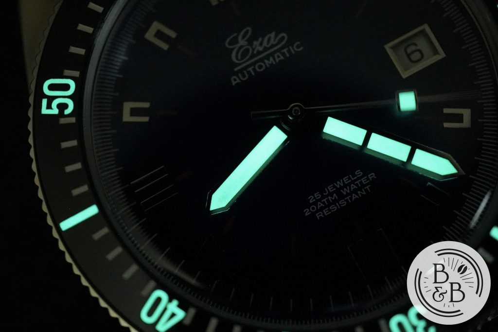
The hands are well lumed, and this includes the rectangular element on the seconds hand. I enjoy when seconds hands are lumed, so this is a win for me. Overall, good job here and I don’t think anyone will be really disappointed by either the design or the performance.
Movement
This watch uses an ETA 2824-2 movement, and I think it is very appropriately selected for this watch given it’s case design and it’s price. This is tried and tested movement, and is very easy to service and regulate.
I logged the accuracy of this watch over a 5 day period, and observed roughly +6.4 spd. Eza includes a testing certificate with each watch, and this watch was tested in 6 positions with an average accuracy of +6.4 spd. So this is definitely within reasonable performance.
Eza founder Adriaan has a few short clips discussing the movement and testing positions on their YouTube page.
On The Wrist
Usually, I’d be worried about watches that have a lug-to-lug width of 50mm, but given the dramatically curved lugs, the case wears quite nicely on my 6.25″ wrist, and I would definitely wear this watch even though it occupies a lot of wrist real-estate. The 40mm diameter helps it wear a bit smaller than the lug-to-lug width might suggest.
The case height of 12mm (10.5mm without the crystal) is well balanced and sits well on the wrist. As with most vintage dive watches from this era, the case-back does protrude out of the case a bit, but it isn’t uncomfortable given the short overall case height.
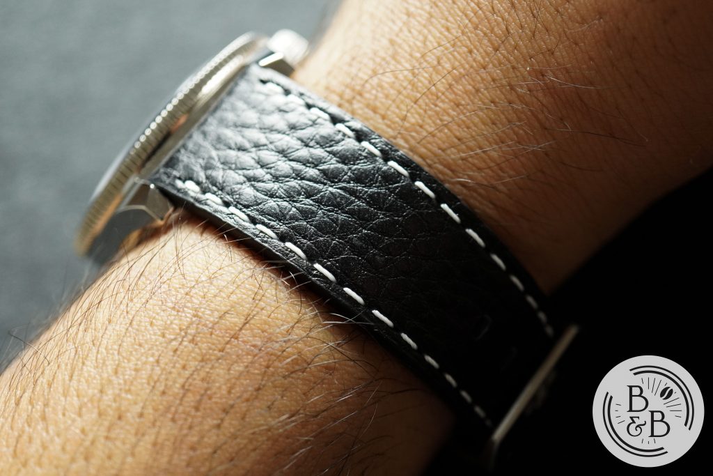
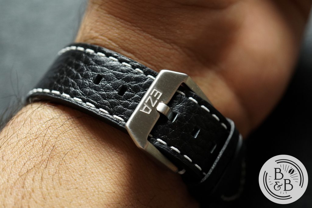
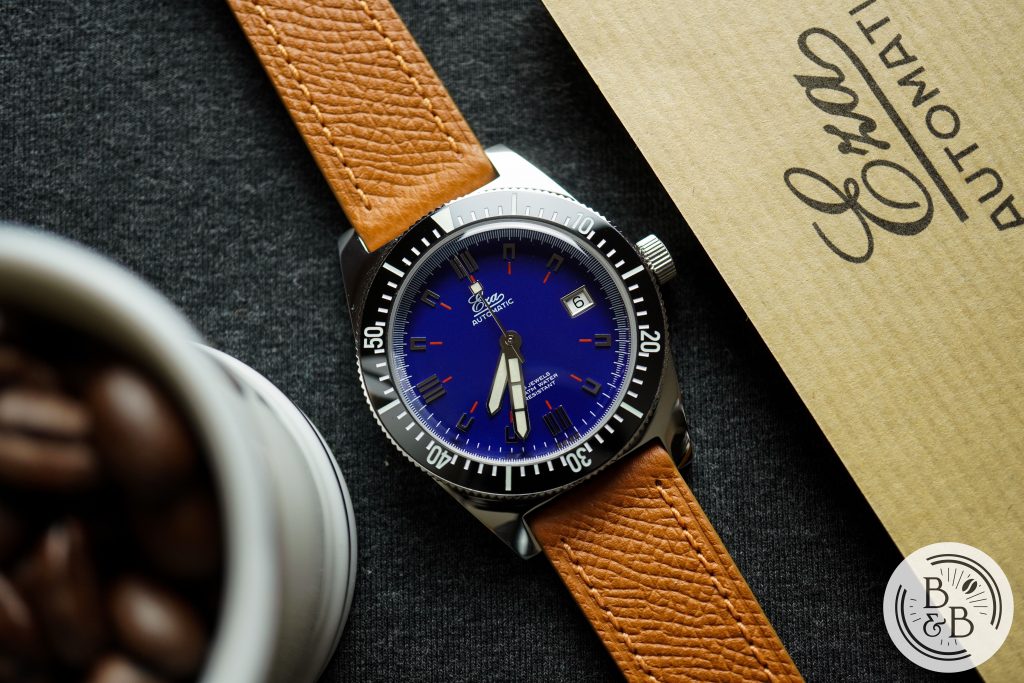
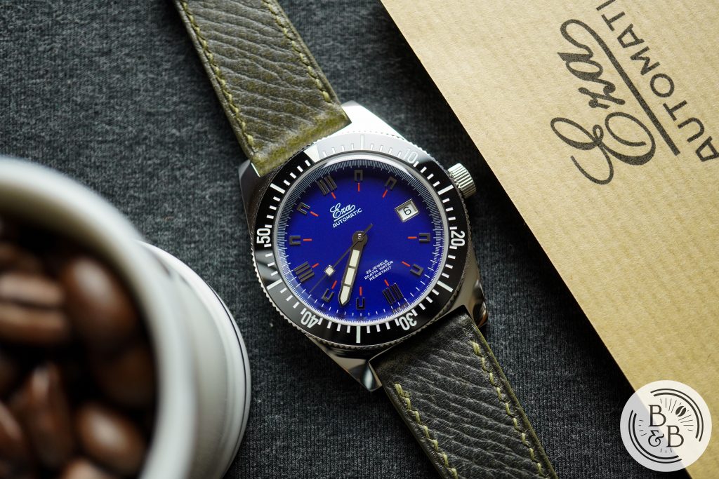
Each watch is shipped with a leather strap as well as a tropic style rubber strap. Both of them have signed hardware, but the buckles are brushed and not polished. I prefer it this way, since my buckles get destroyed with scratches anyway, but some might prefer polished strap hardware instead. Both straps are of good quality, but I found that the white stitching on the black leather strap takes too much attention away from this beautiful dial.
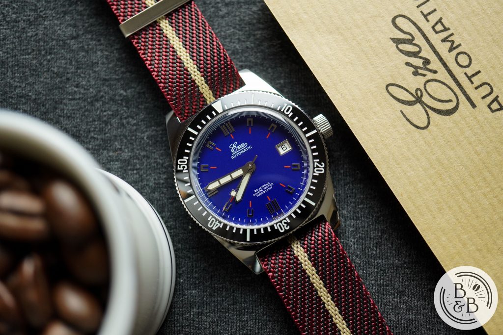
I would’ve also liked to see them supply their diving mesh bracelet in 20mm with this watch. While it doesn’t match the 1972 skin diver aesthetic perfectly, I think it would look great!
Concluding Thoughts
$760 is on the expensive side of micro-brand dive watches. But when you consider that the Miyota 9039 equipped Baltic Aquascaphe costs roughly $700 (on a tropic rubber strap), this starts to feel like a pretty good deal. And I say that as a happy owner of a Baltic Aquascaphe. Another option is the slightly more affordable Lorier Neptune, coming in at $500 on the metal bracelet with a Miyota 90S5. But I can’t fully enjoy a watch with a plexi-glass crystal, so the Lorier doesn’t make the cut for me here.
While the Baltic and Lorier do a good job at being vintage inspired dive watches, the Eza feels more like a vintage watch, period. The design is inspired by itself, and the other skin divers of the 70s era. And there’s something very authentic about this design and experience, and it is difficult to accurately convey this through videos and photographs. But if you could imagine having modern day manufacturing and watch size preferences in the 70s, this is what the original Eza would’ve looked like. And if that sounds like something you might enjoy, I don’t think you’ll regret this purchase.
Strap Change
Packaging
Thanks for reading!