Disclaimer: This review is in no way incentivized by Kurono Tokyo, Chrono Tokyo, the Hajime Asaoka brand or any other entity. I purchased this watch brand new for the purpose of this review. All opinions here are my own.
Contents
Chronograph 1
After the drama that followed my last Chrono Tokyo review, I suspect that some of you didn’t expect to see another one, but ha… I’m back! And this time I bring you something that is even more beautiful than the previous Chrono Tokyo Bullseye. I’m not going to re-introduce Hajime Asaoka or the Kurono Tokyo brand, and I recommend that you check out that review if you’re interested.
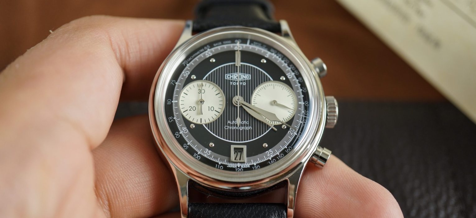
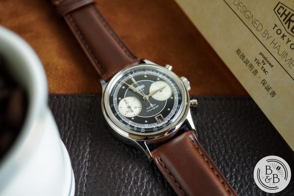
Today I’ll be taking a look at the black dial variant of the Chrono Tokyo Chronograph, which is the Japanese Domestic Market (JDM) release of the Kurono Tokyo Chronograph-1 that was released last year. 68 models in each variant were produced with the Kurono Tokyo logo, and 100 models with the Chrono Tokyo logo. But these watches are identical in every other aspect, as confirmed by Hajime Asaoka on Twitter.
Wei Koh, an avid collector, opinion leader in the industry, and founder of Revolution and The Rake, listed this watch in his “5 best new watches in 2020” at webChronos. And this watch (and dial option) was also nominated for a GPHG award in 2020 in the Chronograph category.
With this watch, Hajime Asaoka used his 3D modeling and watch design skills to create this piece from the ground-up. And as you’ll see, each of the components on this watch have been very carefully designed, and come together in quite a spectacular manner.
As with all of his watches, this watch draws a lot of it’s inspiration from the Art Deco era, and is very much a vintage inspired Chronograph. I have ended up enjoying this watch a lot more than I did the Bullseye, and that says something because I found the Bullseye to be a stunning watch. The Kurono Tokyo Chronograph 1 sold for a little under $4000, and was entirely sold out in less than an hour. The Chrono Tokyo JDM models sell for around $4000 within Japan. Currently on the pre-owned market, these watches are able to fetch prices anywhere between $6000 and $10000, with popular watch dealers like DavidSW listing them at $7875 at the time of this review.
Let’s check it out!
Case
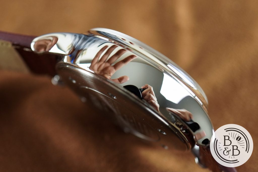
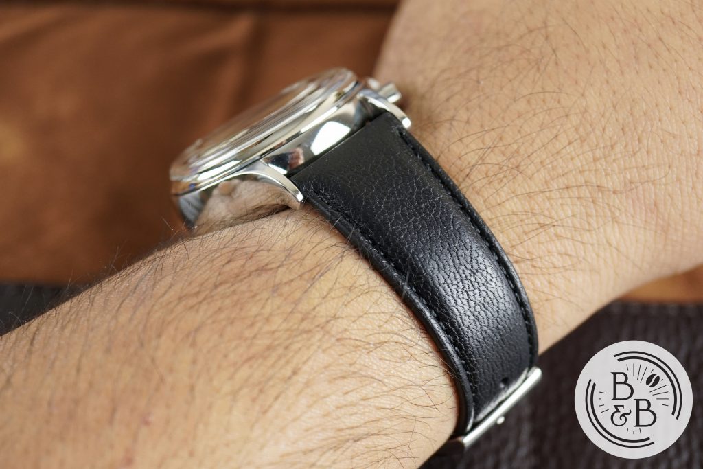
I measured the case to be 37.75 mm in diameter, 46.75 mm from lug-to-lug and 13.75 mm tall. Of that 13.75 mm height, almost 4 mm is the fixed bezel section and protruding sapphire crystal. As mentioned in my previous review, it is rumored that these cases are made by Grand Seiko, but I have no been able to confirm this. But the incredible mirror polishing you see here makes a strong case to support that theory.
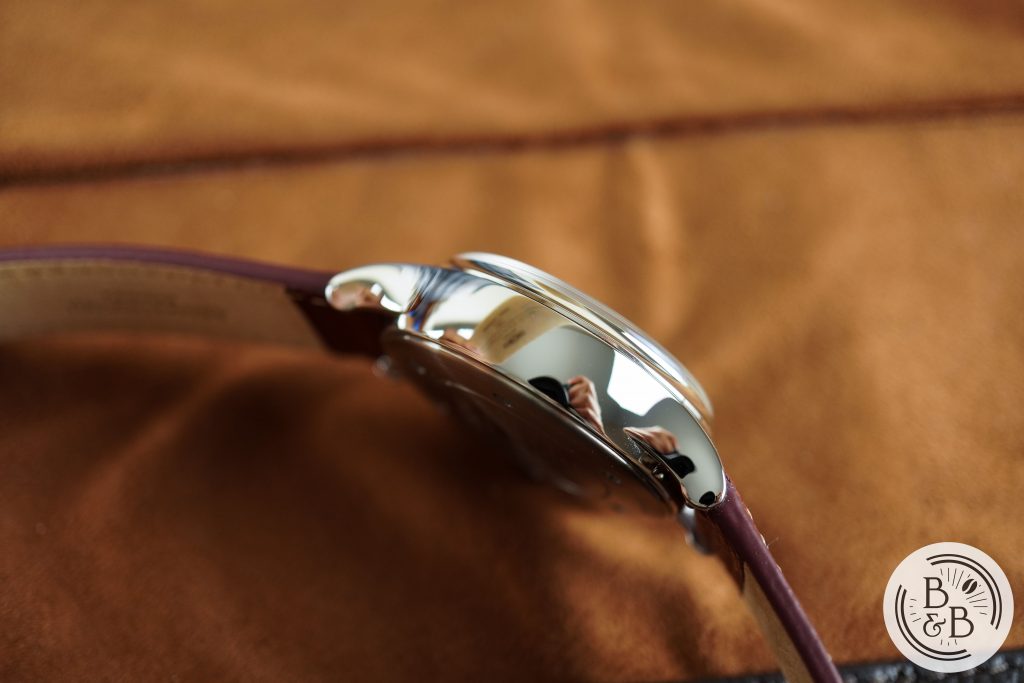
Another interesting fact is that this case was manufactured using a forging press approach, and not a CNC based process. Mechanical engineering isn’t one of my strengths, but I can recognize a well made watch case when I see one, and this is it. Beautiful curves on the case that are perfectly finished.
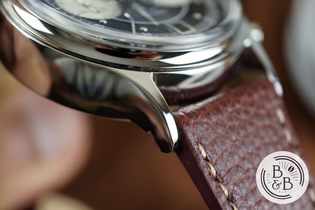
I love the case design, and it is exactly how I would design a 14mm tall watch. The mid-case makes up roughly 9mm of this total height, with a perfectly centered crown and pusher buttons. The mid-case extends outward and slopes down towards the wrist, into a pair of interesting lugs that have a very sleek top profile, but a relatively thick curved side profile. The lug width is 20mm, which I think is a good choice for the 38mm diameter.
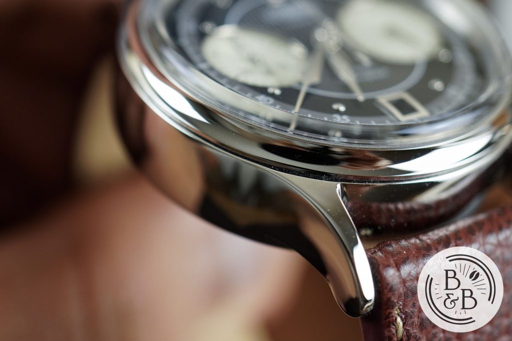
Above the mid-case, there is conspicuously sized fixed bezel section that is concave and beautifully polished. This bezel section seats a boxed sapphire crystal, that together measure about 3-4mm of the overall height. The crystal has very little distortion, so you don’t need to worry about legibility of the outer-most dial track. I’m not sure what kind of AR coating scheme was used here, but I haven’t had any problems with reflections.
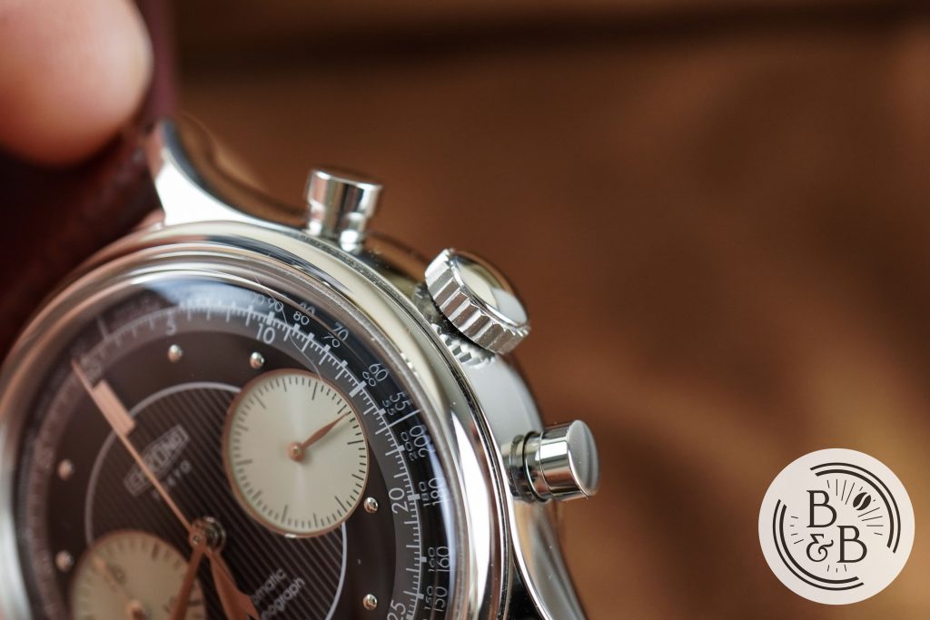
You have a push-pull crown at the 3 o’clock position that is very appropriately sized at 6.25mm, and is easy to grip and operate. The crown action on this watch is excellent, with no crown or stem wobble.
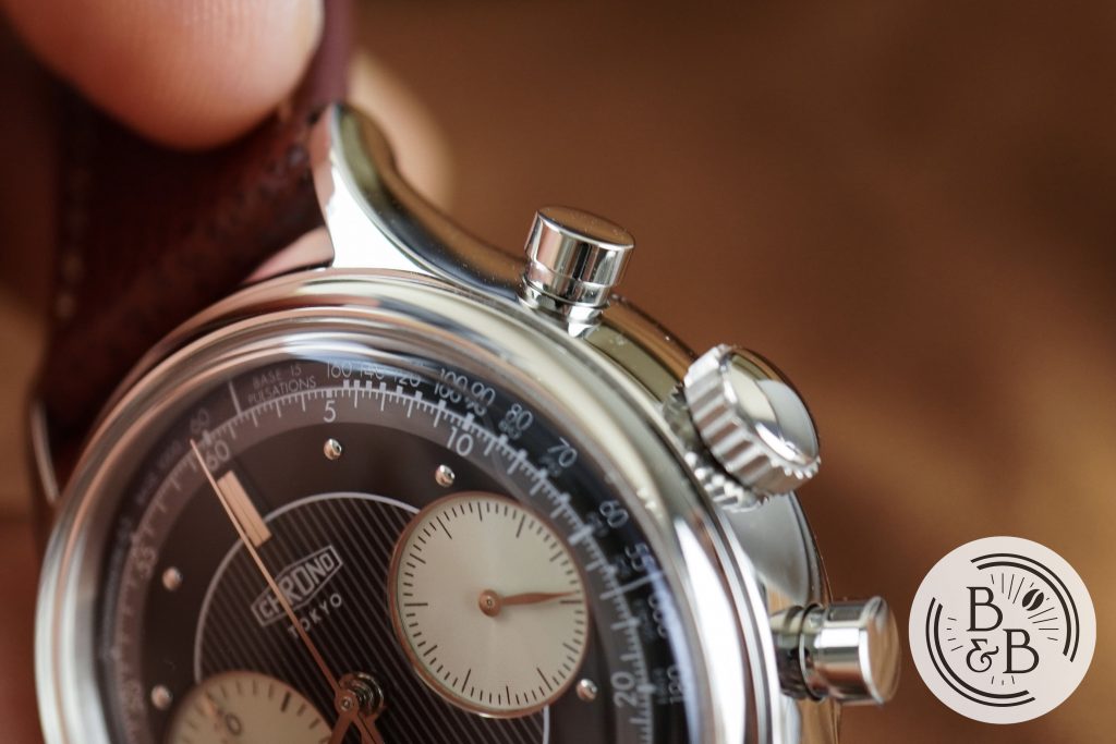
The two buttons are also well proportioned and are easy to operate. As you’d expect with strong vintage roots, the crown and pushers are not screw-down.
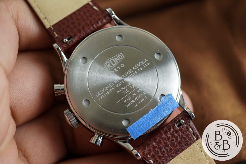
Flipping it over, you have a very slim and flat screw-down case-back. I love this aspect of the watch, and I’ll later show you why it helps balance out the somewhat unusual case dimensions. This watch is rated for up-to 30m of water resistance, but please don’t get this one wet. This is a watch that begs to be treated like a safe-queen.
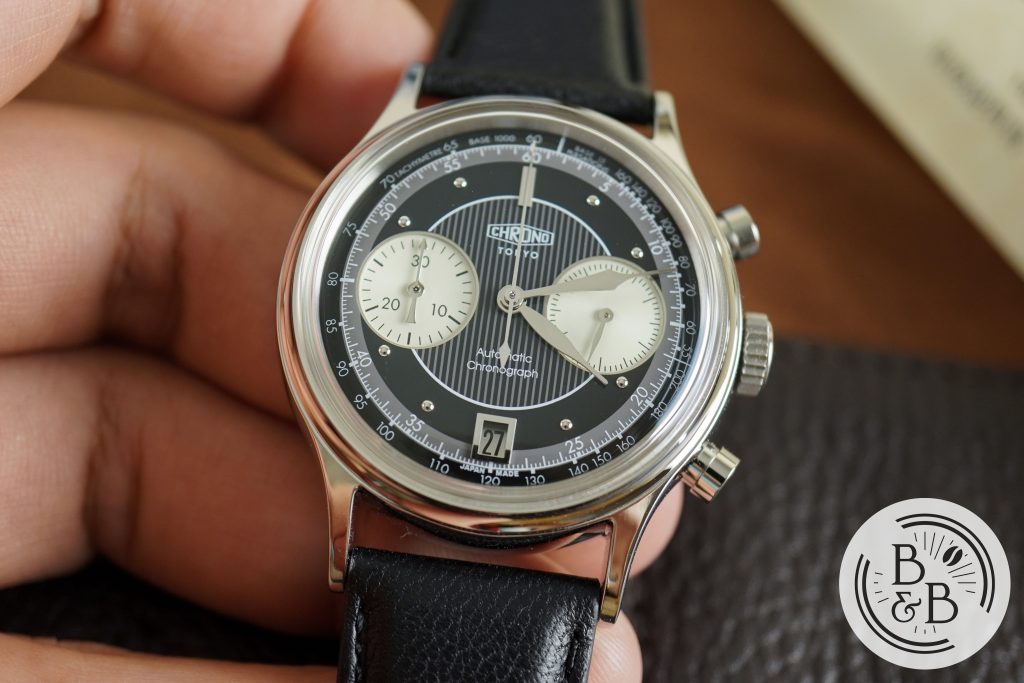
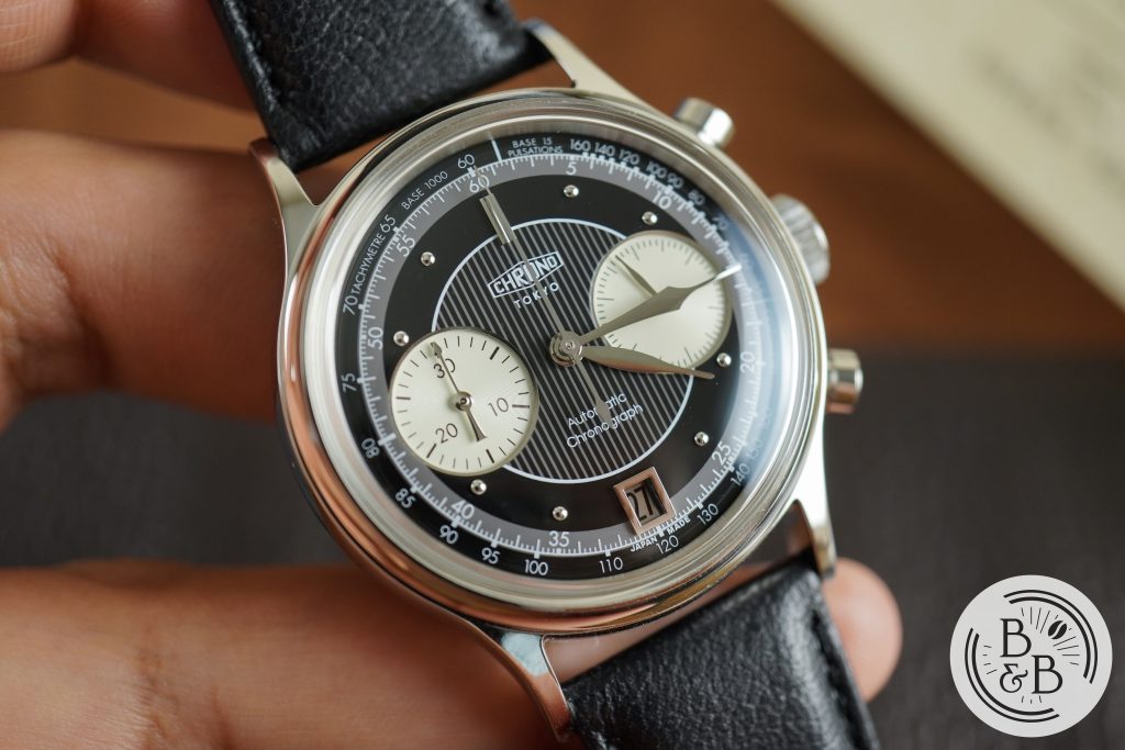
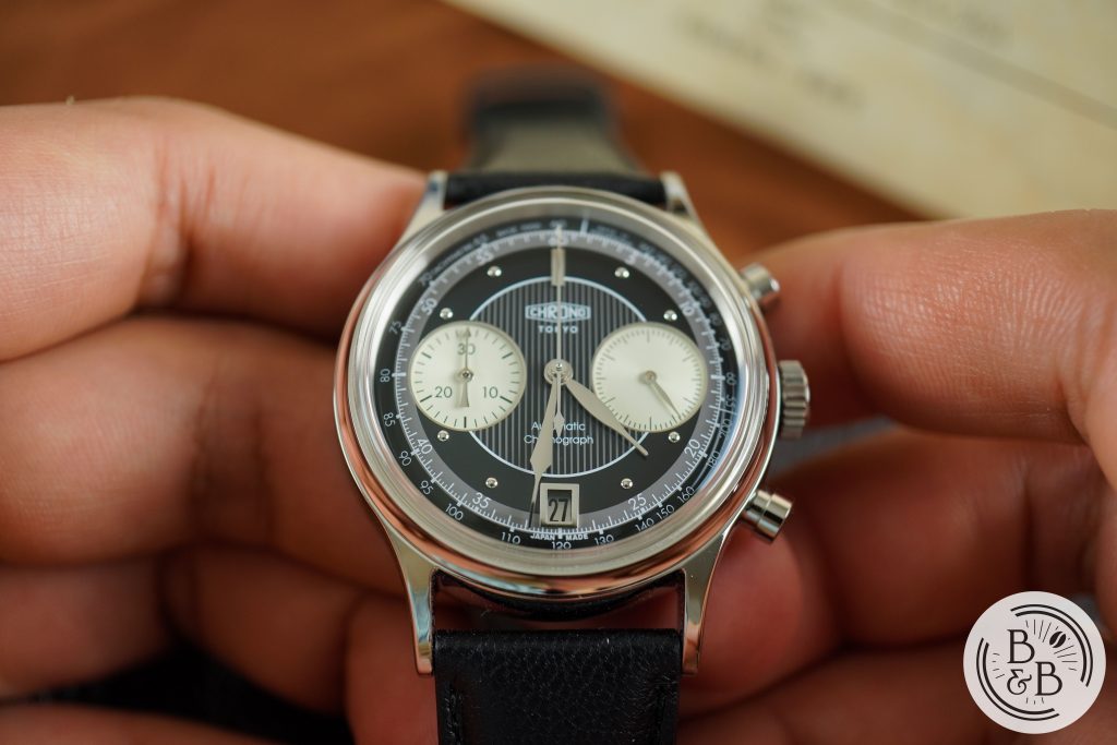
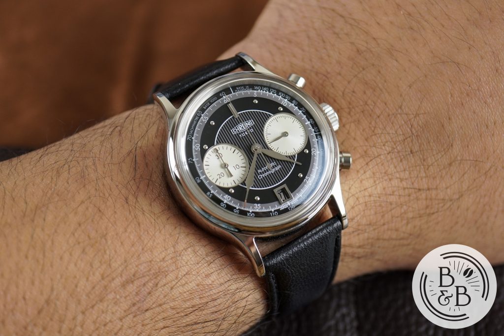
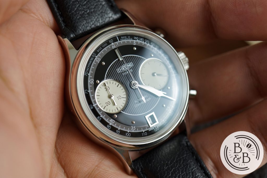
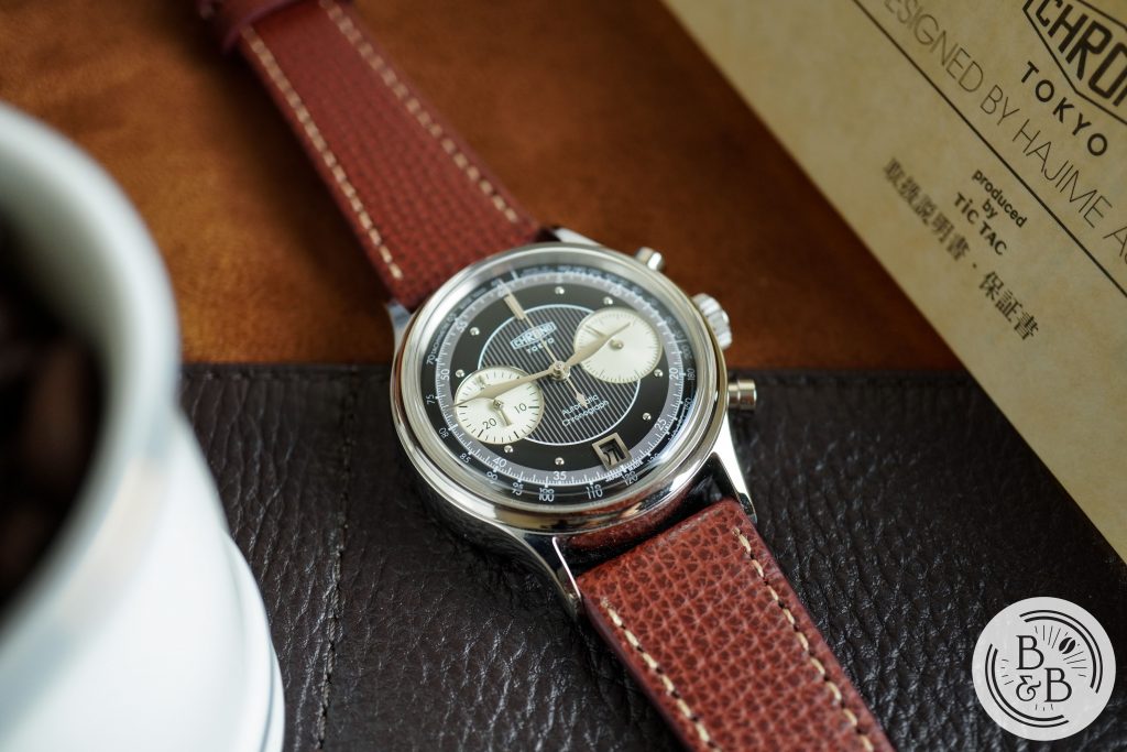
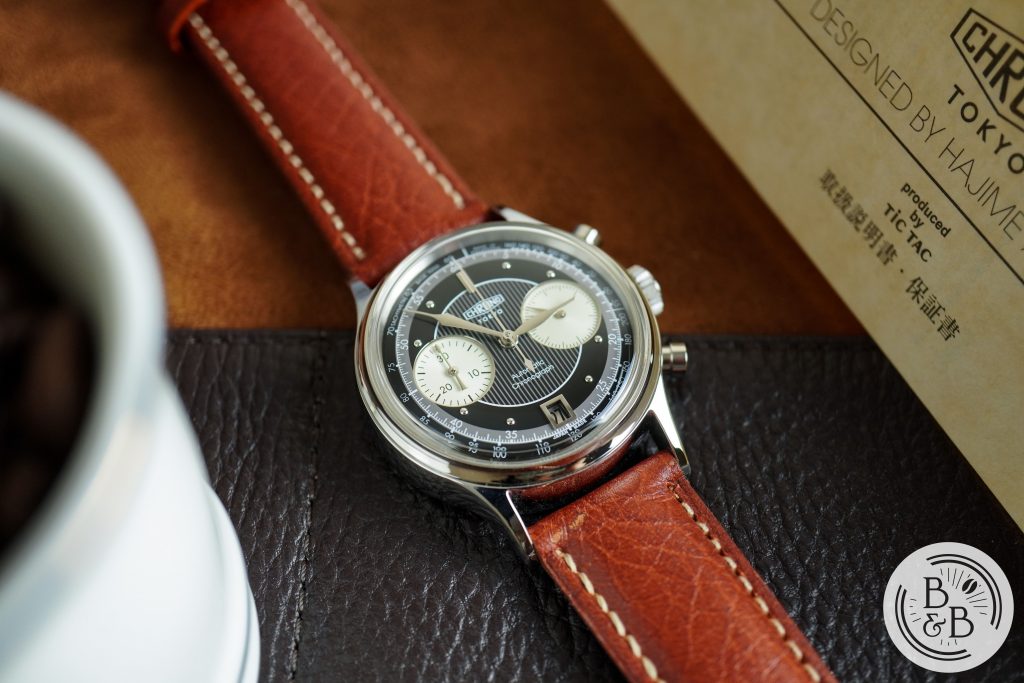
Dial
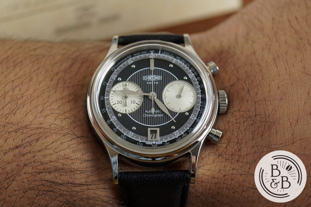
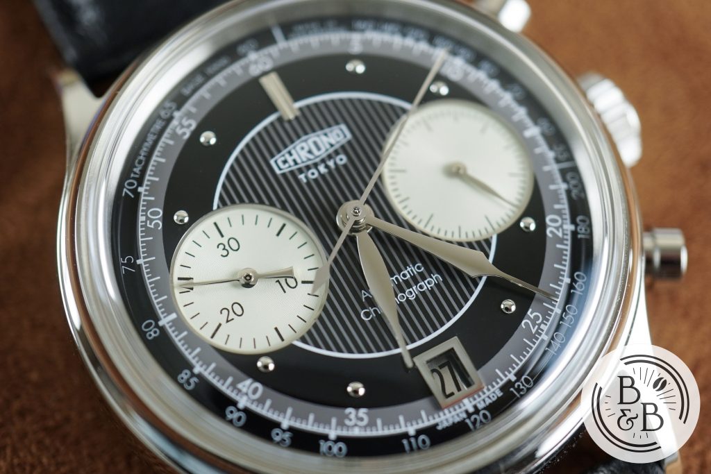
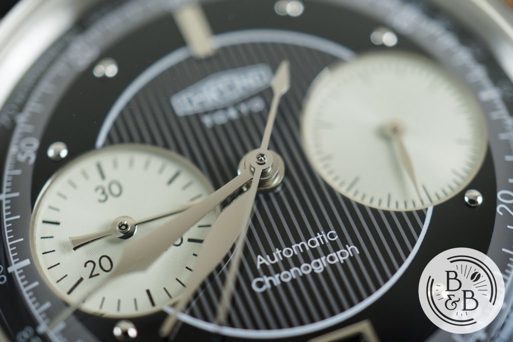
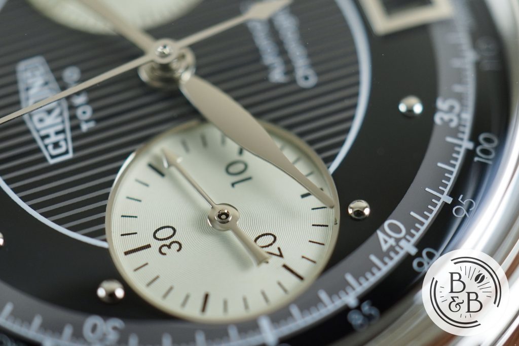
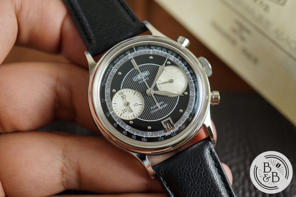
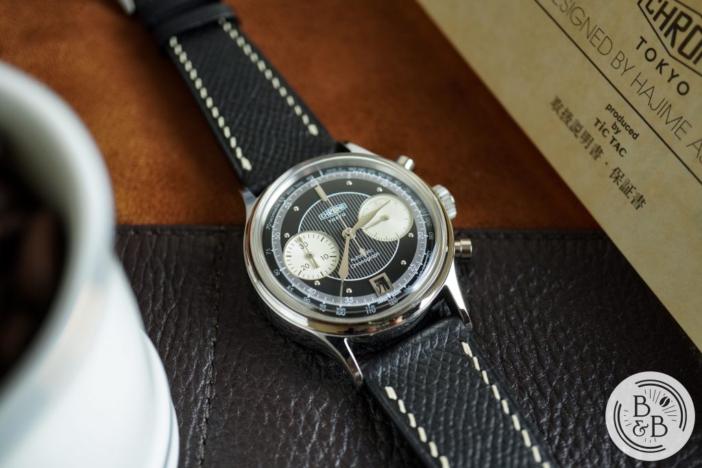
Let’s dive into the beautiful piece of work that is the dial. In my opinion, every element on this dial is perfect from a design perspective. And I typically dislike chronograph watches, and currently have no other chronographs in my collection. This dial is busy, but it also isn’t. It makes great use of empty space, and lays out each element in a manner that doesn’t feel cluttered or claustrophobic. And there is a beautiful symmetry to the whole layout that I absolutely love.
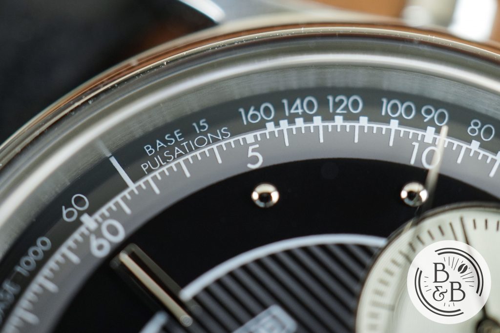
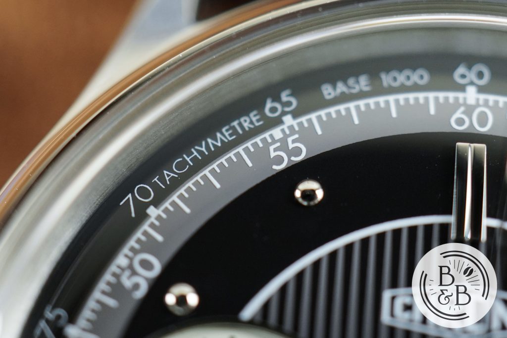
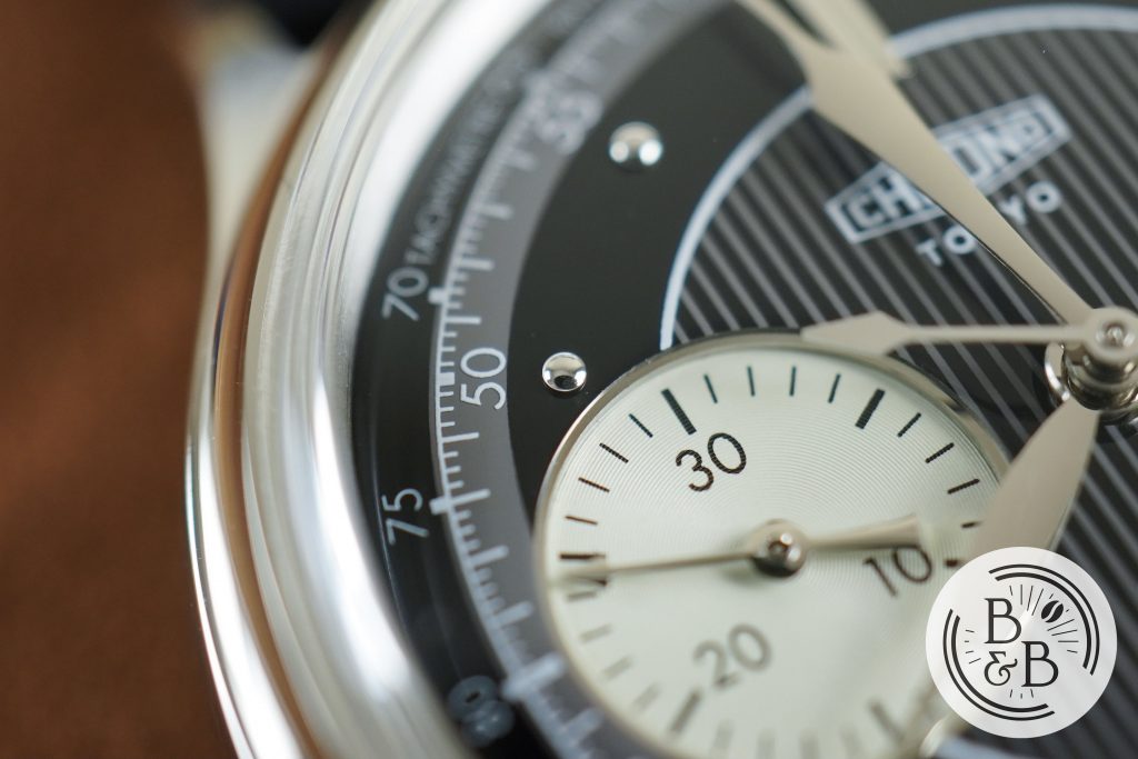
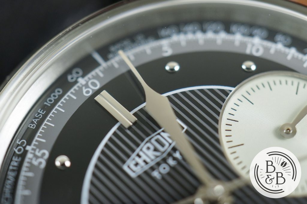
The first element is the outer black ring that is interesting because it is slightly curved, or at least appears that way because of the crystal. I’m pretty sure the dial is physically sloped at the edges but I haven’t been able to confirm. This outer ring is also interesting because it has both a pulsometer scale and a tachymeter scale, both printed in white, separated from each other by a clearly visible white line.
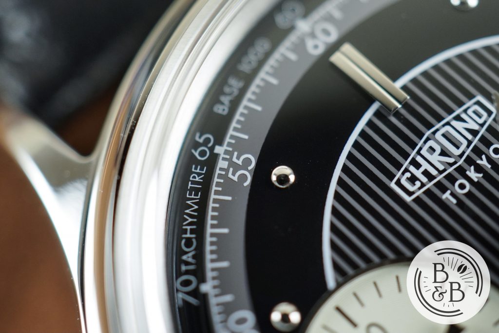
The next element is the gray ring that serves as a traditional minute track, with minute as well as millisecond increment ticks. Each increment of five is printed in Arabic numerals, wherever there is available real estate.
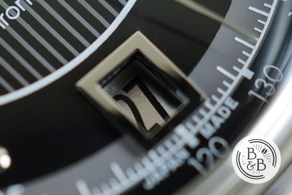
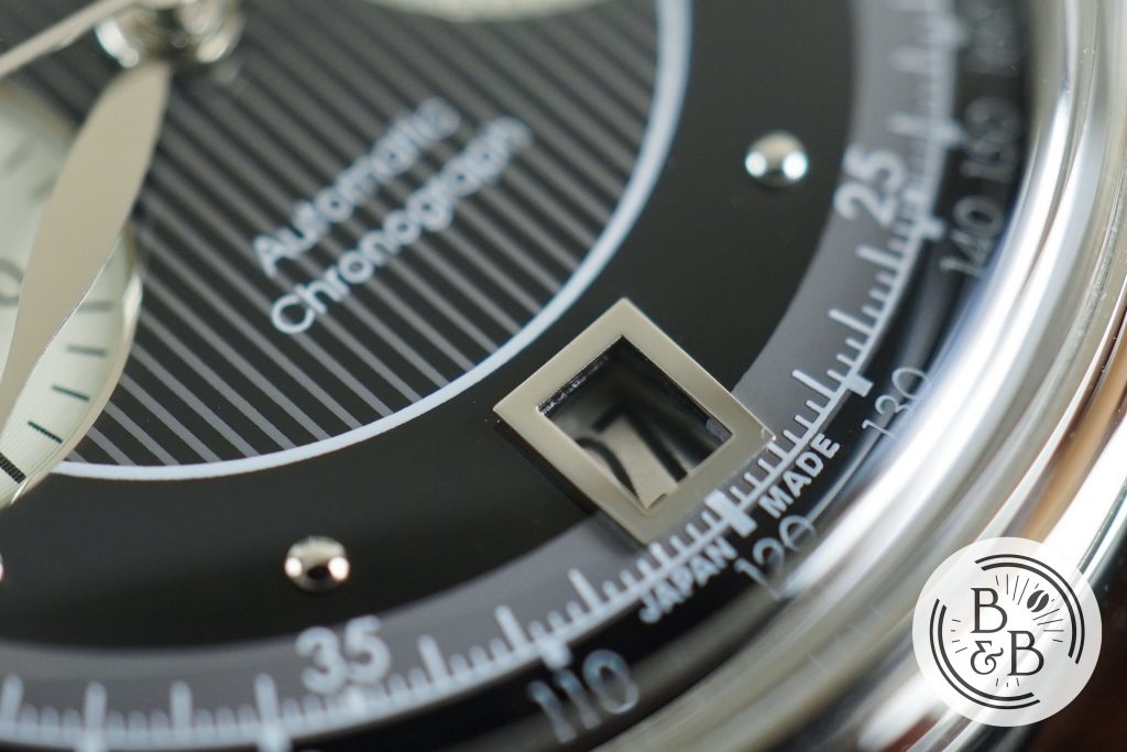
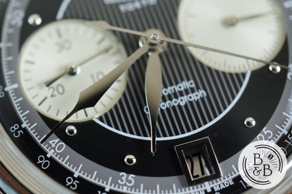
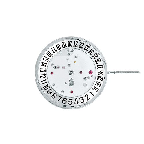
You then have a framed date window at the 6 o’clock position, with a silvery gray date wheel and black font. The finishing around the window is OK, and I noticed some anomalies here – a bit of dust and a microfiber hanging out on one of the corners. These aren’t visible to the naked eye though.
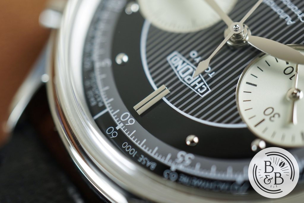
There is also an applied stainless steel index that serves as the 12 o’clock hour marker. This index helps balance out the framed date window and also helps orient this dial.
Once you get past the two busy rings and the date window, you can catch your breath with a wider black ring that exists to serve the beautiful polished stainless steel hour marker pips. I love these, and I think they add a lot of character to the dial.
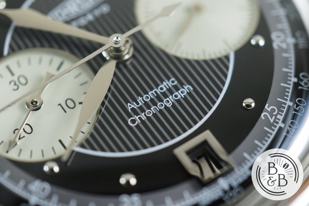
The inner-most section has alternating vertical stripes of black and gray, with the brand’s logo under the 12 o’clock index, and “Automatic Chronograph” above the date window. These section is very tastefully designed, and hints at an Art Deco inspiration for this watch.
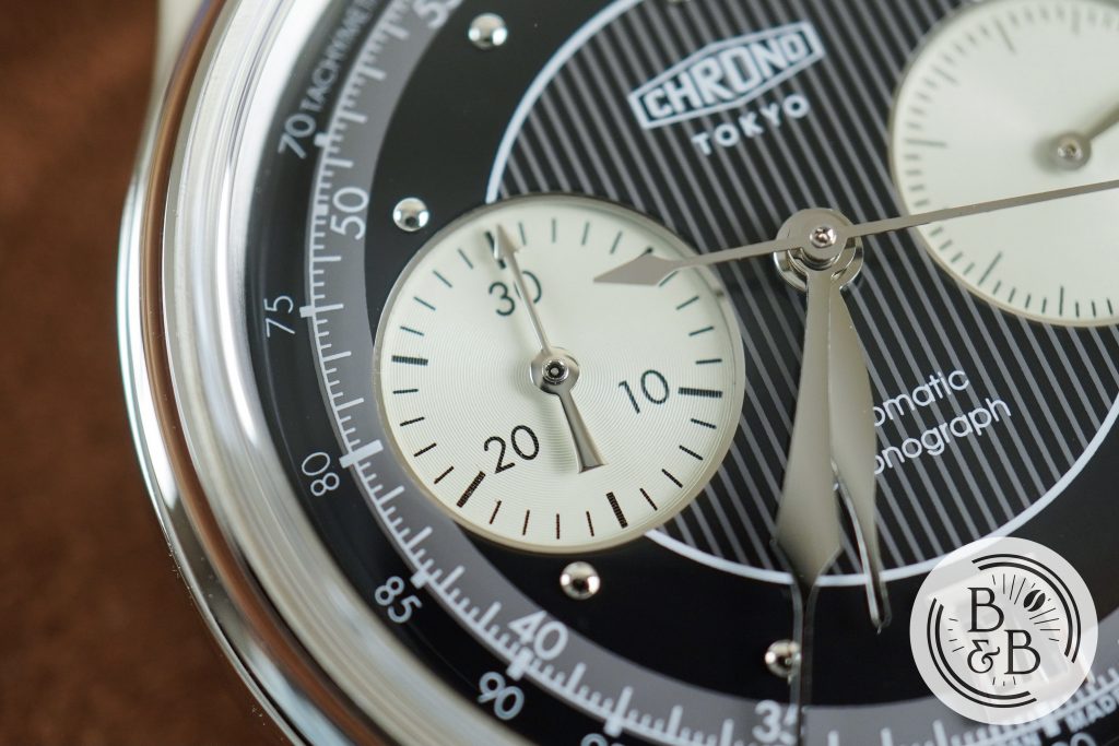
Both sub-dials have a slightly off-white color, and are finished with a very fine concentric ring pattern. The sub dials are recessed into the dial, and this variation in depth along with the curved appearance of the dial surface, is very pleasing. The sub-dial at 9 o’clock has an elapsed time counter, with a very interesting design for the hand. I believe this was inspired by Japanese archery (Kyūdō), and is made to resemble an arrow. The quality of printing and finishing on this sub-dial is alright. I did notice some uneven surfaces at the sub-dial edges, where it is recessed into the dial.
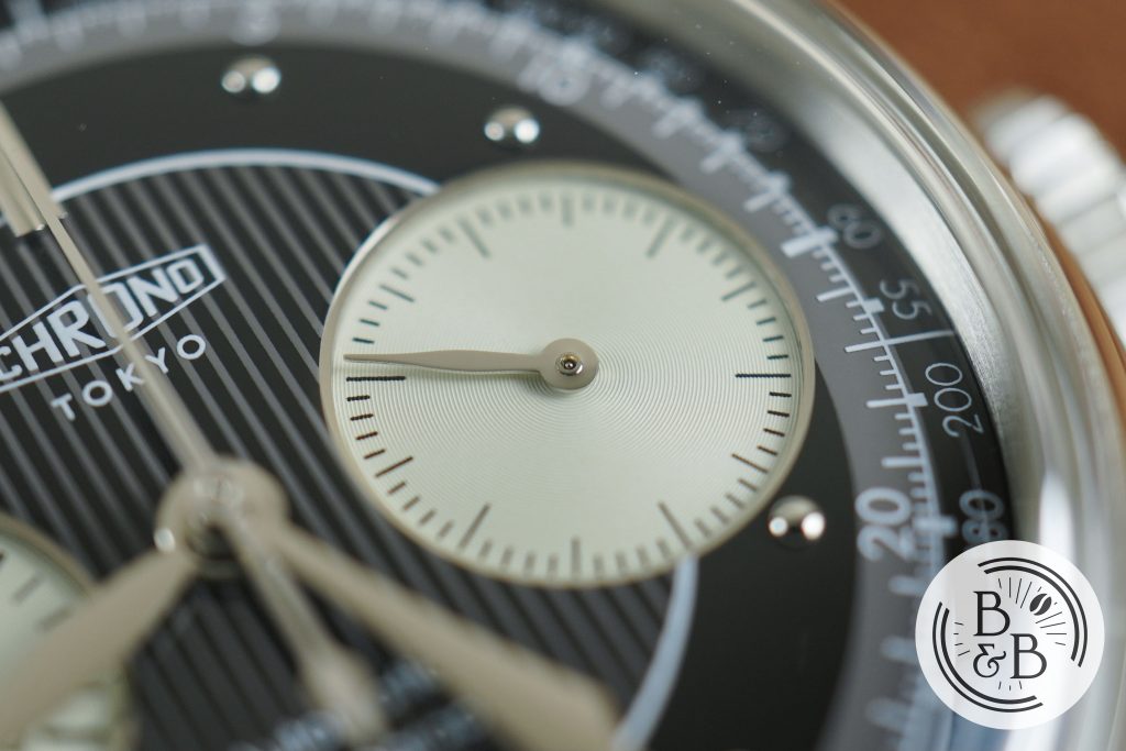
The sub-dial at the 3 o’clock is a running seconds counter, and is a little less busy than the elapsed time sub-dial. It uses slimmer ticks, and lacks any Arabic numerals. It also has a seconds hand that is more along the design aesthetic of the primary hands.
The hands follow a similar design aesthetic to the rest of the Kurono Tokyo watches, and I think this design is incredible. The hands are curved and not flat, and this usually results in a beautiful gradient under most lighting. The finishing on the hands is good – nothing spectacular, but the design details make up for it.
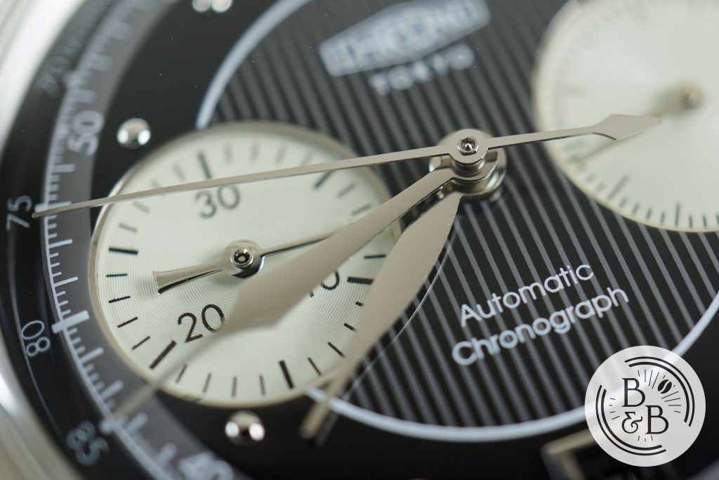
Both the minute and seconds hands are slightly curved towards the tip, and this flows beautifully into the curved dial appearance. The dimensions of all the hands are perfect for legibility, and I can’t fault any of these design decisions. The center cap is exposed, but not as crude as you might expect. There is a hexagonal pattern, and it is reasonably well finished.
Overall, I cannot find faults with any of the design elements, and for my own taste, I think this is as good as it’ll get for a vintage chronograph design. It makes excellent use of the real estate, and delivers something that is equal parts busy and functional, and also beautiful and elegant. If the finishing on the dial was just a little better, I’d say that this watch is easily, and absolutely worth it’s secondary market prices.
Movement
One of the key attributes of the Kurono Tokyo watches is that they are entirely Japanese; that means they use a Japanese movement too. For the Bullseye, they used a Miyota 90S5, which if I’m being honest is not a particularly impressive movement for a luxury watch. But on this watch, they used the Seiko NE86A (NE86A32J to be precise), one of Seiko’s more recent Chronograph movement designs. This movement is roughly 28.6mm in diameter and 7.62mm in height, so I think they’ve done a good job with the case for it.
Don’t let the Seiko name fool you; we’re not talking bare-bones NH35 here. The NE86 has a column wheel, vertical clutch and their magic lever winding system. It is a 311 piece movement, with both sub-registers being driven independently of the main seconds wheel, and each having their own clutch system. You can find the detailed spec sheet here.
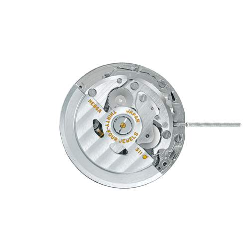
The case-back is closed, and I think that’s a good thing. This movement doesn’t appear to be well decorated, based on the images I found of it online. But in terms of operating experience, I’m quite impressed! This movement feels very sturdy, with excellent button action and crown assembly.
There is an instantaneous date change, and adjusting the date wheel and hands feels very good. This movement is able to deliver a convincing high end watch experience, and the only area where I found this movement to fall a bit short, is in the manual winding. It doesn’t feel cheap, but it is a bit loud. Given that this is clearly a vintage inspired Chronograph, I think that might fit the bill perfectly for some folks.
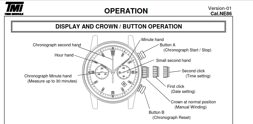
On my time-grapher, I measured roughly +7 spd in the dial-up position, and roughly +4 spd in the crown-up position. The spec sheet indicates an operated range of between -15 spd to +25 spd.
On The Wrist
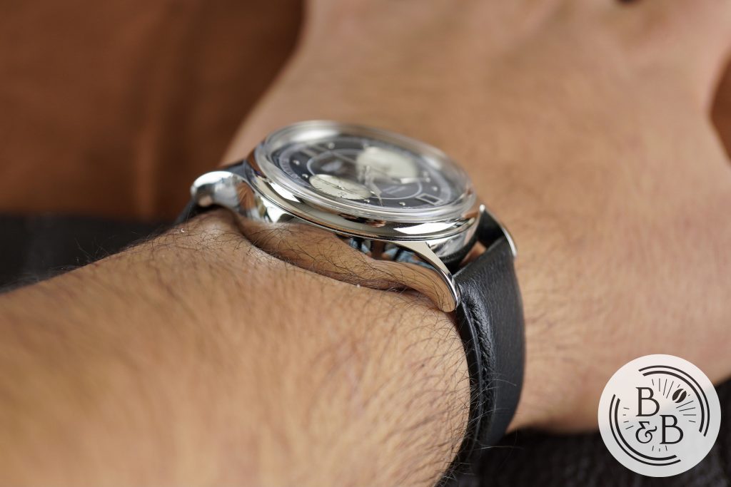
On my 6.25″ wrist, this watch wears very well. I think most people will be concerned about the 14 mm height of this watch, and how that height translates into wear-ability. The case is actually well balanced for what it looks like. It combines a flat case-back, together with carefully positioned lug holes, that force this watch to stay grounded and close to wrist.
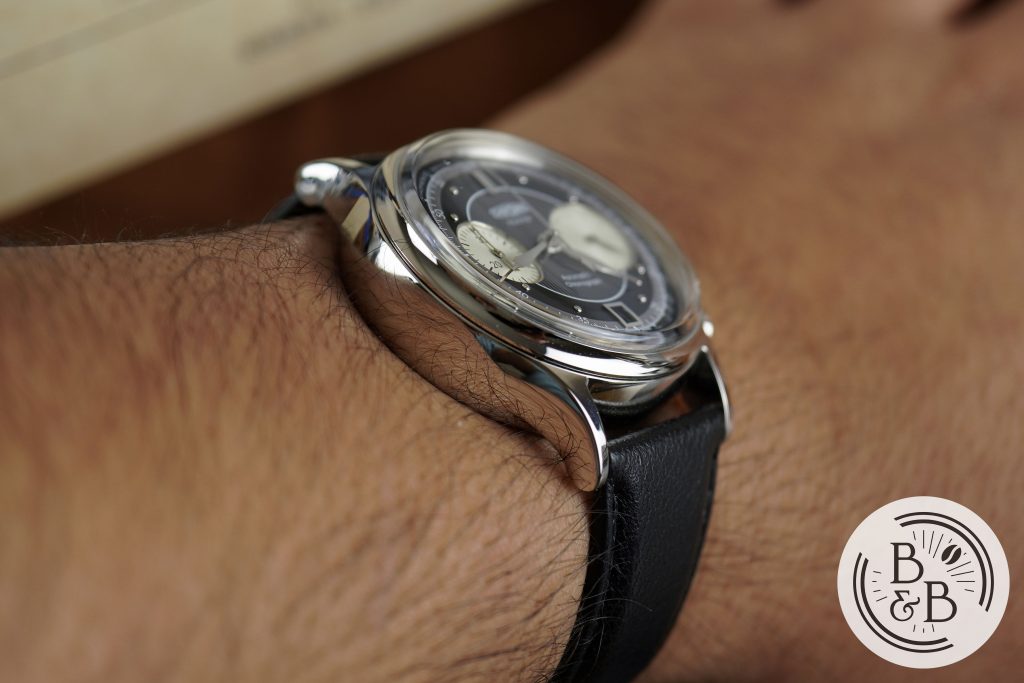
The case-back and mid-case together make up around 10mm of the 13mm height, and the rest is the concave fixed bezel and domed sapphire crystal. I’d say the perceived height of this watch is closer to 10mm than 13mm because of this design, but given the 38mm diameter and 46.75 mm lug-to-lug width, the overall height looks very exaggerated in photographs and videos.
The diameter and lug-to-lug width are perfect for small and medium sized wrists, and given the vintage design aesthetic, I think some larger wrists can pull it off too.
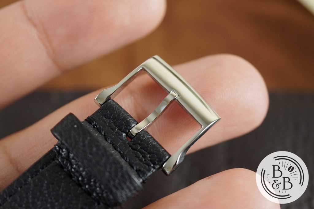
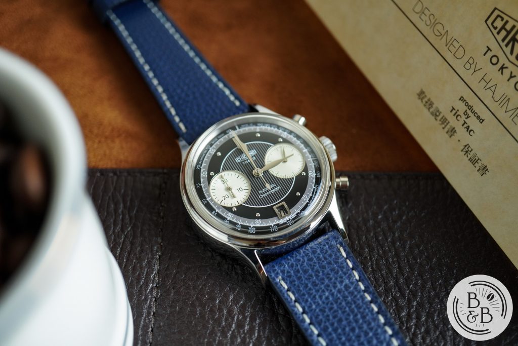
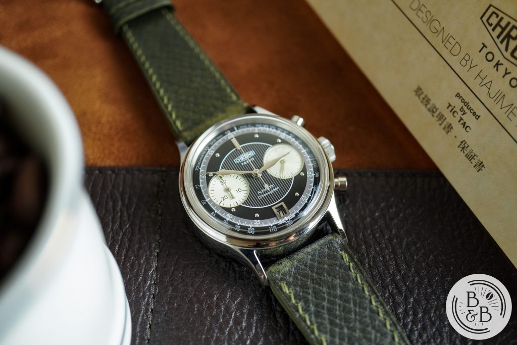
This watch ships with a pretty basic looking leather strap, similar to the one on the Bullseye. I do like that this strap has a custom made buckle to suit the design language of the dial and hands. As in Bullseye review, I wish this buckle was signed. On the stock strap, this watch weighs in at a little under 85g.
Overall, this watch may or may not easily slip under a formal shirt cuff, but it is a very classy watch with a terrific wrist presence. It is way more comfortable than it looks, and wearing this one has been a treat.
Concluding Thoughts
Overall, I love this watch. I think this is a real winner from Hajime Asaoka, and his wonderful design has been matched with excellent build quality and a very nice movement. The dial finishing is good, but don’t expect the attention to detail that you’d see on a similarly priced Grand Seiko watch, and that’s the only avenue I see for improvement here, apart from the awkward and passive-aggressive social media management.
Now comes the tough question – is it worth the $7000-10000 that they’re going for on the pre-owned market? Objectively looking at the watch on it’s own, and ignoring the man behind the brand, and all the hype surrounding it, I’d say No. But I also think the Rolex Submariner isn’t worth the $9000 price tag, and I still jumped through hoops to get one.
But, if you’re looking at this watch from a collector’s perspective, I say Yes. This Chronograph is a massive step up from the Bullseye that I reviewed, and I’m certain it will be a highly sought after watch in the years to come. Given the brand’s recent announcement that they will not be making anymore JDM Chrono Tokyo watches, I suspect that the prices of all Chrono Tokyo watches will continue to climb after they are officially discontinued. And this watch does manage to deliver more than just a ticket to board the hype train. It delivers an incredible case and dial design, and in my opinion, is a watch that will be appreciated even decades from now.
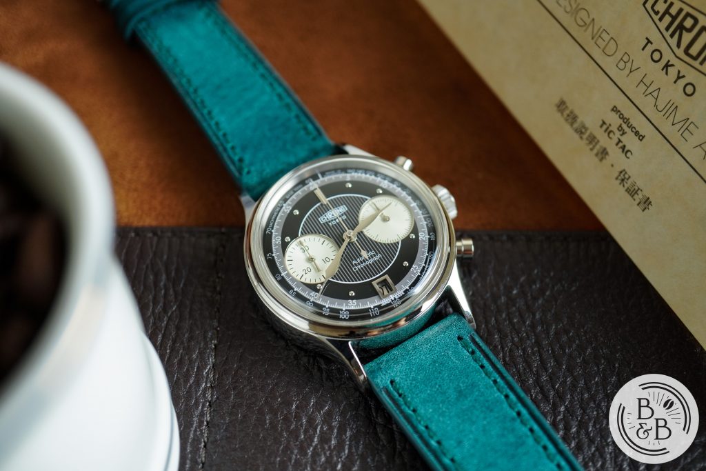
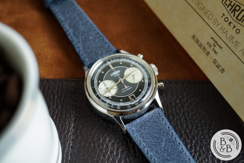
Strap Change
Thanks for reading!