Disclaimer: This watch was sent to me to review, and I was not incentivized in any way to make this review. This is in no way sponsored by Kaal or any other entity. All opinions here are my own. Since this watch is an early stage prototype, please make note that the experience will differ significantly from that of the final production units.
Contents
Kaal Watch
Kaal Watch is a micro-brand fresh out of Singapore, which appears to be an incubator for some of the most interesting affordable micro-brands today. Kaal Watch was founded by Alvin Lye (Azimuth Watch Works), Jessie Yeo (Trifoglio Italia) and Alvin Lew (Micro Brand Watch World), so Kaal Watch maybe in it’s nascent stages, but these three entrepreneurs seem to know their way around the watch industry.
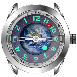
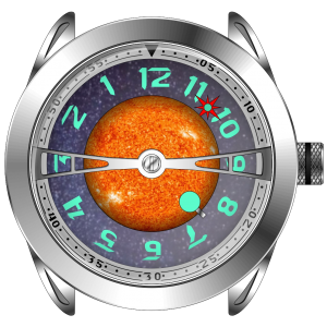
Kaal Watch is launching their debut line of watches on Kickstarter, called the Multiverse Series, that is focused on drawing inspiration from the cosmos with their three watches – Gaea (Earth), Sol (Sun) and Artemis (Moon). These watches will launch at $369 (pre-order) and $399 (Kickstarter), which is quite affordable for conversation pieces such as these. I’m always excited to see creative and artistic watch designs, and I recommend checking out my review of the Feynman One Eclipse if you find this interesting. On that note, I should mention that many of the elements on this watch appear to have been inspired by the Arnold & Son Globetrotter line.
The Kickstarter campaign is scheduled to launch end of September 2020, and the watches are expected to ship out between March and April 2021.
Case
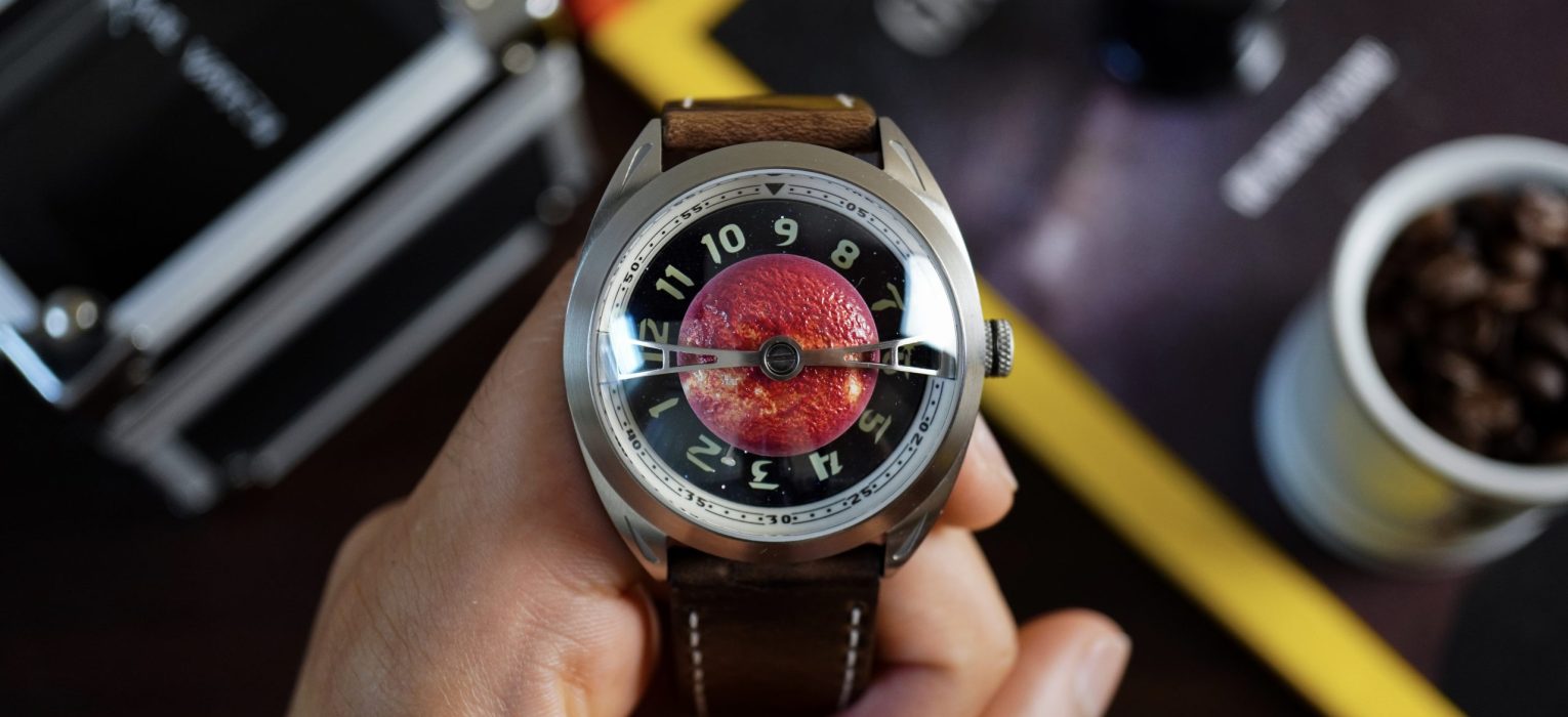
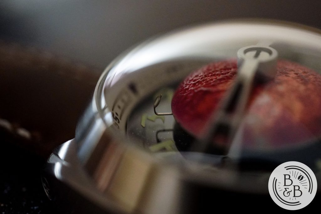
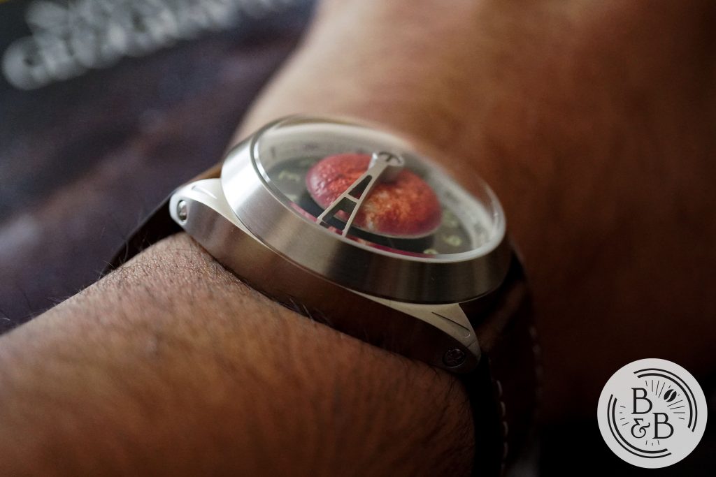
I’m not going to spend too much time on the case because the dial has a lot going on, most of which deserves mentioning. The case was designed to add to the space and space-travel theme with it’s spaceship / flying saucer themed design, combining both a rounded silhouette and a oversized domed enclosure.
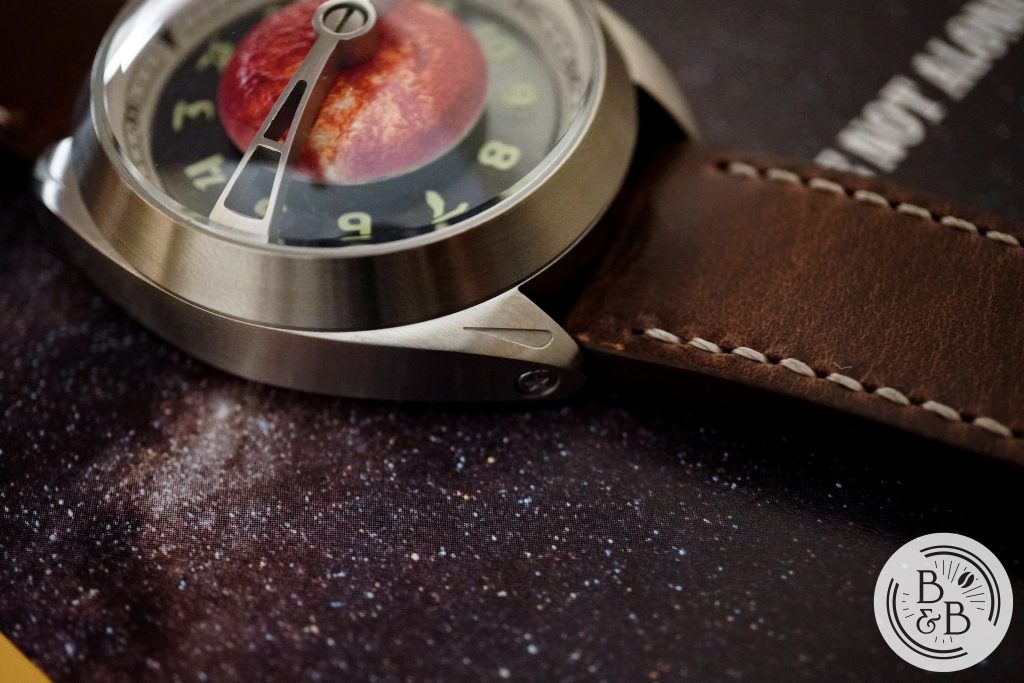
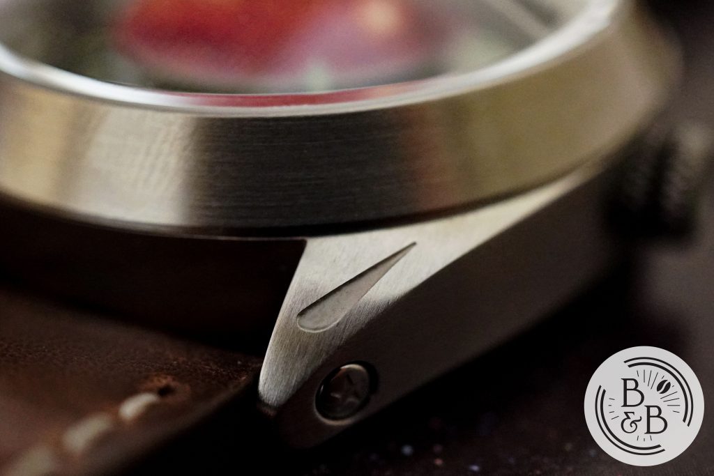
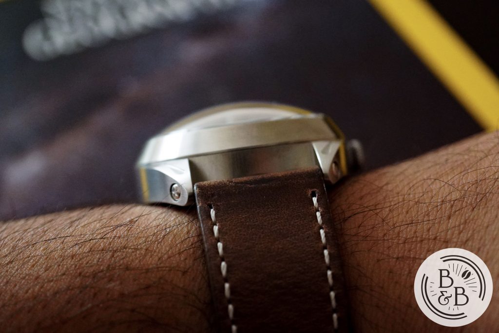
The case is 42mm in diameter, 47mm from lug-to-lug and 19mm in height. The whole case has a somewhat elliptical footprint with unobtrusive lugs that continue this rounded aesthetic. The lugs are patterned with a streak that resembles a meteor entering the Earth’s atmosphere. The lugs are not drilled through, but have an interesting star engraved plate. I’m not sure how I feel about this, and I think I would’ve preferred drilled through lugs instead.
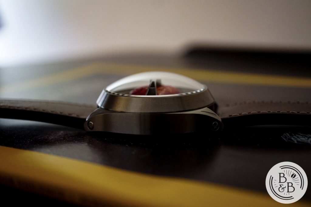
Above the lower case section sits a massive mid-case (a.k.a bezel) that supports the roughly 6mm double domed sapphire crystal.
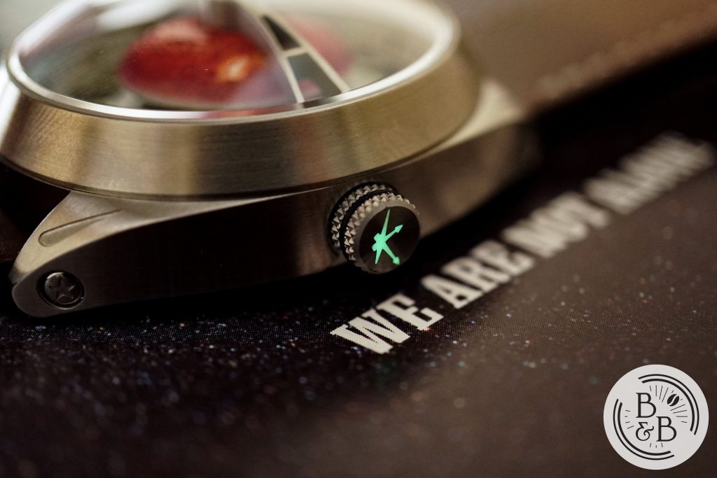
There is a lumed crown which is signed with the brand’s logo and has an interesting and comfortable knurling pattern, that makes the crown easy to operate. The crown is well designed and I didn’t notice any crown or stem wobble. The crown does not screw-down into the case.
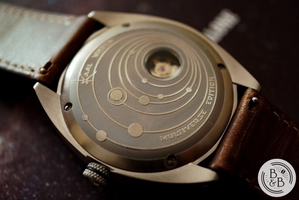
The case-back continues the space theme and has a solar-system design engraved onto the flat case-back, that has a small exhibition window that gives you a glance at the Seiko NH35 movement below it. I think this is a very nice case-back design! This watch is rated for only 30m of water resistance, which shouldn’t come as a surprise given the design.
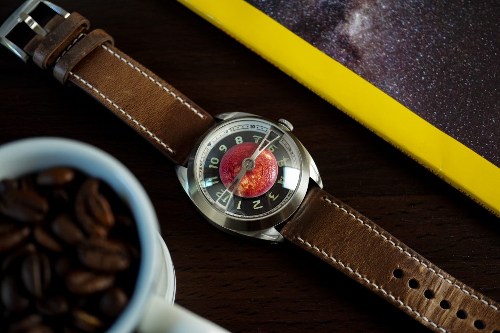
Dial
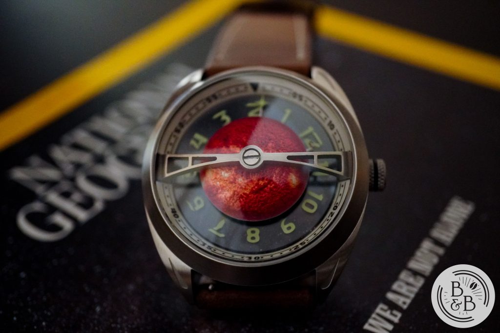
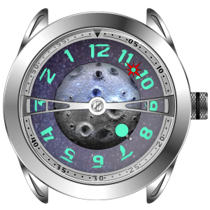
OK, let’s talk about the dial. There’s a lot going on, so I’m going to deconstruct it piece by piece, working my way from the chapter ring to the solar hemisphere at the center. According to the press release, there are plenty of changes that are scheduled to be made, so I will point them out wherever relevant.
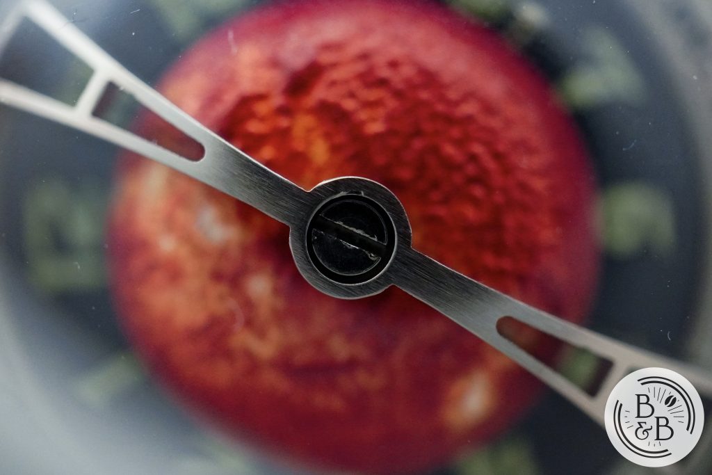
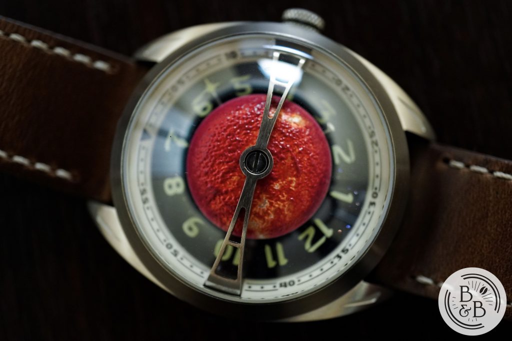
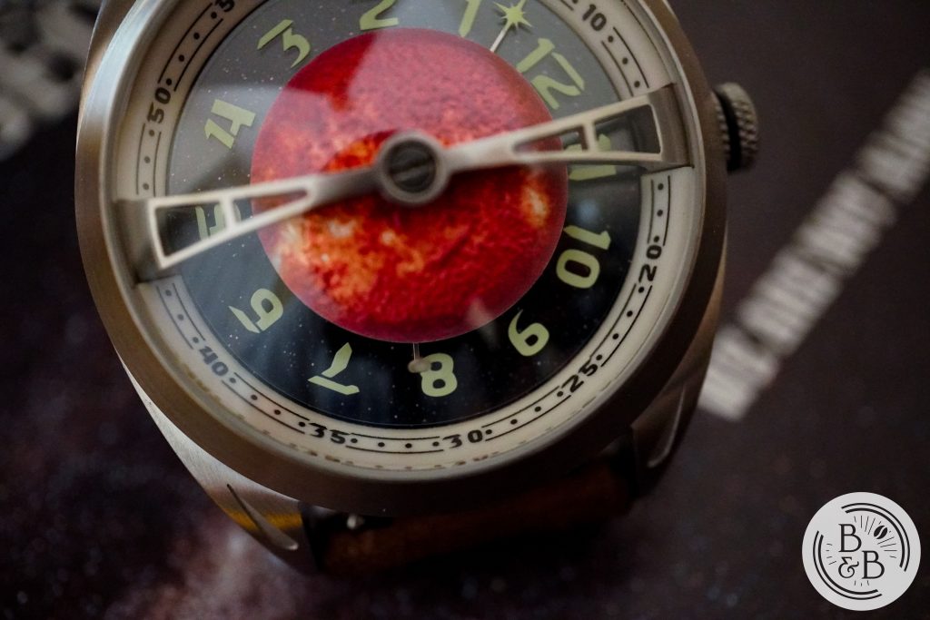
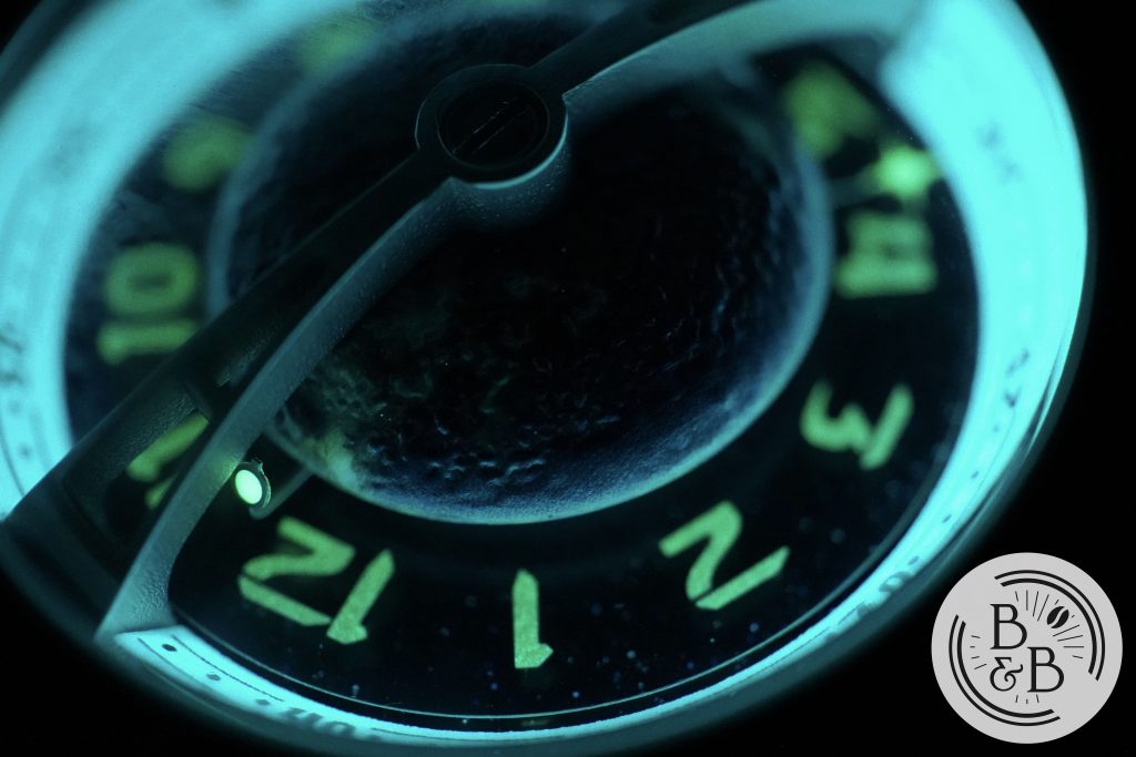
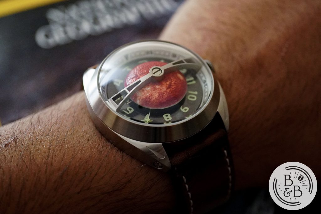
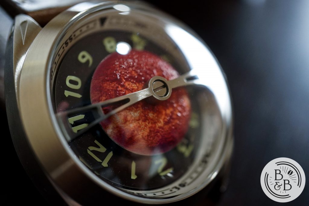
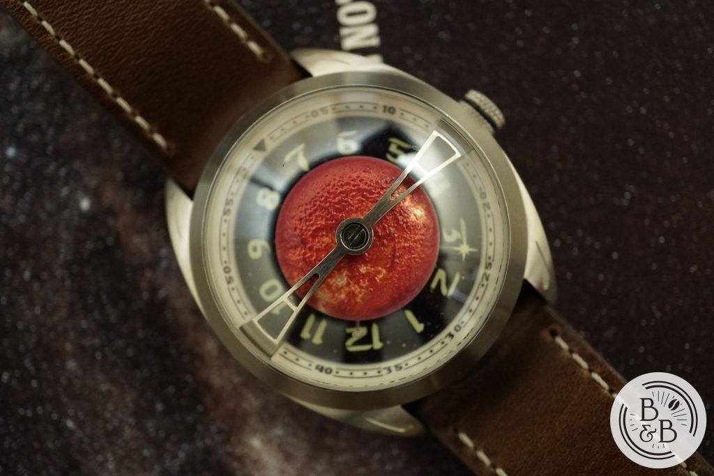
The first element that catches your eye is the stainless steel cross bar that spans across the center of the watch, which is clearly inspired by the Globetrotter. This appears to be holding down the solar hemisphere, while also serving as a visual anchor for an otherwise uniform dial. The finishing on this bar is alright, but I did notice some damages to the screw and and near it. Of course, this is a prototype and these are to be expected, but since this is the most visible object on the dial, Kaal must ensure that the finishing of this cross bar is held to the highest standards on the production units. And I also hope that care is taken to ensure that the screw head is aligned perfectly with the cross bar.
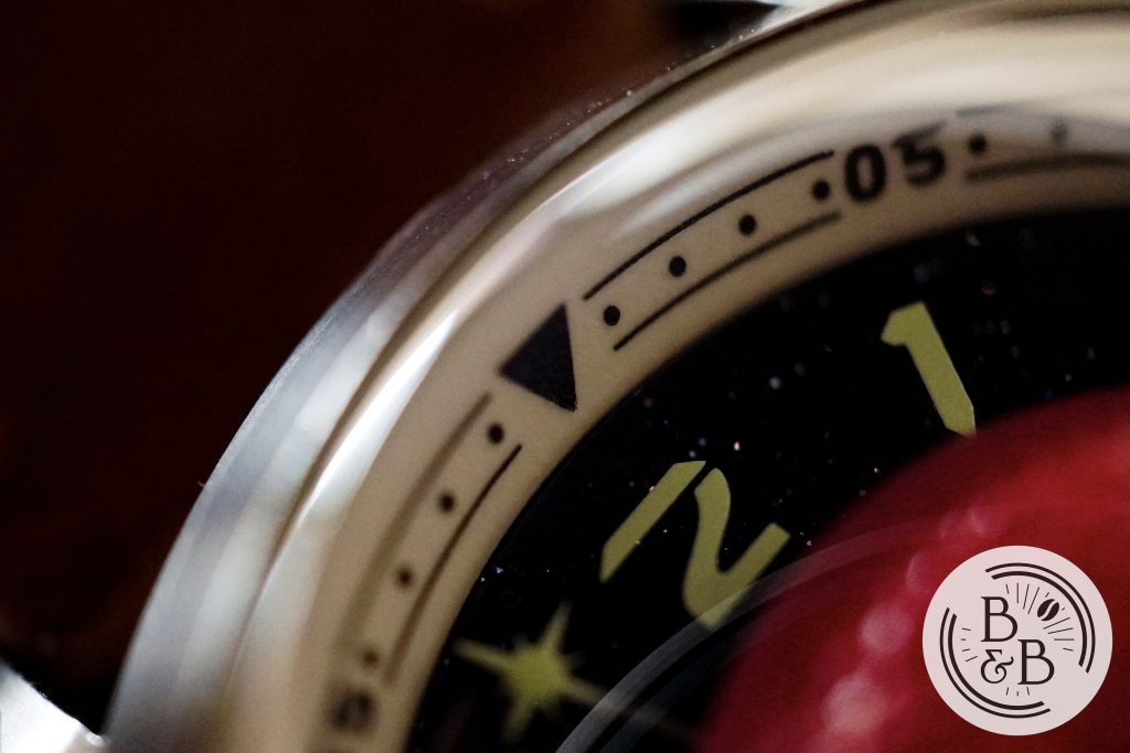
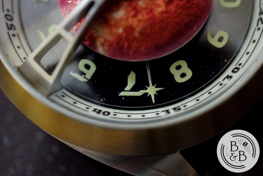
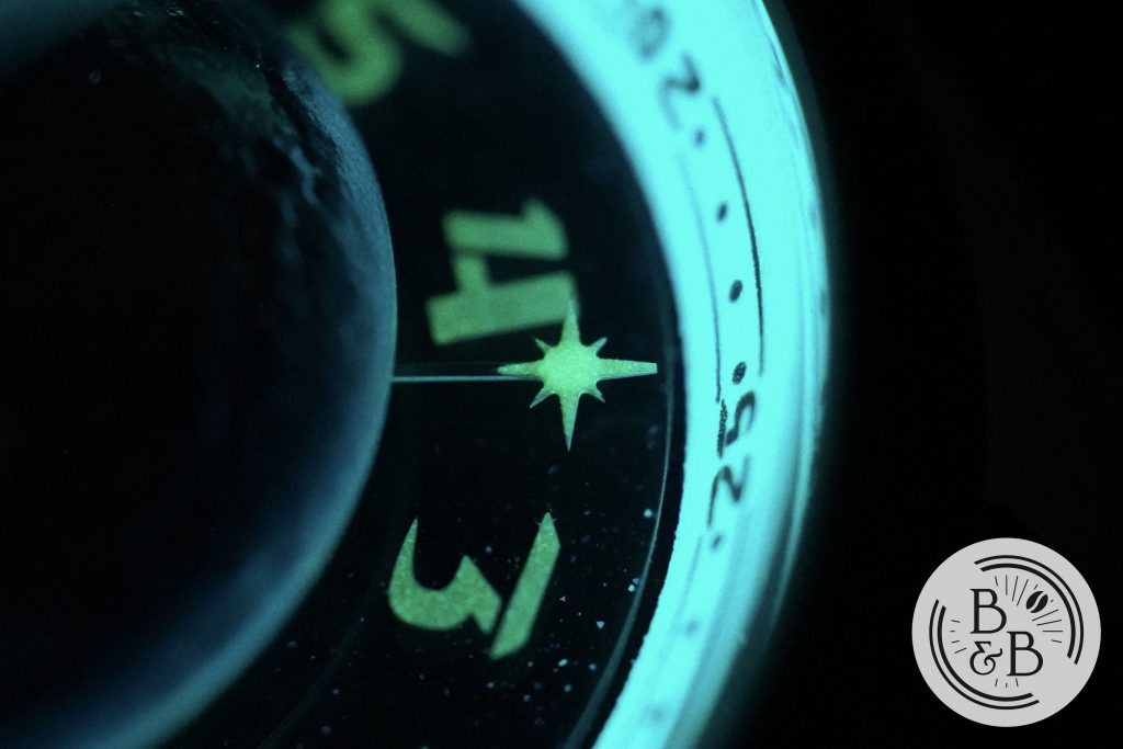
The next piece, and arguably the most important for telling the time, is the fixed chapter ring that is entirely lumed with C3 Super LumiNova. The chapter ring has a triangle marker at the 12 o’clock, numbered increments of five and dot markers for minutes and seconds. The printing on this is good and I couldn’t find any faults here.
The next element is the Aventurine base of the dial, that makes the ‘sparkling‘ starry space in which these elements exist. Aventurine is very difficult to photograph properly, but this does look very beautiful up close.
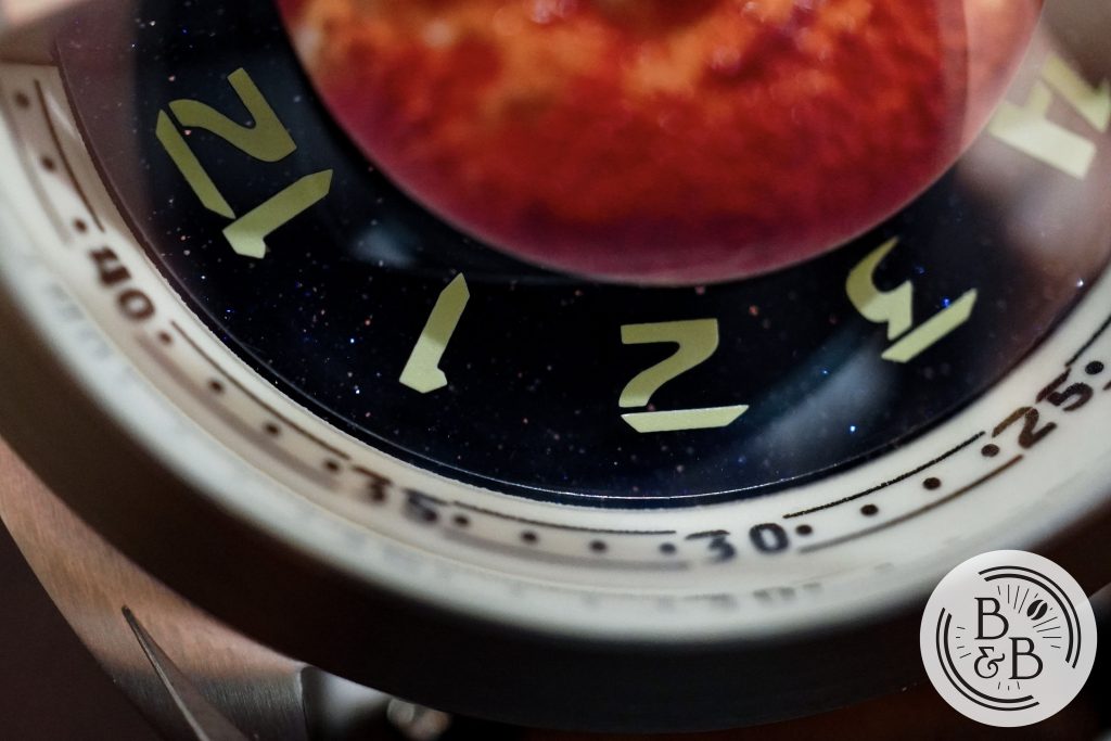
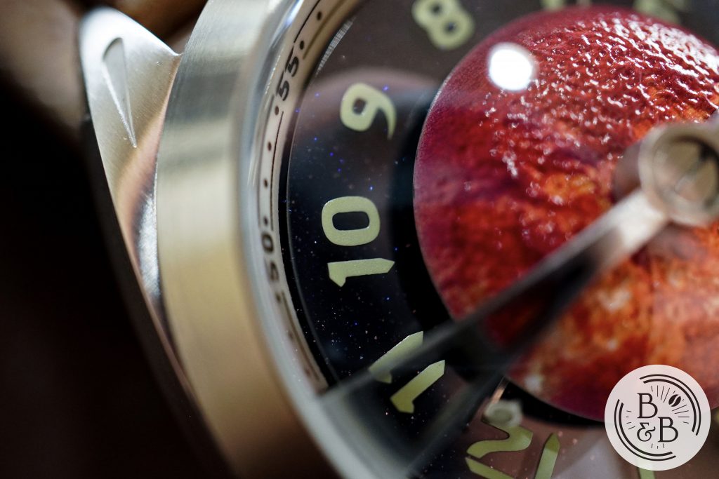
Above the Aventurine base sits what is effectively the ‘hour hand‘, by means of a rotating transparent disc that has the lumed hour numerals printed on it. This appears to be a very thin, almost sticker-like layer. I personally wish they had chosen a more subtle font for the hour disc, but this one does match the aesthetic of the logo and chapter ring.
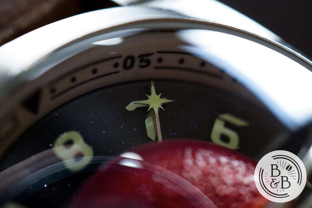
The next element is the minute hand, or ‘star‘, that orbits the solar hemisphere. This star lumed, and can be read in reference to the chapter ring like a regular watch. According to the press release, this star will be made much larger and will complete hide the base stem. It will also be colored red for more easy visibility. I’ve seen a render of this, and if they execute it correctly, I think it’ll look much better than it does now.
We then have a seconds hand, or ‘orb‘ that is currently positioned almost perpendicular to the base of the dial and is a bit small. This element is generously lumed, but is difficult to see during the day given it’s size and alignment. However, this is being drastically changed for the production units, with a much larger size that is also aligned more parallel to the dial, and therefore being more visible.
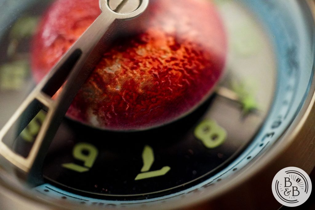
The last piece of the dial is the Solar hemisphere that sits at the center of this watch, with it’s turbulent solar surface. This element is very red, with hints of yellow and orange, but I’ve been informed that this will be made mostly orange for the production units and I definitely agree with their decision.
The finishing across the dial on this prototype is good – apart from some scuffs on the cross bar, I don’t have any quality control misgivings. I would’ve preferred to see different fonts on the dial, but that’s really the only thing that I would change that already isn’t being changed.
Contrary to what you might expect, once you wear the watch for 10-15 minutes, it is actually quite easy to read the dial. Only the seconds ‘orb’ can get hidden at times, but if they execute their proposed changes, it should become very easily visible.
Lume
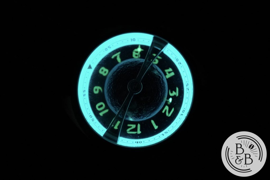
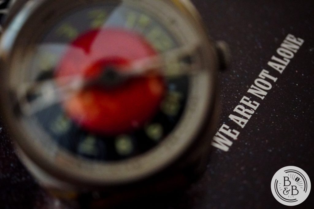
The Multiverse Sol, just like our very own night sky, is best appreciated in the dark, free of any light pollution. This watch comes alive in the dark, with the textured surface of the solar hemisphere reflecting the incident light and subtly revealing the chaotic surface of the Sun.
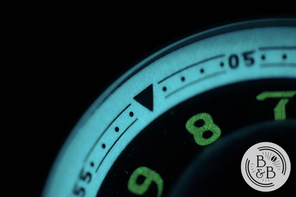
The chapter ring, seconds ‘orb‘ and minute ‘star‘ are the brightest elements here, adequately filled and printed with C3 Super LumiNova.
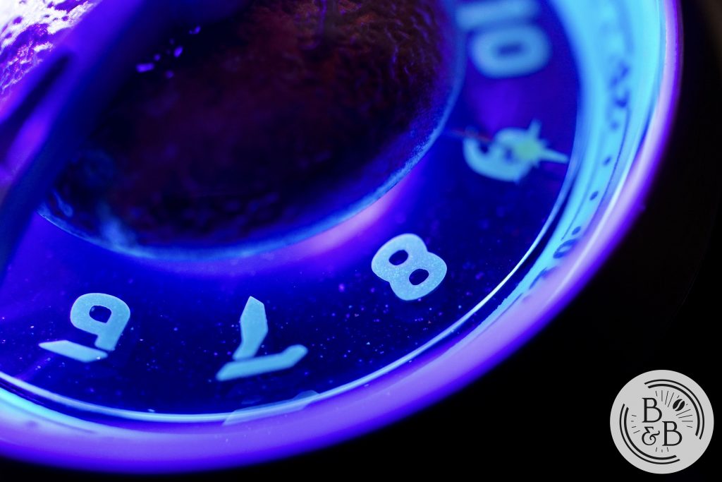
The hour numerals seem to have a very fine layer of lume and hence don’t hold their charge as well as the rest of the watch. But overall, this watch puts on quite a show in the dark, and if you’re wearing this at a social gathering that has poor lighting, it is certainly going to be a conversation starter.
Movement
The watch uses a Seiko NH35, and for the $369/$399 launch prices, this is more than reasonable. By now, we’re all quite familiar with this movement so I wont bother with the details and I’ll jump right to the performance. I logged the accuracy of this watch over a 4 day period and observed roughly -7.7 spd.
On The Wrist
As you might’ve already figured out, this watch is pretty tall with it’s 19mm height. But every other dimension is reasonable, even for medium sized wrists. The 42mm case, has a 47mm lug-to-lug width, and doesn’t look bad on my 6.25″ wrist.
The case-back is flat, so the watch does sit low on the wrist, helping it balance the big dome above it. It’s a bit on the heavier side for a ‘dress watch‘, coming in at around 120g on the leather strap.
I will just conservatively assume that this watch is not going to be your everyday piece, and for the occasional event, this watch is actually quite comfortable given what it looks like. I was expecting it to feel like a snow-globe strapped to my wrist, but the weight is well distributed and the dimensions are quite compact.
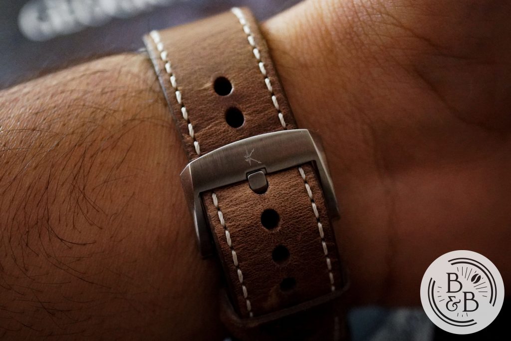
This watch ships with a 22mm Horween leather strap (your choice of black or brown). The strap is quite thick and will require some breaking in, but appears to of good quality, with a stamped buckle.
Concluding Thoughts
To wrap things up, I think this is a very interesting watch that is breaking (mostly) new ground in the “affordable conversation piece” watch market. I have somewhat of a conservative taste for watches, so this isn’t the kind of watch I would typically wear. But I have enjoyed spending time with it, and you can be assured this – there’s never a dull moment when wearing this watch. You often come across some watches that just lack depth and engaging aesthetics – this is not one of them. The well designed lume elements make this watch even more interesting in the dark.
If Kaal Watch is able to make the changes that they’ve proposed, I think this will be quite an appealing watch to those that want an eccentric occasion piece in their collection. I also suspect that their Gaea variant will be the most popular given the balanced colors, and the strong connection to Home.
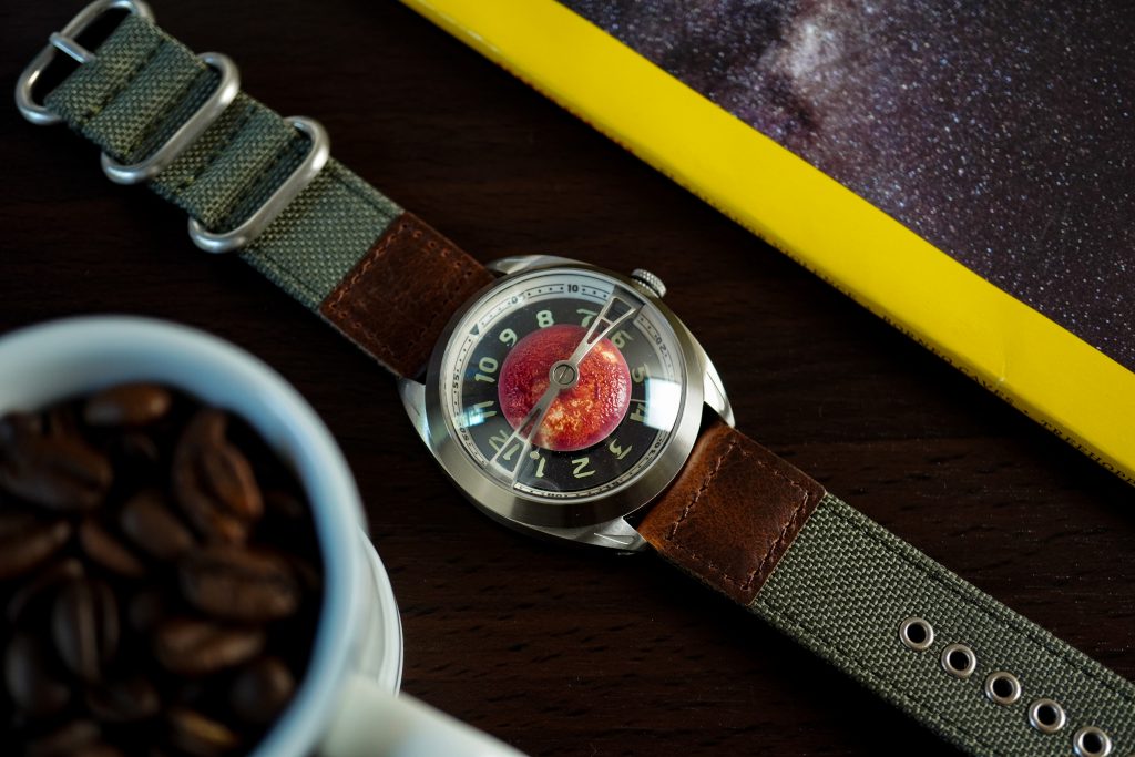
Strap Change
Thanks for reading!