Disclaimer: This watch was sent to me to review, and I do not need to return it after my review is complete. This watch was given to me without restriction and is not contingent upon a particular outcome for my review. All opinions here are my own, and Horizon had no influence over the opinions stated here.
Horizon Spectrum “DotCom”: https://www.horizon-watches.com/product-page/horizon-spectrum-dotcom
Video
Review
Horizon is still a young micro-brand, co-founded in around 2021-2022 by Fred Bekher and Sugi Kusumadi, but the “new brand” label has never really fit the way their watches present in the metal. Bekher, in particular, is a seasoned watch designer, with a long track record of work for brands like Zelos, Arcturus, Velhelm, Gruppo Gamma, and Feynman Timepieces, while Kusumadi is also deeply embedded in the watch scene through his watch store in Singapore. And I’ll just say it up front: I personally love Fred Bekher’s work. I think he’s one of the most talented watch designers out there, full stop, not just in microbrands. He has a real sense of originality, and I have immense respect for designers who can break free from the mold instead of iterating on the same familiar templates.
Horizon’s earlier releases, like the Jules Verne inspired Nemo, already proved they could stand out, but the Spectrum feels like the moment they decide to turn the dial even further. It’s their boldest, most design-forward watch yet, and was submitted to the GPHG 2025, which is an audacious swing for a small brand. And I’m sure plenty of people will dismiss it for that very reason, because it is unapologetically graphic, colorful, and architectural. But I think it’s one of the most interesting releases I’ve seen from the micro-brand space in years, and I’m hoping my review and photography can communicate why.
Before the Spectrum, Horizon’s lineup moved in clear chapters: the -N- debut, the Pilgrim, and the Nemo (with offshoots like AnoNemo and Nemolithic). And then there’s the Horizon x Selten piece, which is especially cool here because it’s a genuine “watch-nerd” collab between two brands I’m a fan of, blending Horizon’s case design magic with Selten’s dial wizardry.
Pricing for the Spectrum is $1,150 USD, and that includes a very unique bracelet plus a premium FKM rubber strap that’s designed around the watch. The watch appears to be ready for immediate delivery. Note: if you sign up to the brand’s newsletter, you can get 10% off.
Let’s check it out!
Case
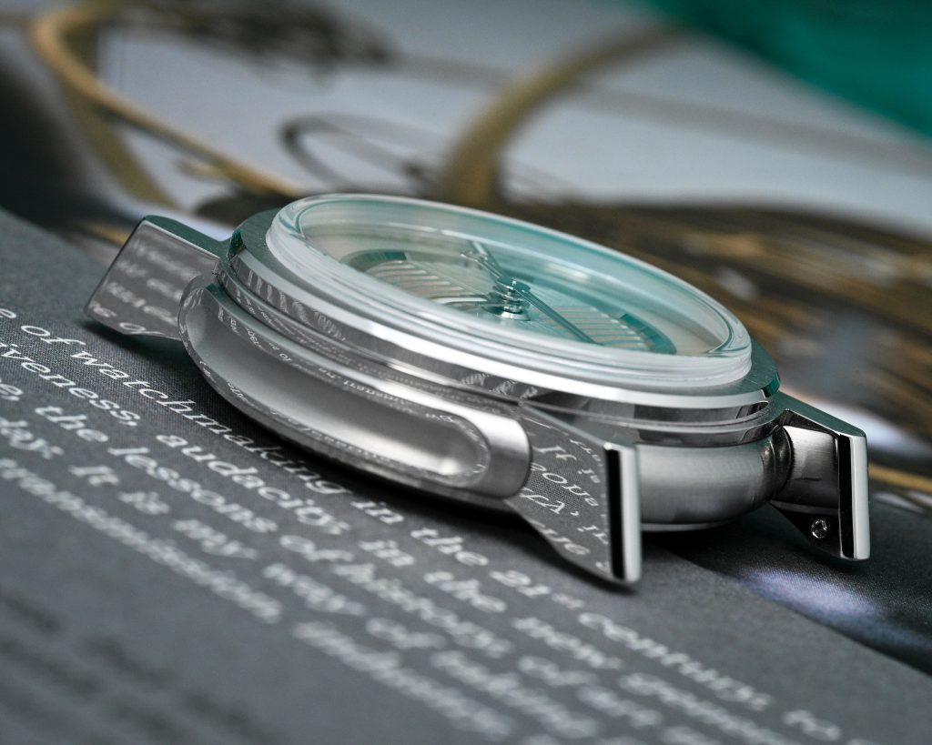
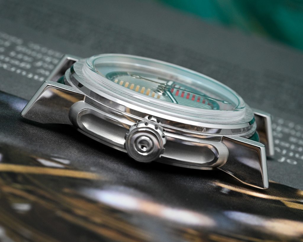
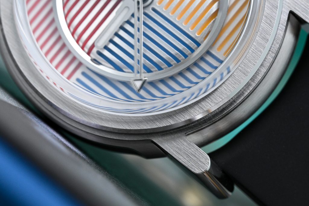
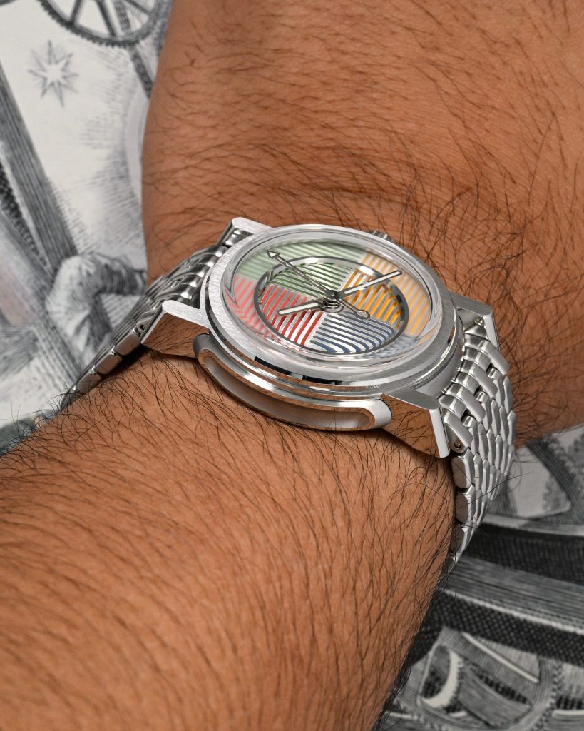
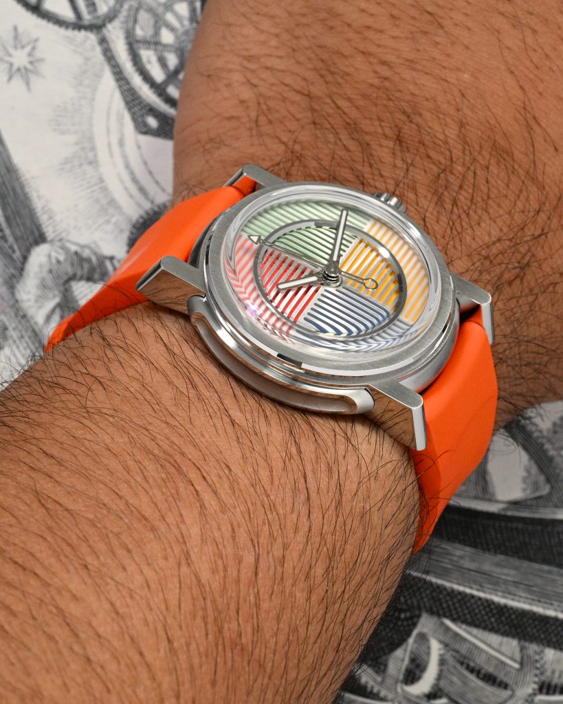
I measured the case at 37.85mm in diameter, 46.7mm lug tip to lug tip, and 11.75mm in overall thickness, and that thickness figure includes the roughly 2mm boxed sapphire crystal. Lug width is 20mm, which makes strap options easy, but the included bracelet and rubber strap are excellent to begin with. The case is entirely stainless steel, and it’s one of the most refreshing and original designs I’ve seen in a very long time. The level of sculptural intent here is rare at any price point, and especially so in the microbrand space. The detailing is so rich that I honestly feel like I could do an entire review of just this case, because every perspective reveals something new: a different transition, a new surface, a surprising cut, a bevel that catches the light differently than you expected.

The mid-case is the foundation of the whole thing: a perfectly rounded, pebble-like silhouette with a clean brushed finish that makes it feel smooth and organic. But then Horizon breaks that softness up with deep side recesses on both the left and right flanks, each framed by polished borders and finished with a brushed inner cavity. The depth and definition here are incredible, and it’s one of those details that makes the watch feel like an artifact from a sci-fi movie.
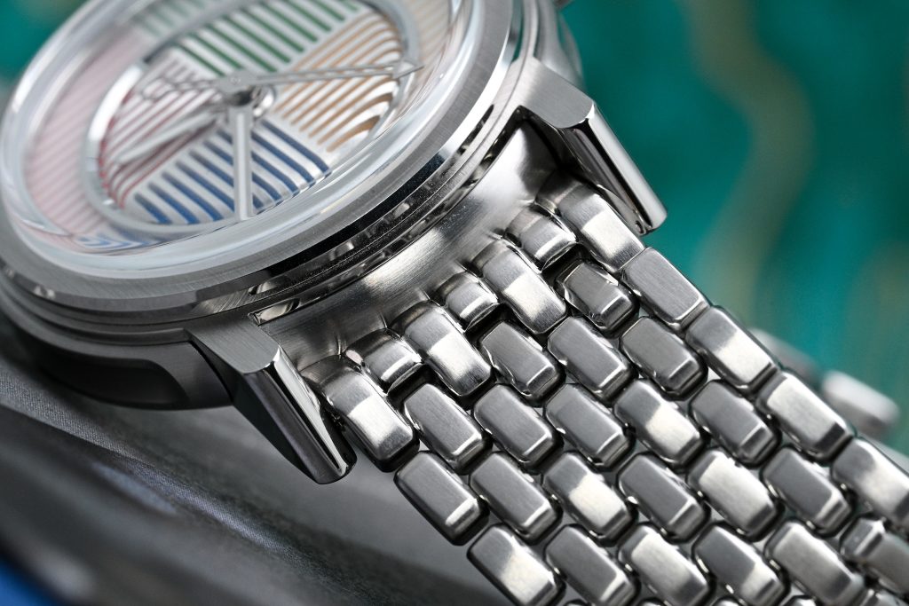
And then, integrated into that fluid mid-case, you get the four lugs, which are sharp, aggressive, and honestly a little bit outrageous in the best way. They dominate the personality of the watch, with a mix of brushed and polished finishing that gives the case a ton of personality. From a top-down view, the watch reads as entirely brushed, and the continuity is excellent: the vertical brushing on the bezel flows naturally into the top surfaces of the lugs, which makes the whole shape feel cohesive rather than pieced together.
From the side, it’s an entirely different aesthetic. Aside from that recessed pebble midcase, the profile is dominated by polished surfaces, and the way those polished planes interact with the brushing is masterfully handled. It’s a case that never looks flat, because the design and the finishing are doing all the work: separating forms, emphasizing curvature, and making those recesses look even deeper than they already are.
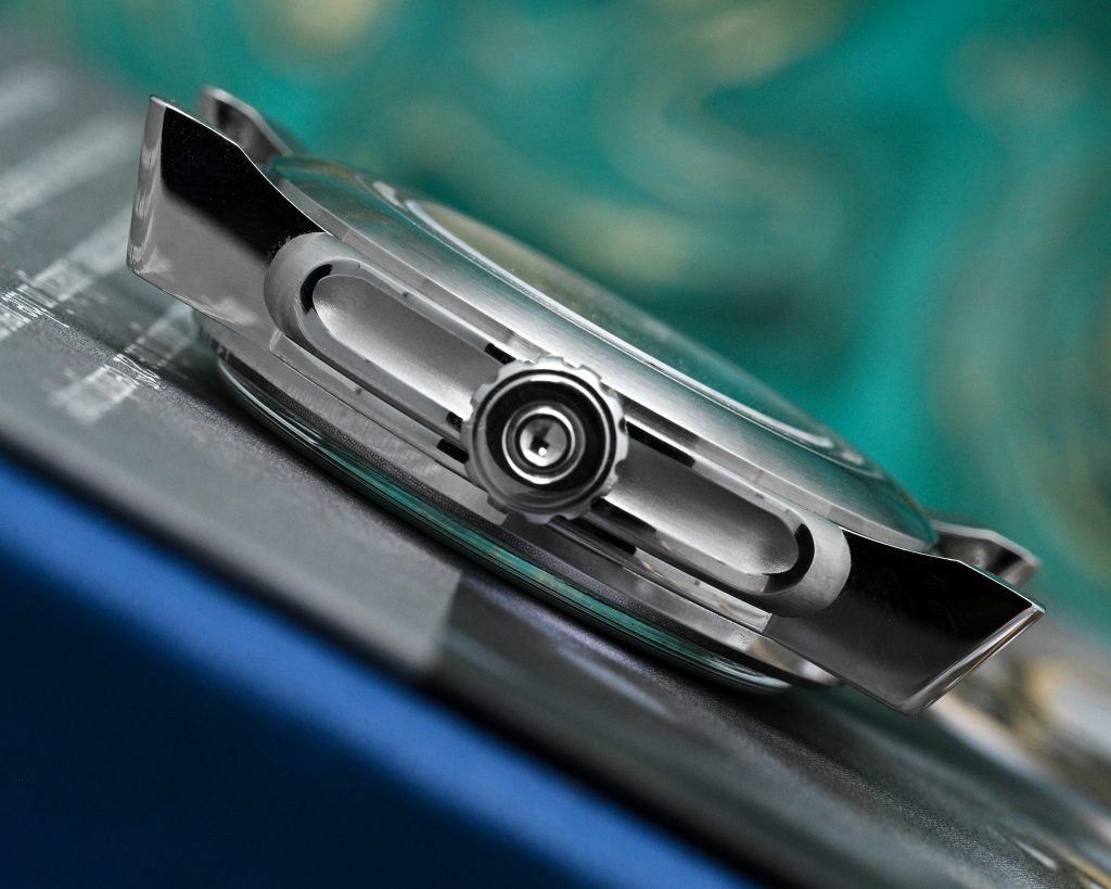
The crown is another highlight: a 7mm screw-down crown with excellent grip, paired with a well-machined crown tube that feels smooth in use. Flipping the watch over, the case-back continues that pebble curvature of the mid-case, and the lugs gently extend beyond it, almost like the feet of this little sci-fi machine. The case-back is screw-down, and the crown is screw-down too, but water resistance is rated at 50m. I’m slightly surprised by that, because all the ingredients feel like they’re here to push it to 100m, but honestly, 50m is more than sufficient for most real-world activities.
Dial
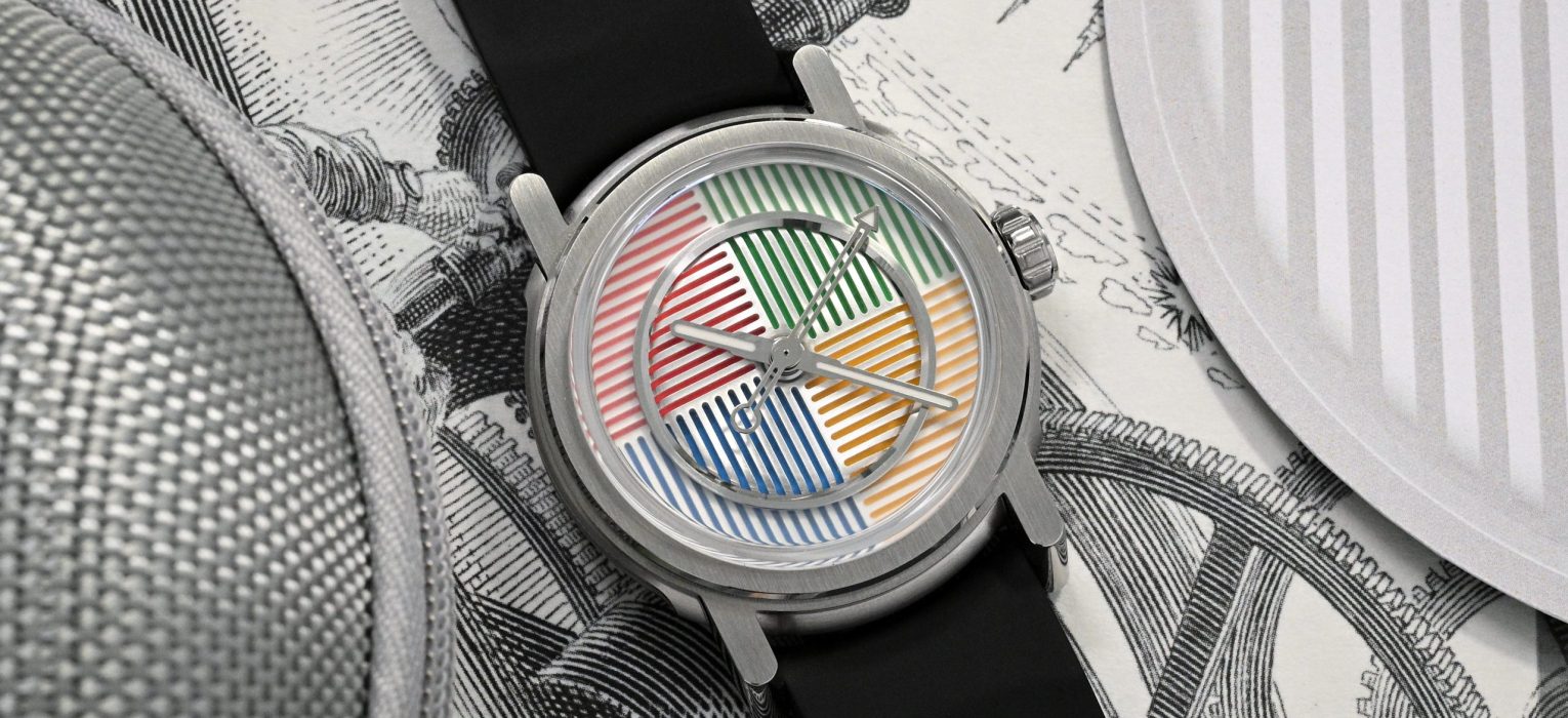
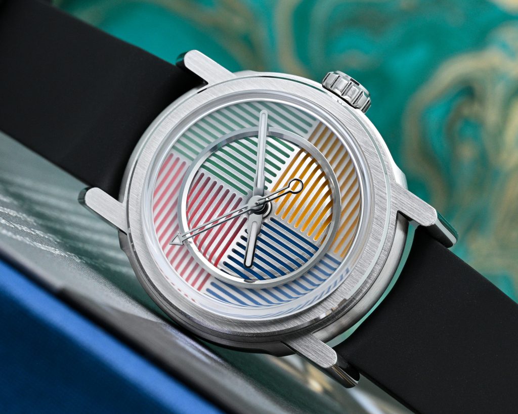
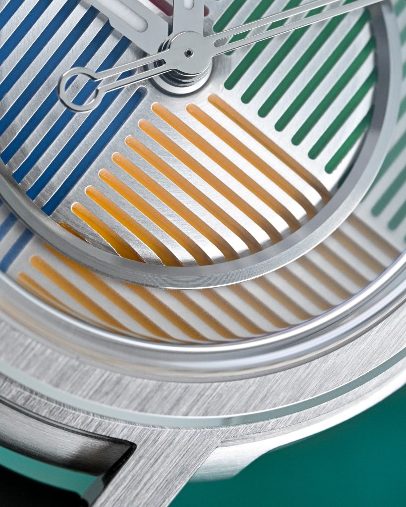
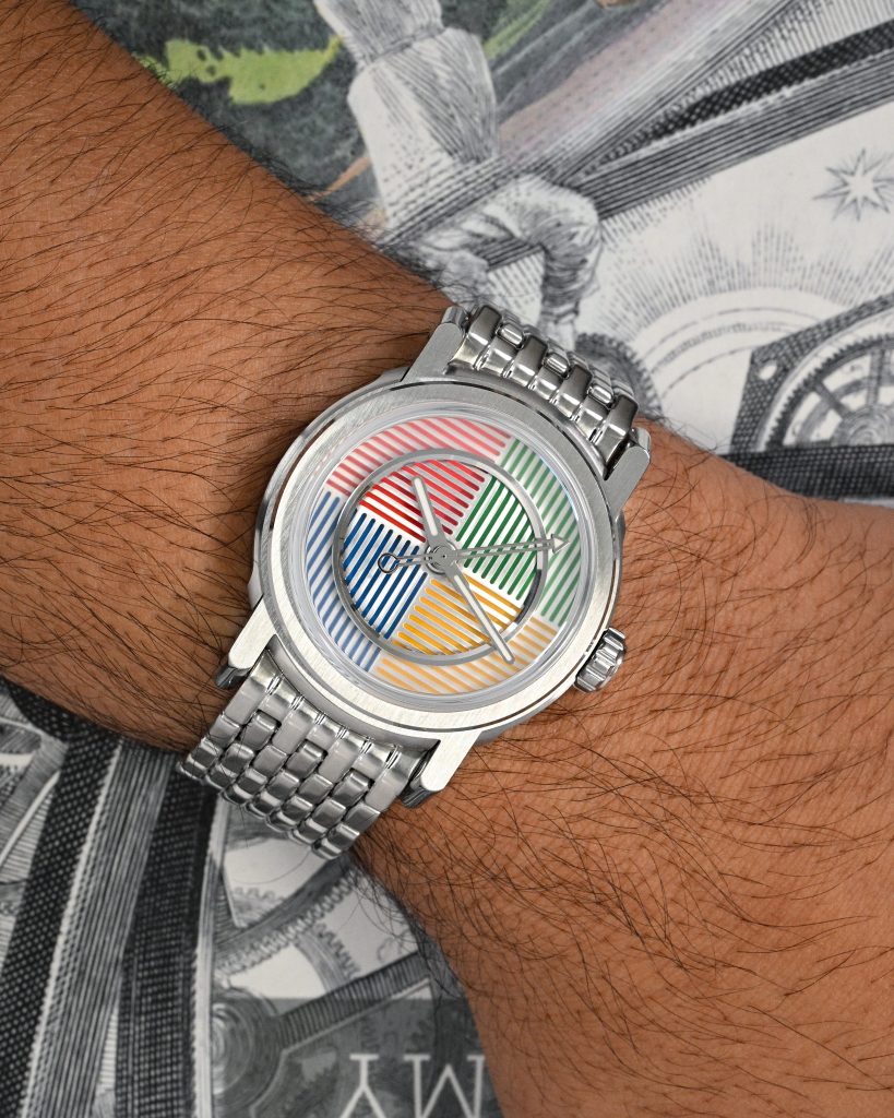
The dial is one of those designs that feels the least traditional in its intent, and more like a piece of modern graphic art that just happens to tell time. There are no applied indices, no numerals, and no conventional minute track. Instead, it’s built like a little piece of graphic architecture: loud, geometric, and disciplined; the kind of thing that genuinely wouldn’t feel out of place at the MoMA Design Store. The colours are bold and unapologetic, but the composition is controlled and perfectly balanced.
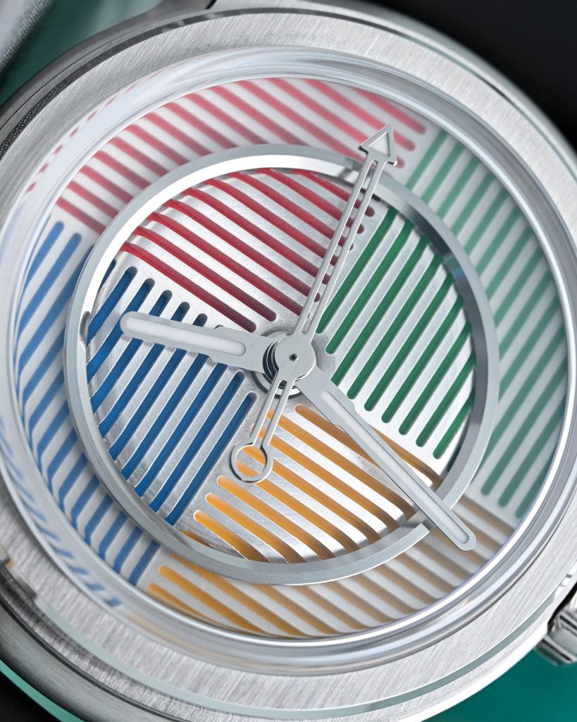
And a big part of that comes down to the fact that this isn’t just colors on a flat plate. It has a three-layer construction: the topmost layer is a single circular piece of CNC-machined stainless steel with crisp polished ridges that reflect light from the dial and the hands. Below it you have what Horizon calls the “pizza” segment: a four-section plate filled with different colours that gives the Spectrum its name. There’s also a raised inner section that creates an almost architectural “stage” for the hands, framed by the stainless steel ring, adding another plane to the design and making the whole thing feel dimensional rather than graphic. On the outside of the stainless steel ring is a glass overlay over the pizza segment, which offers a slight opacity to the colors, making sure your focus is always drawn towards the center, but without being obvious about it.
What really brings the dial to life, though, is the crystal. The boxed sapphire behaves like a lens at certain angles: the curvature and height catch and bend the geometry near the edges, turning straight stripes into curves and giving the whole composition a subtle sense of motion as you move your wrist.
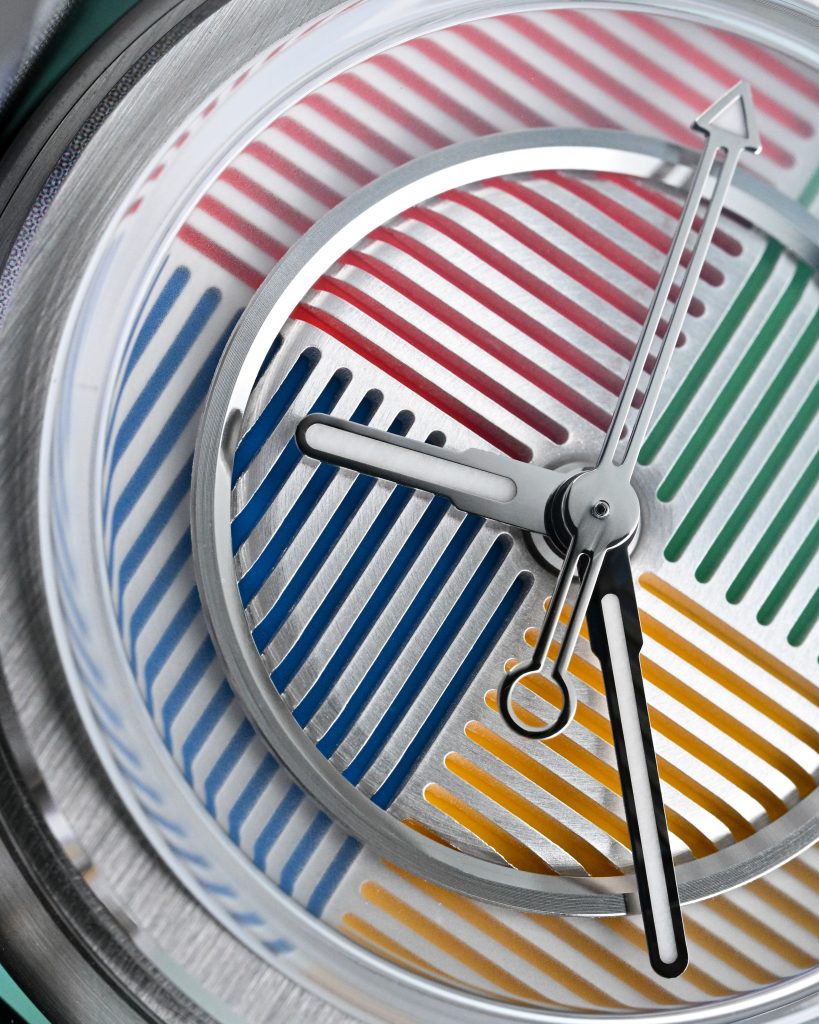
The hands are the other key part of the equation, because Horizon is basically asking you to accept a slightly different relationship with legibility here. The hour and minute hands are bold, lume-filled batons that have a good amount of presence, and the seconds hand adds a bit of playful precision with a lollipop counterbalance and a lume-filled triangular arrow tip. And because there are no markers to “land” on, you’re reading the time by where the hands are in space rather than what they’re pointing at. I know that’s going to put off a lot of traditionalists, but after owning plenty of MINGs and other sci-fi-leaning watches without definitive markings, I’m quite comfortable with it.
Even the colour selection, according to Horizon, wasn’t left to chance. The three Spectrum variants were chosen with algorithmic help, using AI-assisted colour theory, so that each version maps to a distinct emotional tone.
Lume
Lume on the Spectrum is minimal in terms of where it’s applied, because only the hands are lumed, but the execution is solid. Horizon didn’t skimp on the fill: the hour and minute hands get a generous application, and even the seconds hand’s triangular tip is densely packed with lume that makes it easy to pick out in the dark.
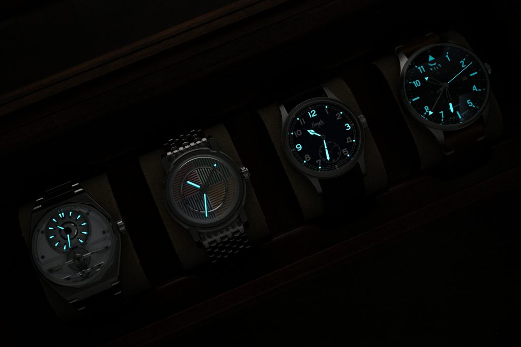
Now, without any hour markers, you don’t get that instant “glance and go” readability at night, but if you can orient the watch on your wrist, it’s still legible enough to confidently infer the time from the hands alone. I do love how the lume on the hands plays with the stainless steel dial ring, creating some wonderful visuals. Personally, I would’ve loved to see a little more lume woven into the design, maybe a subtle lumed ring around the periphery to match the Spectrum’s architecture, but to be fair, I always want more lume in watch designs, so maybe don’t take me too seriously on that one.
Movement
The Spectrum uses the Miyota 9015 automatic, and while I used to have some reservations about the 9-series experience, mainly the uni-directional winding and that audible rotor spin, I’ve come around to it in a big way over the years. After handling a wide range of movements in this bracket from Miyota, Seiko, Sellita, and ETA, I’ve ended up preferring the 9015: it’s thin, robust, and consistently reliable, even if it doesn’t always deliver the “factory-regulated Swiss” romance some buyers chase. And for this watch in particular, I’m genuinely glad Horizon went with the 9015 instead of the Sellita SW200 they used in the Nemo.

The rotor continues the Spectrum’s dial theme in an impressive execution: it presents as a full, symmetrical design, yet it clearly has an asymmetrical weight distribution because the winding efficiency is excellent and the rotor spins exactly as you’d expect from a traditional layout. The clever part is that the mass is essentially “hidden” by the case-back architecture, so you get this striking, balanced look through the display back without sacrificing function. This particular watch was running at +4 seconds per day, which is excellent for this movement.
On The Wrist
The 37.85mm diameter and 46.7mm lug tip-to-lug tip distance put it in that sweet spot where it’ll sit comfortably on almost all wrist sizes. What’s interesting is that it doesn’t look like a 38mm watch at a glance, because the lugs are so bold and so expressive that they visually expand the footprint. It has real presence, just without the actual bulk usually associated with that presence.
The 11.75mm thickness includes the roughly 2mm boxed sapphire crystal, so on wrist it actually wears slimmer than you’d expect from the spec sheet. The mid-case feels more svelte, the watch is planted on the wrist nicely, and the crystal height adds intentional character.
And then there’s the bracelet, which is frankly excellent. It’s a 7-link design with no taper, but it flows perfectly and suits the watch’s design language in a way that makes the whole package feel cohesive. The build quality and finishing here is genuinely impressive: it is one of those bracelets that reminds you how far the micro-brand scene has come in the last few years. Each link has rounded bevels, a fully brushed finish, and really good articulation. The clasp is a butterfly-style deployant with a solid twin trigger release mechanism, and it feels secure and well made.
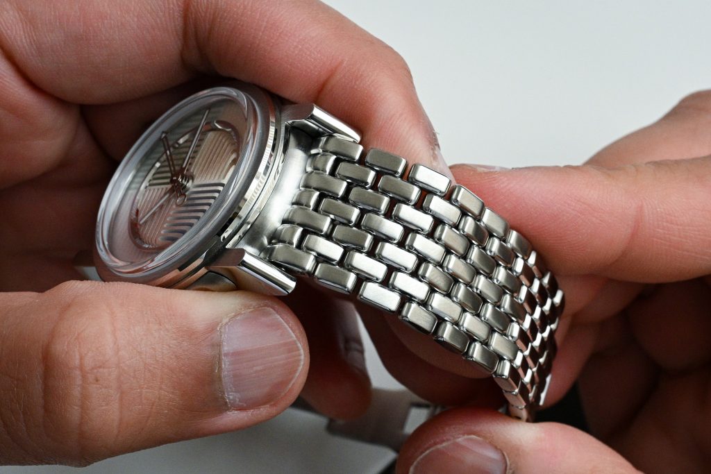
The end links are another standout detail. Cases like this, especially with an unusual shape and dramatic lugs, often struggle with bracelet integration. You tend to end up with something that looks “neither here nor there”, and tend to just feel you’ve had to compromise somehow (think the MING Universal Bracelet). Here, the end links sit flush with the curvature of the case, and there’s a groove in the end link that perfectly mates with the bottom of the case, creating a robust integrated feel without distracting from the case design. My only real criticism is that sizing uses a pin-and-collar system, but honestly, that 20-minute investment to size it is completely worth it.
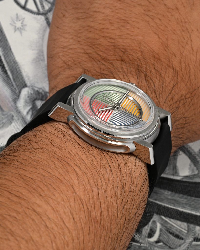
Horizon also includes an FKM rubber strap that feels bespoke in the same way the bracelet does. I like that the bracelet doesn’t taper, but I do wish the rubber strap had a touch of taper from 20mm to 18mm. Still, it’s a really well-considered strap: it tapers in thickness from about 4.25mm at the case to roughly 2.75mm at the buckle. The buckle is another strong design detail and matches the case nicely; I just wish it were slightly smaller. Because the strap stays 20mm at the buckle, the overall buckle width lands at around 26mm, so it looks a bit large visually even though it wears great.
But honestly, these are all minor nitpicks. As a complete package, the Spectrum is a 10/10 for wearability: great proportions, an exceptional bracelet, and a high-quality rubber strap that feels purpose-built rather than tossed in as an accessory.
Wrapping Up
Fred and Sugi have created a bit of a masterpiece with the Spectrum, and I’ve tried throughout this review to communicate just how exceptional it is: especially that case design, and the way it flows so naturally into a bracelet that feels purpose-built rather than merely fitted. I also know it won’t be for everyone; it contradicts a lot of traditional ideas of watch design with its dial, and it almost feels seriously unserious in the way it tells time. But that’s exactly the point: a return to the fundamentals, reimagined into something genuinely new, and I’m glad Fred had the conviction to materialize those ideas into a real watch.
If you can appreciate originality and truly ambitious design execution, I can’t recommend the Spectrum highly enough. I’m completely smitten by it, and it’s honestly one of my favorite case designs in a very long time. I really hope Horizon builds on this platform, because it feels like they’ve struck gold here.