Disclaimer: this video/review was not sponsored by Farer or any other entity.
Video
Review
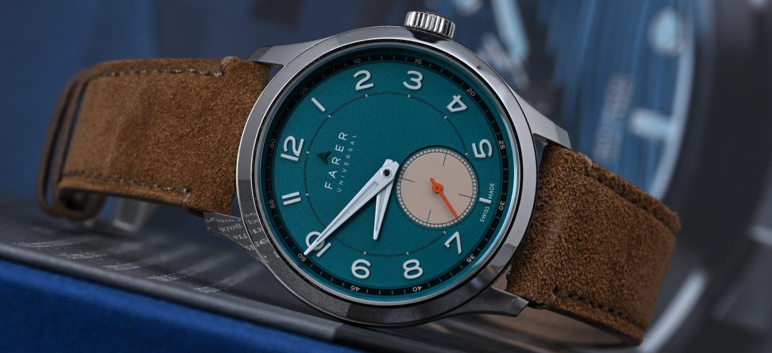
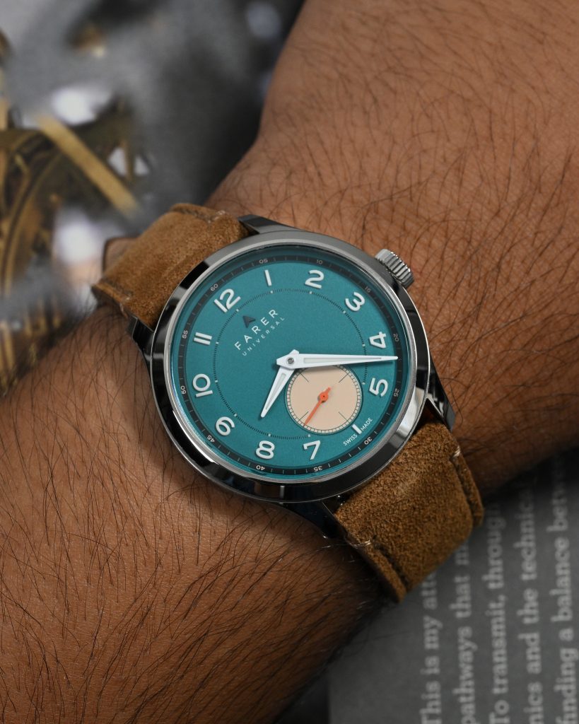
Farer is one of those micro-indie brands I’ve kept an eye on for years, but didn’t really have an opportunity to spend time with one or review one. Known for their vibrant use of color, quirky British flair, and just the right touch of vintage-modern hybrid design, Farer has carved out a niche as the go-to brand for folks who want their watches to look fun, fresh, and unmistakably Farer. Their catalog has long been a technicolor dream, often mixing unexpected hues with beautifully detailed dials, and for a brand that seems to embrace joy in design, the Lissom Forrest might be one of their most quietly confident releases to date.
It’s also the first Farer I’ve actually spent real time with on-wrist, thanks to a loaner prototype piece kindly sent over for review – and I’ve got James Mulvale and Mike Razak to thank for making that happen. The prototype does have a few stray dust particles visible on the dial, but that’s forgivable given the pre-production nature of the piece. The Lissom Forrest is priced at $1,295 USD, and after wearing it for a few weeks, I’m starting to understand what all the fuss has been about.
Let’s check it out!
Case
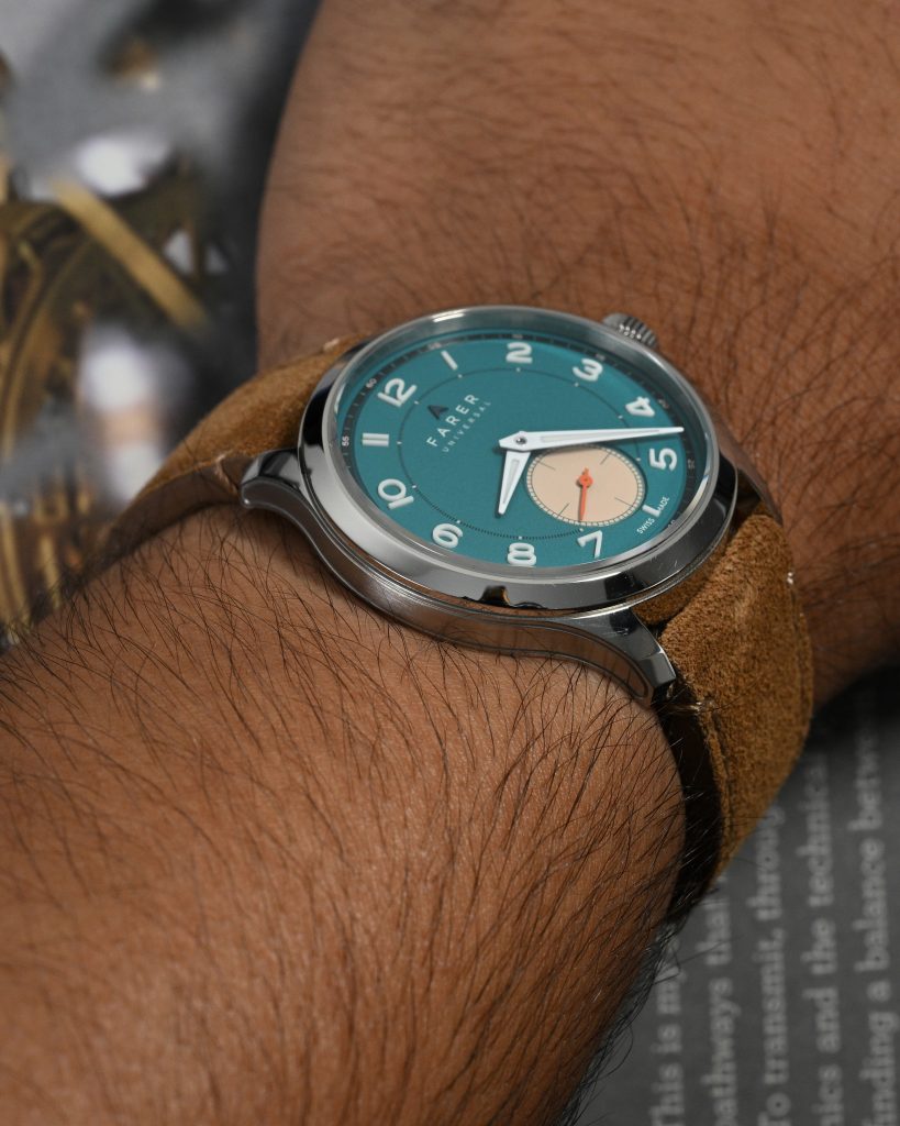
I measured the case at 37.75mm in diameter, 42.5mm lug to lug, and just 8.60mm thick, including the sapphire crystal and case back. That’s already impressively slim, but Farer’s case design takes things a step further with a clever relief line engraved into the mid-case, giving the illusion of even more thinness. The case has a refined, mildly architectural quality to it – simple at a glance, but hiding some thoughtful design touches that become more apparent with closer inspection.
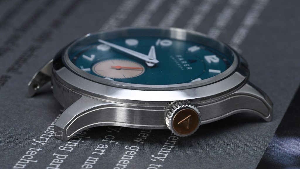
The lugs are one of the most distinctive visual elements of the Lissom case. They sweep down well past the mid-case and feature a subtle angular twist that gives them a dynamic silhouette. At 20mm wide, they’re proportionally well-matched to the rest of the case and make strap pairing easy. On wrist, the way they curve and wrap around the wrist adds plenty to the overall comfort.
The crown measures 5.75mm and is a practical highlight here. In a hand-wound watch like this, crown ergonomics matter a lot more than they would in an automatic, and Farer nailed the execution. It’s easy to grip and operate, and the brass-tone inset with the Farer “A” logo gives it a stylish, slightly vintage feel that adds character to the overall profile. The push-pull crown suits the watch’s style and supports its 50m water resistance rating… adequate for this kind of dressy-casual piece.
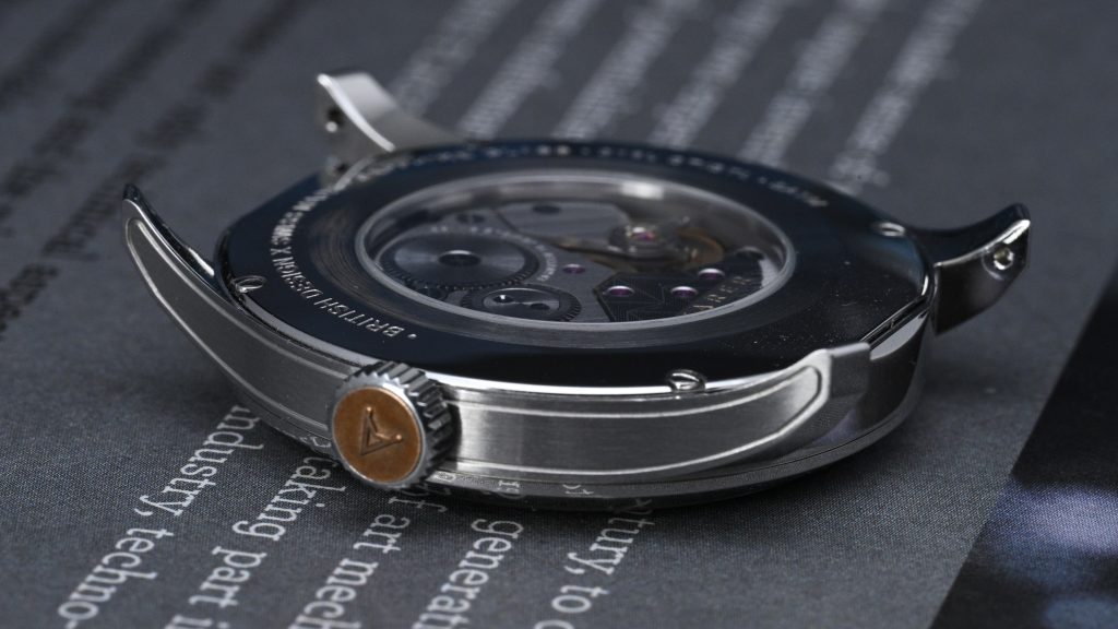
Finishing on the case is a mix of polished surfaces and brushed sides, both cleanly executed. It’s a well-balanced look that gives the case just enough contrast without feeling flashy. That said, it’s hard not to compare it to Christopher Ward, another British micro-brand that often punches above its weight class in case finishing, especially at this price point. Finally, the box-style sapphire crystal up top could benefit from stronger anti-reflective coating, as glare can be an occasional issue. Flip it over, and you’ll find a screw-down sapphire case back that gives you a full view of the La Joux-Perret D100 movement inside.
Dial
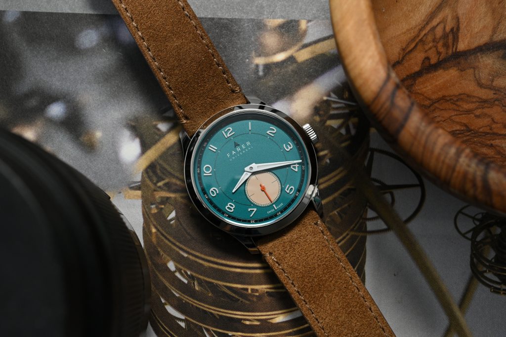
The dial of the Forrest is absolutely the star of the show. It’s a rich, saturated teal-blue that somehow manages to feel both playful and refined… a tough balance to strike. The matte texture keeps reflections down and gives the color a soft, velvety depth that changes character subtly depending on the light. And while this particular prototype has a visible particle on the sub-dial (a forgivable anomaly since it is a pre-production piece), everything else about the dial’s presentation is incredibly clean.
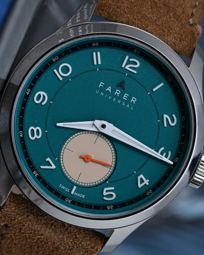
The numeral layout and construction deserves special note. Each of the raised, solid all-lume numerals is positioned with radial symmetry that instantly brings to mind the elegance of Hermès designs, and is a style I love. Some might not appreciate the gravity aligned numeral layout, but I don’t mind it. Farer has chosen to go fully typographic here, with a bold font that’s easy to read and well designed. The use of raised numerals adds depth and gives the dial an extra layer of dimensionality that contrasts beautifully with the flatness of the sub-dial.
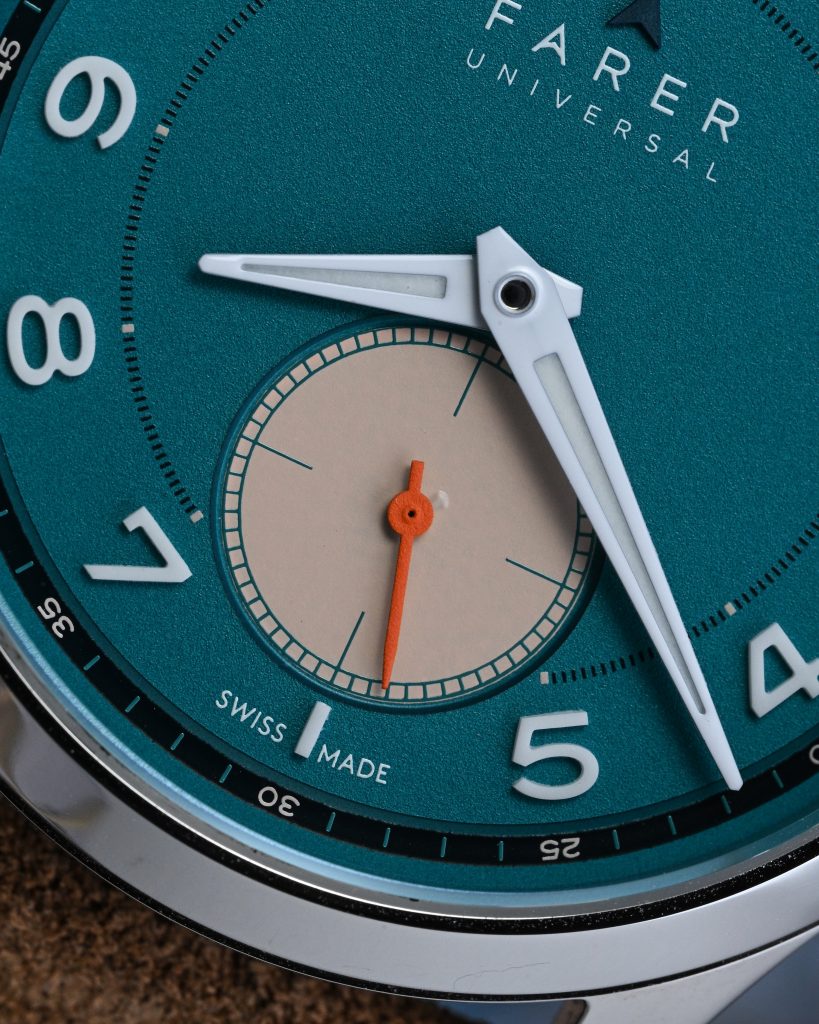
Speaking of which, the small seconds sub-dial at 6 o’clock has the right amount of Farer flare with its color choice. The creamy, almost sand-like tone is a surprising but complementary pairing with the teal main dial, giving the watch a slightly vintage feel without leaning into faux patina territory. The printed seconds track around the sub-dial adds a touch of precision, and the contrast helps balance the overall layout without overpowering it. It also brings a little visual grounding to an otherwise uniform and conservative dial.
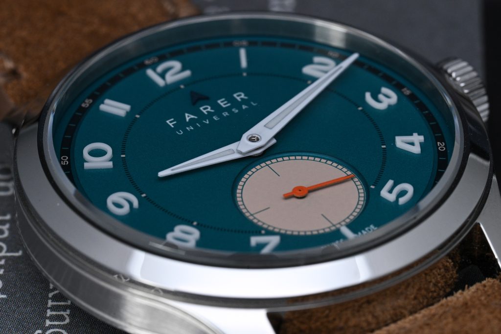
The small seconds hand color is perhaps the most Farer-like design touch, with a vivid orange that punches through the more muted tones around it. It’s playful and eye-catching, and while it might not be to everyone’s taste, I found it grew on me quickly. It adds a dash of Farer’s trademark color experimentation, reminding you that this isn’t just another watch… it’s a Farer, and it’s here to have a bit of fun.
Lume
he numerals are made from solid ceramic blocks infused with Grade X2 Super-LumiNova, giving them a raised, three-dimensional look that glows with a satisfying brightness in the dark. The hands also feature Grade X2 Super-LumiNova, though applied in the more traditional style inside lume plots. In real-world use, both the numerals and hands charge quickly and emit a consistent, legible glow.
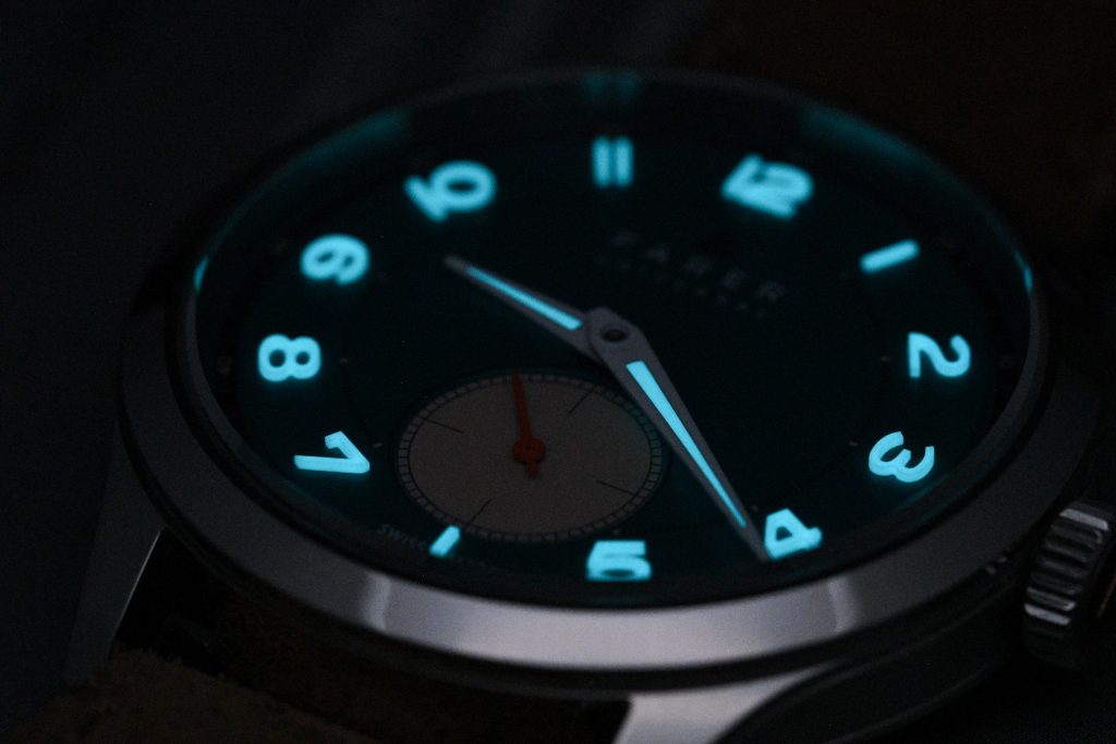
I ran a couple of side-by-side time-lapse comparisons with other lume-heavy watches like the Christopher Ward Lumiere and the Halios Seaforth IV, watches that outperformed the Lissom in terms of sheer brightness and longevity, but also have significantly more surface area to work with. In context, the Lissom’s lume is more than adequate for its design intent, and I doubt anyone will walk away wishing for more. For a watch of this slim and dressy character, the lume is nicely executed and pleasantly effective.
Movement
Powering the Farer Lissom is the hand-wound La Joux-Perret D100, a movement that will likely be familiar to fans of thin, manually wound watches. Based on the Peseux 7001 architecture, the D100 brings that same slim 2.5mm profile but elevates things with modern refinements and top-grade machine finishing. This particular execution is the soigné version (the highest grade available at La Joux-Perret) complete with blued screws, polished chamfers, and traditional côtes de Genève across the bridgework. It’s also technically sound: the movement is adjusted in four positions, has 18 jewels, beats at a smooth 3Hz, and offers a generous 50-hour power reserve.
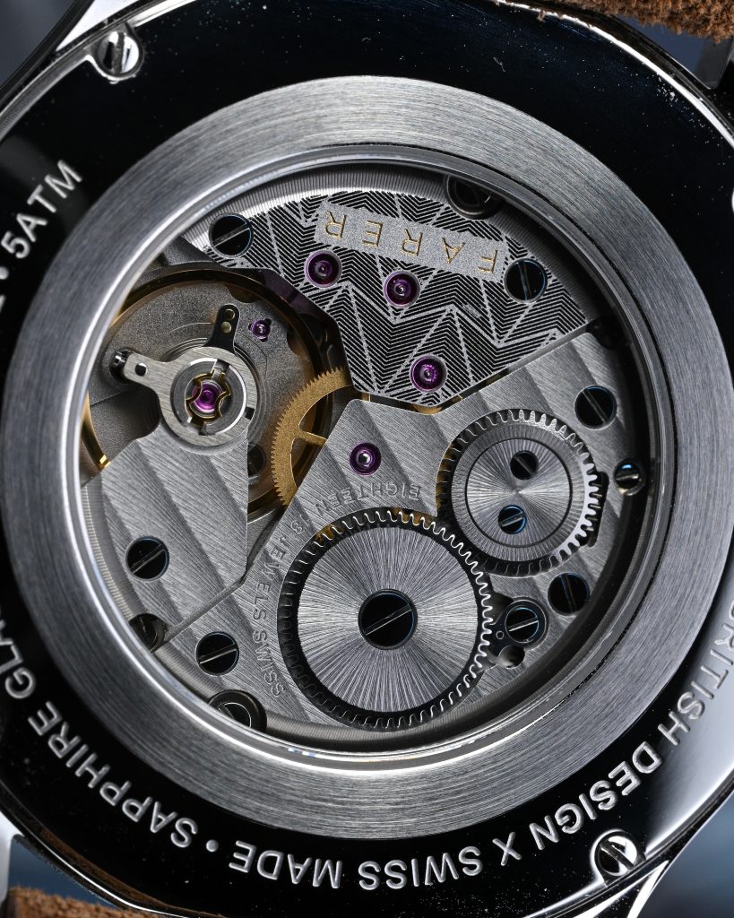
This specific prototype was running well within spec during its time on my wrist, consistently holding within +/- 5 seconds per day. The finishing is good for the price – crisp, clean, and well-executed, with no rough edges or unfinished surfaces. Winding the D100 feels buttery smooth and deliberate, offering just enough tactile resistance to make the ritual enjoyable without being fatiguing.
On The Wrist
The sleek 37.75mm case diameter, compact 42.55mm lug-to-lug span, and svelte 8.6mm thickness give the Farer Lissom an inherently dressy profile, even though the design leans far more casual, and even a bit sporty, in execution. On my 6.75″ wrist, the short lug-to-lug distance makes it wear slightly smaller than I usually prefer, but that’s coming from someone who generally gravitates toward larger watches. For most people, though, I suspect this size will hit a real sweet spot. The lugs have a nice downward curve that helps the case hug the wrist cleanly, and it sits extremely low, making it a perfect choice for slipping under a cuff or just disappearing into your day.
The included leather strap is soft and well made, with no break-in required, and pairs nicely with the watch’s subtle lines and lightweight feel. It adds to that “set it and forget it” quality… this is one of those watches you’ll throw on in the morning and forget is on your wrist. The Lissom’s ergonomics and barely-there profile make it a pleasure to wear, even if the overall footprint lands on the smaller end of my personal preference. As a complete package, though, it nails the comfort factor with ease.
Wrapping Up
Farer occupies a fascinating corner of the watch world, a design-first brand that fully embraces creativity without ever feeling try-hard or pompous. In the relatively short time they’ve been around, they’ve built a catalog of watches that are approachable, cheerful, and unmistakably their own. There’s no pretense here, just a sincere commitment to fun, color, and detail… something that’s harder to pull off than it looks. And the Lissom Forrest might just be one of my favorite examples of what Farer does best. I was genuinely excited to get my hands on this one (okay, I may have begged a little), and it didn’t let me down.
The Lissom Forrest is the kind of watch that reminds you that watches are meant to be fun. It’s well made, thoughtfully designed, and just plain enjoyable to wear. If the combination of rich turquoise tones, glowing numerals, and sharp finishing speaks to you the way it does to me, then the $1,295 USD price tag feels entirely fair, especially given the specs, quality and overall execution. This isn’t a watch that tries to prove anything. It just exists to be worn, enjoyed, and smiled at. And really, what more do you need?