Disclaimer: This watch was sent to me to review, and I do not need to return it after my review is complete. This watch was given to me without restriction and is not contingent upon a particular outcome for my review. All opinions here are my own, and Tool Watch Co. had no influence over the opinions stated here.
Tool Watch Co. Chroma Green Chronograph: https://toolwatchco.com/TWCO-Chroma-Chronograph-Green
Video
Tool Watch Co. Chronographs
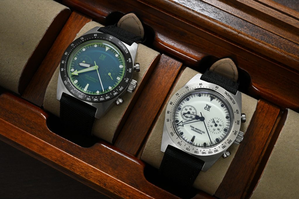
I reviewed the Tool Watch Co. Lumecore Chronograph not too long ago, and that watch had a very clear identity: a compact, affordable, meca-quartz chronograph built around a fully lumed dial and a clean black-and-white layout. The Chroma Green uses what is effectively the same basic platform, but changes the personality quite a bit.
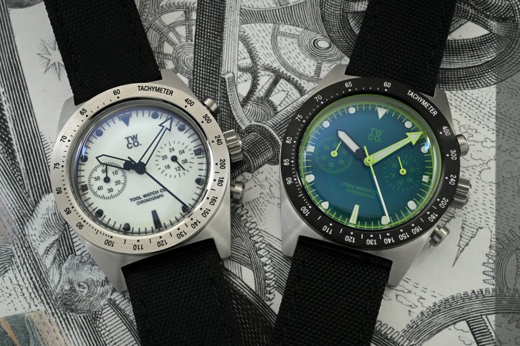
This is no longer the stark, lume-forward version of the watch. It is glossier, greener, more colorful, and probably a better example of how dramatically the character of a watch can change when the case, movement and proportions remain the same, but the dial (and bezel) go in a completely different direction. This watch is priced at $275 USD, which is $20 less than the Lumecore, and is readily available.
Let’s check it out!
Similar Fundamentals
The case, movement and overall wearability are essentially identical to the Lumecore, so I do not think this needs to be a full re-review of the entire watch. You get a 38mm brushed stainless steel case, a 46.4mm lug-to-lug, 12.3mm thickness, 20mm lug width, a fixed tachymeter bezel, and the Seiko VK64 meca-quartz movement inside. And you get the same comfortable wearing experience that made the Lumecore easy to recommend for most wrist sizes, including my 6.75″ wrist.
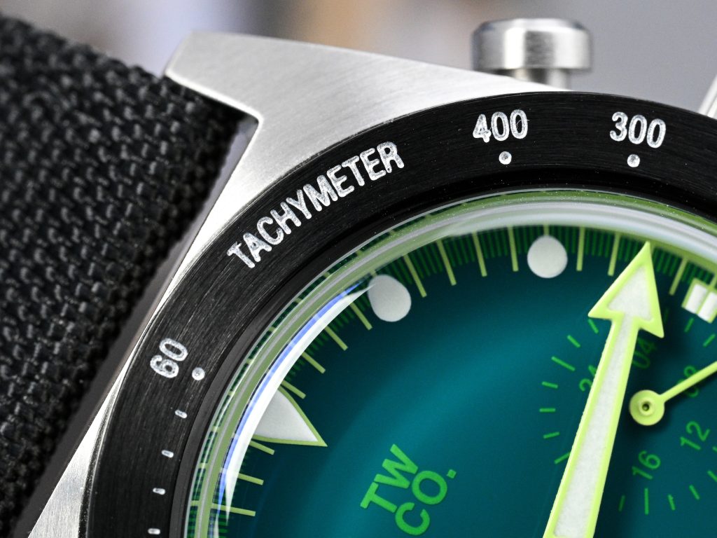
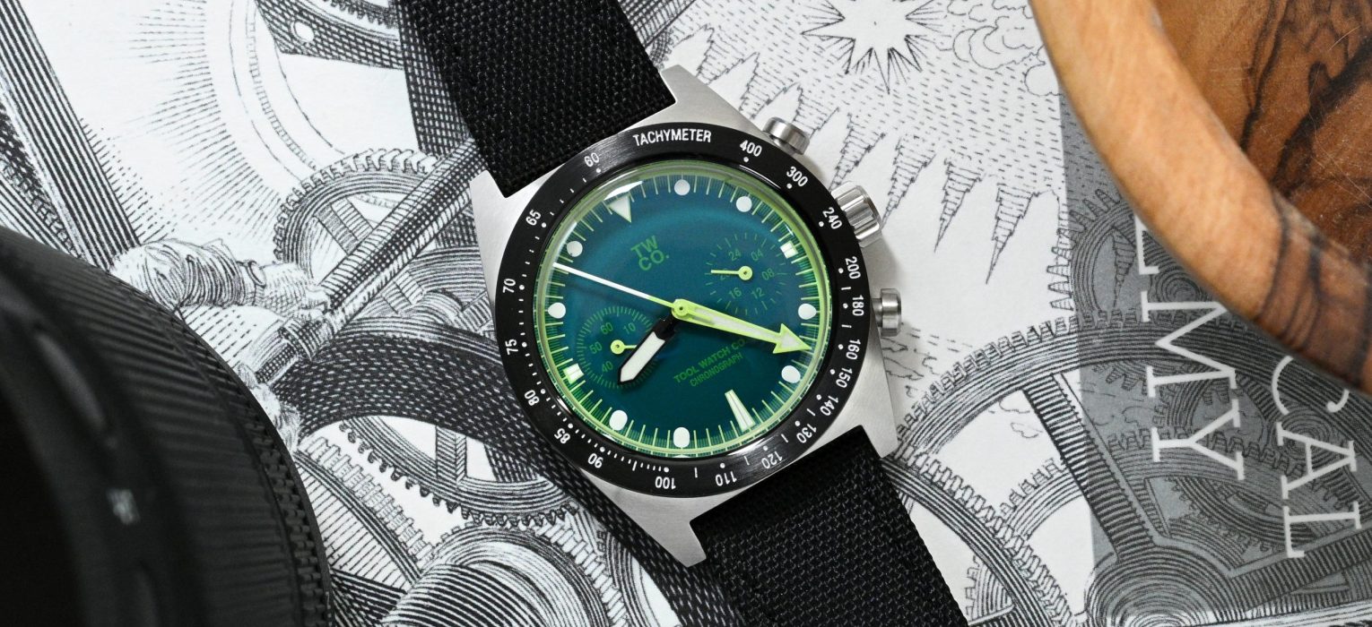
But the bezel is different, and it changes the look of the watch considerably. Instead of the stainless steel tachymeter bezel used on the Lumecore, the Chroma Green has a black PVD-coated stainless steel bezel with white text and markings. I think this works very well with the overall design because it frames the dial in a more sporty, graphic appearance. PVD coatings can fade or wear down over time, and I know that may bother some people. Personally, at this price point, I am totally fine with it. In fact, on a watch like this, I think I might actually enjoy the worn-down look if the bezel starts picking up some character over the years.
How does the Chroma dial hold up against the Lumecore?
The dial is where the Chroma separates itself from the Lumecore. The Lumecore worked because it was almost aggressively restrained: fully lumed white dial, black printing, black skeletonized hands, and little unnecessary color. The Chroma Green goes in a very different direction. The green dial has a very unique shade that almost shifts blue at certain angles, and the texture and finish remind me more of enamel or lacquer than a typical flat painted dial. I think it looks fantastic!
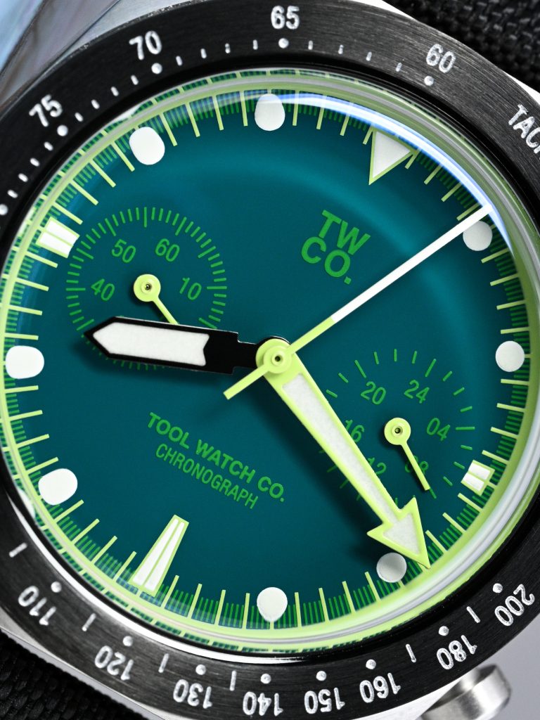
What I like most is that the rest of the dial design feels properly considered, not just colorful for the sake of being colorful. The green dial is matched with subtle green chronograph subdials, green logo and branding, white hour markers, and an almost fluorescent green outer ring and seconds track. There is a lot going on, but it does not feel messy. The colors work together, and the design still feels cohesive. Compared to the Lumecore, this is definitely the more expressive version, but I think the execution is very good.
The hand design is also interesting because the basic shape is identical to the Lumecore, but the execution feels very different. On the Lumecore, the fully black skeletonized hands were one of my favorite details because they solved a very specific problem with fully lumed dials. They avoided the hand shadow effect that I have noticed on some fully lumed watches with large solid hands, while still remaining visible against the glowing dial.
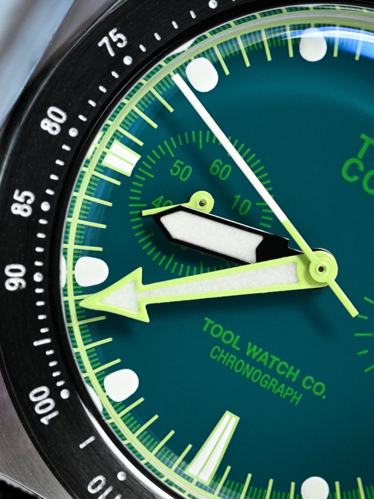
Here, the hour hand is black with a large lumed plot, while the minute hand is an almost fluorescent green with a similarly large lumed plot. The chronograph seconds hand uses that same light green color at the base and a contrasting white tip. The colors are undeniably bold, but I think they work, and work well. The hands are easy to locate quickly, and the different colors help separate the time-telling hands from the chronograph hand and the dial around them.
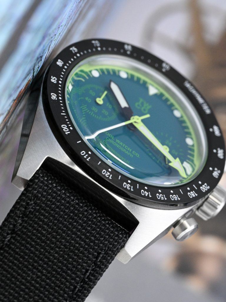
Legibility is excellent, even though on paper the green on green subdials might seem contradictory. But this one remains very easy to read. The white hour markers, strong hand contrast, and well-defined outer track all help, and the crystal plays a big role too. The double-domed boxed K1 crystal gives you some beautiful vintage-style distortion at the edges, which adds a lot of charm to the watch without making it frustrating to read. I also think Tool Watch Co. did a very good job with the anti-reflective coating on the crystal.
Lume
The lume discussion is very different from the Lumecore. The Lumecore was fundamentally a lume watch. That fully lumed dial was the main event, and the entire design was built around making that concept work. The Chroma Green isn’t trying to do the same thing. It has lumed hour markers and lumed hands, but it does not have the same overall coverage or potency as the Lumecore. That is expected, and I do not think it should be judged by the same standard.
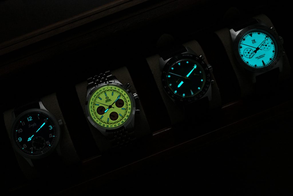
That said, the lume on the Chroma Green is better than I expected, especially on the hands. The hour markers are lumed, but they fade a bit sooner than the hands. The hands, however, are very well lumed. They glow surprisingly bright and have excellent longevity. I compared the Chroma Green with my Buser Freres GSTP 38, the MMI Heritage 38 Chronograph, and the Lumecore, and while the Lumecore obviously has the advantage in overall dial coverage, the hands on the Chroma Green are probably the best of the lot.
Other Thoughts
The strap is the same as the Lumecore, and I still think it is excellent. It suits the watch, feels comfortable, works well with the case proportions, and does not feel like an afterthought. At this price point, that is surprisingly rare to see. The one criticism that carries over is the 30m water resistance. I understand that this is not unusual for an affordable chronograph, but I still think a stronger rating would make the package feel more complete.
Overall, I think the Chroma Green is a very successful variation of this watch. The Lumecore was the more conceptually focused version, built around the fully lumed dial and the clever use of skeletonized hands. The Chroma Green is less singular, but probably more fun and more casually wearable. The green dial, black PVD bezel, almost-fluorescent accents, strong legibility, and surprisingly good hand lume give it a personality of its own.
If you liked the Lumecore platform but wanted something less monochrome and more expressive, this is probably the version to look at. It keeps the same compact, comfortable, affordable chronograph foundation, but makes the watch feel different enough.